
A disorganized home affects more than just the way a space looks. Studies show that clutter increases stress hormones and reduces the ability to focus. Homeowners who reach the point of searching for a professional organizer have already decided they need help.
What they haven’t decided is which company to trust. The home organization company whose website communicates calm authority, shows real transformations, and makes booking easy will win that decision before a competitor’s page even loads.
This article reviews 21 of the best home organization company websites and what each one does well.
Here’s what we cover:
- What makes a home organization website convert curious visitors into booked clients
- 21 standout home organization company websites, reviewed and linked
- Design and content choices worth applying to any professional organizer’s site
- What every home organization website needs to turn visitors into consultations
- How brands like Neat Method and The Home Edit set the standard for the category
We’ve built service business websites that turn first impressions into booked consultations for over 2,400 clients since 2011. Our web design portfolio shows what that looks like across dozens of industries, including home services.
What makes a home organization company website convert
A good home organization company website is just as organized and accessible as the service it promotes. The best websites feature clean layouts, vibrant full-color photographs of organized spaces, concise service descriptions, and a clear invitation to take the first step. The homepage is often the first and only chance to make the sale.
Home organization is an emotionally driven purchase. Clients aren’t just buying a service. They’re buying peace of mind, relief from the stress of clutter, and the promise of a transformed space where everything has its place. The best home organization company websites understand this and lead with the emotional outcome, not just the process.
Here’s what the top home organization company websites consistently get right:
- They show the transformation, not just the service. Before-and-after photos of closets, pantries, kitchens, and entire home spaces communicate the real impact of the work more persuasively than any written description. Clients want to see what their own space could look like after the process is complete.
- They use calm, neutral color palettes that mirror the outcome. White, soft gray, light blue, sage green, and neutral earth tones all signal the same thing: order, clarity, and peace. The visual design of the website functions as a preview of what the client is buying.
- They make the consultation request immediately accessible. A visible “Book a Consultation” or “Schedule a Call” button, a contact form above the fold, and clear service descriptions all reduce the friction between a visitor’s interest and a confirmed appointment.
- They introduce the organizer as a person, not just a brand. Home organization is an intimate service. A professional organizer comes into someone’s most private spaces. Websites that introduce the founder or lead organizer with a personal photo, a brief story, and a warm, direct tone build the kind of trust that converts interest into a consultation request.
| Weak home organization website | High-converting home organization website |
|---|---|
| Generic lifestyle stock photography | Real before-and-after photos from completed projects |
| No booking CTA above the fold | Consultation request button immediately visible |
| Vague service descriptions | Clear organization systems explained per service type |
| No personal introduction | Founder photo, bio, and personal philosophy |
| No social proof | Client testimonials, press mentions, and featured publications |
The 21 best home organization company websites of 2026
A good home organization company website is just as organized and accessible as the service it promotes. The best websites feature clean layouts, vibrant, full-color photographs, colorful descriptions, and a brief sales pitch that shows the audience why they need this service in their lives. The homepage of your website is your first, and sometimes last, chance to make the sale. With a crisp layout and clear functionality, you’ll have a website that drives sales instead of merely suggesting them.
1. No Wire Hangers

No Wire Hangers greets visitors with a clean layout and a bright, full-color photograph that immediately sets the visual tone for the brand. Calm, soothing colors like white, light blue, and forest green inspire exactly the thoughts a homeowner searching for an organized space wants to feel: peace, clarity, and a tidier home on the horizon. Scrolling down reveals a vibrant description of the service alongside links to deeper information, creating a natural browsing flow that rewards exploration without demanding it.
2. Organized Nest

Organized Nest delivers its message with admirable efficiency: bright photographs, short text blurbs, and three clear actions for visitors: schedule an appointment, meet the team, or read the blog. For professional organizers whose brand identity is built on simplicity and clarity, a homepage this deliberately focused is itself a demonstration of the philosophy the service delivers.
3. NS Organizing

NS Organizing uses appealing photographs of different room types to show clients exactly what they can expect from this service across the entire home. The page links sit in a neat header at the top, organizing the site itself as a demonstration of the professional organizer’s approach. A clean pink and white color palette conveys the calmness and clarity that characterizes the best-organized spaces.
5. Imagine Home Organization
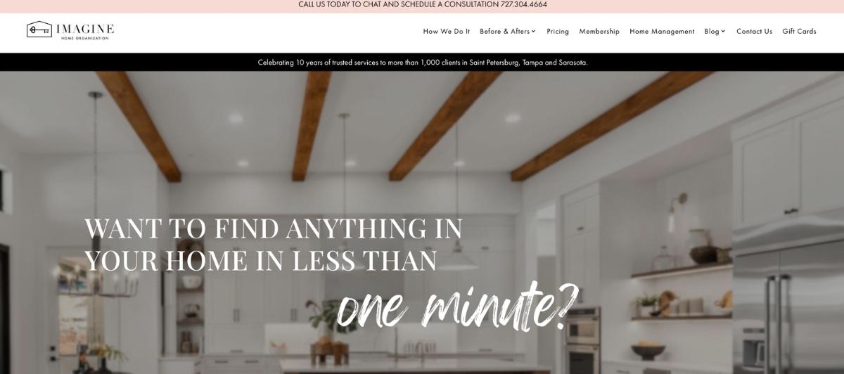
Imagine Home Organization opens with a question that invites the visitor to picture how great it would be to live in an organized home, creating an immediate emotional hook before any service description appears.
A clear list of services and a substantial collection of client testimonials follow as visitors scroll, serving both the client who is still deciding whether they need help and the one who just needs confirmation they’ve found the right professional organizer.
6. Practically Perfect

Practically Perfect combines a neat row of navigation links at the top with social media icons in the top-right corner and a pop-up invitation to learn about virtual consultation sessions. For clients who want to explore organization systems remotely, this immediate virtual option is a meaningful differentiator. The site’s blocky, uncluttered layout and clean lines of text communicate the same sense of order that the service itself delivers.
7. Urban Clarity
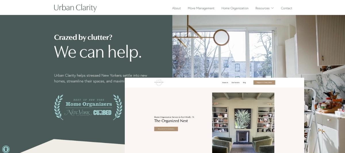
Urban Clarity greets visitors with a pop-up announcing their remote move management service, which immediately communicates that this professional organizer offers additional services beyond standard home organization.
The clean, accessible design with simple text and large, crisp images gives the browsing experience the same quality of clarity the brand name promises. A minimal color scheme of brown, aqua, and white ties visually to the company logo in a cohesive brand system.
8. Get Organized

Get Organized communicates its specialty in closets and storage immediately, so no client has to read through a services page to confirm this company handles what they need. Contact information is front and center, removing the barrier between a motivated visitor and an initial conversation. Facts and statistics about the effectiveness of professional organization services support the emotional appeal with logical reinforcement, while full-color images show completed projects in real life.
9. Life In Jeneral
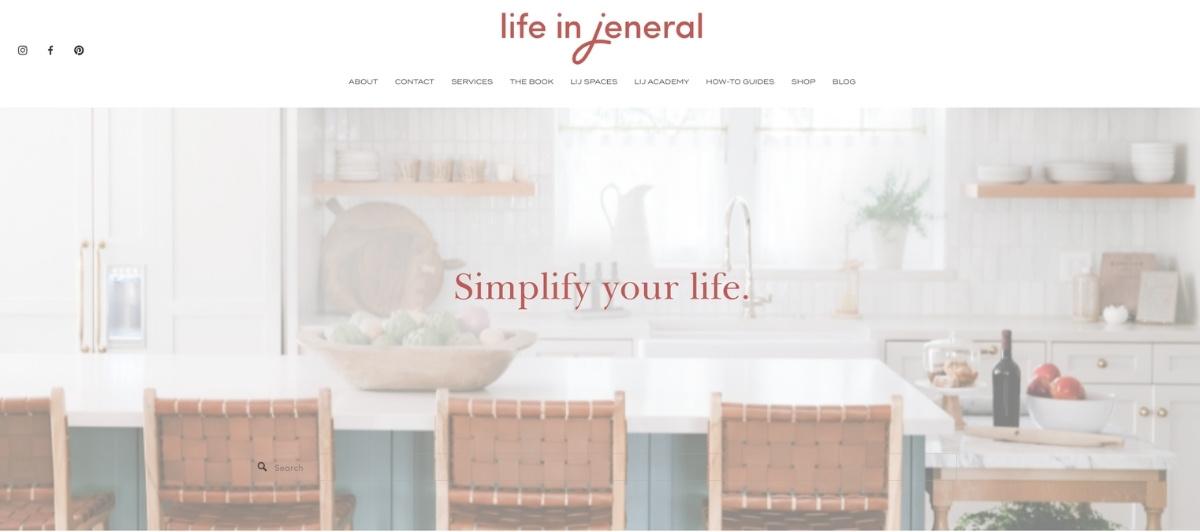
Life In Jeneral opens with a newsletter signup pop-up that captures visitors who aren’t yet ready to book but are interested enough to stay connected, creating an email marketing touchpoint that converts prospective clients over time. The minimalist layout and neutral color scheme communicate exactly what the brand promises: a clean, modern approach to organization that applies to a home’s aesthetics as much as its function.
10. Neat With Nic

Neat With Nic builds credibility immediately by displaying the publications and blogs that have featured the company, communicating professional recognition and established expertise before a visitor reads a service description. The full-color photo of the founder alongside a personal invitation to learn more makes the professional organizer feel familiar and approachable, which is exactly what a client handing over access to their most intimate home spaces needs to feel.
11. Sorted Out
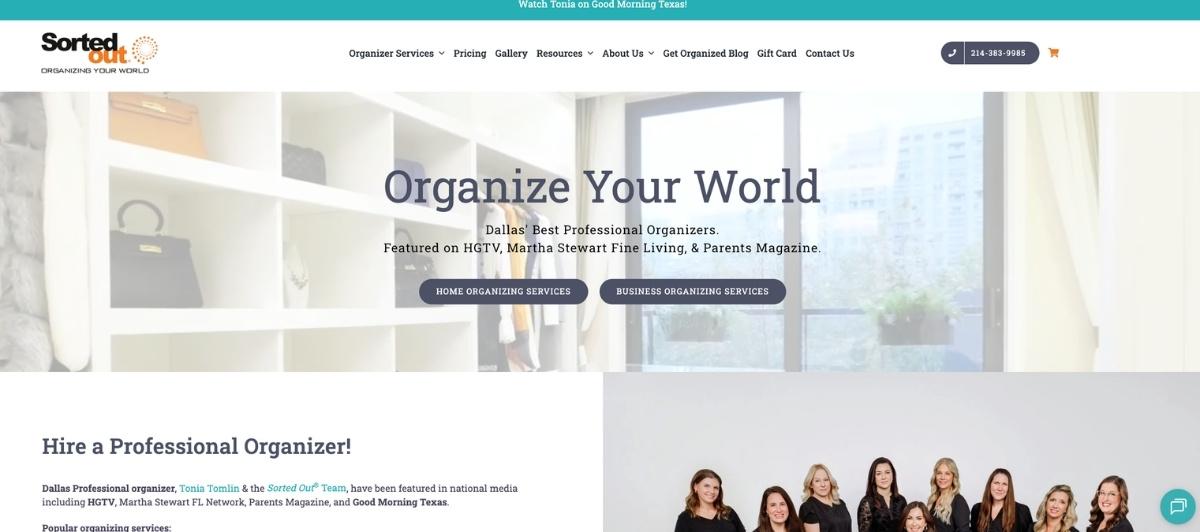
Sorted Out opens with a short video clip that captures attention immediately, followed by large, clearly labeled buttons for home organizing and business organizing that route different client types to the right service information without requiring navigation effort. Press coverage from well-known magazines and television shows adds the kind of recognized third-party validation that dramatically reduces a prospective client’s hesitation about trying a new service.
12. Done & Done Home

Done & Done Home stands out for two features that most professional organizer websites never include. A helpful video showing exactly how the service works reduces the uncertainty that many first-time clients feel about inviting a professional organizer into their home. A mention of the nonprofit organization the company supports communicates values that resonate with community-minded clients and adds a dimension to the brand that pure service descriptions cannot.
13. Sage
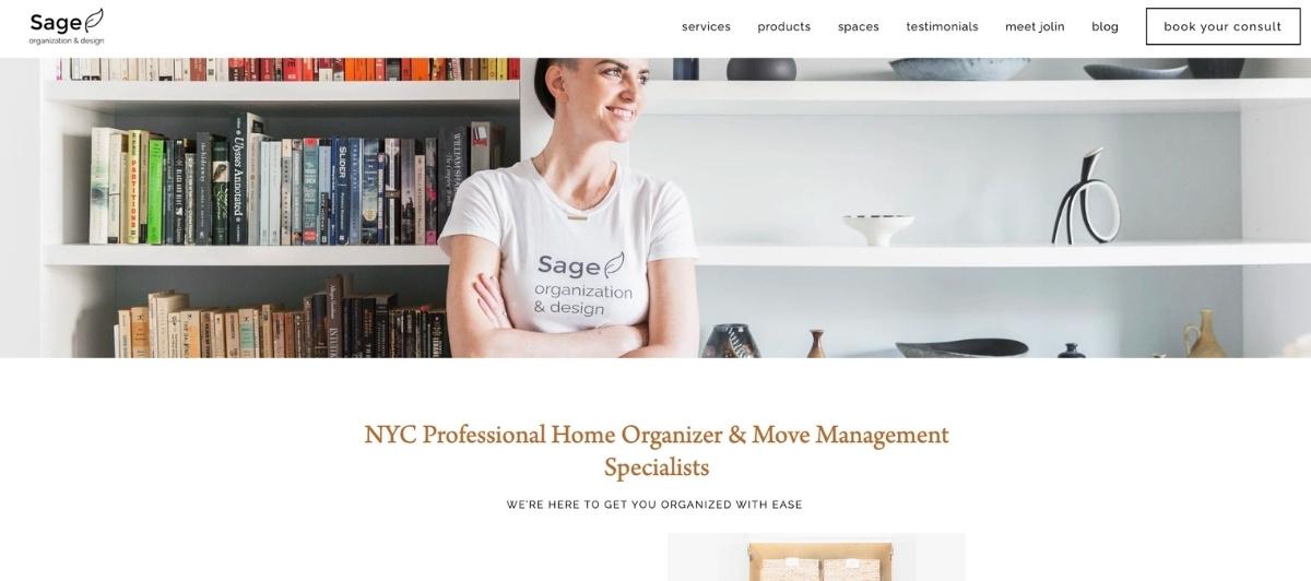
Sage leads with a newsletter signup offer that functions as a gentle first engagement step for visitors not yet ready to schedule. Clean black navigation links on a simple, concise homepage communicate the same discipline the organization systems the company implements in real life. Short content blurbs rather than long paragraphs reflect an understanding that clients overwhelmed by clutter often feel equally overwhelmed by dense, text-heavy web content.
14. The Home Edit
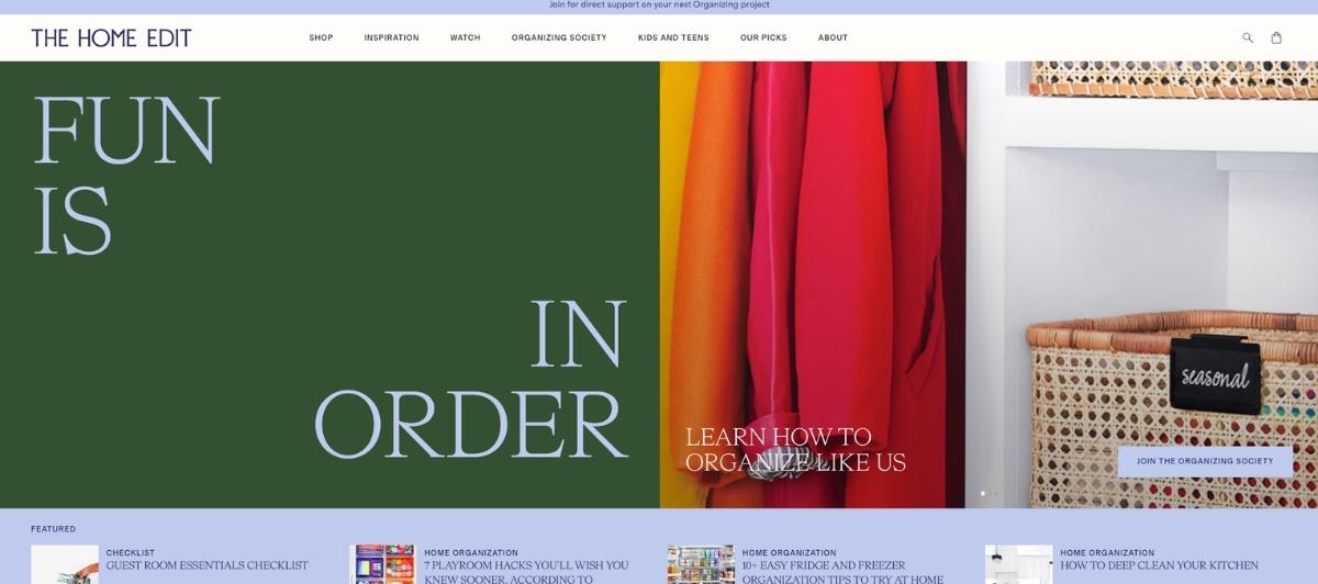
The Home Edit is arguably the most recognized brand in home organization, and its website reflects the full breadth of what the brand has become. A vibrant opening image of products organized by color communicates a philosophy that turns function into beauty.
A list of major publications, companies, and influencers that recommend the service adds an authoritative layer of social proof that few professional organizer websites can match. Product links and branded merchandise extend the relationship beyond the service engagement itself.
15. Neat Method

Neat Method opens with an offer to save money on first services alongside a newsletter option, immediately providing two low-barrier entry points for visitors at different stages of their decision process. A founder video adds genuine personal warmth to a brand that has scaled significantly through franchise owners across multiple cities. The gentle white and gray color scheme and orderly layout reflect the organizing philosophy consistently across every page of the site.
16. Simply Organized

Simply Organized uses a clean white design that rests the eye immediately and positions the brand’s core philosophy, organizing with style for real life, in clear, readable text near the top of the page. An Instagram feed at the bottom of the homepage serves as a continuously updated portfolio of completed projects, giving potential clients an ongoing stream of visual proof that the service delivers beautiful, functional organization systems in actual homes.
17. LMW Edits
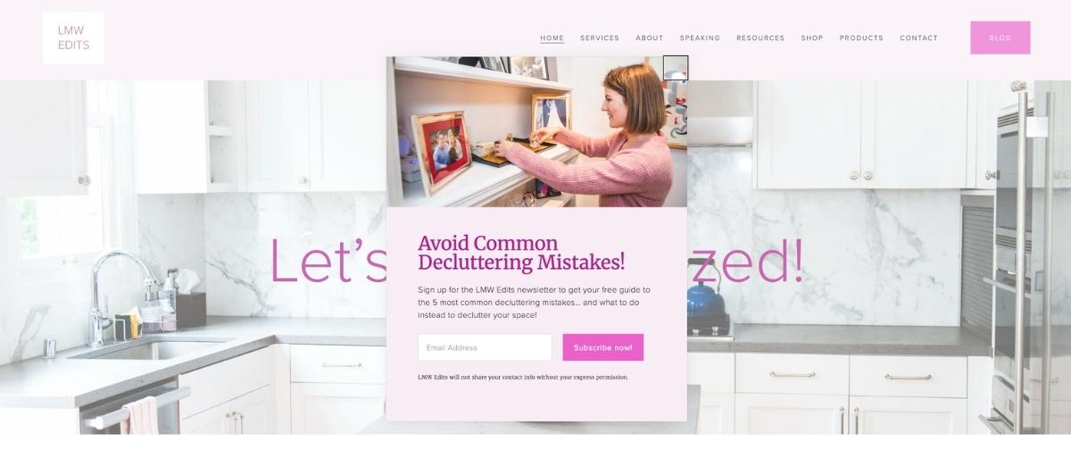
LMW Edits opens with a foundational philosophy statement that tells the reader about the values driving the company before describing a single service, which is a deliberate choice to build brand identity alongside service awareness. A newsletter pop-up and a row of social media icons communicate a practice that is active and engaged beyond individual projects. The consultation scheduling button is eye-catching and positioned where motivated visitors expect to find it.
18. Arranged by Erin
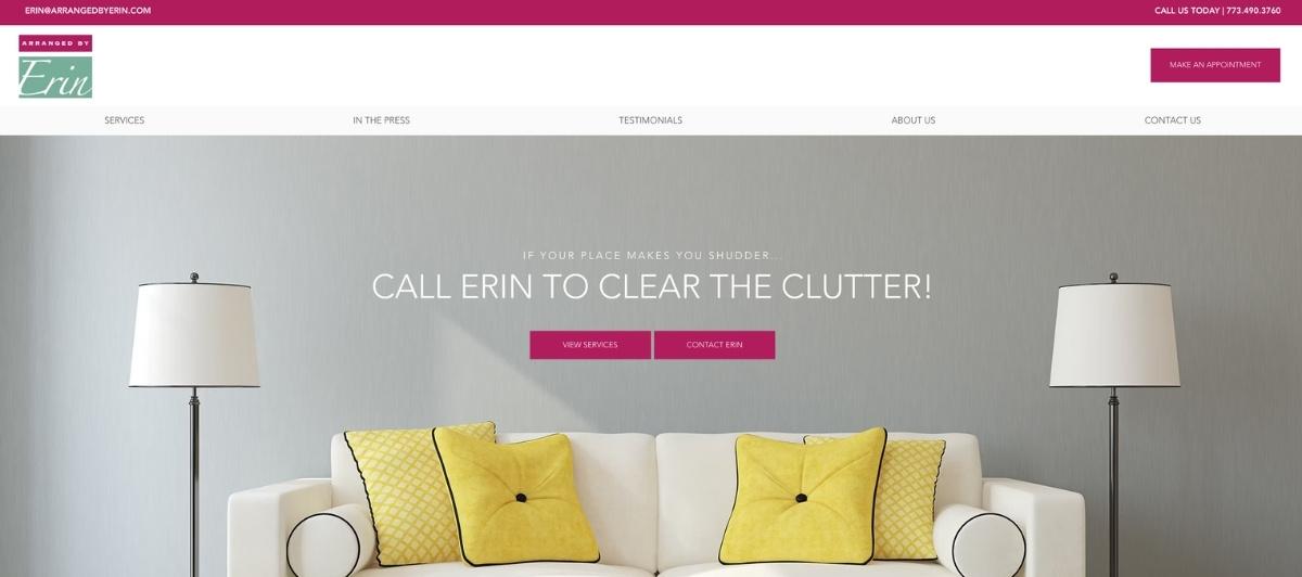
Arranged by Erin places three bold, eye-catching action buttons, contact, view services, and book an appointment, at the very top of the page, where they greet every visitor immediately. This structure prioritizes conversion at every entry point rather than asking motivated visitors to scroll or navigate before taking action. Images of neat, orderly homes fill the content below, providing visual confirmation that the action is worth taking.
19. OCD Experience
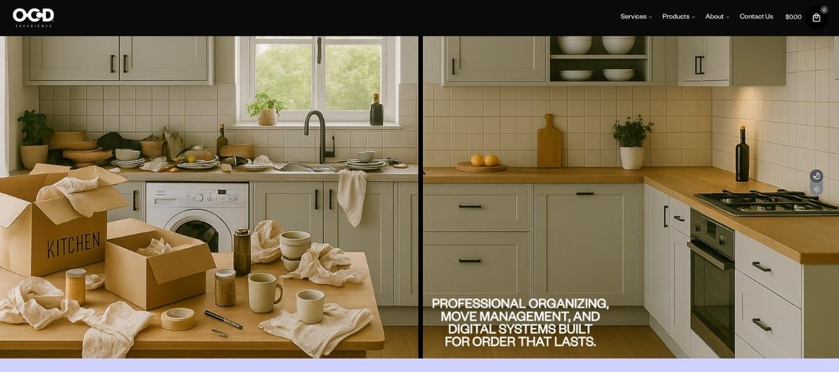
OCD Experience takes a distinctive approach to social proof by featuring endorsements from celebrity clients alongside their photos in a slideshow format. For clients who want to know who else has trusted this professional organizer with their spaces, this format answers that question memorably. The abstract jigsaw puzzle opening image and the brand’s tagline to “organize and create discipline” position the service around a broader life philosophy rather than just a closet cleanup.
20. The Clutter Curator
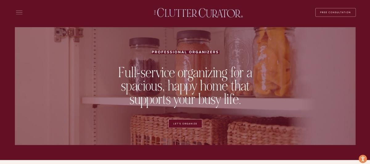
The Clutter Curator opens with a neat desk photograph that immediately shows visitors the organized outcome available to them. A description of the business and a personal message from the founder add context and warmth, and a free organization guide offered near the bottom provides a no-risk first step for visitors who want help before they’re ready to schedule a full project consultation.
21. The Tidy Bungalow
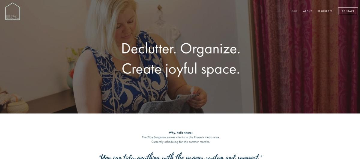
The Tidy Bungalow invites visitors to “create joyful space” as its opening statement, which reframes home organization as a path to a specific emotional outcome rather than a chore to complete. A clear services list with benefit descriptions follows, and third-party blog features add the kind of external credibility that helps a professional organizer convert visitors who are comparing multiple companies before deciding.
Design choices worth applying to any home organization website
Looking across all 21 of the best home organization company websites above, specific decisions consistently produce the sites that convert visitors into consultation requests. Here’s what’s most worth applying.
Let before-and-after photography do the conversion work
Homeowners searching for a professional organizer have a specific vision of what their space could look like. Before-and-after photos of completed organization systems, particularly of closets, pantries, playrooms, and entire home projects, answer the implicit question every visitor carries: can you actually transform a space like mine? Project Neat, NS Organizing, and Deluxe Organizers all demonstrate how prominently real project photography should feature throughout a home organization website.
Use color and design to preview the outcome
The best home organization company websites use calm, neutral color palettes precisely because those palettes communicate the experience of an organized space. White space, soft earth tones, gentle greens, and clean typography all signal order and calm before a visitor reads a word of content. The design of the site is itself a sales tool. Our WordPress web design team builds this kind of intentional visual language into every service business site we deliver.
Introduce the professional organizer personally
Home organization is a trust-intensive service. A professional organizer comes into a client’s most private spaces and handles deeply personal belongings. Websites that introduce the organizer with a real photo, a genuine personal story, and a warm bio consistently outperform those that present only services and process descriptions. The Home Edit, Neat Method, and Neat With Nic all demonstrate this principle at different scales, from a single founder to a national franchise network.
Offer a virtual consultation option prominently
Virtual consultations have become a meaningful entry point for clients who want to explore organization systems before committing to an in-person project. Practically Perfect and Urban Clarity both surface this option prominently, recognizing that the virtual consultation reduces the commitment barrier for undecided clients and creates a natural pathway into the full service. Our SEO services help home organization companies build exactly this kind of service-specific visibility over time.
Build a blog that supports ongoing discovery
Blog content covering organization tips, product recommendations, storage solutions for specific spaces, and seasonal decluttering guides attracts organic search traffic from homeowners in the research phase, long before they’re ready to book.
Organized Nest, Colorado Voice Clinic, and Done & Done Home all use ongoing content to create multiple entry points into their brands beyond the direct service page. A consistent blog also supports the social media and email marketing strategies that keep a professional organizer’s brand visible between projects.
What every home organization website needs
Whether your business is a solo professional organizer or a franchise operation like Neat Method with locations across multiple cities, these are the elements every home organization company website needs to convert visitors into consultations.
- Real project photography organized by space type. Closets, pantries, kitchens, living rooms, children’s rooms, garages, and home offices each attract different clients with different specific needs. Organizing project photos by room type helps visitors find the transformation most relevant to their own situation and confirms that the company has experience with exactly what they need.
- A clear, low-friction consultation request. The goal of every page is the same: get the visitor to schedule a consultation. A visible button, a simple contact form, and a clear description of what happens next all reduce the hesitation that prevents interested visitors from taking action. Pricing tiers, as Simply Organized Systems demonstrates, can also help budget-conscious clients self-select before reaching out.
- A personal introduction from the founder or lead organizer. For solo professional organizers especially, the person is the brand. A genuine photo, a personal story of how the organizer came to the work, and a warm direct tone all build the trust necessary for a client to invite someone into their home.
- Social proof distributed throughout the site. Client testimonials, press mentions, featured publications, and blog recognitions all communicate that this is a professional with a proven track record. These signals should appear throughout the homepage and service pages, not only on a dedicated testimonials page.
- Mobile-first design and fast load speeds. Many homeowners browse home organization company websites on their phones, often inspired by a frustrating morning of searching for things that should be in obvious places. A site that doesn’t display well on mobile loses those motivated visitors before they see a single project photo. Our WordPress speed optimization service ensures every service business site performs well across all devices.
Build a home organization website as polished as the spaces you create — Freshy makes that happen
The best home organization company websites communicate the outcome before they explain the process. They make an organized space feel achievable, the professional organizer feel trustworthy, and the first step feel effortless. Every design choice, from the color palette to the project photography to the consultation CTA, should serve that moment of conviction.
Key takeaways:
- Real before-and-after project photography converts browsers into consultation requests more effectively than styled lifestyle imagery
- Calm, neutral color palettes signal the organized outcome and build brand trust before any copy is read
- Introducing the professional organizer personally is one of the highest-trust conversion tools available to solo and small-team practices
- Virtual consultation options reduce commitment barriers and serve clients in the early stages of their decision
- Blog content covering organization tips and storage solutions attracts organic traffic from homeowners researching before they’re ready to book
- Mobile-first design ensures clients inspired to organize can find and contact you from any device at any moment
If your home organization website isn’t converting the visits your work deserves, tell us about your business and let’s build one that does. Browse our portfolio to see the kind of work Freshy brings to service businesses across every industry.
FAQs
What should a home organization company website include?
The best home organization company websites feature real before-and-after project photography, a personal introduction from the founder or lead organizer, a clear consultation booking CTA above the fold, service descriptions organized by room type or organization system, client testimonials, virtual consultation options, and a blog covering organization tips and storage solutions for ongoing organic visibility.
How do home organization websites generate more clients?
A clean, visually calm website that leads with transformation photography, introduces the professional organizer personally, and makes consultation booking immediately accessible converts local search traffic into booked clients consistently. Blog content covering home organization tips and specific organization systems attracts visitors in the research phase and builds long-term search visibility.
Should home organization companies offer virtual consultations on their website?
Yes. Virtual consultations reduce the commitment barrier for clients who want to explore organizational systems before scheduling an in-person project. Offering and prominently displaying this option serves clients at different stages of their decision process and expands the practice’s geographic reach beyond its immediate local market.
How important is photography for a home organization website?
Photography is the single most important conversion element. Before-and-after photos of completed organization systems across different room types, including closets, pantries, kitchens, and entire home projects, show potential clients exactly what their space could look like and confirm that the professional organizer has experience with their specific situation. Real project photography consistently outperforms styled lifestyle stock imagery.
How much does a home organization company website cost?
A professionally built home organization website typically costs $2,500 to $6,000, depending on the number of service pages, project gallery depth, virtual consultation integration, blog structure, and whether local SEO and mobile optimization are included from the start.


