
A flooring project is one of the most significant home improvement investments a homeowner makes. It’s expensive, it’s permanent, and it’s deeply personal. Before they call anyone, they research online. 80% of consumers search online for local businesses weekly, and flooring contractors who show up with a polished, trustworthy website win the consultation before competitors even know the homeowner was looking.
This article breaks down 18 of the top flooring contractor websites and exactly what each one gets right.
Here’s what we cover:
- What makes a flooring contractor website generate real leads
- 18 of the top flooring contractor websites, reviewed and linked
- The design and conversion choices worth applying to your own site
- What every flooring website needs to turn visitors into consultations
- How to build a site that works as hard as your installation team
We’ve built contractor websites that turn site visits into booked consultations, and our contractor web design work reflects exactly that. Take a look whenever you’re ready for inspiration.
What makes a flooring contractor’s website generate leads
Most flooring contractors generate leads through local SEO, Google Business optimization, service pages targeting flooring keywords, and conversion-optimized websites. The website is the hub where all of that effort either converts or evaporates.
A homeowner evaluating flooring contractors makes their shortlist based on three things: visual proof of quality work, ease of getting information, and trust signals that indicate professionalism. The best flooring contractor websites deliver all three before a visitor ever scrolls below the fold.
Here’s what separates the top flooring contractor websites from generic contractor pages:
- They lead with stunning visuals. Flooring is a visual product. Hardwood, tile, stone, carpet, vinyl flooring, and waterproof laminate all look dramatically different in a real space versus a product swatch. The sites that convert show completed flooring projects in real homes, not just manufacturer images of flooring products sitting on a white background.
- They make the next step obvious. A free in-home consultation request, a phone number that’s immediately visible, an online chat, or a quick quote form. Every one of the top flooring contractor websites makes it effortless to take the next step. Homeowners evaluating multiple contractors will choose the one that responds fastest, and your site needs to make that first contact as frictionless as possible.
- They build trust before the first conversation. Customer reviews, warranties information, years in business, certifications, and before-and-after project photos all signal that this flooring company delivers on its promises. People are 90% more likely to trust brands recommended by friends, and for flooring projects costing thousands, personal recommendations carry huge weight. Online reviews and customer satisfaction signals are the digital equivalent of that referral.
- They showcase the full range of flooring products. Hardwood, carpet, tile, stone, vinyl flooring, waterproof laminate, and commercial floor coverings all attract different homeowners with different budgets and needs. Organized, well-photographed product pages help visitors self-select and feel confident they’ve found the right flooring company for their specific project.
| Weak flooring contractor website | High-converting flooring contractor website |
|---|---|
| Stock imagery of flooring materials | Real completed project photos in actual homes |
| No visible phone number or CTA above the fold | Free estimate button and phone number immediately visible |
| Generic service list | Individual pages for hardwood, carpet, tile, vinyl flooring, and commercial services |
| No reviews or testimonials | Customer reviews woven throughout, not just on a separate page |
| No financing or scheduling information | Financing options, online scheduling, and consultation booking clearly displayed |
Top 18 flooring contractor websites of 2026
Flooring is a vitally important component of a home’s overall aesthetic, safety, and value. It’s also not cheap, with a good floor replacement costing thousands of dollars. Flooring contractors recognize this, and that’s why so many have gone out of their way to create outstanding websites like the ones in this list.
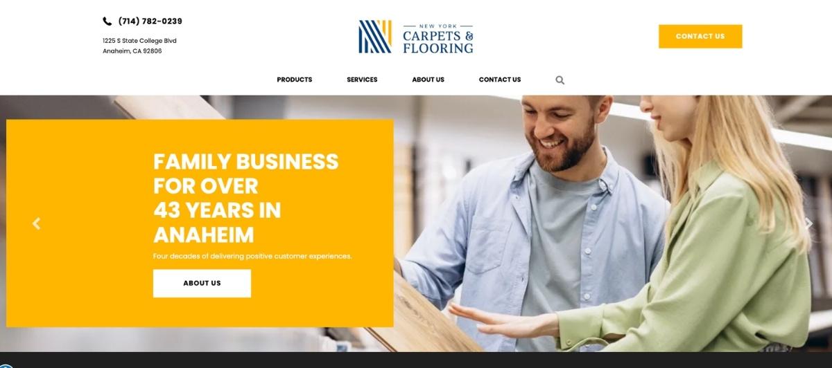
1. State of the Art Wood Floor Gallery
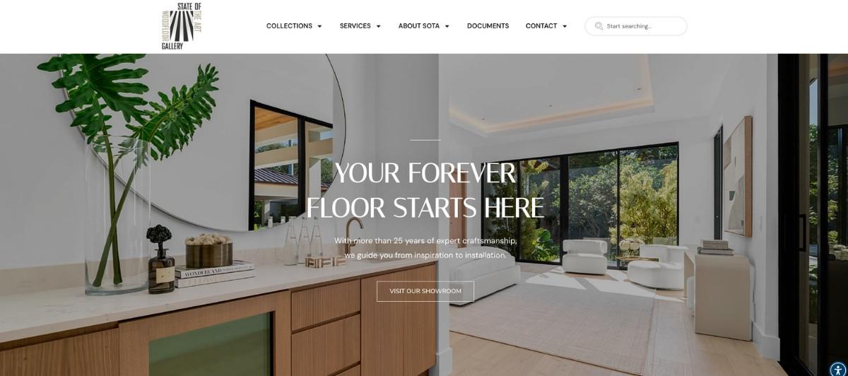
State of the Art Wood Floor Gallery uses its own hardwood flooring installation work as the building block of its entire design. Fantastic photos of completed projects appear throughout the homepage, with text elegantly overlapping floor imagery in a way that makes the design itself a portfolio piece.
This is a flooring website design at its sharpest: the product and the presentation are one and the same. Any flooring contractor looking for inspiration on how to turn project photography into a design asset should explore this site.
2. Shaw Floors
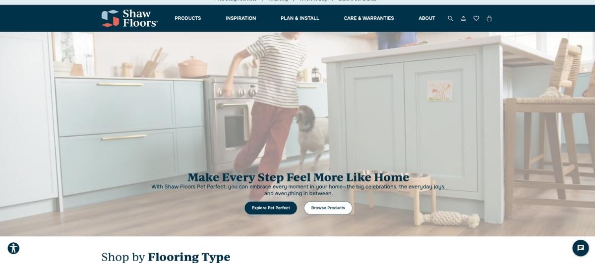
Shaw Floors is a master class in how a flooring brand can use immersive photography to sell an experience rather than a product. Striking full-screen, three-dimensional photos give homeowners an overview of complete living rooms, kitchens, and bedrooms with beautiful hardwood floors.
Scrolling changes the image angle, and a single click opens details on the specific flooring products used in each space. For anyone deciding between floor coverings, Shaw Floors makes the decision feel exciting rather than overwhelming.
3. Unique Flooring
Unique Flooring leads with rotating background photos and immediately communicates two things that convert homeowners: the business is family-owned, and getting a free quote is one click away. The content structure below the fold is clean and easy to read, with services organized clearly so visitors can find what they need for their flooring project without scrolling through pages of unrelated content. It’s a site that understands the first 10 seconds of a visit are the most critical.
4. Walsh Hardwood Flooring
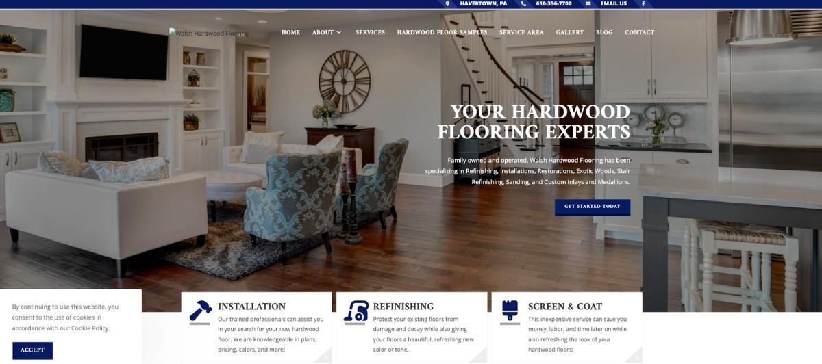
Walsh Hardwood Flooring opens with a photo of a stunning home interior featuring gleaming hardwood floors, immediately setting the quality standard for everything that follows. Three clearly labeled service buttons funnel visitors directly into the part of the site most relevant to their project. The two-decades-of-experience detail that appears as visitors scroll reinforces credibility without requiring a separate About page visit. It’s a site built around how homeowners actually make decisions.
5. Keystone Floor Works
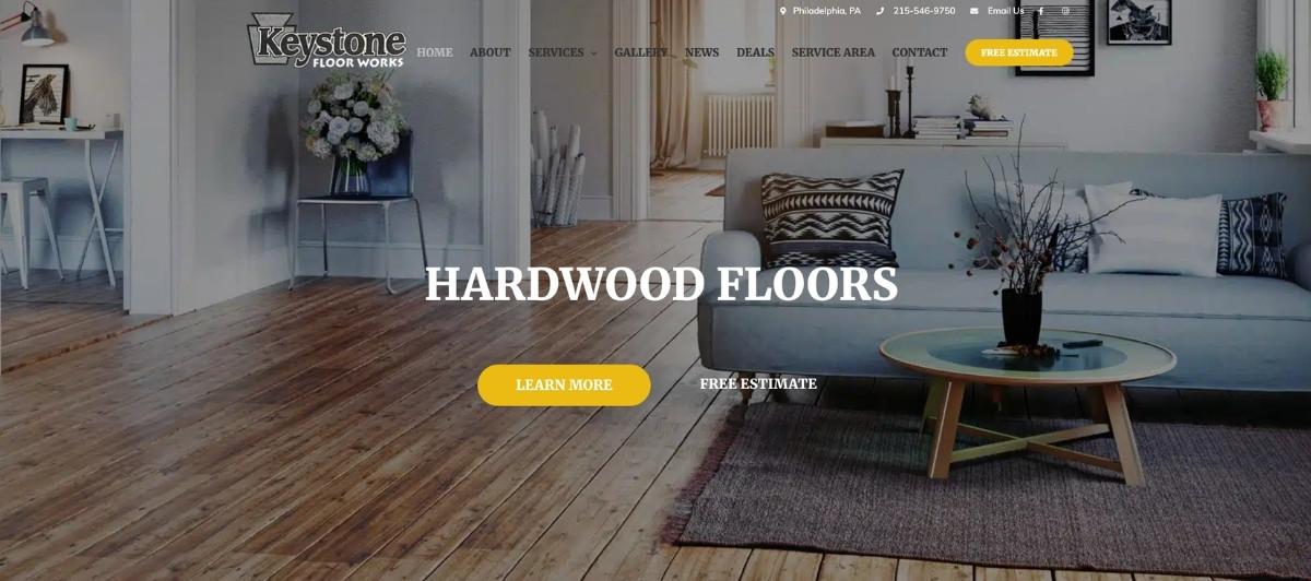
Keystone Floor Works takes a creative approach to its homepage layout, using left-side navigation buttons that toggle between full-screen project photos, alongside a custom hardwood floor graphic that breaks up the content in a memorable way. The email capture pop-up on arrival, combined with social media links, gives this flooring contractor more customer touchpoints than most competitors bother with. For flooring companies looking to build an audience around their brand, not just their services, this site is worth exploring.
6. Stylish Carpets and Fine Flooring
Stylish Carpets and Fine Flooring uses large bold typography over a beautiful kitchen hardwood floor image to communicate its core offer immediately. Two clear buttons separate the carpet from the countertop, and customers from the moment they arrive.
Further down, organized photo categories by flooring material let visitors explore the variety of floor coverings available without navigating away from the page. For flooring companies serving customers across multiple product types, this organized approach makes the variety feel like a strength rather than an overwhelming catalogue.
7. Our Home Improvement
Our Home Improvement packs an unusually high number of useful features into a single homepage without feeling cluttered. A click-to-call phone button, a “Discuss Your Project” button, a chatbot for real-time answers, and a visual photo carousel controlled by a “See What We Do” button all sit above the fold together. For a home improvement and flooring business, this level of accessibility ensures no visitor leaves the site without a way to connect with the team, regardless of what stage of decision-making they’re in.
8. Scharm Floor Covering
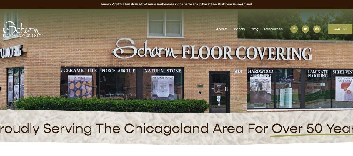
Scharm Floor Covering opens with an instantly memorable image: a baby exploring a carpeted floor, which transitions into a video of hardwood flooring installation in progress. A second video with sound features a real couple discussing the flooring challenges they faced and why they chose this company.
That customer video is one of the most effective trust-building elements on any flooring contractor website in this list. Letting happy customers sell the experience in their own words is a strategy worth borrowing regardless of which flooring products you offer.
9. Midway Flooring
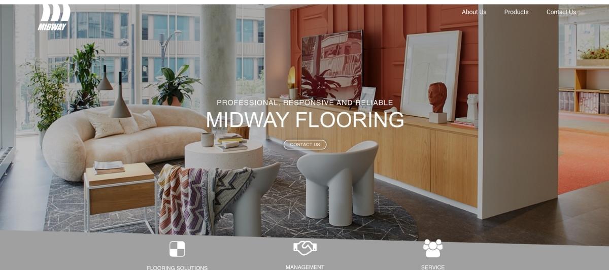
Midway Flooring takes a refreshing approach to its homepage structure by leading with competitive advantages rather than product categories. Rather than immediately listing floor coverings and flooring products, the site’s first scrollable section explains why this company is worth choosing.
Client types served, and company values follow before any product imagery appears. This inverted structure builds trust first and showcases services second, which is the right order for homeowners who have already decided they want new flooring and are now comparing contractors.
10. Royal Home Flooring
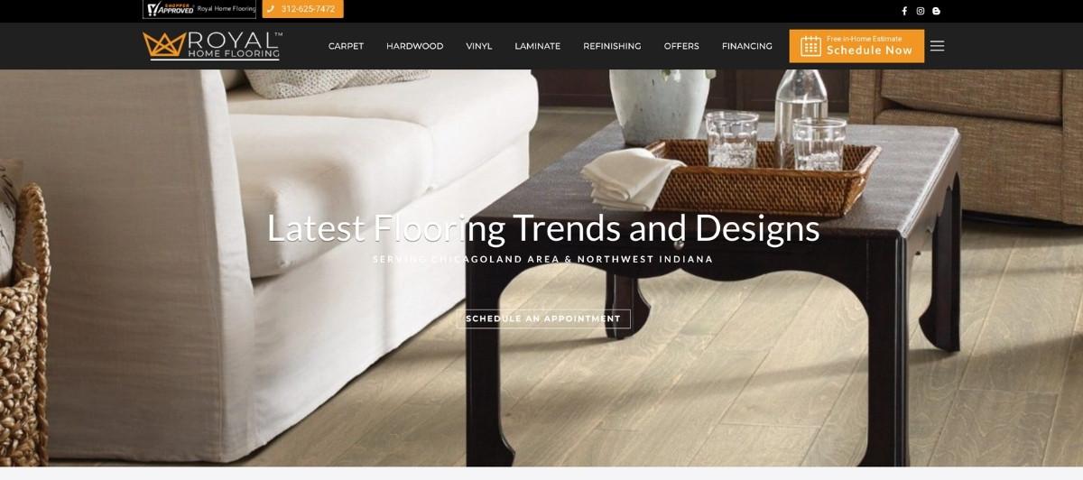
Royal Home Flooring offers one of the most feature-rich flooring contractor websites on this list. A live chatbot connects visitors with a real person. A free in-home estimate button enables instant scheduling.
Products, completed projects, awards, and customer reviews all appear in a well-organized layout that rewards scrolling. For flooring companies that want their website to function as a full business development tool, Royal Home Flooring shows how much a single page can accomplish without feeling overwhelming.
11. Robert Tile
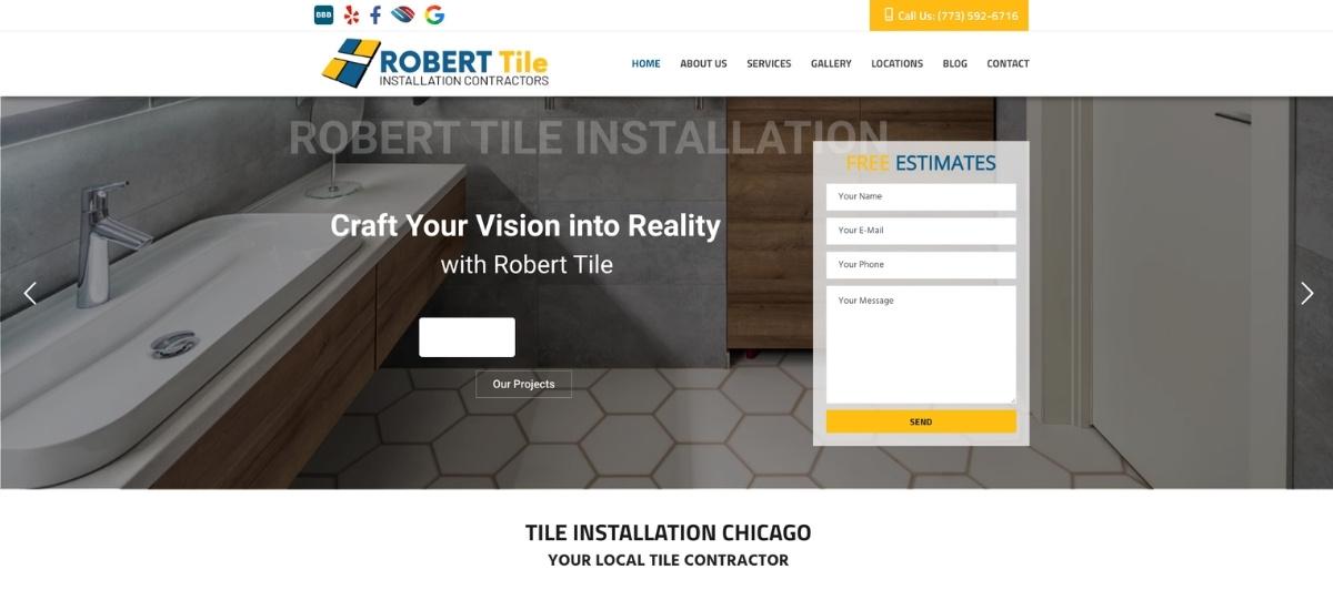
Robert Tile uses a distinctive white, blue, and gold color scheme that ties its project photography and text into a unified brand identity. A free estimate form appears immediately on arrival, removing the barrier between a curious visitor and a potential consultation.
The “Why Choose Us” section further down is one of the cleaner examples of trust-building content on any flooring contractor website, presenting customer satisfaction proof without relying entirely on third-party review embeds.
12. Pacific Hardwood Flooring
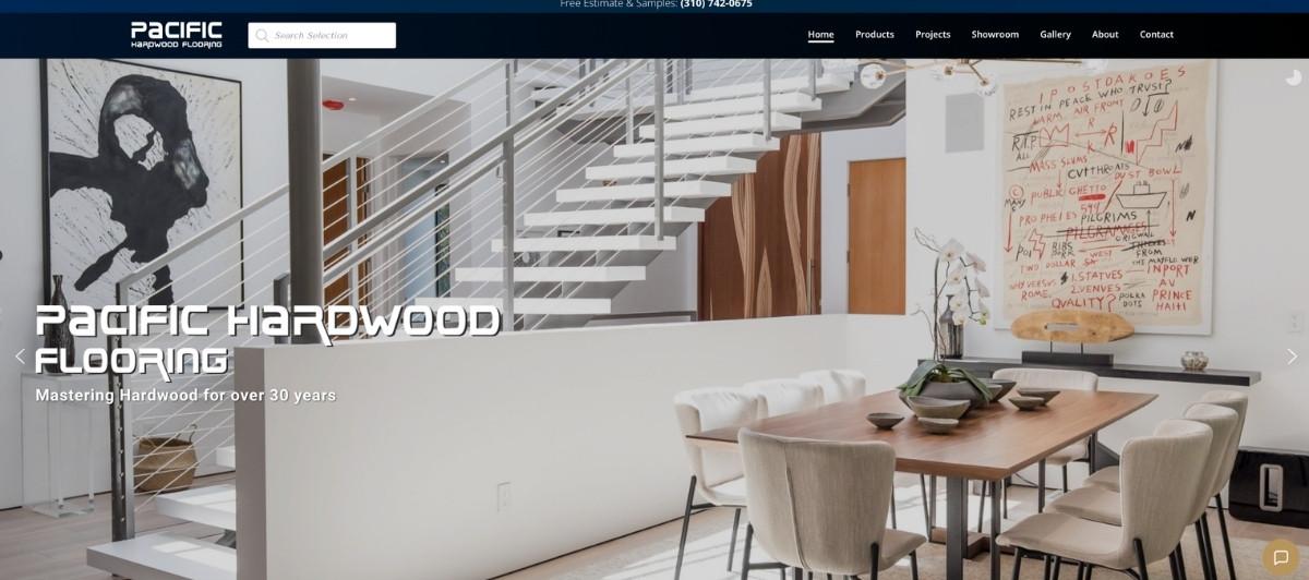
Pacific Hardwood Flooring leads with one of the sharpest photo sliders in the flooring category, with project images that highlight the company’s range across different flooring installation types and room styles. Gorgeous photography of both completed projects and individual flooring products fills the rest of the page, giving visitors a visually rich experience that communicates quality at every scroll point. The navigation bar makes it easy to explore specific product categories without backtracking.
13. New York Carpets
New York Carpets takes an approach that most flooring contractor websites avoid: it leads with the store itself. A video showcasing their physical showroom alongside a still photo slider gives homeowners a sense of the breadth of floor coverings and flooring products available before they ever visit in person.
A project gallery further down provides the completed installation proof that converts browsers into callers. For flooring companies with a significant retail showroom component, this dual focus on store and craftsmanship works well.
14. Color Interiors
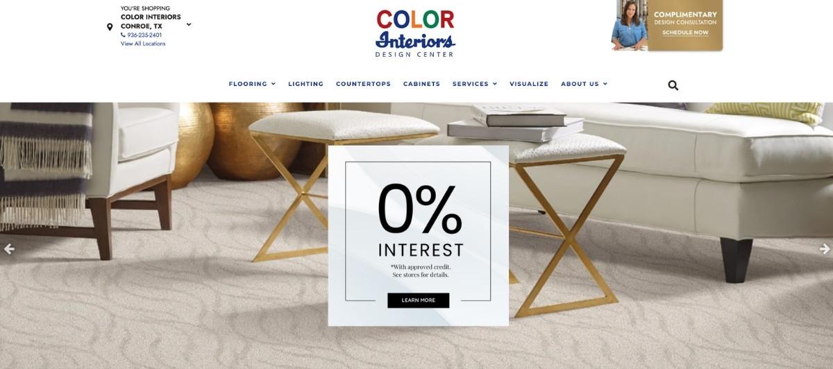
Color Interiors packs more functionality into its homepage than almost any other site on this list. The slider above the fold includes buttons to explore inventory, shop from home, schedule a consultation, and access a discount, all before a visitor has scrolled once.
A virtual concierge chat feature, store location finder, and extensive product pages make this one of the most complete flooring contractor websites available. For flooring businesses that want to offer the best experience possible across both digital and in-person touchpoints, this site is the clearest example of what that looks like.
15. Petra Flooring and Blinds
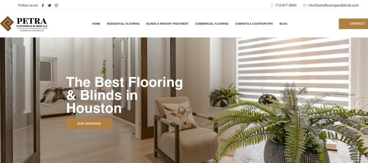
Petra Flooring and Blinds earns its place on this list largely through its approach to social proof. An extensive customer review section gives homeowners a deep look at the experience of working with this company across different flooring project types.
Combined with a well-organized layout that alternates between text and photos, the site communicates both expertise and genuine customer satisfaction in a way that shorter review sections simply cannot replicate.
19. Trinity Floor Company
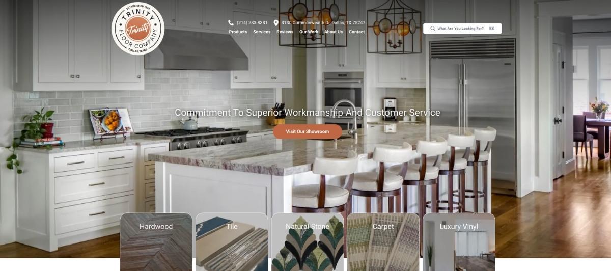
Trinity Floor Company leads with project images from some of the most impressive commercial flooring installation work in its portfolio: symphony centers, sculpture galleries, and high school facilities, alongside residential projects.
This combination tells a story of range and capability that few flooring contractor websites manage to communicate so clearly above the fold. For flooring companies pursuing both commercial and residential work, Trinity’s approach of leading with the most impressive portfolio highlights is a smart strategy.
17. Carlson’s Floors
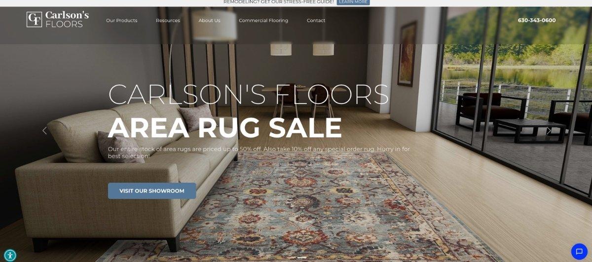
Carlson’s Floors uses the breadth of its flooring products as a visual selling tool, showing a wide variety of floor types in different real-world settings to communicate versatility. Sticky tabs fixed to the left and right sides of the page give visitors instant access to customer reviews and live chat from anywhere on the homepage, an unusually thoughtful UX detail that ensures no visitor has to hunt for either social proof or direct contact options.
18. Great Western Flooring

Great Western Flooring earns attention for features you rarely see on flooring contractor websites: virtual consultants, room measurement tools, and a dedicated “tips and inspiration” section. These tools serve homeowners who are early in their flooring project research phase and not yet ready to request a consultation, giving the site a genuine reason to be bookmarked and revisited. White space used throughout makes the content easy to consume without the visual overload that affects many flooring websites.
Design choices worth applying to your own flooring site
The top 18 flooring contractor websites above share specific design and content decisions that separate them from generic home improvement pages. Here’s what’s worth prioritizing.
Lead with real project photography
Before-and-after photos of flooring jobs keep content current and are one of the most effective tools for demonstrating the quality of your flooring installation work. Shaw Floors and State of the Art Wood Floor Gallery both demonstrate how real project photography, when presented well, sells the flooring installation experience better than any written description. Every flooring contractor website should feature real completed projects prominently, organized by flooring type where possible.
Make the free consultation request impossible to miss
Responding to a homeowner within the first hour can increase conversion rates up to 7x compared to waiting a day or more. Your site needs to make that first contact as easy as possible. A free in-home estimate button above the fold, a click-to-call phone number in the header, and an online scheduling option together eliminate the barriers between a visitor’s interest and a booked consultation. Royal Home Flooring and Color Interiors both execute this exceptionally well.
Organize flooring products and services by type
Hardwood flooring installation, tile and stone, carpet, vinyl flooring, waterproof laminate, and commercial floor coverings each attract different customers searching different keywords. Dedicated service pages for each flooring type improve both user experience and local SEO performance significantly.
These keywords often represent homeowners actively planning a flooring project, which makes them extremely valuable for lead generation. Our SEO services help flooring contractors build exactly this kind of keyword-specific page structure.
Feature financing options prominently
Flooring projects can cost thousands of dollars, and many homeowners decide whether to proceed based on whether financing is available. Sites like Mayfair Floors and Color Interiors make financing options visible above the fold. Displaying financing availability clearly on your homepage and service pages removes one of the most common hesitations in the flooring purchase decision.
Include warranties and guarantees information
Customer satisfaction guarantees, installation warranties, and product warranties from brands like Shaw Floors distinguish professional flooring contractors from lower-cost competitors. Displaying these details clearly on product pages and in a dedicated warranty section builds the kind of confidence that converts undecided homeowners into committed customers.
What every flooring contractor website needs
Whether your flooring company serves residential customers exclusively or splits its work between residential and commercial floor coverings, these are the elements every flooring contractor website should have before investing in any marketing or advertising.
- A prominent free estimate or consultation CTA on every page. The single highest-impact change most flooring contractor websites can make is ensuring a clear, visible call to action appears on every page, not just the homepage. Homeowners researching flooring options visit multiple pages before deciding to contact anyone. Every page is a potential conversion point.
- A project gallery organized by flooring type. Hardwood, tile, stone, carpet, vinyl flooring, and waterproof laminate all deserve their own gallery section. Homeowners searching for vinyl flooring installation want to see vinyl flooring projects, not a general gallery that buries the specific work they’re evaluating.
- Customer reviews integrated throughout the site. A dedicated testimonials page is useful but insufficient. When your customers provide positive online reviews, they become one of the most meaningful forms of endorsement your flooring business can receive. Reviews should appear near service descriptions, near CTAs, and on the homepage, where they reinforce confidence at the moments that matter most.
- Online scheduling or a real-time contact option. A live chat, an online booking form, or a consultation scheduling tool gives homeowners who aren’t ready to call a way to connect with your team on their own terms. Our web design team builds flooring contractor websites with these conversion tools integrated from the start.
- Service area information, clearly displayed. Homeowners want to confirm you serve their area before they invest time in exploring your site. Your service area, whether it’s a single city, multiple counties, or a broad regional territory, should appear on your homepage and on a dedicated service area page that helps with local SEO as well.
- Mobile-first design and fast load speeds. Most homeowners researching flooring companies are doing it on a phone. A flooring contractor website that doesn’t load fast and display cleanly on mobile loses a significant share of its potential customers before they ever see the work. Our WordPress speed optimization service keeps contractor sites performing well across every device.
A great flooring website is one of your best-performing sales tools — Freshy builds those
The best flooring contractor websites do something simple and powerful at once: they make a homeowner feel confident they’ve found the right company before they ever speak to anyone. Every design decision, from the project gallery to the free estimate button to the customer review placement, should serve that single outcome.
Key takeaways:
- Real completed project photography converts homeowners far more effectively than manufacturer product images
- A free consultation or estimate CTA should appear above the fold and on every service page
- Financing options displayed prominently remove one of the most common barriers to booking
- Service pages organized by flooring type, hardwood, carpet, tile, vinyl flooring, and waterproof laminate, improve both conversions and local SEO
- Customer reviews placed near CTAs convert undecided visitors into consultations more effectively than a standalone testimonials page
- Mobile-first design and fast load speeds are non-negotiable when most homeowners research on their phones
If your flooring contractor website isn’t generating the consultations your business deserves, let’s change that. Tell us about your company, and we’ll walk you through what a properly built flooring website could do for your lead flow. Or take a look at our contractor portfolio to see the kind of work we do for home service businesses just like yours.
FAQs
What should a flooring contractor website include?
The best flooring contractor websites include a project gallery organized by flooring type, a free estimate CTA above the fold, customer reviews throughout, financing information, service area details, mobile-friendly design, and individual pages for each flooring installation service.
How do flooring contractor websites generate leads?
Most flooring contractors generate leads through local SEO, Google Business optimization, service pages targeting flooring keywords, and conversion-optimized websites. A site that loads fast, showcases real project photos, and makes consultation booking effortless converts that traffic into actual flooring projects.
How important is project photography for flooring websites?
Critical. Flooring is a visual product, and homeowners need to see completed installations in real spaces before they commit. Real before-and-after project photos of hardwood, tile, vinyl flooring, and carpet installations convert browsers into consultation requests far more effectively than stock imagery or manufacturer photos.
Should flooring contractor websites show pricing?
At a minimum, they should show financing options and explain that free estimates are available. Exact pricing is difficult to display given the variables involved in any flooring project, but hiding all cost information creates hesitation. Framing around free consultations and flexible financing removes that barrier without requiring published price lists.
How much does a flooring contractor website cost?
A professionally built flooring contractor website typically costs $2,500 to $7,000, depending on the number of service pages, project gallery depth, local SEO structure, and whether features like online scheduling, virtual room visualization, or financing application integration are included.


