Your personal website is the only place online where nobody else sets the rules. No algorithm decides who sees it, no platform changes the layout overnight, and no character limit trims your story. That freedom is exactly what makes a personal brand website worth building, and exactly why so many people freeze at the blank page.
Here’s what this guide covers:
- The 17 best personal brand websites for 2026, reviewed
- What every personal site must communicate above the fold
- How to decide whether you need a portfolio, resume, or content hub
- Telling your own story through a distinct brand voice and visual identity
- Choosing a website builder and getting found in search
Personal sites are the rare project where the brief is entirely self-authored, and the ones that land tend to share a few structural habits worth borrowing. Our WordPress design team sees those patterns constantly, and the examples below put them on display.
Best personal websites for 2026
There are many reasons you might need or want a personal website. From showcasing your creative work, to selling your goods and services, or even displaying a resume of your professional experience, a personal website can help you achieve many different goals. These websites represent a wide variety of individuals with a wide variety of talents.
1. Gari Cruze

You can tell from Gari Cruz’s website that he is a clever copywriter and, well, isn’t that the point? Strategically designed to be bold and intriguing, we love that the front page of Gari’s site displays barely any text (although the text is what he ultimately wants you to see). This unique design feature helps to reduce that overwhelming feeling that too many words bring to a page.
As you browse through the different pictures on the homepage and select each one of them individually, you can see examples of the work Gari has done. All-in-all, this site shows that you don’t have to go with the obvious option – sometimes it’s best to think out of the box.
2. Geraldine DeRuiter
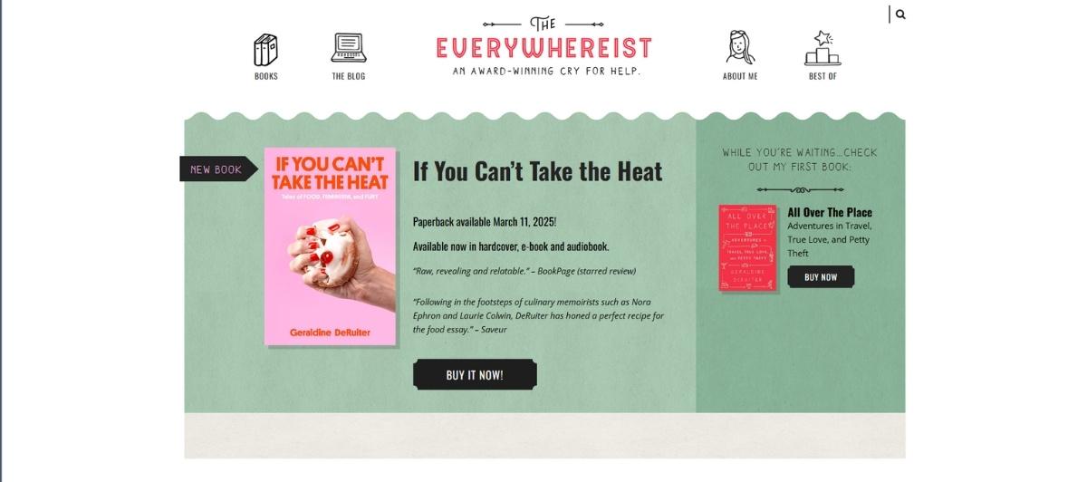
Also known as ‘The Everywhereist,’ Geraldine Deruiter is a travel enthusiast gone pro who will help you navigate your next trip and almost all of the awkward situations in life. Her website makes our list of the best personal websites for 2022 because it brings quirky and functional together in a beautiful way.
Although the basic layout of the site isn’t extremely unique, the features added to it, such as the custom graphics and branded font, make it more compelling than most of its competitors. And isn’t that what everyone wants?
3. Gary Sheng
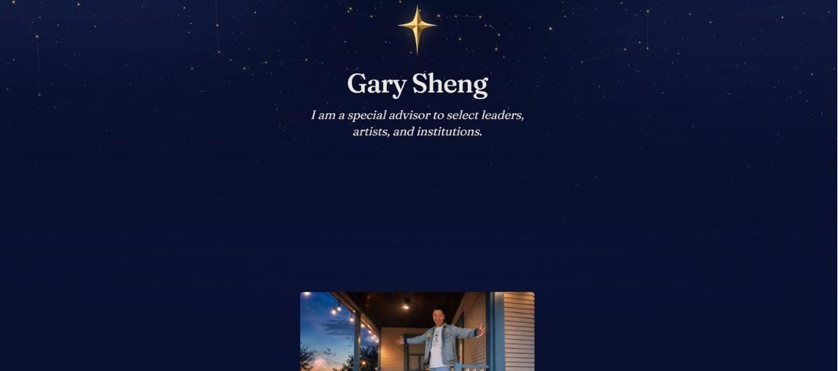
The greeting on the front page of this site couldn’t be any more basic, but in this case, basic is best. The purpose of Gary Sheng’s website is for him to introduce himself as an individual and professional to those who might be interested in acquiring his talents. As you scroll down the page, you can see all of his work experience, as well as some of his personal thoughts on a few topics.
There is only one page to his site, but that’s all he needs to sell himself. Gary’s website proves that those who want to market themselves can, with a little bit of creativity, some quality copywriting and a bit of web design.
4. Leah Goetzel
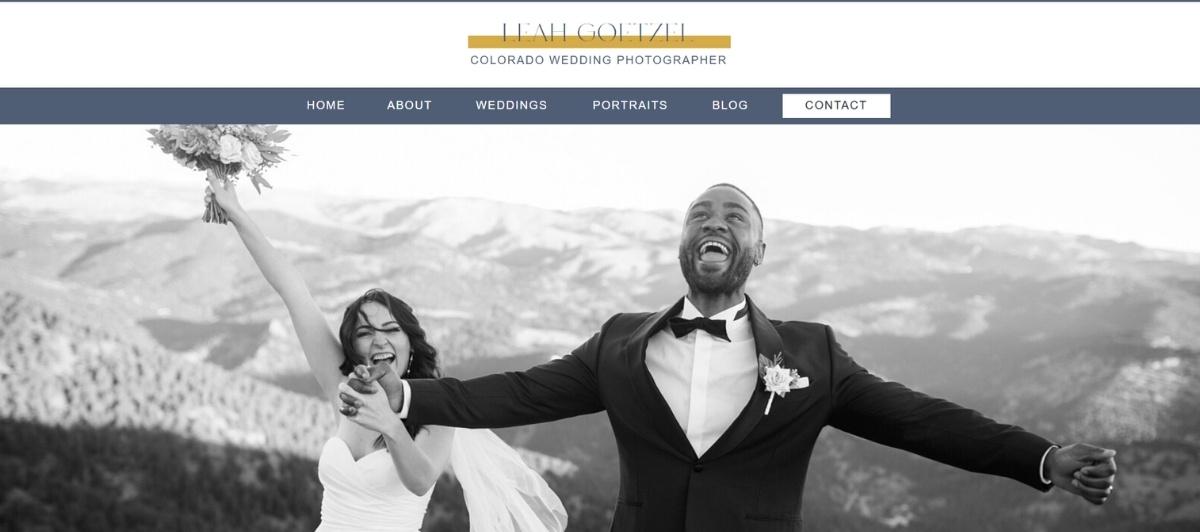
Leah Goetzel is a Colorado based wedding photographer. We love this website because it’s fun, and colorufl, yet extremely effective. Leah uses her homepage to explain as much as she can about her services, provide examples, and tell visitors more about her.
5. Devon Stank
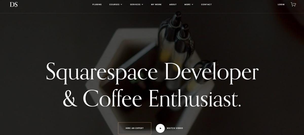
Devon Stank is primarily a Squarespace developer. So, yes, he used Squarespace to design his site. That, however, is not what we want you to take away. We chose Devon’s site as one of the best because it has a very organized layout that displays his talents and past projects well.
Different sections on the front page have been isolated to feature individual components of his work and highlight the main focuses of his career. This type of organization helps to create a natural flow for the eyes to follow, which helps people to get to the end of the page before giving up – something we all can aspire to.
6. Daniel Grindrod
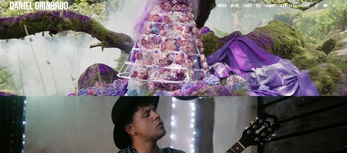
A professional videographer, Daniel Grindrod knows how to make film the highlight of his personal website in a seamless, professional manner. As you venture through Daniel’s page, you’re able to see multiple samples of his work and experience what you might receive if you were to hire him as a videographer for the next special event in your life or business.
On Daniel’s website, you can view his portfolios, look through what he uses to create his work (his kit) and learn more about the services he offers. It’s really plain and simple, but plain and simple, in this case, is perfect.
7. Jasmine Star
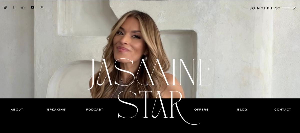
Everything about Jasmine Star’s website if fabulous, from the constantly changing pictures on the front slider, to the side navigation and the free downloads to help lure site visitors in. The color scheme is strategic and so are the fun and fancy fonts that grace each page. But, we aren’t surprised because, after all, Jasmine Star is a web designer and social media guru. No matter what you do, what you should take away from Jasmine’s website is that when you showcase what you do best through your website design, you will win every time.
8. Robby Leonardi
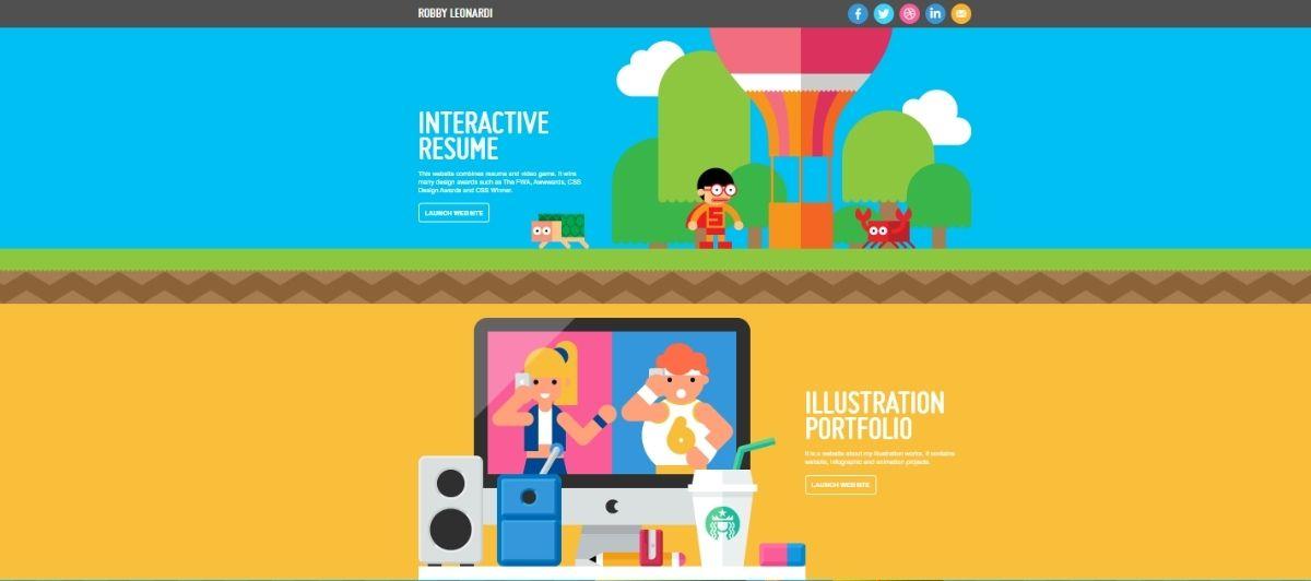
If you want to see something really impressive, then you need to see Robby Leonardi’s interactive resume website. Designed like a video game, this site takes you through the different “levels” of Robby’s expertise and showcases all of his skills and talents in a fun, unique manner.
Although it does take some time to see it all, this website is easily one of the best for the year 2022 because people love to see someone take their creativity to the next level. So, when you design your website, take a lesson from Robert and don’t be shy – show off your skills!
9. Brian Michael Gossett
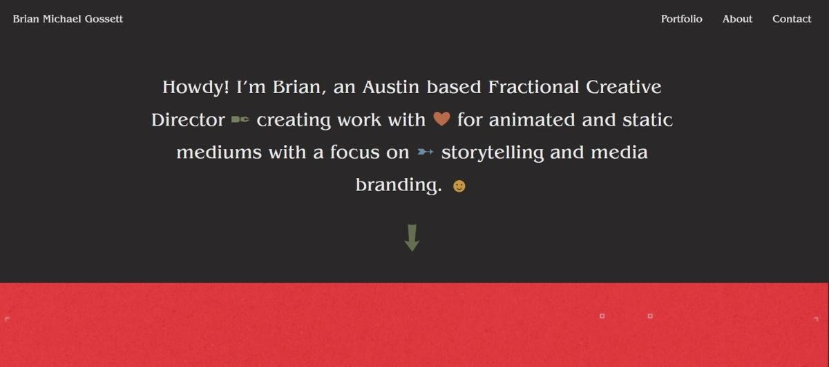
From the moment you land on Brian Michael Gossett’s homepage, you can easily assume he is a creative graphic designer and illustrator. That’s because his entire website puts his best work into focus to create a one-of-a-kind portfolio. As you scroll down his homepage gallery, you will get a glimpse of everything Brian can do and maybe even what he can do for you.
We also like that his navigation is simple, yet creatively worded to draw visitors in. It goes to show that he truly thought of every design element involved in his website, because he wanted it to be one of the best.
10. Victoria Bona

Victoria Bona is a graphic design artist who has done work for some pretty big names. We’re talking Victoria’s Secret, The Knot and more. The best part about the work she has done is she’s not afraid to show it off on her perfectly designed website.
From the homepage, you can browse her most recent accomplishments and drool over her intelligent design choices that could make any product look like a dream. What we believe everyone can take away from Victoria Bona’s site is that you shouldn’t be shy when designing a personal website – give it your all and don’t be afraid to brag a little.
11. Dave Gamache

Completely unique and even a little bit strange, Dave Gamache’s personal website is simply a landing page with links to his social sites that showcase his work. And, although his site might not be complex or glamorous, it’s completely functional and effective because what Dave wants to do is engage with his audience and that’s what this site enables him to do.
Whether you want to see his work on Twitter or Medium, Dave has the links on his site for you to do that. You can even send him a personal email from the bottom of the page. Sometimes, like Dave’s site shows, less is truly more.
12. Gary Vaynerchuk

Even if you can’t picture his face, you probably know Gary Vaynerchuk’s name. That’s because he’s an extremely successful serial entrepreneur who has a lot of advice and insight to offer the world. His website isn’t bad either! On his personal site, you can listen to his past podcasts, purchase his books and read some of the inspirational messages he has to offer.
Furthermore, you can sign up for events where he will be featured and even get into contact with him. It’s true there’s nothing extremely exceptional about Gary’s site, but it’s completely functional and not at all confusing – so that’s a winner in our books!
13. Anthony Wiktor

A website that really makes you say “whoa,” Anthony Wiktor’s site is truly unique and can offer inspiration to everyone. The site switches from white and black, to black and white, as you scroll up and down the page – and you can view a portfolio of his work from the top right-hand corner of the page. We love this website because it offers a personal touch with a professional design.
Oh, and did we mention how cool the interactive animation squares at the bottom of the page are? They change colors of the website as you scroll over their text that transforms into pictures. How cool is that?
14. Melanie Daveid

An art designer and director living in Berlin, Melanie Daveid has a lot of talent to offer the world and her website certainly helps her out. Completely professional yet utterly unique, the personal website of this creative is interactive and intriguing.
The way it blends her personal style with her professional portfolio welcomes everyone who lands on the front page. And, if you scroll far enough to the bottom of the page, you will even get a high-five. Now that’s what we like to call thoughtful design!
15. Andrew Huang

This website showcases a single page design with simple navigation that scrolls through the content for you automatically as you take in all that Andrew Huang has to offer in terms of the music business. Brightly colored and boldly executed, Andrew’s website nods at the vibrant personality and fun work he is so well known for.
From his blog, you can learn musical tips and tricks and take away information about his next single or album. We think that Andrew’s website is one of the best personal websites in 2022 because it’s so unique and well-curated.
16. Charlie Waite
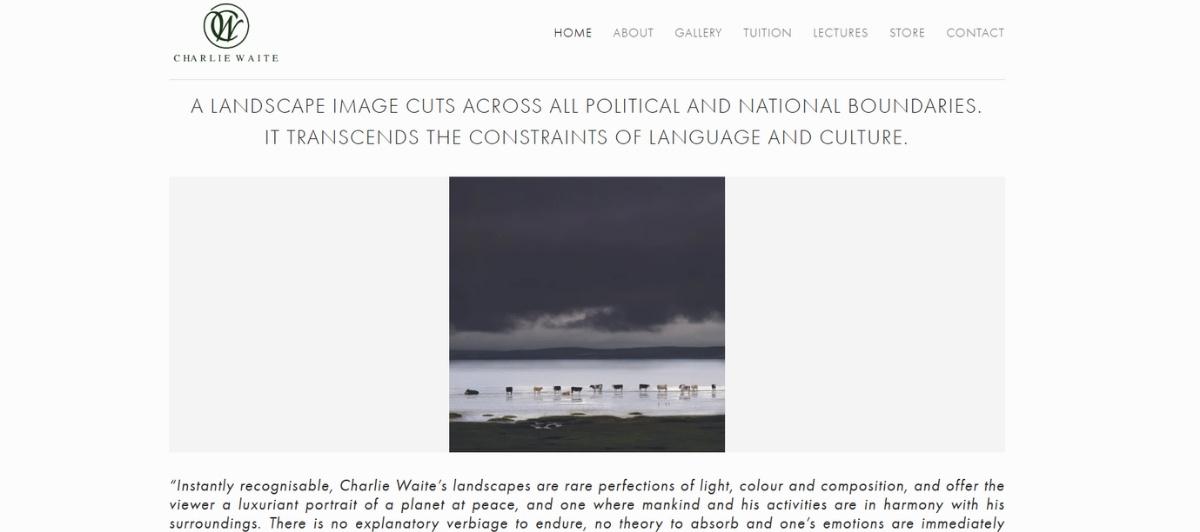
A guy with quite the resume and quite the website to show it off, Charlie Waite is a designer, thinker, father and husband. Although he currently works for Uber, you’re welcome to view some of his most prized work on the homepage of his website.
Everything you need (and want) to see is displayed on the right-hand side of the page, while an opportunity to contact him waits in the left. Extremely simple, you could never go wrong with a design like Charlie’s.
17. Tasha Meys
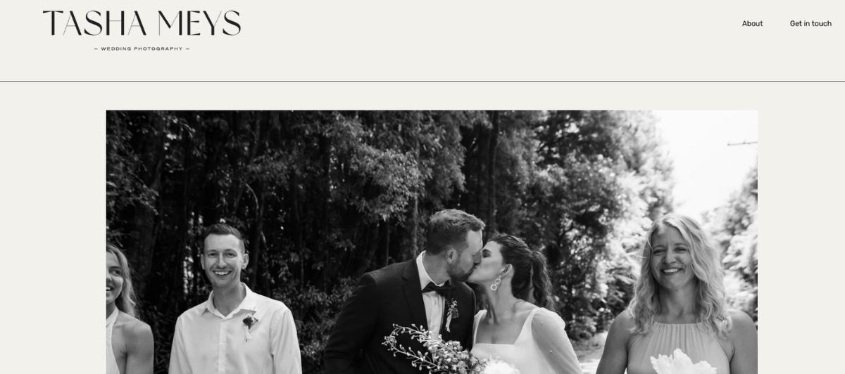
A photographer, adventurer, and Instagram expert, Tasha Meys has truly aced the world of influencer marketing and climbing the ladder of online success. Tasha’s website showcases who she is as an individual and some of the work she has created on her own as well. What makes her site one of the best, however, is that every single element on her site is a nod to her talents and style.
And, what you can take away is that you shouldn’t be afraid to show your style off – even if it is a little bit different!
What the first screen has to accomplish
A visitor decides within seconds whether your personal brand website is worth their time. That means the top of the page carries almost all the weight. Successful personal brand websites communicate a clear value proposition above the fold, then immediately back it up.
The common structure looks like this:
| Element | What it does |
|---|---|
| Hero section | States who you are and what you do in one clear line |
| Value proposition | Explains what a visitor gets from working with you |
| Credibility signals | Client names, press mentions, or notable work |
| Primary call to action | Hire me, read my work, subscribe, or get in touch |
Gary Sheng’s homepage is almost aggressively plain, and that’s the point: he introduces himself as an individual and a professional, then lets his work experience do the rest. Charlie Waite arranges everything a visitor wants on one side of the page and a contact option on the other, achieving a clean visual hierarchy without any complexity.
Clarity beats cleverness here. High-performance personal brand websites emphasize clean design with clear typography, and the best ones don’t try to do everything. Gari Cruze deliberately strips text from his front page to avoid overwhelming visitors, proving that restraint can be its own kind of statement.
Seamless navigation helps visitors reach your services and content quickly, and placing social proof near your calls to action turns interest into contact. This is where clear content strategy separates a memorable site from a forgettable one.
Deciding what your site is actually for
The biggest mistake in personal branding is building a site without deciding its job. A professional portfolio, an online resume, and a thought leadership platform all look different, and trying to be all three at once produces something that serves none of them well.
Here are the main formats, and who each suits:
- The portfolio site. Best for visual artists, designers, and creative professionals who let work speak first. Brian Michael Gossett builds his entire homepage as a gallery, and Victoria Bona showcases work for major brands without apology.
- The one-page website. A single scrolling page covering everything essential. Gary Sheng and Andrew Huang both prove a one page format can carry a full professional online identity.
- The digital business card. Dave Gamache’s site is essentially a landing page with direct links to his social media accounts and an email address, and it works because direct communication is exactly what he wants.
- The content hub. Gary Vaynerchuk’s personal site collects podcasts, books, events, and writing into an integrated home for his content. Integrated content hubs act as authoritative homes for blog posts and portfolio work alike.
- The service and lead generation site. Leah Goetzel explains her services and shows examples, using her personal website as a lead generation engine for potential clients.
- The personal store. Some creators add an online store to sell books, presets, or courses directly, giving the site an all in one solution feel.
Robby Leonardi’s video-game-style interactive resume shows how far the format can stretch when the purpose is clear: he wanted to prove his skills, so the site itself became the demonstration. Whatever your website’s purpose, choosing it first makes every design decision easier. Effective personal brand websites act as hubs for lead generation and content distribution, not just a static résumé.
Telling your own story with a distinct voice
Anyone can list credentials. What makes a strong personal brand is a point of view, and the best personal website examples articulate a distinct perspective across every element. Story-driven About pages create authentic narratives that genuinely connect with visitors, which is why they’re often the second-most-visited page on a personal site.
Build a visual identity that sticks
Strong visual identities enhance memorability. Geraldine DeRuiter layers custom graphics and a branded font over a fairly standard layout, and that visual flair is what elevates it. Tasha Meys makes every element on her site a nod to her own talents and style. Jasmine Star, a web designer herself, uses a strategic color scheme and distinctive fonts to demonstrate her craft while describing it.
Brand consistency across pages matters as much as the individual choices. When your typography, colors, and tone stay on brand from the homepage to the contact page, visitors register a coherent digital identity rather than a collection of pages.
Let the medium show the message
The most compelling personal sites make their format part of the argument:
- Daniel Grindrod puts film front and center, letting a videographer’s work sell itself
- Anthony Wiktor flips between white-on-black and black-on-white as you scroll, with interactive animation squares that transform on hover
- Melanie Daveid blends personal style with her professional portfolio and rewards deep scrollers with a high-five
- Devon Stank isolates sections to create a natural flow that carries visitors to the bottom of the page
Adding a personal blog gives you a dedicated space for thought leadership and actionable insights, whether you’re a freelance writer, a content creator, or a consultant. Regularly updating that content keeps visitors engaged and gives search engines a reason to return.
More personal website examples to inspire you
Beyond the seventeen above, a handful of designers and creative professionals have built personal sites worth studying for their approach to storytelling and art direction. Personal brand websites in 2026 increasingly prioritize minimalism paired with interactive storytelling, and these examples show both ends of that spectrum.
| Designer | What their site does differently |
|---|---|
| Daniel Sun | Combines storytelling with a minimal layout |
| Jason Briscoe | Uses bold visuals and large typography for immediate impact |
| Gabriel Valdivia | Includes a thorough About Me page plus an FAQ section |
| Artemii Lebedev | Employs bold visuals and 3D motion design |
| Anton Repponen | Builds a collage-like layout with overlapping images |
Gabriel Valdivia’s inclusion of an FAQ is a quietly smart move for anyone in the tech industry or freelancing: it answers the questions potential clients ask before they ask them. Artemii Lebedev and Jason Briscoe both show how bold visuals and typography enhance engagement, while Daniel Sun demonstrates that minimalist designs can highlight personal branding just as effectively. Anton Repponen’s overlapping-image approach proves there’s still room for genuine experimentation.
If you produce in-depth case studies rather than quick portfolio shots, structure them as narratives: the problem, your approach, and the outcome. That format works whether you’re a designer, a strategist, or a consultant, and it leaves a far more lasting impression than just a list of logos.
Choosing a platform and getting found
Once you know your site’s purpose and voice, the practical questions arrive: what do you build it on, and how do people find it? The right website builder depends on how much control you want and how technical you’re willing to get.
Platform options at a glance
| Platform | Best for |
|---|---|
| WordPress | Extensive plugins and full control over customizable features |
| Webflow | Custom websites with advanced features and no coding required |
| Squarespace | Curated website templates for a polished, professionally designed look |
| Wix | A drag-and-drop editor that makes building your own site straightforward |
| Carrd | Simple one-page websites built quickly |
Devon Stank’s Squarespace-built site shows that the platform matters less than the thinking behind it. Each platform’s strength lies in a different trade-off between speed and flexibility, so match the tool to your ambitions rather than the other way around.
The technical basics that decide whether anyone sees it
A few fundamentals separate a personal site that gets found from one that sits unvisited:
- Get a custom domain. Your own website on your own domain gives you complete control over your brand identity, unlike a profile on someone else’s platform.
- Optimize for search engines. Using SEO techniques improves your ranking and makes your work discoverable, which is why search engine optimization matters even for a personal portfolio.
- Prioritize mobile optimization. Mobile-first responsive layouts are essential, since much of your audience will arrive from social media platforms on a phone.
- Keep it fast. Sites must load in under three seconds to avoid visitors abandoning them, which is where good hosting and speed optimization pay off.
- Add a real contact page. Include contact details and direct communication options so opportunities can actually reach you.
- Consider newsletter-first architecture. A current trend in personal branding sites is designing around email capture, building an audience you own rather than rent.
Include social media links, but treat them as supporting cast rather than the main event. Your personal site should be the hub; the platforms feed it. A site that’s accessible anytime from anywhere in the world, updated regularly, becomes a genuine asset in a way no social profile ever will.
Build a personal brand website worth bookmarking, with Freshy
The best personal brand websites all do the same core things: they state a clear value proposition immediately, commit to one purpose, express a distinct voice, and make it easy to get in touch.
Here are the key takeaways from this guide:
- Lead with a clear value proposition and credibility signals above the fold
- Decide whether you’re building a portfolio, resume, hub, or lead generator
- Develop a visual identity and brand voice that stay consistent across every page
- Write a story-driven About page rather than a dry list of credentials
- Choose a platform that matches your ambitions, and get your own custom domain
- Build mobile-first, load in under three seconds, and optimize for search
Whether you’re a photographer, a consultant, or an entrepreneur building a thought leadership platform, your personal website should feel unmistakably like you.
Freshy builds high-performing WordPress websites for individuals and businesses alike, backed by ongoing support and maintenance. When you’re ready to claim your corner of the internet, tell us what you’re building.
Frequently asked questions
What should a personal brand website include?
At minimum: a hero section stating who you are and what you do, credibility signals like client names or press mentions, a portfolio or work samples, a story-driven About page, clear contact details, and links to your social media accounts.
Do I need a multi-page site or is one page enough?
One page is often enough. Gary Sheng and Andrew Huang both use single-page designs effectively. Choose multi-page only if you have distinct content types, like in-depth case studies, a blog, and services, that each need their own space.
Which website builder is best for a personal site?
WordPress offers the most plugins and control, Webflow enables custom design without coding, Squarespace provides curated, polished templates, Wix has a drag-and-drop editor, and Carrd specializes in quick one-page sites.
How do I make my personal website rank in search?
Use a custom domain, apply SEO best practices to your page titles and content, publish regularly through a blog, ensure mobile optimization, and keep load times under three seconds to avoid visitor abandonment.
How is a personal website better than social media profiles?
A personal website gives you complete control over your brand identity, isn’t subject to algorithm changes, and serves as a central hub linking all your content and social platforms. It’s accessible anytime, from anywhere, on your terms.