
Every parent searching for a new pediatrician is carrying some version of the same anxiety: they need someone they can trust with the most important people in their life. Over 70% of patients check a provider’s website before booking an appointment.
A pediatric website that feels cold, confusing, or outdated signals the wrong things before a family ever walks through the door. The best new pediatrician websites feel warm and welcoming the moment they load, and make every next step easy to find.
This article showcases 31 of the best new pediatrician websites and the design choices behind them.
Here’s what we cover:
- What makes a pediatrician website earn parent trust from the first visit
- 31 of the best new pediatrician websites, reviewed and linked
- The design and feature choices worth applying to any pediatric practice
- What every great website needs to serve new patients and thriving families alike
- How to build a site that becomes your practice’s most welcoming digital front door
We’ve built healthcare websites that turn first-time visitors into registered patients, and our healthcare web design work reflects that. Take a look when you’re ready to be inspired.
What makes a pediatrician website earn parent trust
Good pediatric sites effectively communicate their expertise and inspire trust in their visitors in order to convey to parents that their children will be in good hands. That trust-building process happens visually before it happens textually. A parent who lands on a pediatric website with bright, welcoming colors, real photos of smiling children, and a clearly visible appointment booking button has already made a positive emotional association with the practice before reading a single word.
If there is one visual element to invest in, it is high-quality, professional photography of your own practice. Generic stock photos of smiling children are instantly recognizable and create a sterile, impersonal impression. Parents want to see the real people and the real environment where they will be bringing their family.
Here’s what the best new pediatrician websites consistently get right:
- They create an inviting atmosphere immediately. Bright colors, child-friendly imagery, and warm photography communicate the culture of the practice before any copy is read. Parents evaluating pediatric care options make emotional decisions first and practical ones second. A site that feels right earns the consideration that clinical credentials alone cannot.
- They make appointment booking the clearest CTA on the page. New patients need to register. Existing patients need to book. Parents in between visits need to access the patient portal. The best pediatrician websites make all three of these actions immediately visible and easy to complete, ideally without navigating away from the homepage.
- They serve parents who arrive with questions at night. A great pediatrician website isn’t just about looks. It’s about clarity: easy-to-find contact information, services, and credentials. Convenience: online booking, forms, and patient portals. Trust: clear bios, patient reviews, and professional design. Education: helpful health resources for kids at different ages.
- They highlight inclusion and diversity prominently. Families of every background need to feel welcome at a pediatric practice. The best new pediatrician websites use diverse patient photography, clear non-discrimination policies, and multilingual resources to communicate that every child and every family belongs.
| What loses parents | What builds trust and wins new patients |
|---|---|
| Generic stock photos of children | Real photos of actual patients and staff |
| No online booking or patient portal | Prominent appointment booking on every page |
| No after-hours information | 24/7 nurse line or after-hours contact visible |
| Buried inclusion or non-discrimination policy | Prominent inclusion statement or homepage feature |
| Outdated content with no current news | Regularly updated health resources and telemedicine info |
31 best new pediatrician websites to follow in 2026
There isn’t a parent out there who isn’t worried about the health of their children. That’s why pediatrician websites have become so important. They have useful information that can be easily consumed via clear design elements.
1. Central and Priority Pediatrics
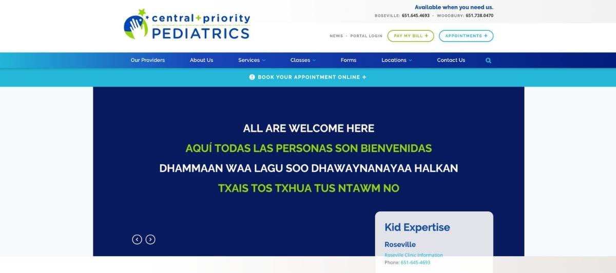
The Central and Priority Pediatrics website makes excellent use of a warm color scheme and adorable rotating pictures that immediately create an inviting atmosphere. What pushes it above most pediatric websites is how frequently it is updated, making it feel like a thriving, active practice rather than a digital brochure. The big headline advertising telemedicine services is prominently placed, communicating to busy parents that they have options beyond the in-person visit.
2. Sunrise Pediatrics
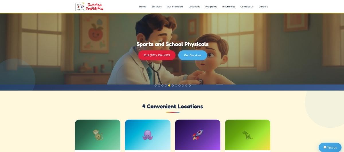
Sunrise Pediatrics leads with a clean header bar that gives patients easy access to whatever information they need the moment they arrive. The site makes it immediately clear that the practice offers a variety of services and gives parents convenient options, including resources they can access from home, which is a meaningful signal to families who value flexibility in their pediatric care.
3. Cannizzaro Integrative Pediatric Center
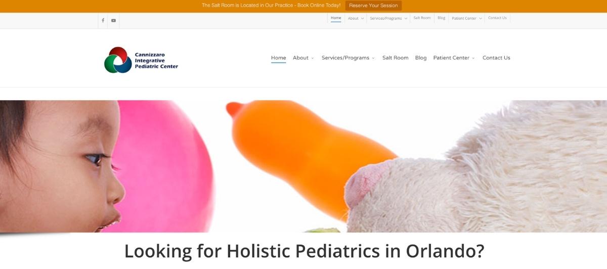
Cannizzaro Integrative Pediatric Center takes a distinctive approach to introducing the practice through a prominent YouTube video that provides foundational information about the clinic in a format that many parents find more accessible than written text. Three large, clearly labeled clickable buttons sit below the video, giving parents immediate access to services, appointment booking, and other critical information.
4. Panda Pediatrics and Adolescent Care
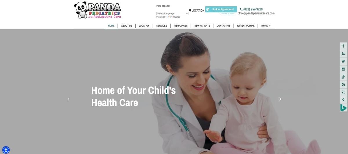
The homepage of Panda Pediatrics and Adolescent Care is one of the best on this list. Rotating pictures featuring a diverse array of children creates a welcoming, representative atmosphere from the first second. Four large buttons positioned prominently give parents quick access to the most commonly needed services, and a well-organized navigation menu ensures easy movement throughout the site.
5. Lake Country Pediatrics
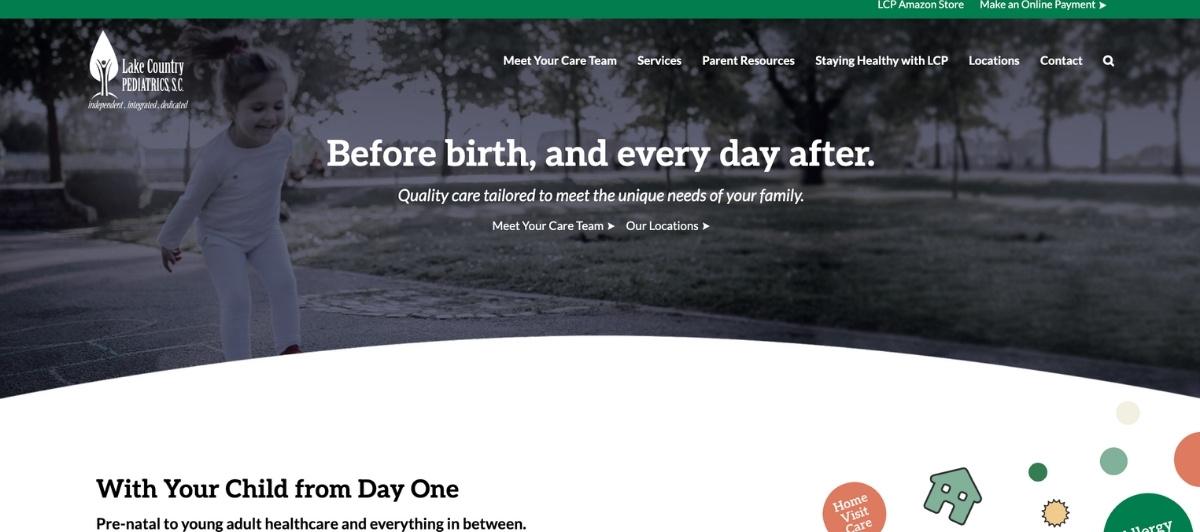
Lake Country Pediatrics takes a refreshingly personal approach by leading with pictures of its nine doctors and allowing visitors to click through to individual physician profiles. This doctor-first homepage structure acknowledges that parents choose a pediatrician before they choose a practice, and makes that selection process feel personal and accessible from the very first visit.
6. Pediatrics Costa Mesa

Pediatrics Costa Mesa features one of the most eye-catching homepage experiences on this list. A modified video grid displays multiple clips that gradually merge into one large unified video, creating a visually memorable and distinctly modern presentation that captures attention and holds it. For pediatric practices looking to stand out in a competitive market, this creative approach to video integration is worth studying closely.
7. Pediatrics East

Pediatrics East makes inclusion a central homepage element by featuring a large, prominent non-discrimination policy button that greets every visitor immediately. This bold statement communicates that all families are welcome before anything else is communicated about the practice. Combined with a sharp design and easily accessible news and patient resources, this site sets a standard for how pediatric websites can communicate values visually.
8. Almaden Pediatrics
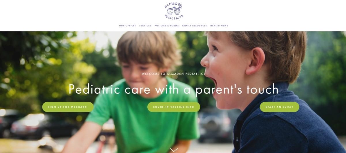
The unique, adorable branding that appears in the top navigation menu and as a clickable video element immediately captures the attention of parents visiting Almaden Pediatrics. The intentionally muted color scheme prevents the design from feeling overwhelming, allowing the distinctive branding to stand out without creating visual noise that competes with the practical information parents need to find.
9. Hirsch Pediatrics
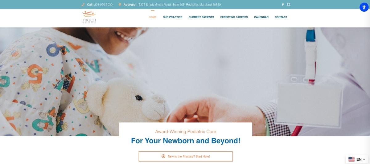
Hirsch Pediatrics stands out with a sidebar navigation menu rather than the standard top bar, offering a visually distinct browsing experience that keeps the main content area clean and focused. Quick-access buttons to popular pages and a pleasant color palette make this site genuinely easy to use, demonstrating that departing from conventional navigation structures can be highly effective when executed thoughtfully.
10. Peek-A-Boo Pediatrics
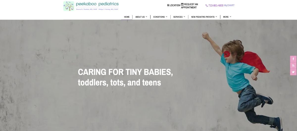
Peek-A-Boo Pediatrics keeps things clear and accessible with large, easy-to-click buttons and high-quality photography, but distinguishes itself through a genuinely useful feature set that includes up-to-date health recommendations, detailed vaccine information, and even a virtual office tour. For new patients researching a practice before their first visit, this level of accessible information is a meaningful differentiator.
11. Center City Pediatrics
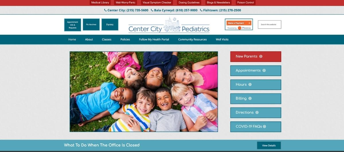
Center City Pediatrics adds genuine value for families through a comprehensive medical library that goes well beyond standard service information. The library covers what to do when a child is sick, medication dosage guidance, and information on common pediatric conditions, giving parents a reason to return to the site between appointments and positioning the practice as a trusted health resource for the community it serves.
12. Pediatric Associates of Dallas
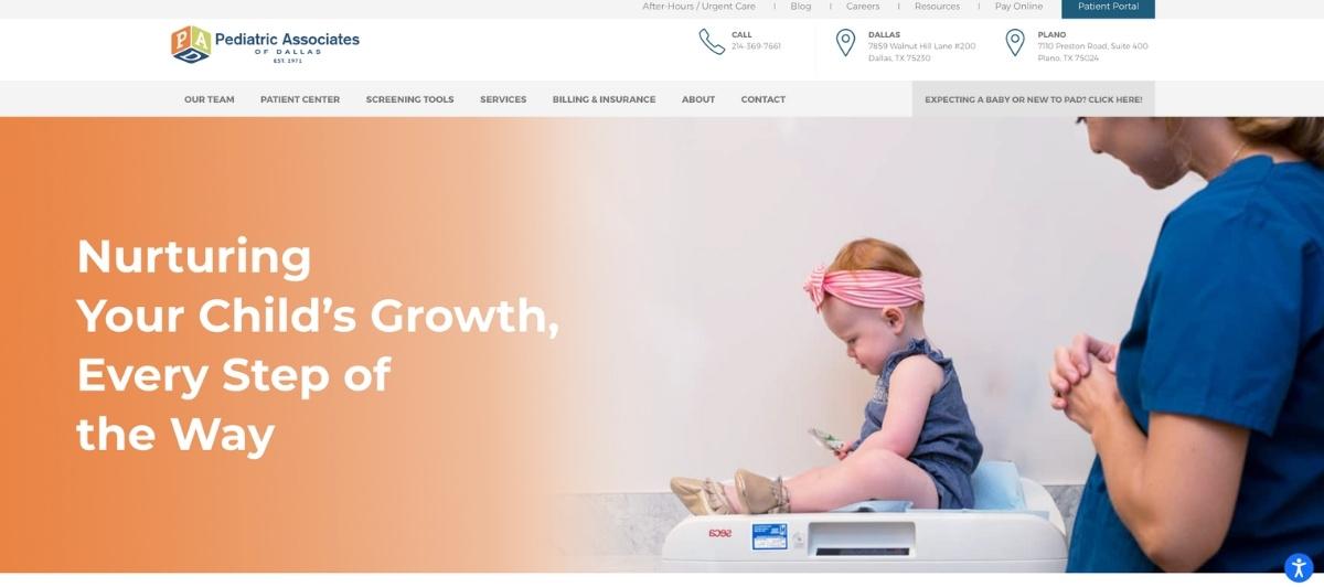
Pediatric Associates of Dallas incorporates a degree of interactivity rarely seen on pediatric websites, with graphics that respond dynamically when parents hover their mouse over them. This small but memorable touch communicates that the practice’s website is current and attentive to the experience of its visitors, which mirrors the kind of attention to detail parents hope to find in the exam room.
13. Memphis Pediatrics
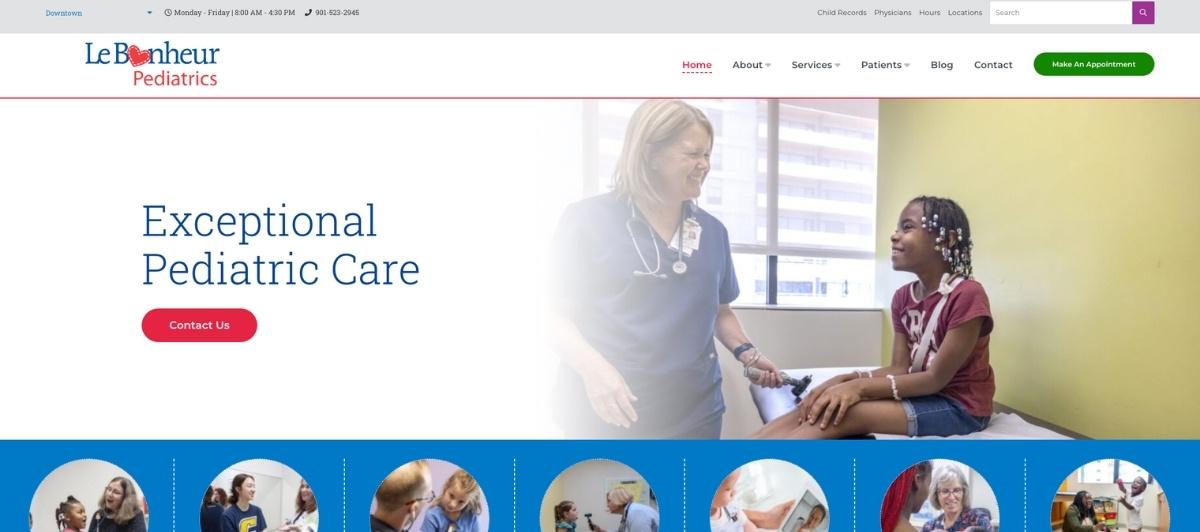
Memphis Pediatrics earns particular credit for its commitment to authentic photography. Rather than relying on stock imagery, the site uses real pictures of real patients, families, and office spaces, giving parents a genuine glimpse into the practice before they visit. Rotating real-life photos alongside practical features like online access to children’s medical records makes this site stand clearly above many of its peers.
14. Children’s Clinic of Nashville
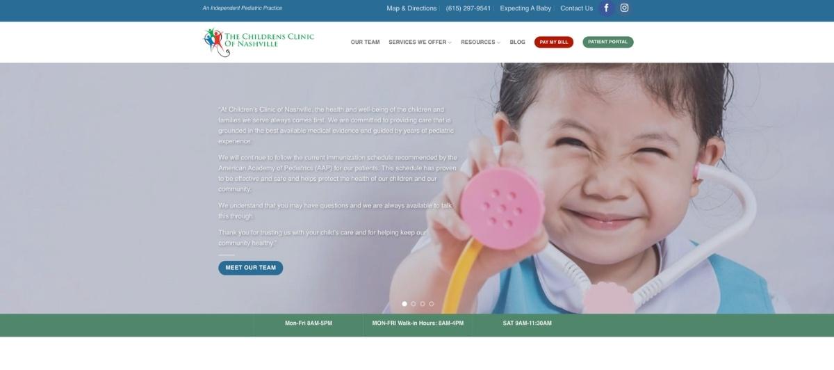
Children’s Clinic of Nashville uses a dual-menu approach that places the most critical features in a prominent top position while keeping a secondary navigation accessible throughout. Rotating pictures of a genuinely diverse patient set makes every family feel represented and welcome, and the appointment scheduling and patient portal features are positioned where parents expect to find them.
15. Nash Pediatrics
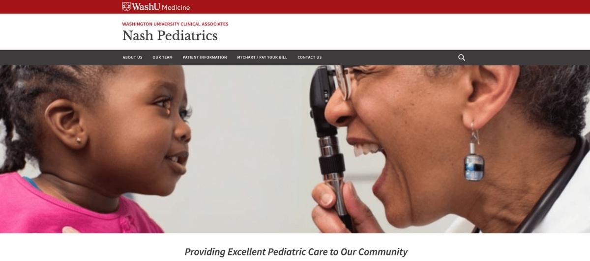
Nash Pediatrics uses clear, high-quality photographs of real staff and patients to create an immediately authentic first impression. An explicit, easy-to-find section explaining how new patients can register addresses one of the most common points of friction for parents trying to join a new pediatric practice, making the site genuinely helpful at exactly the moment it matters most.
16. Avala Pediatrics
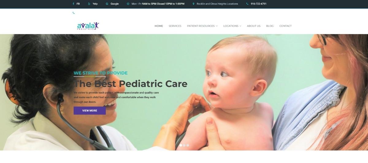
Avala Pediatrics features a smooth text-load animation that engages visitors as they scroll, making the browsing experience feel polished and attentive to detail. The site’s breakdown of specific services like newborn screening and same-day appointments helps parents understand exactly what they can expect from the practice, reducing the uncertainty that often delays families from committing to a new pediatrician.
17. Healthy Children Florida

Healthy Children Florida opens with a genuinely charming photo of a doctor and a child both wearing clown noses, immediately communicating that this is a practice that knows how to make kids feel at ease during visits. From there, the site guides parents efficiently to the practice’s two main offices and provides a strong educational resources page that positions the clinic as a health partner beyond the scheduled appointment.
18. Northern Virginia Pediatric Associates

Northern Virginia Pediatric Associates earns recognition for keeping its content current, including displaying the practice’s holiday and current hours prominently on the homepage. A symptom checker tool built directly into the site gives nervous parents a way to assess their child’s symptoms at night without immediately calling the office, which is one of the highest-value features any pediatric website can offer to the families it serves.
19. Lakeview Pediatrics
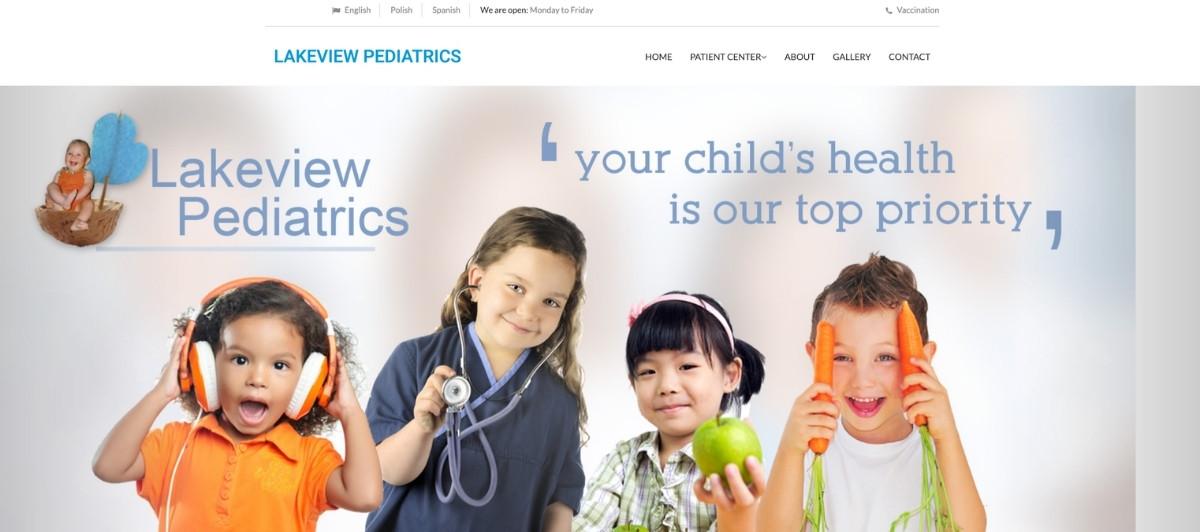
Lakeview Pediatrics distinguishes itself by explicitly addressing the needs of young adults, a patient group that pediatric practices often serve but rarely acknowledge on their websites. A comprehensive patient center tab covering visit schedules, vaccination information, and developmental resources makes this site a genuinely useful ongoing reference for families managing their children’s healthcare across different life stages.
20. Premier Pediatrics
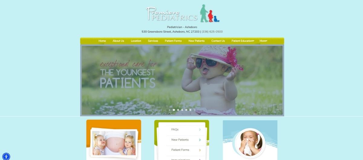
Premier Pediatrics earns points for its smart marketing decision to explicitly state that the practice serves patients from babies through college students. This clear scope statement gives families with children of different ages confidence that they can stay with the same practice as their kids grow. Well-organized tabs make navigation intuitive, and the comprehensive service descriptions help parents understand everything the practice offers before their first visit.
21. Pediatrix
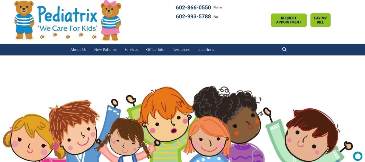
Pediatrix uses a large, clearly organized navigation menu to make the most frequently needed information immediately accessible without requiring parents to scroll or search. Immunization details, medication refill requests, bill payment, and appointment requests all sit at the top level of the navigation where parents expect to find them, demonstrating a strong understanding of what families actually come to a pediatric website to do.
22. Almouie Pediatrics

Almouie Pediatrics combines telemedicine advertising with a genuinely delightful pediatric brand identity featuring bright colors and an alligator with a stethoscope. This playful design approach immediately communicates that this is a practice that understands children and knows how to make them feel comfortable. The site’s visual personality is one of the most distinctive on this list, making it memorable in a category where many sites look nearly identical.
23. Pediatrics 5280

Pediatrics 5280 places both the MyChart login and a symptom checker directly on the front page, giving the two most frequently needed tools immediate prominence. For parents who visit the site at odd hours, concerned about a sick child, having a symptom checker on the homepage without any additional navigation is genuinely useful and reflects a practice that understands how its families actually use its digital presence.
24. Capital Area Pediatrics

Capital Area Pediatrics uses photography in a distinctive way: rather than presenting images as gallery elements, the site layers photos throughout the homepage in a way that naturally directs the eye toward the most important text and menu sections. This unusual visual organization keeps the page information-rich without feeling cluttered, and the four prominent navigation menus that appear as visitors scroll reward continued engagement.
25. Agave Pediatrics

Agave Pediatrics opens with a bold, attention-grabbing close-up of a clinical moment that immediately communicates the hands-on nature of pediatric care. A green and purple color scheme stands out sharply against the white space throughout the rest of the site, and the overall design quality is among the crispest on this list. For practices looking for an example of how a strong color scheme and clean layout work together, Agave is worth a close look.
26. Just Kids Pediatrics

Just Kids Pediatrics opens with a cheerful rainbow-design pop-up highlighting virtual visits, a visual choice that immediately communicates the practice’s child-friendly personality. The uncluttered main menu, rotating photos, and a collection of adorable logos create a site that genuinely makes visitors want to spend more time exploring, which is exactly the emotional result every pediatric website should strive for.
27. Laurelwood Pediatrics
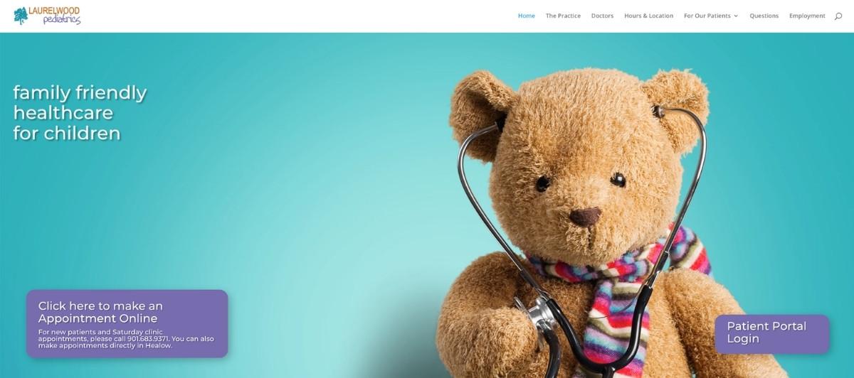
Laurelwood Pediatrics takes one of the most minimalist approaches on this list, with a simple homepage featuring a friendly teddy bear on a blue background. The deliberate simplicity creates an immediate sense of calm and approachability that complex layouts sometimes undermine. Buttons highlight up-to-date practice information, and as visitors scroll, the clinic’s 24/7 on-call policy and early morning clinic availability are featured prominently, which is exactly the kind of after-hours support information that anxious parents need to see.
28. Dangond Pediatrics
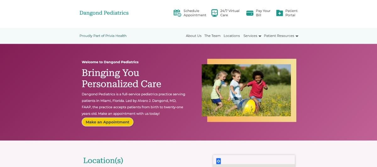
Dangond Pediatrics features rotating patient reviews as a homepage element, which is a rarely used approach in pediatric website design but a highly effective one. As reviews cycle through automatically, they create ongoing visual interest while consistently delivering the social proof that helps undecided families commit to registering with the practice. For pediatricians looking for a differentiated way to present testimonials, this format is worth borrowing.
29. Pediatrics Northwest PS
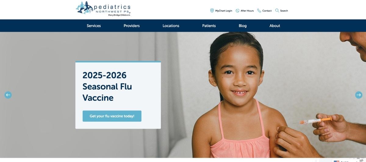
Pediatrics Northwest PS demonstrates how thoughtful formatting choices can elevate a straightforward design. Nicely spaced top navigation allows for comfortable reading, rotating photos showcase the warmth of the practice, and circular navigation buttons give the homepage a visual energy that keeps visitors engaged as they explore the site’s different sections. The coordinated use of multiple shades of blue throughout creates a cohesive color scheme that feels calm and trustworthy.
30. North Seattle Pediatrics
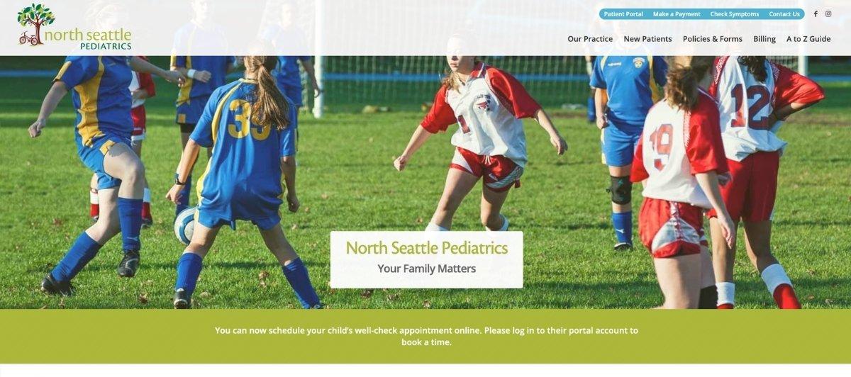
North Seattle Pediatrics earns its place on this list for its exceptional attention to typography and layout. Center-aligned body text creates a clean, readable reading experience, while the logo and primary navigation are aligned to opposite sides of the page, creating a visual balance that makes the homepage feel organized and considered rather than accidental. These small formatting decisions add up to a distinctly professional feel.
31. Pediatric Associates

Pediatric Associates rounds out this list with a fun orange and blue color scheme that is eye-catching without being overwhelming. A clean grid layout makes every section of the site easy to find, and a right-side menu bar housing appointment scheduling, doctor search, and bill pay keeps the most-used features immediately accessible throughout every page visit.
What these sites teach us about pediatric web design
Looking across all 31 of the best new pediatrician websites above, clear patterns emerge in the sites that most effectively serve parents and convert visitors into registered patients. Here’s what’s worth applying to any pediatric practice building or rebuilding its website.
Bright, warm color schemes signal a child-friendly environment
Both content and design should be developed strategically and according to overall goals. For pediatric practices, one of those goals is communicating to parents that their children will feel comfortable and welcome during visits.
A warm color scheme, playful typography, and child-friendly imagery all accomplish this non-verbally before a parent reads a single word. Sites like Almouie Pediatrics, Agave Pediatrics, and Spring Valley Pediatrics demonstrate how powerfully a deliberate color and visual approach can shape the emotional first impression of a practice.
Real photography of real patients and staff outperforms stock imagery
Generic stock photos of smiling children are instantly recognizable and create a sterile, impersonal impression. Parents want to see the real people and the real environment where they will be bringing their family.
Memphis Pediatrics and Nash Pediatrics both demonstrate how authentic photography of actual patients and staff creates a level of trust that stock imagery cannot replicate. For any pediatric practice investing in a new website, professional photography of the real clinic environment is among the highest-return components of that investment.
Symptom checkers and after-hours resources serve parents when it matters most
Some of the most distinctive features across the best new pediatrician websites are the resources that serve families between appointments: symptom checkers, medication dosage guides, vaccine information, and 24/7 nurse line contacts.
Northern Virginia Pediatric Associates and Pediatrics 5280 both demonstrate how these features position a pediatric practice as a partner in ongoing child health rather than simply a scheduled appointment destination. Our WordPress web design team builds these kinds of patient-serving features into healthcare sites from the start.
Inclusion needs to be stated, not implied
Pediatrics East’s prominent non-discrimination homepage button is a design decision worth studying. In a category where all practices theoretically welcome all families, explicitly stating that welcome creates a meaningful distinction that parents from underrepresented communities notice and value. The best new pediatrician websites make inclusion a visible element of the homepage, not a footnote buried in a policy document.
Telemedicine and virtual visit options should be prominently advertised
Multiple sites on this list, including Central and Priority Pediatrics, Almouie Pediatrics, and Just Kids Pediatrics, feature telemedicine prominently above the fold. For busy families managing work and childcare, the ability to consult a pediatrician virtually for appropriate concerns is a meaningful benefit that should be communicated clearly on the homepage. Pediatric practices that offer telemedicine but don’t advertise it prominently are leaving a significant conversion opportunity unused.
What every pediatrician website needs to serve new and existing patients
Whether your practice has two physicians or twenty, these are the elements every great pediatric website should have in place.
- A clear new patient registration path. New patients need to register before their first visit. Making this path explicitly obvious, as First Choice Pediatrics does with a dedicated “New Patients” button, removes friction for families who are ready to join but unsure how to begin.
- Online appointment booking, visible above the fold. Most parents will attempt to schedule their child’s appointment online before they consider calling. A booking tool accessible from every page, ideally in the header, serves this expectation and reduces the after-hours frustration that many families experience with practices that require a call to schedule.
- A patient portal link, prominently placed. Existing patients accessing medical records, vaccination history, and visit summaries need the patient portal immediately findable. It should appear in the primary navigation, not just in a footer link.
- An after-hours contact or nurse line. Parents of sick children don’t keep business hours. A clearly displayed after-hours contact number or 24/7 nurse line information gives families the reassurance that they have someone to turn to when the office is closed, which is one of the most meaningful trust signals a pediatric practice can offer.
- Mobile-first design and fast load speeds. Most parents visit pediatric websites on their phones, often in stressful moments. A site that loads quickly and works well on every screen size serves those moments rather than adding to them. Our WordPress speed optimization service keeps healthcare websites performing across all devices.
- ADA-compliant design accessible to all families. Families with visual or cognitive accessibility needs deserve the same quality of access to pediatric information as any other parent. ADA-compliant design is both a legal standard and a values statement. Our WordPress ADA compliance services help pediatric practices meet these requirements within their existing design framework.
When families are choosing a pediatrician, your website is the first thing they trust — Freshy helps you make that count
The best new pediatrician websites share one quality: they make parents feel, before a single appointment is scheduled, that they have found a practice that understands and genuinely cares for their family. Every design choice, from the color scheme to the symptom checker to the new patient registration button, should serve that first impression.
Key takeaways:
- Bright, warm color schemes communicate a child-friendly environment before any copy is read
- Real photography of actual staff and patients builds trust that stock imagery cannot replicate
- Symptom checkers and after-hours resources position the practice as a genuine health partner
- Prominent inclusion statements make all families feel explicitly welcome rather than implicitly tolerated
- Telemedicine options featured above the fold serve a significant portion of parents who value virtual care
- A clear new patient registration path removes the friction that prevents interested families from joining
If your pediatric practice website isn’t making the first impression your team deserves, tell us about your practice and let’s build something that does. You can also browse our healthcare portfolio to see the standard we set for medical practice websites.
FAQs
What makes a great pediatrician website?
A great pediatrician website combines clarity, easy-to-find contact information, services, and credentials, with convenience through online booking and patient portals, trust through clear bios and patient reviews, and education through helpful health resources for kids at different ages.
What features should the best new pediatrician websites include?
Online appointment booking, a patient portal, telemedicine scheduling, a new patient registration path, after-hours contact information, a symptom checker, vaccine information, real team photography, and a clear inclusion statement are all features that appear consistently on the top pediatric websites.
How important is mobile design for pediatric websites?
Critical. Most parents search for and access pediatrician websites on their phones, often in urgent moments. A mobile-friendly, fast-loading pediatric website serves these high-stakes moments rather than frustrating already-stressed parents into finding a different practice.
Should pediatric websites include health education resources?
Yes. Resources like symptom checkers, dosage guides, vaccination schedules, and age-appropriate developmental guides keep parents returning to the site between appointments and position the practice as a trusted ongoing health partner rather than just a place to schedule visits.
How much does a pediatrician’s website cost?
A professionally built pediatric practice website typically costs $3,000 to $10,000, depending on the number of physician profiles, patient portal integration, online booking tools, telemedicine scheduling, educational resource pages, and whether ADA compliance and local SEO structure are included from the start.


)