A restaurant website is the digital equivalent of a dining room’s front door. Before anyone tastes the food, they’ve already judged the place by its photos, its menu, and how easily they can book a table. In a competitive restaurant scene, a well-designed site is one of the hardest-working members of the staff, quietly selling the experience around the clock.
Here’s what this guide covers:
- The 10 best food and restaurant websites for 2026, reviewed
- Why food photography is the single most important design element
- The reservation and online ordering features diners now expect
- How great sites tell a restaurant’s culinary story
- Where hungry diners actually discover new places to eat
There’s a real craft to translating the warmth of a dining room and the appeal of a signature dish into a website that fills tables. That intersection of appetite and usability is where our team lives, and the WordPress design work behind the examples below shows what’s possible.
Ten inspiring restaurant websites worth savoring
The best sites for restaurants often include incredible images that make visitors salivate almost on-sight. They also are typically organized with interactive menu options, bios of important staff like chefs or business owners, and heartfelt pics of customers enjoying a good chow-down. The sites on our list today do those and more to keep hungry people coming back.
1. Bresca
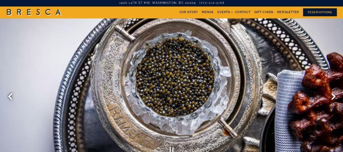
Bresca‘s site is a great model for compelling restaurant design on the web. They make sure their business’s address is at the top of the header bar with their contact information, and the navigation bar includes all the necessary features, like their menu, dining-specific locations, and most popular dishes.
Their reservation button makes a cozy evening-out a breeze with the click of a button, and their full-screen, professional-grade photography offers an important look into their company’s character and vibrant sense of style.
2. Catch

Catch is probably the most unique site on our list, with fun little animations throughout and more static visual details that catch a reader’s eye and keep them engaged. This European fish and chips company offers three location choices in Glasgow from their homepage, and each comes with the same background of scrolling images of their locations, cartoon illustrations of their restaurant culture, and sharp pictures of their delectable food options.
Scrolling down from the landing page takes visitors through a thorough run of their menu specifics, vintage fishing photography that calls back to Scotland’s nautical days of yore, and clever CTAs between sections to keep visitors up to date on the important details between different areas of the company.
3. El Burro

El Burro‘s site offers a very effective, single-page design. The homepage’s striking colors and clever animations make their street food seem steeped in local culture with an awareness about what makes customers remember them by taste and look alone.
Their site’s gallery page deploys a great image slider that automatically cycles through examples of their work and happy patrons, and their highly minimalist illustrations offer a comfortable sense of simplicity and playfulness to your order. That they give an updated location page after scrolling to the footer bar is a very helpful idea for their more on-the-go business style.
4. Easy Bistro & Bar
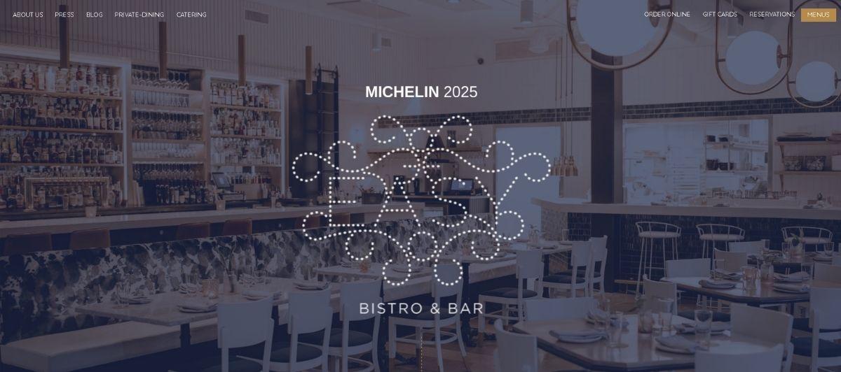
Easy Bistro & Bar uses a traditional slideshow reel of transitioning images at the top of their landing page for a sense of dependability; after all, food is a highly visual medium, and their particular selections make salivating hard to resist. Their contact information and store hours are prominently displayed at the top of the page, and a handy reservation button pops up when scrolling down for easy party scheduling.
Selecting the primary nav menu opens up an entire page of menu options, private dining arrangements, staff bios, and more thorough professional information about the select chefs working on your next meal.
5. Quince
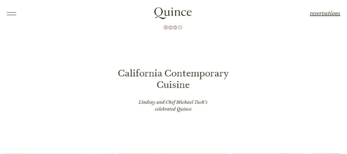
Quince‘s design is a trophy example of how to use minimalist approaches to how your services are represented on the internet. Their landing page gives immediate access to the primary menu, which reveals all their private dining options, reservation requirements, and a concise but inspiring list of their staff and accomplishments.
Their unique “Welcome” button delivers a detailed map for getting to their location, and every sub-page includes high-res images of inside the restaurant and pleased customers enjoying a special meal. It’s hard to miss anything important on their site because they give you all the fundamental information up-front and just want to make sure you can find them in-person and make arrangements for a visit online.
6. Royal Plate
Based in multiple international cities around the world, Royal Plate‘s design has some of the most gorgeous culinary images on the web. Their bakery is well-supported with a plethora of options and toppings, including pancakes, sweet pies, biscuits, and every grain-based breakfast food you might imagine.
Every food option has images from multiple sides for a realistic view of their food standards, and clever hashtags make every menu selection specifically promotable, which is a great way to get word about online about the business via accolades for a specific product.
7. Tio Luncín
From Lima, Peru, Tio Luncín‘s layout is highly vertical with scrolling animations throughout and punchy text for each section on the site. Scrolling down the landing page shows off how engaging a presentation can with just a simple consistency: make each section in the scroll impart something unique about the company’s services, character, community impact, or origin.
The design’s playful scattering of images into different sizes and random-looking positions gives the business a scrapbook-like appearance to offer customers a homey feeling where memories get made. It’s impossible not to remember Tio’s site because their personality is so well represented by the site’s casual-but-devoted style.
8. Fiola Mare
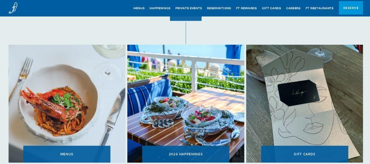
Based in Washington, D.C., Fiola Mare‘s presentation starts off highly visual and stays that way. The homepage’s video loop offers crisp looks at fresh catches of the day near the D.C. and Baltimore harbors and shows off different cooking methods toward their most popular dishes.
Scrolling down, an image carousel depicts the interior and outdoor seating available in the heart of Georgetown, and their stocked bar is established with its own calls to action for scheduling a private meeting or just finding the right general time to have a drink based on popular hours and wait time.
9. Hualalai Grille
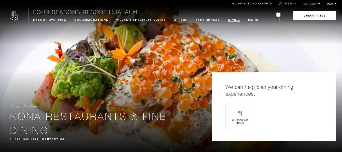
A delicious far cry from restaurants in the continental U.S., Hualalai Grille makes its Hawaiian mark right from the homepage. Since the island state is so lush and well-trodden by vacationers, you might think that more sophisticated presentations of local cuisine wouldn’t be new or necessary for those most interested.
But for an entire state that’s as isolated as Hawaii, standing out from the crowd becomes even more important. Their individual business has a strong presence on the primary Four Seasons website with an immersive homepage picture of local parties and regularly updated events for Chef Fest with plenty of pictures.
10. TNQ
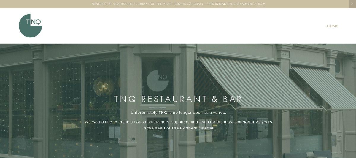
From London, UK, TNQ offers regional cuisine from the British homeland. Their warm interior brings a comforting presence via beautiful high-res images of seating options and patrons fawning over stylized speciality dishes.
The white space between images in different sections offer plenty of space for concise text about what the images reference, and each image itself is slightly blurred and color-muted to give a sense of nostalgia, dependability, and reverence for traditional and the comfort behind what works when eating the creations of culinary experts in a world-class city.
Why food photography is the whole meal
If there’s one lesson every site above teaches, it’s that food photography does the selling. A diner can’t taste a dish through a screen, so the image has to trigger the craving on its own. This isn’t a hunch: 45% of restaurant patrons look for food photos on a website before deciding where to eat, which makes high-quality images the single most important element of restaurant website design.
The standouts treat their imagery as the main course:
- Bresca leads with full-screen, professional-grade photography that captures the restaurant’s character before a word is read.
- Fiola Mare uses a homepage video loop of fresh catches and cooking methods, turning motion into appetite.
- Royal Plate shoots every dish from multiple angles, giving a realistic, high-resolution view of its food standards.
High-resolution visuals play such a crucial role because food is an inherently visual medium. Blurry or sparse photos read as a warning sign, while bright colors and crisp, high quality images build an immediate emotional connection with potential patrons.
The catch is that rich photography can slow a site down, which is why fast managed hosting and speed optimization matter as much as the camera work itself.
The booking and ordering features diners expect
Beautiful photos start the craving, but a great restaurant website has to make acting on it effortless. A well-designed site works as a 24/7 sales tool, taking reservations and orders long after the host stand goes quiet. With younger generations preferring online interactions over phone calls, seamless digital booking is no longer optional.
The essentials every effective restaurant website needs include:
- Online reservations. A prominent reservation button, like Bresca’s one-click booking or the pop-up scheduler on Easy Bistro & Bar, removes friction from planning a visit.
- A clear, accessible food menu. The menu is the most-visited page on any restaurant site, so it should be text-based, easy to find, and never trapped in a slow PDF.
- Online ordering. Over 50% of people aged 18 to 29 ordered food online back in April 2020, and that habit has only grown, making online ordering a baseline expectation.
- Contact details and opening hours up front. Address, phone, and hours belong in the header, exactly where Bresca and Easy Bistro & Bar place them.
- Mobile-first design. With over 70% of food orders now placed via phones, a mobile-friendly, responsive layout with intuitive navigation is critical for both accessibility and sales.
Getting these systems to work together smoothly, from a reservation widget to an online ordering flow, takes real technical depth. That’s where experienced WordPress development turns a pretty site into a genuine sales engine.
Telling a restaurant’s story through design
The best restaurant websites do more than list dishes and hours. They tell the restaurant’s story, using visual storytelling to build a strong visual identity that makes a place memorable. A tasting menu at a Michelin-starred restaurant and a food truck slinging tacos both have a culinary story worth telling, and design is how they tell it.
The sites on this list each express a distinct personality:
- Tio Luncín scatters images in a scrapbook-like layout that feels homey and personal, making every scroll reveal something about the restaurant’s community and origin.
- Catch weaves in vintage fishing photography and playful animations that root the brand in Scotland’s nautical heritage.
- TNQ uses slightly muted, nostalgic imagery and generous white space to evoke tradition and comfort in a world-class city.
- El Burro leans on striking colors and minimalist illustrations to make its street food feel steeped in local culture.
The tools of this storytelling are consistent: elegant, refined typography, thoughtful color schemes, high-quality images, and a user-friendly design that guides the visitor’s attention. Whether a modern restaurant wants a sleek minimalist design or an old-fashioned, warm aesthetic, the goal is the same: forging an emotional connection that turns a browser into a diner.
A clear visual identity, carried consistently from the home page through every sub-page, is what separates a forgettable site from a great example that potential customers remember.
Design inspiration from top restaurant cities
Great restaurant web design often takes cues from the dining capitals of the world. Looking at design examples city by city is a useful way to spark inspiration, since each scene brings its own flavor to how a restaurant presents fresh food and a memorable customer experience online.
What standout scenes do well
Different cities have become known for different strengths in restaurant web design. Here’s a quick look:
| City | Design strength | What to borrow |
|---|---|---|
| New York | Bold, editorial layouts worthy of a New York Times review | Elegant typography and confident visual hierarchy |
| San Francisco | Clean, minimalist design that lets delicious food shine | Simple design with easy navigation |
| Los Angeles | Lifestyle-driven imagery capturing a location’s ambiance | Photos that sell the dining experience, not just the plate |
| Chicago | Warm personality, exemplified by spots like Girl & the Goat | A cold beer, communal energy conveyed through design |
| Mexico City | Vibrant color and culture woven into the brand | Strong identity that reflects local cuisine |
The key features these examples share
No matter the city, the best restaurant sites focus on the same fundamentals. When you gather inspiration, look for how each design delivers on these:
- Elegant typography that sets the tone before a single photo loads
- A clear focus on the food and the location’s ambiance, never clutter
- Easy navigation that gets diners to the menu and booking in a click or two
- Accurate contact info placed where visitors expect to find it
- A simple design that lets high-quality imagery create the craving
Studying these design examples helps any restaurant, whether in New York, San Francisco, Los Angeles, or beyond, create a site that captures its own dining experience. The goal isn’t to copy a look but to understand why it works, then adapt those principles to tell your own story.
Where diners discover restaurants online
A restaurant’s own website is the anchor, but it’s only part of how hungry people find their next meal. Understanding the wider ecosystem helps any restaurant show up where diners are already looking. Beyond a great site, discovery happens across reservation platforms, review sites, and editorial guides.
Here’s how the major channels compare:
| Channel | Examples | What it’s best for |
|---|---|---|
| Reservation platforms | OpenTable, Resy | Booking tables, with verified diner reviews |
| Review and rating sites | Yelp | Extensive community reviews for local restaurants |
| Editorial guides | Eater, The Infatuation | Curated recommendations and restaurant news |
| Recipe sites | Various | Helping home cooks recreate restaurant-quality meals |
Reservation platforms do double duty. OpenTable pairs booking with verified reviews from real diners, while Resy has become the go-to for making reservations at trendy spots. For broad community feedback, Yelp offers extensive reviews and ratings of local restaurants. And increasingly, food enthusiasts turn to editorial recommendations: Eater is a leading source for restaurant news and culinary trends, and The Infatuation complements the review platforms with opinionated, trusted picks.
The lesson for restaurants is to maintain a strong presence across these channels while keeping their own website, the one place they fully control, as polished as possible. Strong SEO ties it together by making sure that website surfaces when someone searches for a place to eat.
Serve up a better restaurant website with Freshy
The best food and restaurant websites all do the same core things: they make visitors hungry with stunning photography, take reservations and orders effortlessly, and tell a story diners remember.
Here are the key takeaways from this guide:
- Lead with high-quality food photography, since nearly half of patrons look for it first
- Make reservations, the menu, and online ordering easy to find and use
- Build mobile-first, since most orders now happen on phones
- Put contact details and opening hours right in the header
- Use typography, color, and imagery to tell your restaurant’s unique story
- Maintain a presence on OpenTable, Resy, Yelp, and editorial guides like Eater
Whether you run a cozy neighborhood bistro or a Michelin-starred destination, your website should make people hungry and make booking a table effortless.
Freshy builds high-performing WordPress websites with online ordering and reservation tools, backed by ongoing support and maintenance, for food businesses of every size. When you’re ready to fill more tables, pull up a chair and talk to our team.
Frequently asked questions
What makes a great restaurant website?
The best restaurant websites lead with high-quality food photography, offer easy online reservations and ordering, display the menu clearly, and put contact details and hours up front. Mobile-first, intuitive design ties it all together.
Why is food photography so important for restaurants?
Diners can’t taste dishes through a screen, so photos do the selling. Around 45% of patrons look for food photos on a restaurant website, making high-resolution, appetizing imagery the most important design element.
What booking tools should a restaurant website include?
Restaurants should offer online reservations directly on their site, plus a presence on platforms like OpenTable and Resy. Online ordering is also essential, since over 50% of diners aged 18 to 29 order food online.
How important is mobile design for restaurant websites?
Critical. Over 70% of food orders are now placed via phones, so a mobile-first, responsive design with intuitive navigation is essential for both accessibility and sales. A slow or clunky mobile site drives diners away.
Where do people discover new restaurants online?
Diners use reservation platforms like OpenTable and Resy, review sites like Yelp, and editorial guides like Eater and The Infatuation. Maintaining a presence across these channels, alongside a strong own website, maximizes discovery.