Citizens decide in seconds whether a government website will actually help them. If they can’t find a permit form, pay a bill, or locate office hours in one or two clicks, they’re gone and back to calling the front desk. Good municipal website design isn’t about looking impressive. It’s about getting residents to the most important information in less time.
We reviewed 17 of the best government websites to show you what exceptional looks like. Here’s what’s inside:
- The 17 best municipal and state websites ranked and reviewed
- What each site does exceptionally well
- Design trends shaping government websites in 2026
- Must-have features for modern city and state sites
- Common mistakes that cost local governments public trust
Our team at Freshy has built WordPress websites for cities and government organizations across the country. If any of these spark an idea for your own site, we’re ready to help you build it.
The 17 best municipal and state websites
Government websites carry a unique burden. They serve everyone from retirees paying property taxes to entrepreneurs pulling business permits, and they do it across every device, connection speed, and level of digital literacy. The sites below figured out how to serve all those users without overwhelming any of them. Here they are.
1. Utah

Finding the information you need doesn’t get any easier than simply typing it in and having it pop-up for you. And, on Utah’s state website, that’s exactly what you find. In the middle of the home page, there is a large search bar where visitors type in what they are looking for and when they hit enter, the search results are quickly displayed.
This coupled with the icon-based navigation at the top of the page makes this site one of the best examples of simple navigation we could find. We also want to note that the professional quality pictures in the background of the site are a nice touch as well!
2. Chattanooga, TN
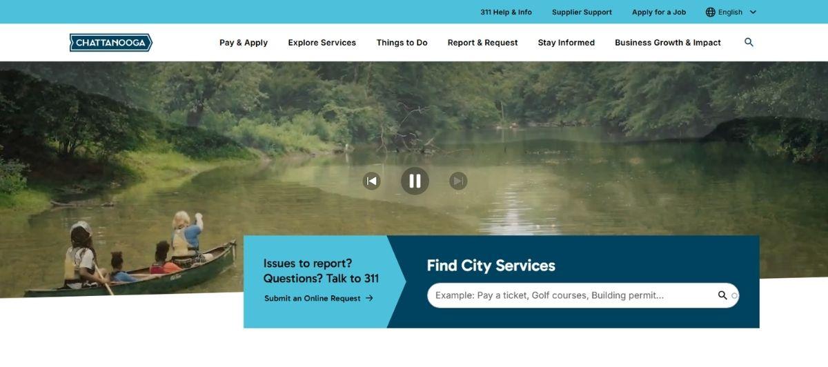
It’s not flashy, but in the world of city websites the Chattanooga, TN website takes the cake. Some of the best elements on the site are the ‘Popular Links’ navigation on the left side of the home page, as well as the easy to find main navigation at the top.
Unlike many other websites, the Chattanooga, TN city website does not scroll on the home page, which we think helps to prevent site visitors from getting lost in a sea of unnecessary information. Overall, the Chattanooga website is one of the best because it has all the information visitors expect and nothing more, simplicity at its finest.
3. Manassas, VA
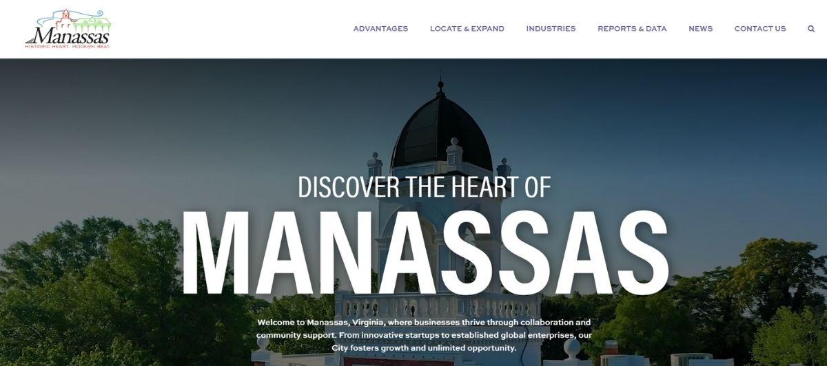
Choosemanassas.org is not an official city website, but a city visitors website. We might be a bit biased here since we designed this website, but the simple design and bright imagery make this a perfect example of what a city website should, and can, look like. In the middle of the home page are four brightly colored icons that serve as navigation to the most popular pages on the site.
These make it easy for site visitors to find what they’re looking for without having to look around and waste too much time. However, if visitors are looking for some fun information, the ‘Latest News’ section at the bottom of the page is the perfect place to find it!
4. Pennsylvania Great Outdoors Visitors Bureau
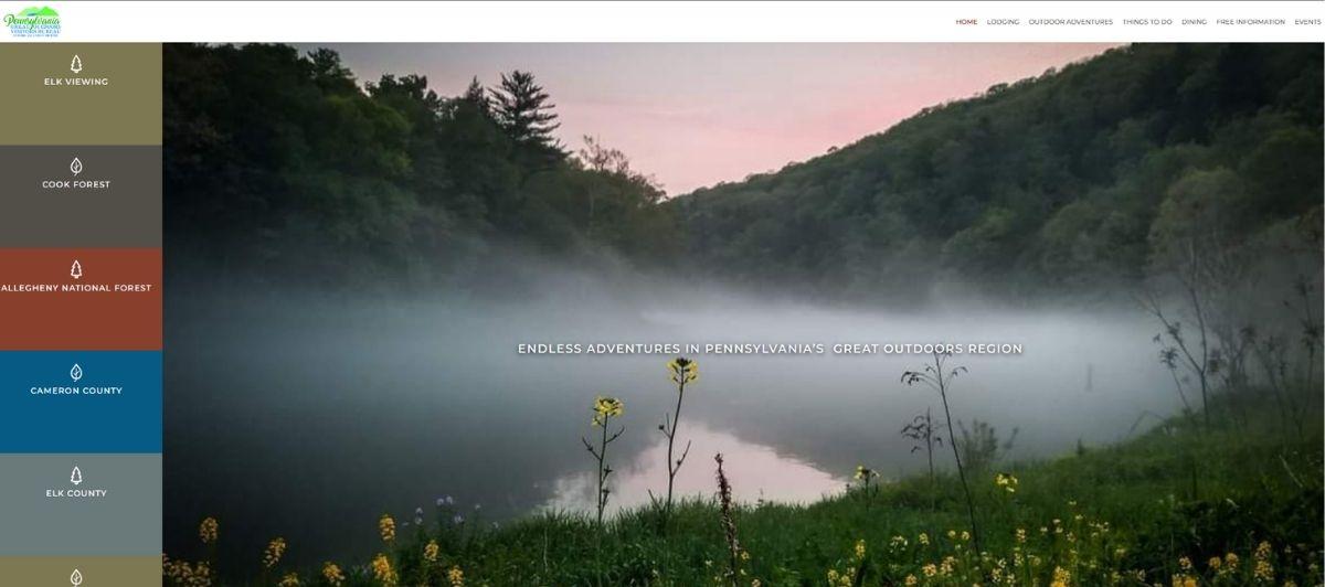
The Pennsylvania Great Outdoors Visitors Bureau is another visitor website that is a perfect example of thoughtful navigation and design that can make a city or state website one of the best. We know it may be a little one-sided since we crafted this website ourselves, but it’s hard to deny this site is spectacular. The moving images on the front page of the site draw you in and make you want to learn more.
But, if you already know what you’re looking for, you don’t have to waste any time because the bold navigation on the side and at the top of the page will easily help you find it! Overall, the Pennsylvania Visitors Bureau website has a plethora of information to communicate to visitors, but the careful design of the website pulls it off flawlessly.
5. Maryland
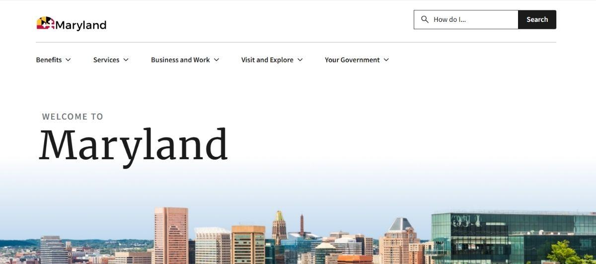
Simple and bold, the state of Maryland’s website certainly stands out among the other 50 as one of the best. A search bar next to the navigation at the top of the page makes it easy to find what you are looking for, and the scrolling news bar in the middle gives you the information you never knew you needed. And, although there is a lot of text and content displayed on the homepage, this site does a great job at organizing it so that it’s not overwhelming to any site visitor.
6. Austin, TX
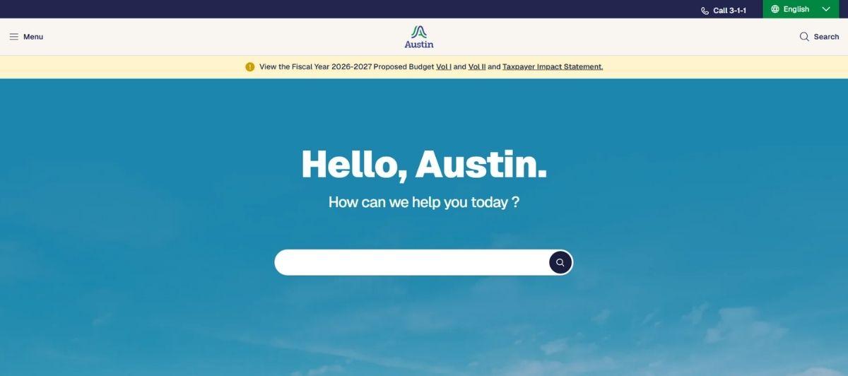
For a city that likes to ‘Stay Weird’, the Austin, Texas city website is not weird at all. In fact, it’s considered one of the best for that fact. The neutral color scheme is easy on the eyes and buttons displayed in that color scheme make it easy to find the information you’re looking for. On the home page, you will see four separate navigation bars.
However, because they are strategically layered, the fact that there are multiple navigations isn’t confusing at all. The most pertinent information is displayed from the main navigation, and any additional information can be found using additional navigations.
7. Visit Saint Paul, MN
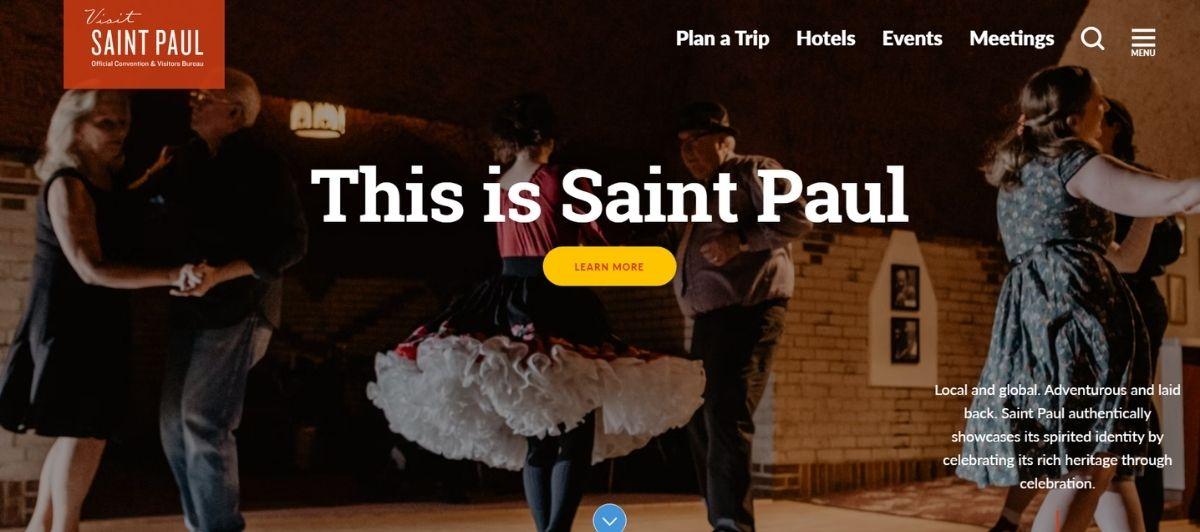
Bright and colorful, the visitors’ website for Saint Paul, Mi nnesota is a page we love and think everyone should see. Pictures on the homepage display everything that’s great about the city without using any words.
Slightly different from other pages we’ve seen, the left-side navigation on this website is comprised solely of icons. Other navigations on the page, however, utilize both. One of our favorite features of the site is at the bottom of the page and is a categorized menu of information the website has to offer.
8. Washington, D.C.
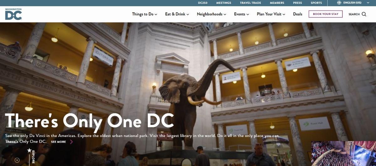
As our nation’s capital, one would expect Washington D.C. to have a website that outshines the rest, and it certainly does not disappoint. Everything on the washington.org website is displayed in large fonts and large pictures in order to make it easy for any visitors who makes their way to this site to find the information they’re looking for.
On this site, we appreciate that all of the information you would ever need about Washington D.C. is organized into 5 simple categories on a drop-down navigation at the top of the page. But, we also have to say that the #mydccool display at the bottom of the home page is pretty cool too.
9. Denver, CO
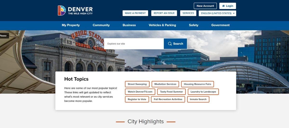
The “Mile High City” has a website that is brag-worthy thanks its carefully concocted color-scheme and easy-to-understand layout of the page. From the front page, you are invited to learn more about Denver and also to search the site to find what you’re looking for using the strategically placed search bar.
Underneath the search bar, visitors will find one of the best features of the website, a 12 icon navigation that offers easy access to important information. Denver’s page makes our list of the 17 best municipal and state websites because it communicates a lot of important information perfectly. A feat that isn’t easy to accomplish.
10. Los Angeles, CA
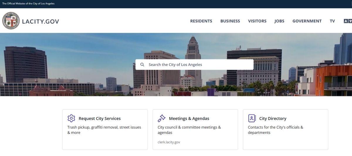
For a city that has a lot going on all of the time, the Los Angeles, California city website is by far one of the most minimalist city websites we’ve ever seen. A short homepage, 5-category navigation and 8 icon information gateway creates access to every page on the website. There are no long lists or jumbled information sections.
And, if for some reason you can’t find the information you are looking for from one of the navigation options, there is a search bar to help you out. From this website, it seems as though the City of Los Angeles has thought of everything without overthinking it.
11. New York, NY
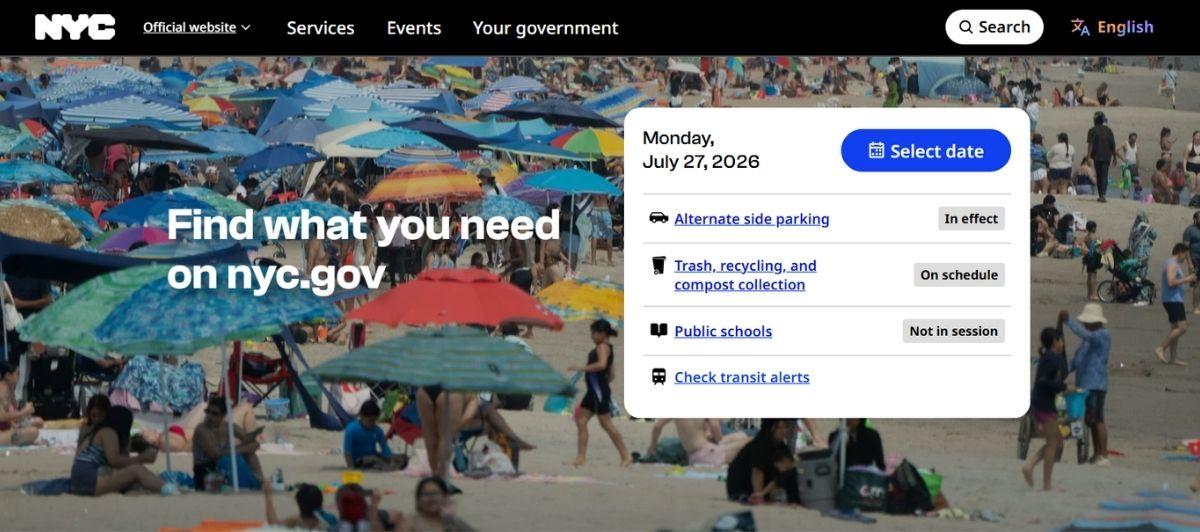
Undoubtedly one of the busiest cities in the world, New York, NY has a lot going on all of the time. It isn’t called “The City That Never Sleeps” for no reason. Therefore, many people would assume that creating a website to communicate all of that information would be difficult.
However, from the carefully planned layout and easy-to-use website the city currently has, one doesn’t get that impression at all. From the simplistic navigation and bold fonts, visitors to the city website can easily see that NYC went with the motto ‘Less is more’ and it certainly is working for them!
12. Georgia
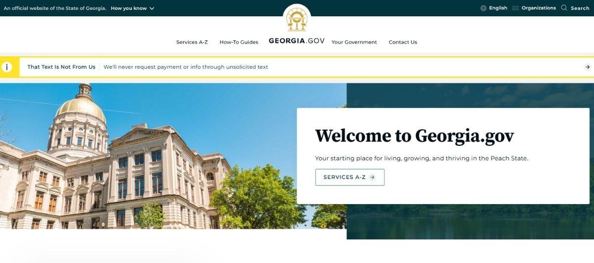
Georgia.gov makes the list of 17 best municipal and state websites because of its ability to clearly communicate important information with ease. Although not terribly innovative, the basic blue background of the website eliminates distractions and draws focus to the important features of the website such as the navigation and search bar at the top of the page.
13. Brevard, NC

Beautiful Brevard! From the picture of foggy morning mountains displayed in the background of Brevard, North Carolina’s website if you don’t already live there, you’re going to be enticed to visit. But, beautiful pictures aren’t the only thing this one-of-a-kind website offers.
For a city website, we think it does a great job of being of service to both residents and visitors to the city alike. As you visit the site and scroll down the page, you can quickly browse all of the options the site has to offer through the multiple strategically placed navigations. Truly an amazing website!
14. Texas
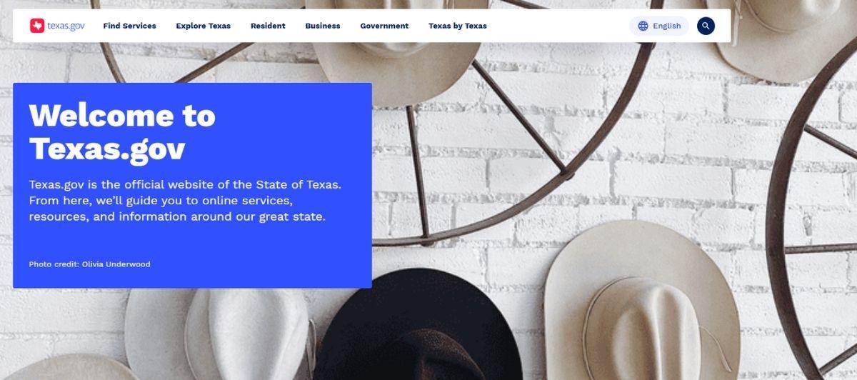
Everything’s bigger in Texas! That’s certainly the phrase that comes to mind when visiting the Texas state website. As you land on the home page, it’s hard not to realize that all of the fonts are bigger than normal. However, we don’t feel that’s a bad thing!
Bigger fonts and navigation makes it easier for page visitors of all ages and abilities to find the information they are looking for. And, if from the big icons and bold fonts visitors are still lost, they can always use the search bar!
15. Chicago, IL

One of the most well-known cities in the United States, the City of Chicago has a website that certainly competes with the best of the best. This website has a governmental feel but offers inviting pictures of the city for visitors who might not be familiar with the iconic skyline. Large pop-outs offer access to the latest city news and a simple, four-category navigation at the top of the page makes it easy to find any other pages you might be looking for. Overall, the city of Chicago has a rather basic website, but it’s basic at its best.
16. Mississippi
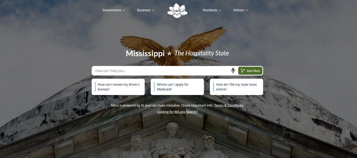
The state website for Mississippi is a stand-out winner among the other fifty states. Its modern, interactive design makes it fun to visit and look around. Likewise, the bright colors for the page and carefully chosen fonts also add a touch of personality that’s not often seen on government websites.
One of the best features of the site is the ‘Quick Links’ section at the bottom of the page that makes it fun and possible to find the most important information on the site. We chose Mississippi as one of the best municipal and state websites because, well, it’s just the best.
17. Mesa, AZ
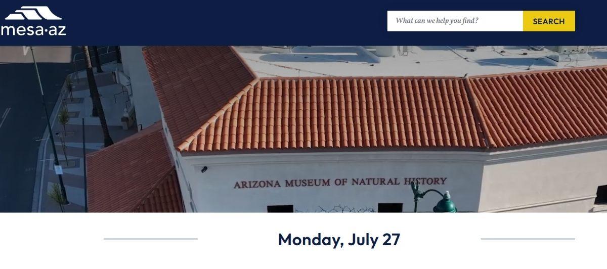
Last but certainly not least, Mesa, Arizona is a city website that easily makes our list of best municipal and state websites. Colorful, fun and easy to use, this city website offers everything a city website needs and more. Big, bold icons help visitors easily access the most important news, and simple navigation at the top of the page makes it easy for frequenters of the site to get their business accomplished without too much of a fuss.
What these sites get right
The sites above look different from each other, but they succeed for many of the same reasons. Here’s what separates government websites that residents actually use from the ones they abandon in frustration.
They lead with search
The single most common feature across the best government websites is a prominent search bar placed front and center on the homepage. Utah, Denver, Maryland, Georgia, Los Angeles, and Texas all treat search as the primary navigation tool, because citizens don’t browse government sites. They arrive with a specific question, a form to find, or a bill to pay.
Oregon.gov is another strong example outside this list, using a simple search bar as the first interaction point so residents can skip menus entirely.
They organize by task, not by department
Most residents visiting a city or state site don’t care which department handles their request. They want to pay a parking ticket, apply for a permit, or register a vehicle. The best municipal websites organize their homepages around tasks and outcomes, not internal org charts. Chattanooga’s ‘Popular Links’, Mesa’s bold icon grid, and Denver’s 12-icon navigation all reflect this resident-first logic.
Tulare County took this approach further in a major redesign, consolidating over 50 department websites into one unified platform and introducing a task-based filter so residents could get to the right page without knowing which department to contact. The result was an 85% improvement in overall site performance.
They use visuals with purpose
Brevard’s mountain photography draws visitors in emotionally. Saint Paul’s icon-only navigation removes language barriers instantly. Washington D.C.’s oversized fonts make the site readable for users of all ages. The best sites use imagery and typography not as decoration, but as navigation tools that reduce the time between landing and finding.
They keep the homepage short
Most of the sites above resist the urge to put everything on the homepage. NYC, Los Angeles, and Chattanooga all embrace restraint, surfacing only the most critical pathways and letting search or sub-navigation handle everything else. Shorter homepages load faster, reduce decision fatigue for users, and focus mobile visitors on what matters most.
They make contact and payments obvious
Effective municipal websites treat bill pay, contact information, and permit applications as priority features, not buried links. States like Texas and cities like Austin surface payment portals and contact forms high in the page hierarchy because that’s what most citizens come to do.
Government web design trends to watch in 2026
The bar for government websites is rising faster than most municipalities realize. Residents now compare their experience on a city site to their experience on a banking app or retail site, and the gap is still significant. These are the trends the best government websites are using to close it.
Mobile-first is now the baseline
U.S. government web traffic from mobile devices reached approximately 54% in recent years and continues to grow. Residents checking permit status, paying utilities, or looking up transportation schedules are doing it on their phones. A responsive WordPress design that loads fast on mobile is no longer optional for local governments. It is the foundation everything else is built on.
Hyper-personalized navigation by user type
Leading government sites are moving away from one-size-fits-all navigation toward personalized user journeys. Utah’s site offers an interactive section where visitors select their persona (resident, visitor, business owner) and see a filtered version of the most relevant services.
New York State uses topic filters and search refinement to help citizens narrow results without scrolling through hundreds of programs. This contextual design approach reflects how different populations actually use government sites.
Integrated online payments and self-service portals
Citizens expect to pay taxes, renew licenses, apply for permits, and file documents entirely online without calling an office. Effective municipal websites serve as centralized self-service digital hubs where residents can complete government business from any device at any time. Integrated payment systems, document uploads, and form submissions reduce call volume and improve efficiency for both residents and staff.
Proactive notifications and real-time alerts
The best government sites don’t wait for residents to come looking for information. They push it out proactively. Real-time alerts for road closures, weather emergencies, permit approvals, and utility outages keep citizens informed and reduce inbound contact to overwhelmed government phone lines.
AI-assisted search and content discovery
Advanced technology is making its way into government websites in the form of smarter search. NOAA’s website, for example, allows visitors to filter weather content by location and includes a user feedback button that helps the team continuously improve what residents find. Sites implementing AI-assisted search return more relevant results for natural-language queries, reducing the frustration of residents who can’t find what they need through standard menus.
Transparency features that build public trust
Easily accessible public records, published budgets, open data dashboards, and meeting agendas signal that a government organization has nothing to hide. Research shows that 88% of residents trust local governments more when the website is easy to navigate. Transparency features are not just a governance priority. They are a design priority.
Must-have features for municipal and state websites
Whether you are designing a website for a small town or managing a redesign for a large county, these are the features that separate the best government websites from the rest.
| Feature | Why it matters |
|---|---|
| Prominent search bar | Residents arrive with tasks, not browsing intent |
| Online payment portal | Reduces calls for taxes, utilities, permits, and fines |
| Mobile-responsive design | Over 54% of government site traffic now comes from mobile |
| ADA-compliant accessibility | Legal requirement under Title II of the ADA for public entities |
| Multilingual content | Serves diverse communities and improves access equity |
| Real-time emergency alerts | Keeps citizens informed without requiring them to visit the site |
| Online forms and document submission | Reduces in-person visits and speeds up government services |
| Transparent budget and records access | Builds community trust and meets open government obligations |
| Fast load times | Google research shows 53% of mobile visitors abandon slow sites |
| Screen reader compatibility | Required for WCAG 2.1 AA compliance and broader civic access |
A note on accessibility compliance
As of April 2026, state and local governments serving populations over 50,000 must comply with Title II of the ADA’s updated web accessibility rules, requiring WCAG 2.1 Level AA standards across all public-facing websites and mobile apps. Smaller municipalities have until 2027 or 2028, depending on population size. Despite this, only 13% of local officials report feeling very familiar with the new accessibility requirements, while 63% of residents say accessibility features on government sites are important to them.
Screen reader compatibility, keyboard navigation, proper color contrast, alt text, and multilingual support are all part of this requirement. Freshy’s ADA compliance service for WordPress helps government and public-sector clients meet WCAG 2.1 AA standards before deadlines arrive.
Pitfalls that cost local governments public trust
Even well-intentioned municipal websites lose citizens with the same preventable mistakes. Here’s what to avoid.
Organizing by department instead of by task
Residents should never need to know that business permits come from the planning department while zoning questions go to a different department. Government sites that organize navigation by internal structure make citizens do the homework that the site should do for them. The fix is to think like a resident, not like an org chart.
Burying the search bar
Search is the most used feature on most government websites. Placing it in a footer or a secondary menu guarantees frustration. It belongs front and center on every page, especially the homepage.
Skipping mobile optimization
A government site that isn’t optimized for mobile is inaccessible to more than half its users. Slow load times, tiny tap targets, and horizontal scrolling on mobile all signal neglect. Our WordPress speed optimization service addresses the technical side of this quickly.
Ignoring accessibility requirements
Most hospital websites and government sites still fall short of basic accessibility standards. A 2024 audit of one million homepages found an average of 56 accessibility errors per page. For government sites, non-compliance is not just a usability issue. It is a legal liability under Title II of the ADA.
Outdated content left in place
Old department contacts, expired programs, and outdated permit fees quietly erode public trust. Citizens who find inaccurate information on a government site don’t assume it’s a temporary glitch. They assume the organization isn’t paying attention. Consistent WordPress maintenance keeps government content current and accurate between major redesigns.
No self-service options for common tasks
If residents can’t pay a bill, submit a form, or find a permit application without calling an office, the website is not doing its job. Every common task that still requires a phone call is an inefficiency for the city and a frustration for the citizen.
Build your city’s next site with Freshy
A great government website does what the best ones on this list do: it meets citizens where they are, gets them what they need, and gets out of the way.
Here are the key takeaways from everything we covered:
- Organize navigation by task and outcome, not by internal department
- Put the search bar front and center, every time
- Mobile-first design is mandatory, not optional
- ADA compliance under Title II is now a legal requirement for most public entities
- Self-service portals for payments, permits, and forms reduce call volume and improve efficiency
- Transparency features like public records and budgets build lasting community trust
Freshy has been helping government organizations and public-sector clients build fast, accessible, and easy-to-navigate WordPress websites since 2011. If your city, county, or state site is overdue for a redesign, let’s talk.
Frequently asked questions
What makes a municipal website effective in 2026?
Effective municipal websites prioritize mobile-first design, prominent search, task-based navigation, and ADA compliance. Residents expect self-service access to government services online.
What features do the best government websites share?
The best government websites include easy access to payments, permits, and forms, a clear search bar, fast load times, and multilingual support for diverse communities.
How important is mobile design for city and state websites?
Critical. Over 54% of U.S. government web traffic now comes from mobile devices, making mobile-first design essential for local governments serving modern residents.
Are government websites legally required to be accessible?
Yes. Under Title II of the Americans with Disabilities Act, most government organizations must meet WCAG 2.1 AA standards, including screen reader compatibility, by 2027.
How can a city website build more public trust?
Publishing budgets, public records, and meeting agendas openly, alongside easy navigation, directly improves trust. Research shows 88% of residents trust local governments more when sites are easy to use.