A prospective student shortlisting colleges rarely visits a campus before they narrow their choices. They visit websites. The most effective college and university websites are designed with multiple personas in mind, including prospective students, current students, faculty, staff, alumni, and counselors, each needing tailored content and intuitive navigation. When a homepage fails to communicate campus life, academic excellence, and a clear path forward in the first thirty seconds, that student moves on.
This article breaks down 10 of the best university websites and what makes each one genuinely effective.
Here’s what we cover:
- What separates great higher education websites from generic institutional pages
- 10 of the best university websites, reviewed and linked
- The design and content choices worth borrowing for your own institution
- What every college website needs to serve prospective and current students well
- How to build a higher ed website that drives enrollment and community engagement
We’ve built websites for educational institutions and mission-driven organizations across the country, and the team at Freshy understands the unique challenge of serving a diverse audience without losing focus. Browse our university and education web design work when you’re ready for inspiration.
What makes a great university website
A great higher education website does three things exceptionally well: helps prospective students decide fast whether the institution is a fit, makes academic information, including programs, deadlines, costs, and outcomes easy to find, and delivers a modern, accessible, mobile-first experience across hundreds or thousands of pages.
University websites face a design challenge that few other site types encounter: they must serve fundamentally different user groups simultaneously. A high school senior exploring majors, a parent evaluating financial aid, a current student checking upcoming events, a faculty member accessing research tools, and an alumnus making a donation all land on the same homepage with completely different needs.
Here’s what consistently separates the best university websites from the rest:
- They communicate campus life visually, not descriptively. High-quality images and video of real students in real settings, both academic and social, do more to convey what attending a school feels like than any brochure copy ever could. The best college websites treat their photography as their most important conversion asset.
- They offer straightforward navigation organized by user type. Identify five to seven user groups or personas within your higher education audience to determine which user journeys to prioritize on your website. Prospective students, current and prospective students with different needs, faculty, staff, and alumni all benefit from a navigation structure that routes them to relevant content quickly rather than forcing everyone through a generic menu.
- They make the next step obvious. Whether it’s “Apply Now,” “Schedule a Visit,” “Explore Programs,” or “Request Information,” every best university website makes clear calls to action available above the fold and after every major content section. Enrollment begins with a click that the homepage should make irresistible.
- They balance institutional prestige with human warmth. The schools that convert prospective students most effectively aren’t just displaying accolades. They’re showing real people living real campus lives, which is the experience a student is actually deciding to buy into.
| Weak higher education website | Best university website |
|---|---|
| Dense text menus with no visual hierarchy | Streamlined navigation organized by user type |
| Generic stock photography | Real campus photography and authentic student video |
| One CTA buried in the footer | Multiple clear calls to action on every page |
| No mobile optimization | Fully responsive across all mobile devices |
| Accessibility as an afterthought | ADA-compliant design built from the foundation |
The 10 best university websites of 2026
If you want to draw new students and help existing ones, your university or college website should be informative, engaging, and appealing. As a higher education facility, your website is your declaration of value, and can be the deciding factor between whether a student applies to your college or not.
But what features and elements should a university website have exactly?
To answer that question, we compiled a comprehensive list of the best university websites around today.
We looked at the top university, college, and higher ed websites operating today to find out what makes them work. The key features include plenty of appealing photos and videos, lists of facilities and events, and easy-to-use navigation to help users find the information they need.
These all combine to give new students a real sense of what campus life is like — essential for any college website.
Discover which university has the best website in our ultimate list of 2026.
1. Rhode Island School of Design

Rhode Island School of Design’s website opens with a bold statement above the fold, immediately establishing the institution’s legacy. As users scroll, high-quality images fade into view, creating an immersive experience that showcases student and alumni work. The site’s clean, minimalist design creates a gallery-like experience, with generous white space and understated typography that ensures the focus stays on the creative work itself.
Since RISD is an arts institution, this design philosophy is itself a demonstration of what students can expect to produce. Every section is clearly titled in bold white text, and sub-pages use a scrolling blog-style format that keeps the experience current and topical rather than static and institutional.
2. George Washington University

George Washington University’s approach to the campus experience is genuinely original. Rather than relying on photography alone to communicate what attending an urban university feels like, the site offers an interactive campus map that regularly updates images, building locations, and names across both campuses.
For prospective students weighing a city-based college experience against a suburban or rural alternative, this tool makes an abstract decision concrete in a way that no written description can match. It’s one of the most effective uses of interactive elements on any higher education website reviewed here.
3. Brown University
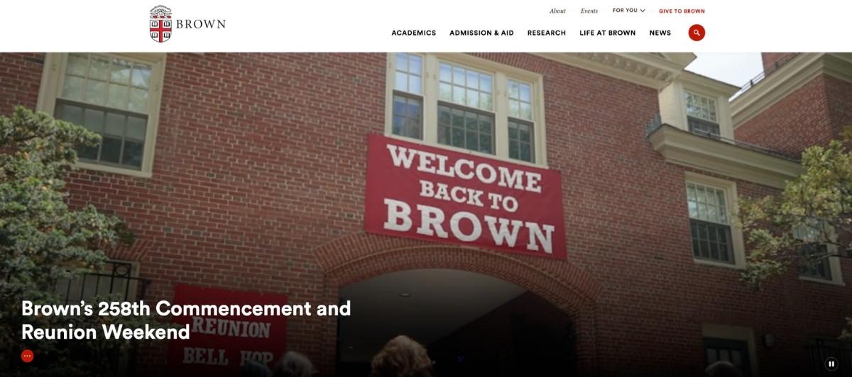
Brown University manages the tension between visual richness and technical performance in a way most image-heavy higher education websites don’t. Background images are rendered in filtered white and video automation doesn’t trigger until the visitor scrolls to the relevant section.
This approach means prospective students get a visually compelling experience without the slow load times that drive them away, especially on mobile devices. The result is a site that showcases New England campus life across multiple seasons and settings while remaining technically sound across every device.
4. Cornell University
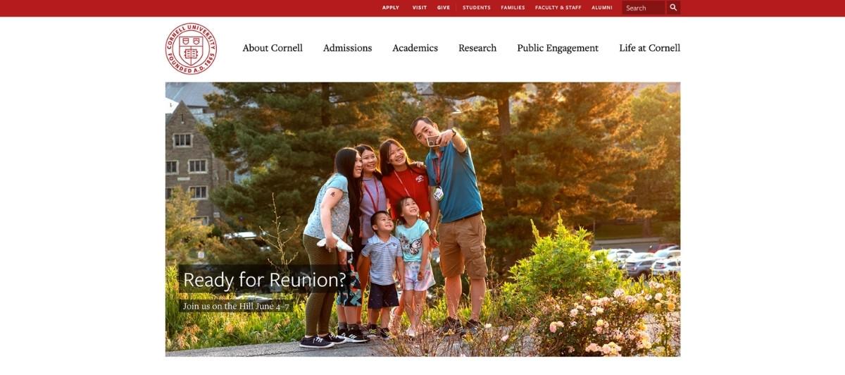
Cornell University’s homepage slider leads with recent graduates and emerging classroom technology, immediately communicating both tradition and innovation to prospective students. The “Around the University” sub-page deserves particular attention: an extensive image gallery of campus life with filters allowing visitors to separate distinct aspects of the school makes academic information and social context equally accessible.
The “Cornell Chronicle” news tab keeps the site feeling active and current without competing visually with the more prominent imagery that makes the first impression. For large research universities serving a diverse audience, Cornell’s approach to balancing those competing demands is worth studying closely.
5. Johns Hopkins University

Johns Hopkins University’s website earns its place on any list of the best university websites for how effectively it pairs student achievement with institutional ambition. Full-screen video loops and landing page images create an immersive experience that communicates the school’s relationship to Baltimore and its research mission simultaneously.
What makes the site exceptional beyond its visual quality is the header navigation, which manages to be one of the most graphically intensive elements on the page while remaining among the easiest to use. That balance between aesthetic ambition and practical usability is what higher ed website design should consistently aspire to.
6. University of Pennsylvania
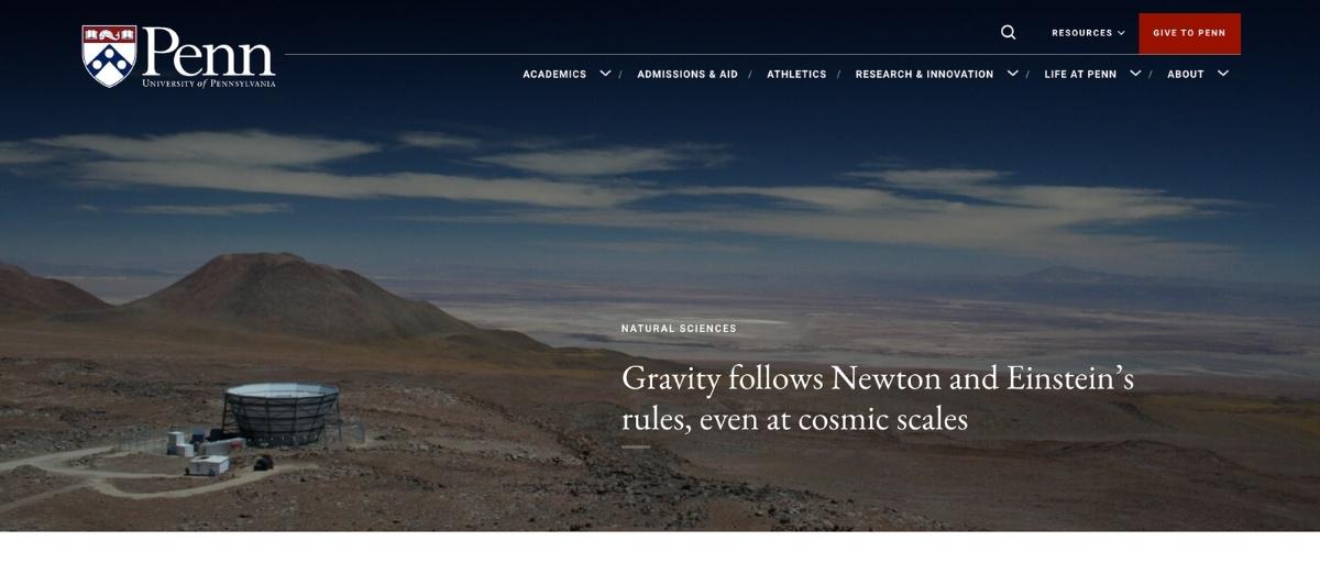
The University of Pennsylvania gives student groups, clubs, and initiatives genuine visibility on the school’s homepage, which communicates something important: this is a community, not just a credential.
Degree programs are promoted through realistic, unfiltered photography of real outcomes, including a couple at home with their newborn for the nursing program, connecting academic information to life impact in a way prospective students respond to emotionally.
The homepage gallery represents success across every discipline, from entrepreneurs to visual artists, ensuring that every prospective student can find a version of themselves in the school’s story.
7. Regent College
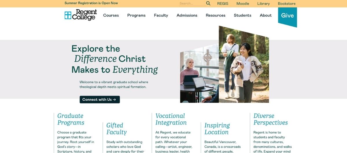
Regent College’s site is a masterclass in compact, purposeful design. A vertically slim navigation bar works seamlessly across both mobile devices and desktop, and the black and white primary color palette makes the bright toolbar sections stand out without competing for attention.
For smaller educational institutions whose web budgets and content teams are more limited than their larger peers, Regent’s approach demonstrates how strong spacing, a restrained color system, and clear hierarchical linking can create a professional, navigable site without requiring the complexity that Ivy League institutions typically build in.
8. Goshen College

Goshen College is a strong example of how a smaller institution can use its website to turn a niche identity into a competitive advantage. The elegant purple and gold palette projects institutional confidence, while the “What’s Distinctly Goshen?” section addresses the specific question that faith-based prospective students and their families most need answered: what makes this community different from a secular school? For colleges with a clearly defined identity, whether religious, environmental, or otherwise, this kind of explicit values communication on the homepage is one of the most effective enrollment conversion tools available.
9. Ohio State University
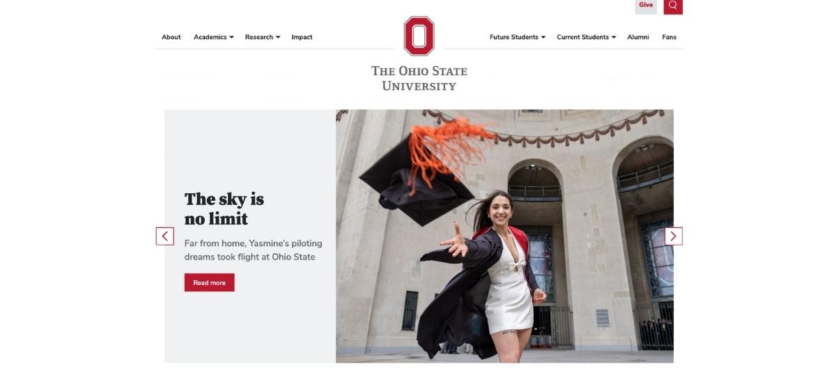
Ohio State University’s homepage makes two decisions that distinguish it from most large public university websites. The action-oriented photography of students at work and play paired with a direct call to action toward the facilities description page helps prospective students understand the full campus experience as a spatial reality, not just an abstract collection of programs.
The “Popular for Current Students” subsection, which surfaces real-time search terms from logged-in current students, serves existing students efficiently while demonstrating to prospective students the kinds of resources and services the school provides as a matter of daily campus life.
10. The University of Texas at Austin
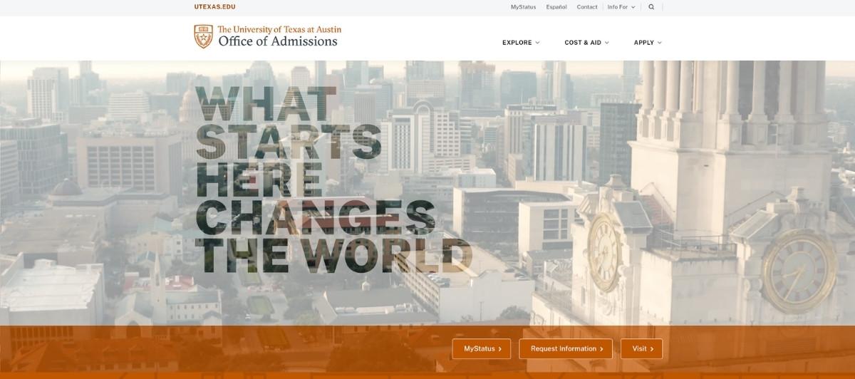
The University of Texas at Austin leads with one of the most direct, confident homepage statements on any higher ed site: “Get Ready to Change the World,” placed over looped classroom video featuring actual professors. This bold statement communicates institutional ambition while the video provides the human proof.
The site consolidates hard data, including student retention rates and national rankings, at the bottom of the homepage, giving analytically minded prospective students and their parents the numbers they’re looking for without making those statistics the emotional centerpiece of the experience. The one-page-per-topic slideshow for exploring, applying, and accessing financial aid keeps the admissions journey visually organized.
Design principles worth applying to any higher education website
Looking across all 10 of the best university websites above, several design decisions appear consistently on the sites that serve prospective and current students most effectively. Here’s what’s worth prioritizing.
Organize navigation around user type, not institution structure
Streamlined menus that guide users by category, such as About, Admissions, Academics, Student Life, and Community, each expanding into user-focused subpages, help prevent overwhelm and make information findable without effort.
Most universities organize their navigation around internal department structures rather than how visitors actually search for information. Reversing this, as the best university websites do, dramatically improves the experience for every user group, from prospective students to alumni.
Use video strategically, not decoratively
Video works when it shows something real: professors teaching, students collaborating, campus spaces in use. It loses its impact when it’s purely decorative. Brown University’s approach of deferring video autoplay until scroll demonstrates that thoughtful video implementation, even on a content-heavy higher education website, can serve both the visual experience and technical performance on mobile devices simultaneously.
Make important dates and enrollment milestones visible
Prospective students tracking application deadlines, scholarship windows, and campus visit opportunities need this information immediately accessible. Higher education websites that bury important dates inside PDF downloads or deep navigation layers lose students to competitors whose sites surface this information upfront.
Build for accessibility from the start
Accessibility considerations ensure your website can be used by everyone, including individuals with a visual or cognitive impairment. This involves more than just readable fonts: it includes alt tags on images, proper use of alternative text, and keyboard-friendly design. Many university websites fail to comply with accessibility guidelines, which can exclude valuable users and risk non-compliance. Our WordPress ADA compliance services help educational institutions meet these standards without sacrificing the visual quality their brand requires.
Integrate upcoming events and campus life content that stays current
Static higher education websites that look the same in October as they do in March communicate institutional stagnation to prospective students who are evaluating whether a school community is active and worth joining. A dynamic events section, a news feed, and regularly updated student life content all signal that something is always happening here worth being part of.
What every college website needs to drive enrollment and serve its community
Whether your institution is a small liberal arts college or a large research university, these are the non-negotiables for any higher ed website serving current and prospective students in 2026.
- A clear admissions pathway for prospective students. Apply, visit, request information, explore programs. These four actions represent the entire early enrollment journey for most prospective students, and each should be accessible in two clicks from anywhere on the site. For institutions competing for the same students, the school whose website makes this journey simplest often wins the application.
- High-quality campus photography that reflects reality. Authentic images of actual students in real campus settings, classrooms, dining halls, residence areas, and extracurricular spaces, build the emotional connection that converts interest into an application. Staged photography with overly polished aesthetics increasingly reads as inauthentic to the prospective students that higher education websites most need to reach.
- A student life section that answers unspoken questions. What does a Tuesday afternoon actually look like here? What communities exist for people who share my interests? What does the campus feel like on a Friday night? The best university websites answer these questions through photography, video, student stories, and upcoming events calendars that make campus life tangible for someone who has never visited.
- Accessible academic information organized by program. Course descriptions, faculty profiles, research opportunities, graduate outcomes, and employment rates by program all serve the prospective student who has moved beyond general interest into genuine evaluation. Making this academic information easy to find and clearly organized is one of the highest-impact investments a higher education institution can make in its website.
- Mobile-first design and fast load speeds across all devices. Ensure your site has an effective mobile-responsive design to offer an equally positive user experience across all devices. Prospective students research colleges on their phones constantly. A higher ed website that performs poorly on mobile loses those students before they ever see the campus, the programs, or the faculty. Our WordPress speed optimization service keeps educational institution websites performing at their best across every device.
- Alumni engagement built into the site structure. Alumni giving, mentorship programs, career networking, and continuing education all depend on the institution maintaining an ongoing digital relationship with graduates. The best university websites build alumni pathways into the primary navigation rather than treating graduate engagement as an afterthought.
Higher ed websites that inspire enrollment deserve the design partner that understands what’s at stake — that’s Freshy
The best university websites serve a remarkable range of needs simultaneously: the seventeen-year-old deciding where to spend four years of their life, the parent calculating return on investment, the current student navigating academic deadlines, and the alumnus reconnecting with a community that shaped them. Every design decision, from the homepage photography to the navigation structure to the admissions CTA, should serve all of them without compromising any of them.
Key takeaways:
- Navigation organized around user type outperforms navigation organized around institutional structure every time
- Real campus photography and authentic student video convert prospective students more effectively than polished, staged imagery
- Video implementation should be strategic and deferred on scroll to protect performance on mobile devices
- Important dates, deadlines, and admissions milestones must be immediately accessible, not buried inside navigation
- ADA compliance is both a legal requirement and a design principle that serves every user group
- Alumni engagement built into the site structure sustains the institution’s community beyond graduation
Whether your institution is planning its first professional website or is ready to retire a site that no longer reflects the campus it’s grown into, we’d like to be part of that conversation. And if you want to see how we approach web design for educational institutions before you reach out, our portfolio is a good place to start.
FAQs
What makes the best university websites stand out?
The best university websites help prospective students decide fast whether the institution is a fit, make academic information easy to find, and deliver a modern, accessible, mobile-first experience across hundreds of pages. Strong photography, clear navigation by user type, and prominent enrollment CTAs are the shared qualities of top-performing higher education websites.
How should a college website be organized?
By user type rather than institutional structure. Prospective students, current students, faculty, alumni, and staff all have different needs. The best university websites route each group to relevant content through clearly labeled navigation paths rather than forcing every visitor through a single generic menu structure.
Do university websites need to be mobile-friendly?
Absolutely. Most prospective students research colleges on their phones. A higher ed website that doesn’t perform well across all mobile devices loses enrollment opportunities before a student ever sees the programs, campus life content, or faculty that might have convinced them to apply.
How important is accessibility for higher education websites?
Critical on both legal and ethical grounds. Many university websites fail to comply with accessibility guidelines, which can exclude valuable users and risk non-compliance. ADA-compliant design, including alt text, keyboard navigation, and readable contrast ratios, ensures every prospective and current student can access the institution’s information without barriers.
What content should a university homepage prioritize?
An enrollment CTA, high-quality campus photography or video, upcoming events, a clear navigation structure organized by user type, and a distinct institutional identity statement. These five elements serve both the first-time prospective student and the returning current student who needs quick access to academic information and campus life resources.