
Let’s face it: figuring out the best web design for your e-commerce site can be tricky. Even the smallest aesthetic or technical difference could have a huge impact on your success. However, it can be hard to craft your perfect site without a gold standard to reference.
Fortunately, there are plenty of exceptional websites to help inspire you. By reviewing the most impressive elements of a few successful business sites, you can apply their strategies to your own content.
In this article, we’ll cover a few traits that the top WordPress e-commerce websites tend to share. Then, we’ll walk you through seven high-quality web design samples to prepare you for your next project. Let’s get started!
What the top WordPress e-commerce sites have in common
We probably don’t need to tell you that every website is different. As such, there’s no such thing as a one-size-fits-all approach to web design. Nevertheless, there are a few traits that you can usually find across most high-quality, e-commerce sites.
One basic element is an easy-to-use interface. Navigational aids like a clearly marked menu and a powerful search function can help users effortlessly explore a site. Moreover, there’s typically an on-brand, mobile-friendly theme. These elements work together to create a cohesive and accessible experience.
As for the pages themselves, these are typically crafted with the same precision. For instance, product pages are often optimized with effective copy, high-quality photos, and easy sharing options. This provides a more engaging and pleasant shopping experience, which could encourage users to add items to their carts and proceed to checkout.
Most online stores make the checkout process as seamless as possible. This is because a faster experience gives users less time for second-guessing. With convenient elements like multiple shipping options, customers can experience less friction at the finish line.
WordPress e-commerce websites: 7 of the best examples for 2026
Even if you’re already familiar with the top web design elements, it can be hard to turn those concepts into reality. If you want to see a few of them in action, here are seven of the best e-commerce examples to consider.
1. Playground One
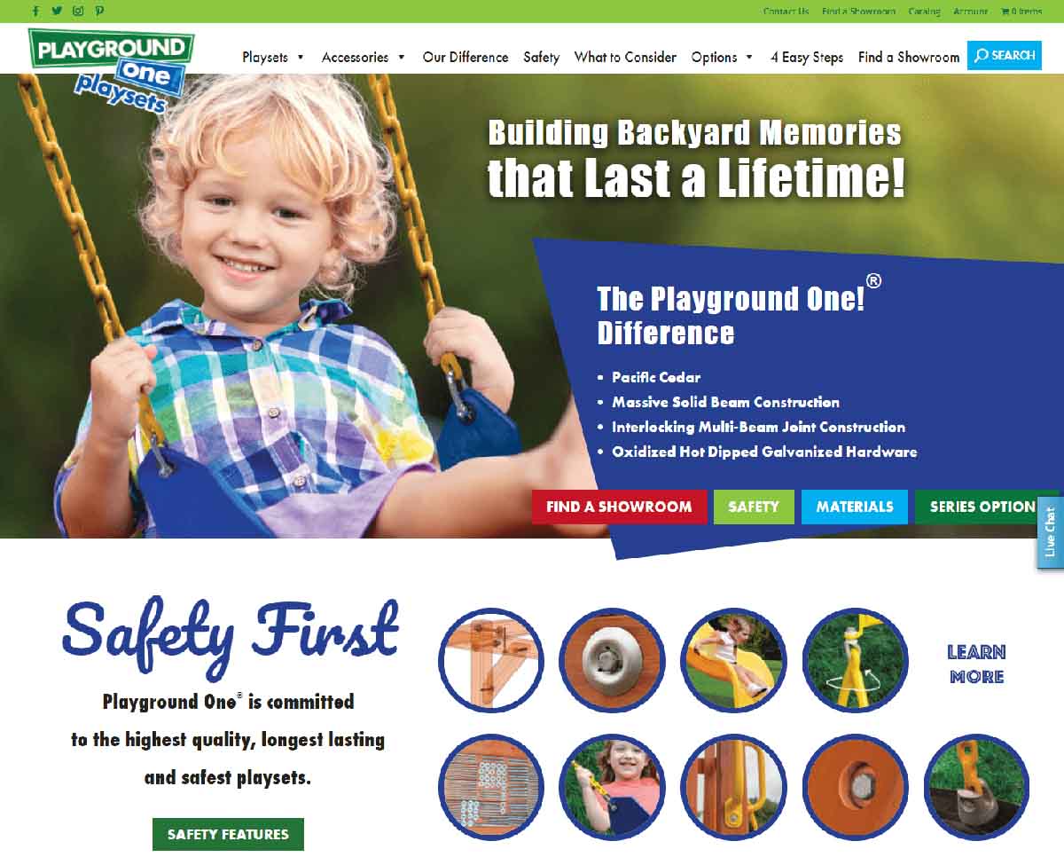
Playground One is a company offering playground equipment with countless customization options. However, you probably already knew that from the homepage. That brings us to the website’s main strength: effective branding.
The bright, playful color palette matches the lighthearted tone of the products being sold. However, clear menus and minimal clutter mean that it can harness this childlike energy within a neatly organized structure. Thus, the branding manages to stay true to its goals without sacrificing a professional image.
Meanwhile, high-quality images of the product subtly highlight the custom construction options that are unique to this company. There are also photos of children enjoying the product, which provides an emotional appeal alongside the more sales-focused one.
We think that Playground One’s web design perfectly showcases the important element of balance. It can be tough to stay true to your branding without sacrificing a seamless online experience. However, this site achieves both goals by leaning towards simplicity and utilizing images as a storytelling tool.
As such, we recommend that you take a cohesive approach to your web design. Focusing on theming or navigation alone can lead to a site feeling disjointed. By finding a way to make different elements work together instead of apart, you can create a harmonious website for your business.
2. Real Healthy Eats
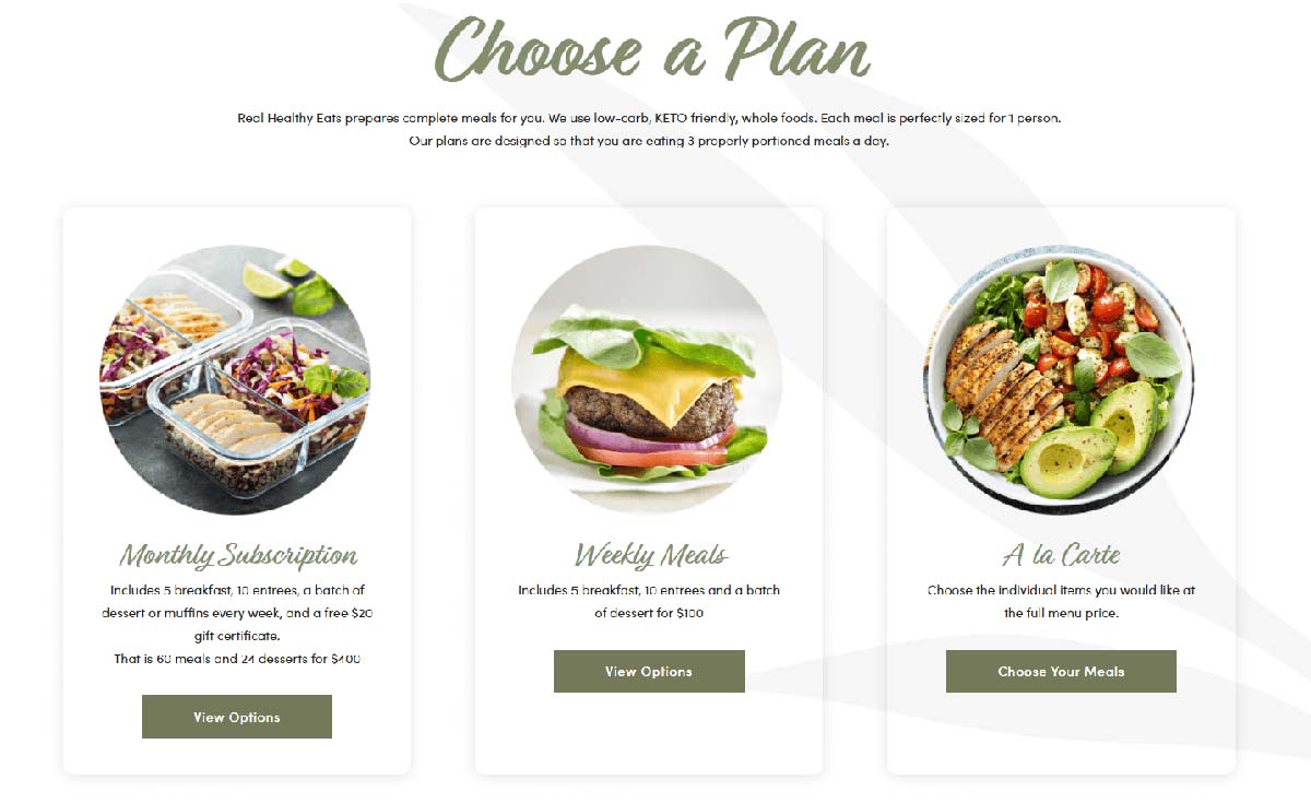
With the fast pace of modern life, meal plan services have come into the spotlight. Real Healthy Eats aims to take advantage of this opportunity while appealing specifically to health-conscious users. To communicate this, the company uses a few powerful web design techniques.
First of all, their meal plan product options rely heavily on mouth-watering images. Meanwhile, the copy focuses on the health benefits. Each page contains concise descriptions, keeping the web design as clean as possible.
Moreover, the site offers several opportunities to follow the brand on social media. By including even a few of these links in the core web design, users are able to easily engage with the company on other platforms. This can help increase brand awareness and conversions.
We also appreciate how Real Healthy Eats has streamlined its registration process. The only personal information that users need to enter is their email address. Even if it’s not the actual purchase point, it lowers the effort needed to take the first step towards becoming a customer.
We feel that the main takeaway from this site is the importance of keeping conversions in mind. Plenty of sales start with casual contact. You can increase the frequency of those essential first interactions with built-in opportunities for easy engagement.
3. House of Whisky
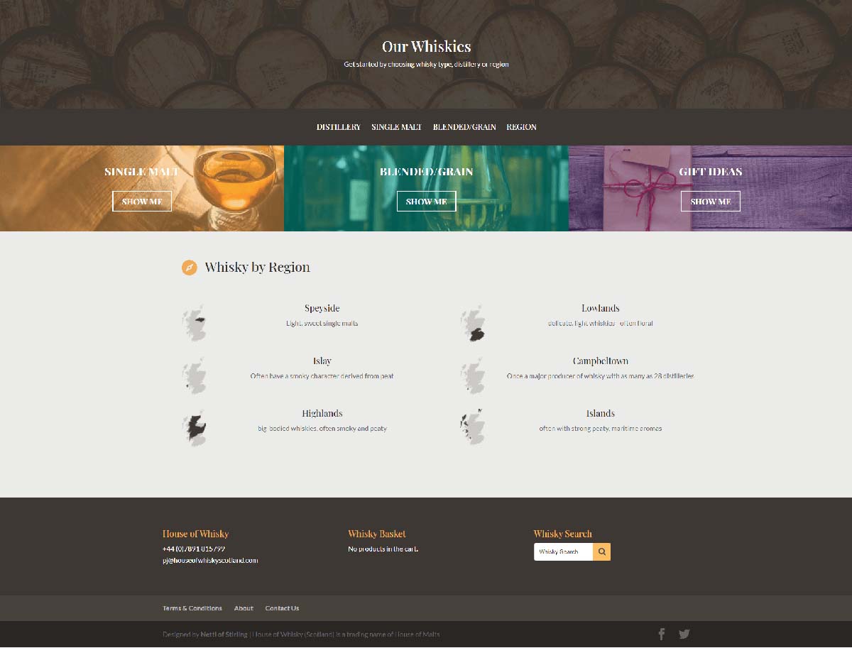
Let’s shift gears to House of Whisky. As you can probably see, simplicity is key with this design: lengthy paragraphs are eliminated in favor of a minimalist approach.
However, it’s not just about the visuals. Every block is navigational. For example, clicking on a region takes you straight to the company’s stock from that area. Thus, every opportunity to engage with this site takes users a step close to their purchases.
In addition to an effective sales funnel, this design makes the User Experience (UX) extremely efficient. Customers don’t have to hunt for the store. They can just select the category that catches their eye and begin browsing products tailored to those standards.
Some whiskies come with a few descriptive paragraphs. Since the sorting process is quite quick and straightforward, users might be more inclined to take the time necessary to fully read the product descriptions.
If you want to let your products really shine, consider a similar approach. A robust navigation design for your goods is a simple way to produce a more seamless user experience and encourage visitors to read more about your products.
4. You Are Joy Worthy
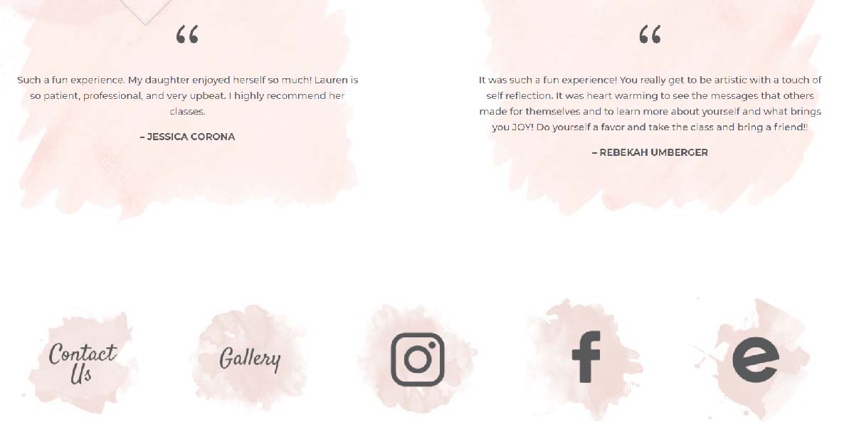
You Are Joy Worthy is an experience-based e-commerce website. The company runs events that combine creative crafts with reflective discussion. Despite this fairly niche focus, the company’s web design effectively communicates both its offerings and its brand identity.
Each clickable element is highlighted with a splash of color behind it. It’s a muted pink on a white background, keeping the design fun but not overbearing.
However, we think this site’s greatest strength is the variety of engagement options. In the photo above, we’ve chosen to share a section that highlights several different ways to get in touch with the company. Besides linking to its social media pages, it also offers direct contact forms and links to buy tickets.
These links are highlighted by a few customer reviews. Nevertheless, they aren’t overly prominent or wordy, meaning that they can provide testimony without distracting from the engagement options below.
You can consider a similar approach by designing a focus point for each of your pages. While you probably hope users will read every page, there’s a large chance that they’ll be skimming through them instead. Prioritizing the most important elements might also make them easier to remember.
5. Guiseppe’s Binghamton
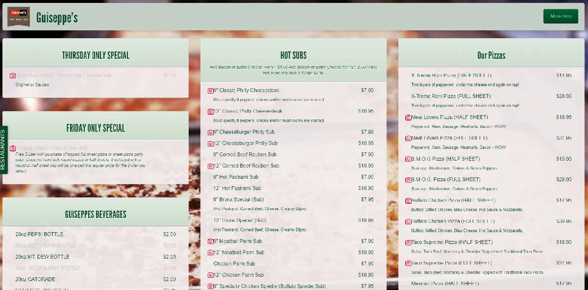
If you run an e-commerce site that focuses on takeout and delivery, you might have two different web designs to create: one for the homepage and one for the ordering system. Both are equally important to your success, as demonstrated by Guiseppe’s Binghamton.
When you visit the main website, you’ll be greeted with a sleek interface. Most of the site is minimalist, focusing its marketing on the restaurant’s identity and connection to the community. This changes as soon as you click on the order button.
It may be a huge menu, but it’s also been designed to be as minimally intimidating as possible by providing brief descriptions. Customers who want to see photos can access them by clicking on the item. This means the whole page has a consistent layout without compromising on effective visuals.
You may want to streamline your e-commerce site in a similar way. For example, let’s say you only have images of some menu options. You may want to hold off on uploading them until you can get all the photos, so that customers can have an easier time navigating your website.
6. Casper
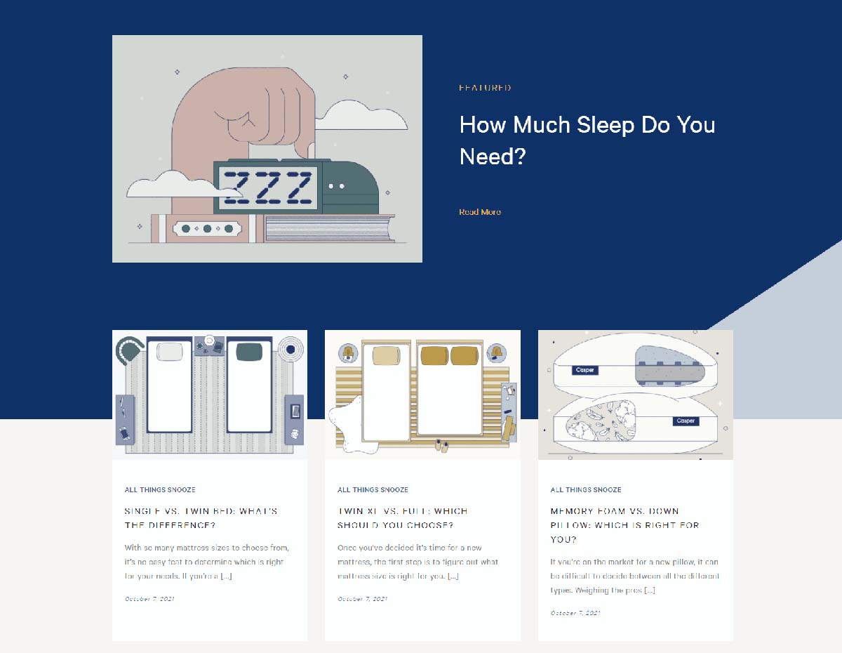
Casper is a popular mail-order mattress company. Since mattresses tend to be a significant financial investment, Casper needs to have a website that can support the purchase journey every step of the way.
It does so with impressive web design. Casper starts with a calming color palette to match the sleep-based theme. In addition to matching the brand, it’s also simple enough to not be distracting.
Casper also embraces content marketing in the form of an informative blog. Each article serves to answer mattress-related questions that users might have. As such, customers have less reason to seek answers elsewhere and can continue building a relationship with the brand.
Consider following its example by applying web design that can keep users engaged on your site. A blog is an effective way to do this, but it isn’t your only option. For example, you could offer a customer chat window so that users can easily and quickly make contact with your team.
7. IM=X Pilates

As the health and wellness industry continues to grow, so will the range of cutting-edge exercise equipment. IM=X Pilates’s web design effectively educates visitors about this growing trend.
Since this relatively new form of pilates is not widely known, IM=X Pilates compensates with an informative homepage. Users can get a quick summary near the top of the page. However, if they scroll down, they’ll find additional resources to help them learn more about the product.
Visitors can use the effective navigation options to go straight to the products if they already know what they want to buy. Thus, this web design caters to all customers no matter where they might be in their purchasing journey.
If you want to emulate the best parts of IM=X Pilate’s web design, we recommend that you keep all customers in mind. Some will be very familiar with your brand, while others will be newcomers. A solid navigation system with easily accessible information can cater to both categories.
Conclusion
Web design isn’t always easy. However, it is almost always important. Fortunately, creating effective e-commerce websites doesn’t have to be a guessing game. Instead, you can set yourself up for success by consulting some of the best business sites around.
In this article, we looked at seven different impressive websites. We covered what they did well and provided a few tips for how you can do the same – most of the time, it comes down to keeping your user’s experience in mind.
If you’re looking to create a professional e-commerce site, Freshy has you covered. We offer a professional website design service tailored to your needs. Consider getting a quote for our services today!


