Digestive health is a sensitive topic, and many patients delay scheduling appointments out of anxiety about procedures like colonoscopy or concerns about what symptoms might mean. 73% of patients evaluate medical care quality based on website experience. A gastroenterology website that feels calm, professional, and informative does real clinical work by reducing that anxiety and making the first visit feel less daunting before a patient ever picks up the phone.
This article reviews 18 of the top gastroenterologists websites and the design decisions that make each one earn patient trust.
Here’s what we cover:
- What makes a gastroenterology website reduce patient anxiety and generate appointments
- 18 standout gastroenterologists websites, reviewed and linked
- Design choices in color, layout, and content worth applying to any GI practice
- What every gastroenterology website needs to serve new patients effectively
- How to build a site that converts digestive health concerns into scheduled visits
We’ve built healthcare websites for medical practices across the US, and the team at Freshy understands the psychological dimension of healthcare web design. Take a look at our healthcare web design work whenever you need a benchmark.
What makes a gastroenterology website earn patient trust
Gastroenterology sits in an unusual position among medical specialties. Patients dealing with symptoms like IBS, colon cancer concerns, acid reflux, or unexplained digestive discomfort often feel a combination of anxiety about their condition, embarrassment about discussing it, and apprehension about procedures. The website a GI practice presents is frequently the deciding factor in whether that patient schedules an appointment or keeps waiting.
A well-crafted website becomes a game-changer. The top gastroenterologists’ websites are not just online business cards. They are powerful tools that inform, guide, and give patients peace of mind before their first appointment.
Here’s what the top gastroenterologists’ websites consistently get right:
- They use calming, trustworthy color schemes. Soft blues signal trust and medical competence, and the trend in 2026 is toward palettes that transform a clinical space into a calming digital experience. Psychologically, blue is known to be a calming and reassuring color, which is why it dominates the most effective GI practice websites. Color choice is a deliberate trust signal, not just an aesthetic preference.
- They reduce procedure anxiety through clear information. Patients want to know exactly what you treat, whether it’s acid reflux, irritable bowel syndrome, or colorectal cancer screening. The best sites provide service pages with easy-to-read explanations. For a specialty where many patients arrive with significant anxiety about colonoscopy or colon cancer screening, plain-language explanations of what to expect are among the most patient-serving content a GI website can publish.
- They make the first appointment feel accessible. A prominently displayed phone number, an online scheduling tool, and a clear new patient section all remove the friction between a patient’s decision to seek care and their first confirmed visit.
- They communicate physician expertise without intimidation. Doctor bios that include credentials, subspecialties, and a personal approach note build the kind of connection that helps patients feel they’ve found a provider they can talk to honestly about concerns they might find embarrassing.
| Weak GI practice website | High-converting gastroenterology website |
|---|---|
| Generic clinical imagery | Calming color palette with real physician photos |
| No procedure explanations | Clear, plain-language colonoscopy and screening information |
| No contact above the fold | Phone number and appointment booking immediately visible |
| One general services page | Dedicated pages for colon cancer screening, IBS, digestive care |
| No patient testimonials | Reviews from patients who felt listened to and comfortable |
Top 18 gastroenterologists websites of 2026
These days, a website is often the first impression for a business. It is the equivalent of giving out an eye-catching and informative business card or flyer. Websites can make or break the amount of your clientele, affecting the bottom line of your business.
For a medical practice, prospective patients and their loved ones need to be able to find enough information to put their minds at ease regarding the doctors and staff. There is a psychological aspect to designing an effective website. If you consider this when choosing colors, fonts, layouts, and photographs, you will have a highly productive website that keeps your online traffic booming.
1. Gastro Arkansas
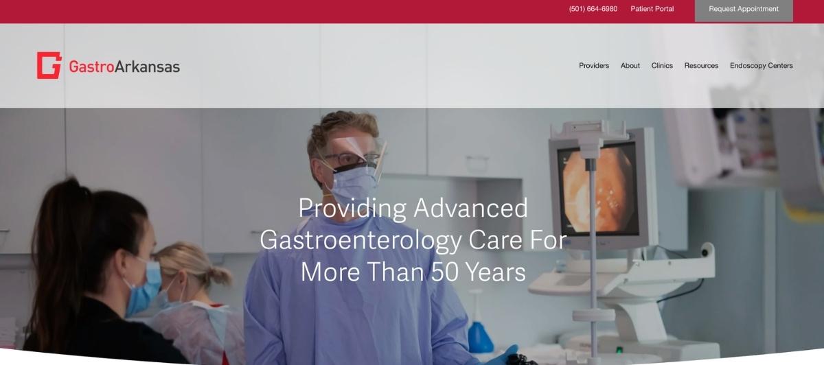
Gastro Arkansas earns its lead position through an immediately cohesive visual identity. A mostly white homepage with deliberate pink accents creates a warmer, more approachable atmosphere than the standard clinical blue-and-white.
The rotating banner and buttons maintain the same color story throughout, giving the site a polished consistency that communicates attention to detail before a patient reads a word of content. For GI practices looking for a color approach that differentiates without sacrificing professionalism, Gastro Arkansas is one of the stronger examples of how to do that well.
2. Hawaii Gastroenterology Specialists

Hawaii Gastroenterology Specialists prioritizes accessibility in a way that few GI websites do as deliberately. Large, neat typography makes the site comfortable to read for older patients who may be navigating digestive health concerns for the first time at an age when smaller text creates additional friction.
Most of the information a new patient needs is accessible from a single page, and the clickable options are written in plain English rather than medical terminology. For a specialty that serves a significant older patient population, this accessibility-first approach is as clinically appropriate as it is good web design.
3. Strand GI Associates
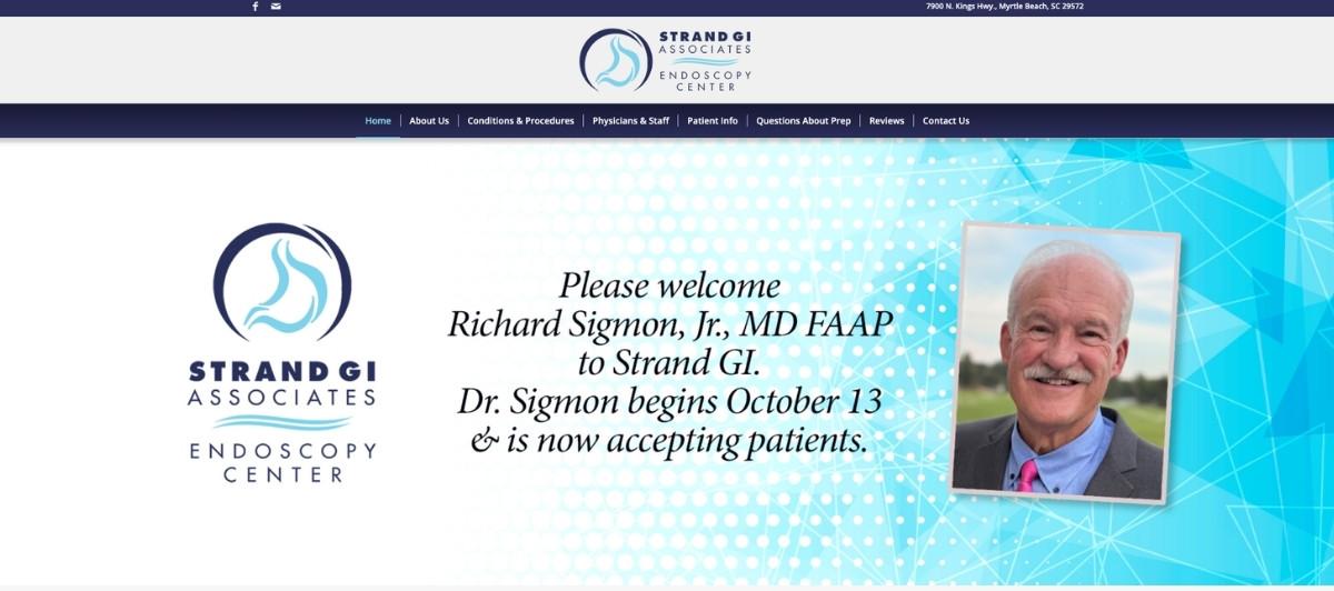
Strand GI Associates uses a homepage banner that rotates at a deliberately unhurried pace, giving patients enough time to absorb each image before the next one appears. This is a small but meaningful UX choice for an audience that often arrives anxious and benefits from a browsing experience that doesn’t feel rushed. The color scheme is professional and consistent throughout, creating a trustworthy first impression that holds up across the full site.
4. Wilmington Gastroenterology
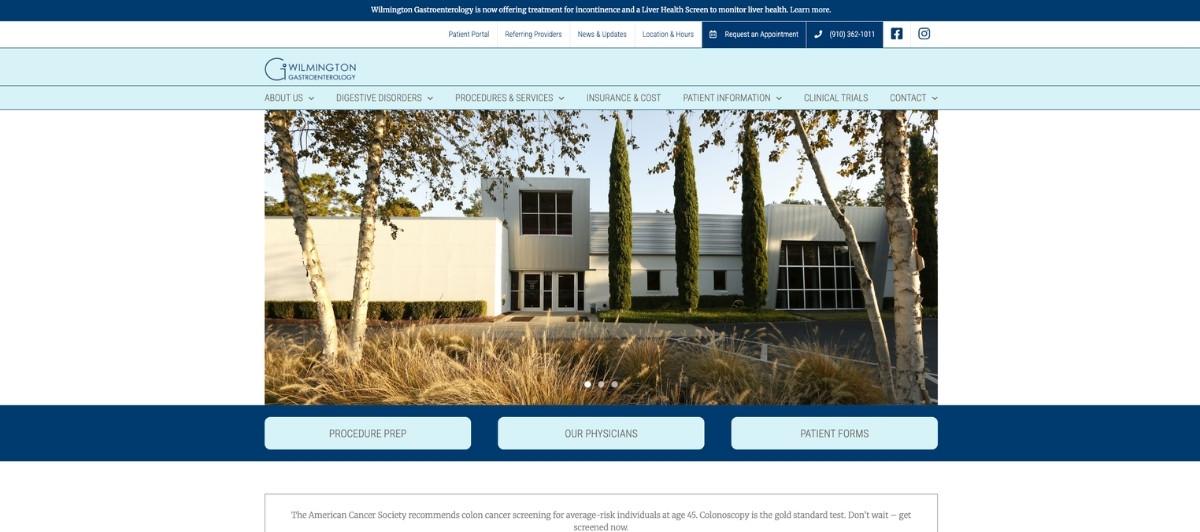
Wilmington Gastroenterology handles two design challenges particularly well: contrast and focus. High-contrast text against background colors makes everything easier to read for patients of all ages. The banner photography uses shallow depth of field to keep the main subjects in focus while the backgrounds blur, creating an immediate visual emphasis on the people rather than the clinical environment. This photography approach makes the site feel human before it feels medical.
5. Manhattan Gastroenterology
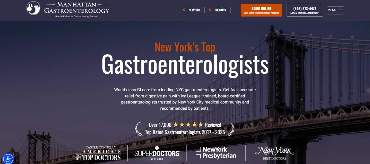
Manhattan Gastroenterology makes a smart trade-off: rather than balancing a high volume of text with competing imagery, the homepage leans into its information density by reducing visual clutter. The result is a site that is information-rich without feeling overwhelming, which serves the analytically minded patient who wants thorough answers before scheduling. For GI practices in competitive urban markets where patients research extensively before committing, this content-forward approach is well calibrated to the audience.
6. Gastroenterology Associates of New Jersey
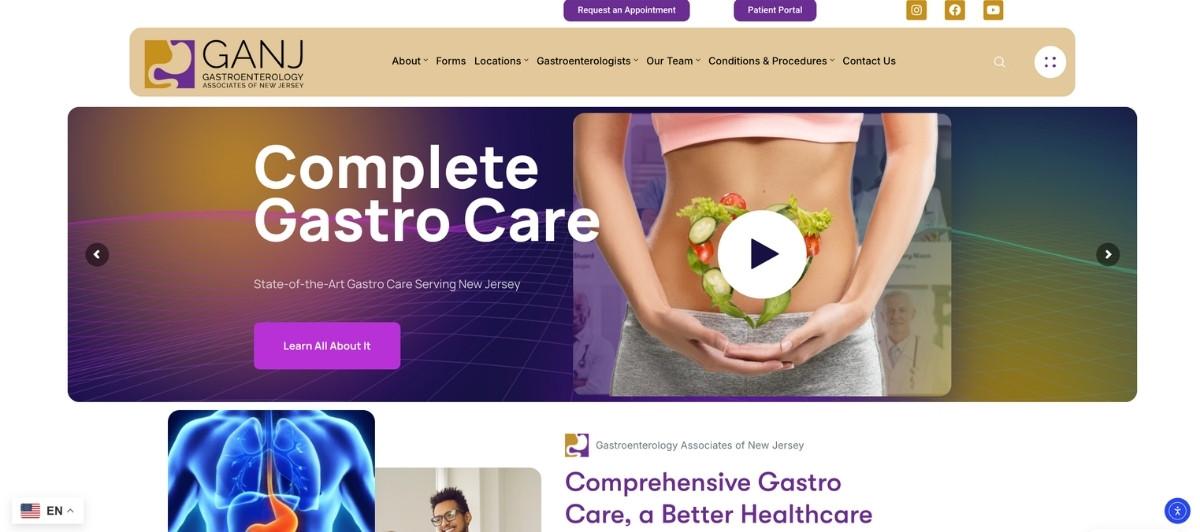
Gastroenterology Associates of New Jersey uses strategic color pops to guide the visitor’s eye toward the most important content on each page, a design technique that improves navigation without requiring the visitor to consciously work at finding information.
The simple, uncluttered layout means patients with high anxiety about digestive symptoms can access what they need without additional cognitive load. For a specialty where patient anxiety is a real conversion barrier, this kind of frictionless navigation is genuinely valuable.
7. Florida Center for Gastroenterology, LLC
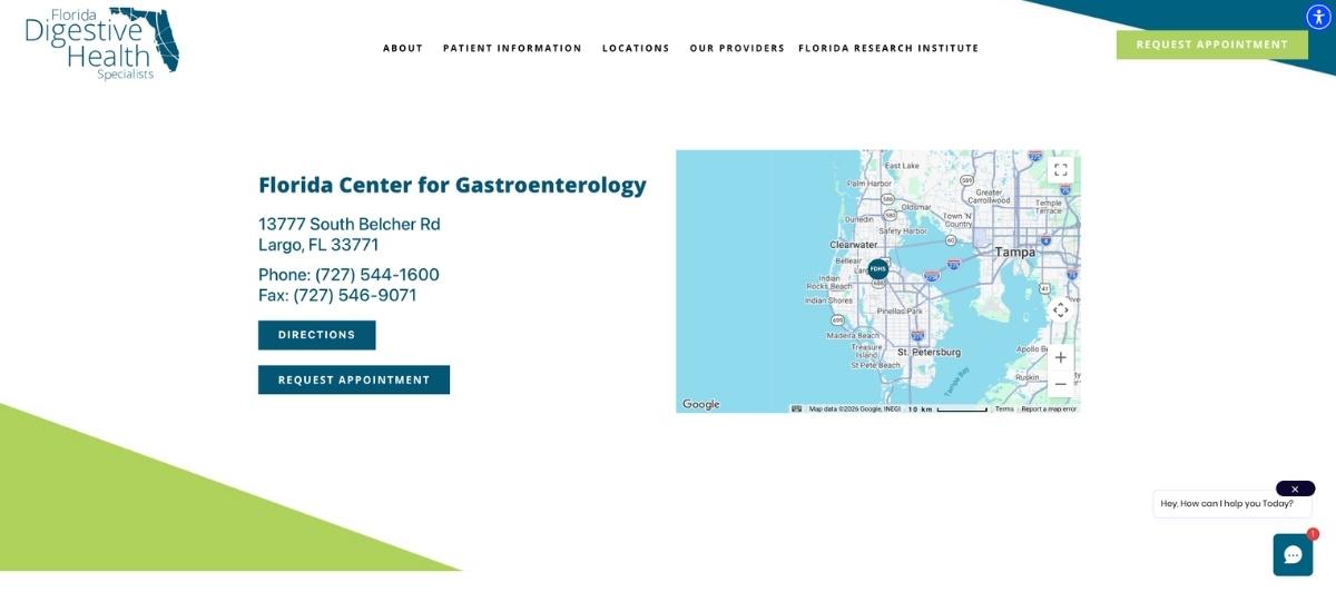
Florida Center for Gastroenterology, LLC demonstrates that a static design approach can be just as impactful as animated or dynamic elements. A single large photo used as a background, with all critical content organized in easy-to-spot positions, creates a calm and focused landing page that doesn’t demand navigation effort from patients who may already feel stressed. For GI practices whose patient population values directness and clarity over visual complexity, this is a strong reference point.
8. Associates in Gastroenterology, P.C.
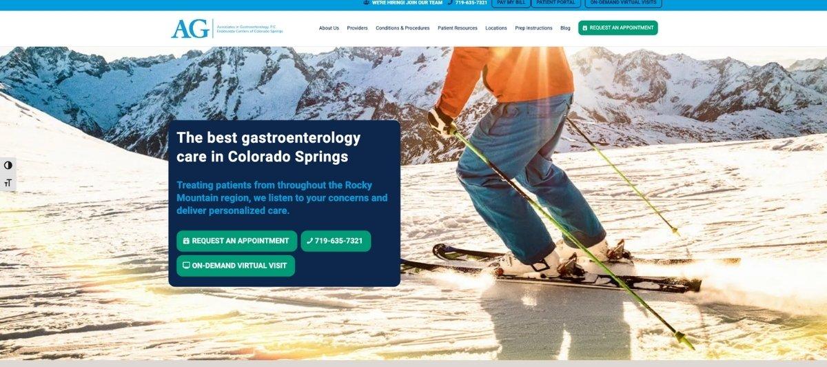
Associates in Gastroenterology, P.C. is one of the clearest examples on this list of designing specifically for an older patient population. Large, bold menu choices remove any ambiguity about where to click, and the comforting photo of an elderly patient in a medical setting immediately signals that this practice understands and regularly cares for patients in that demographic. For GI practices that primarily serve patients over 50, who represent the core audience for colorectal cancer screening and colonoscopy scheduling, this patient-first visual approach is exactly right.
9. Utah Gastroenterology
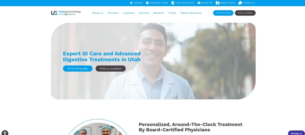
Utah Gastroenterology builds trust from the very first scroll through two deliberate design choices. A positive, warm image of a doctor and patient together communicates a compassionate care dynamic rather than a clinical one.
Menu items that highlight on hover add a subtle layer of interactivity that keeps the experience responsive and modern without distracting from the core function of helping patients find what they need and schedule their first visit.
10. Comprehensive Digestive Institute of Nevada
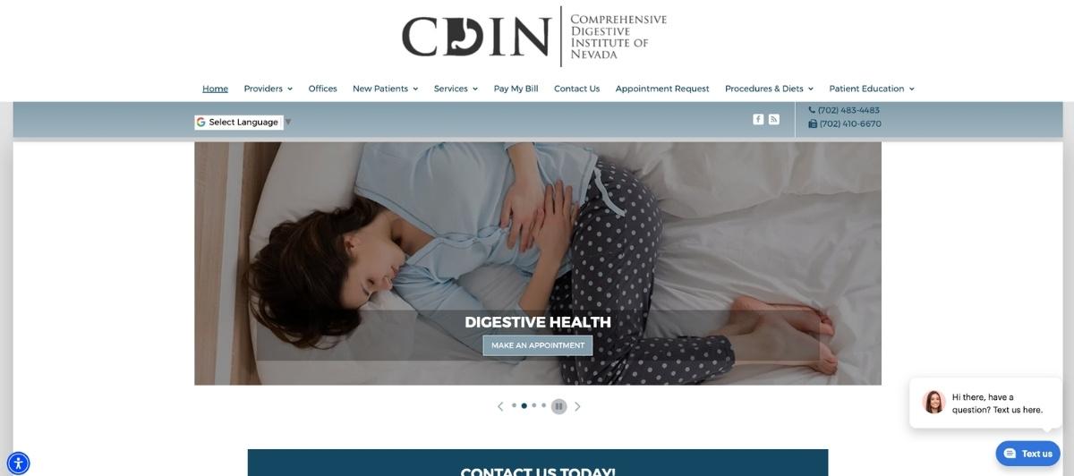
Comprehensive Digestive Institute of Nevada commits fully to a blue-forward design approach that is psychologically well-suited to a gastroenterology practice. Blue as a background hue creates an immediate calming effect on visitors, which is particularly valuable for patients arriving with anxiety about digestive health concerns or upcoming procedures like a colonoscopy. The consistency of this color choice throughout the site means the calming effect compounds rather than disappears after the first scroll.
11. Inland Empire Gastroenterology
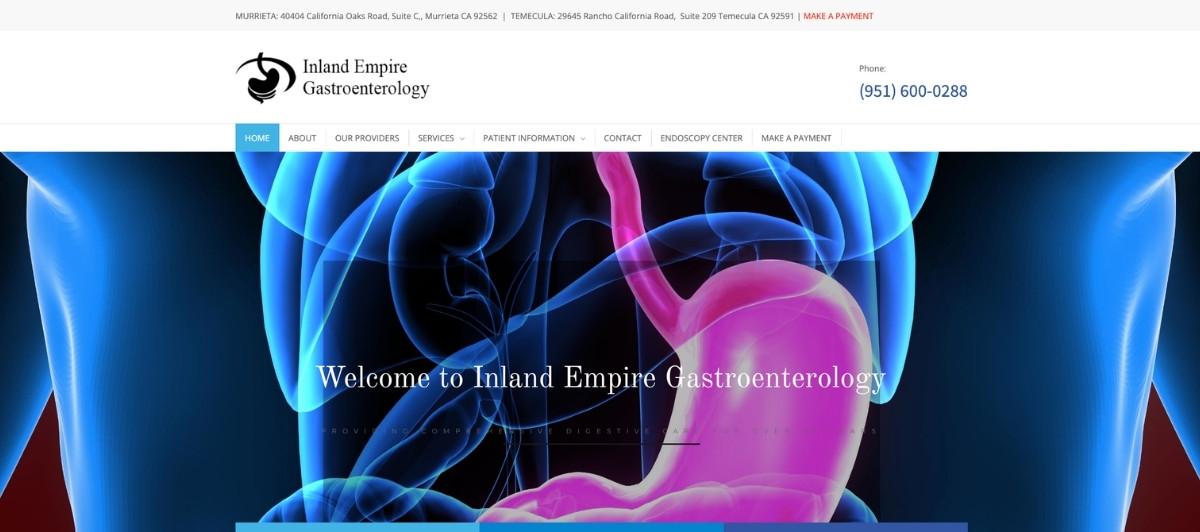
Inland Empire Gastroenterology earns attention for a genuinely unusual homepage feature: a “tiling in” banner effect that creates a sense of technological sophistication from the first second on the page. For a digestive care specialty where patients are often evaluating whether a practice has access to current procedures and technology, the implied message that a technologically advanced website represents a technologically advanced practice is a meaningful trust signal.
12. Greater Michigan Gastroenterology
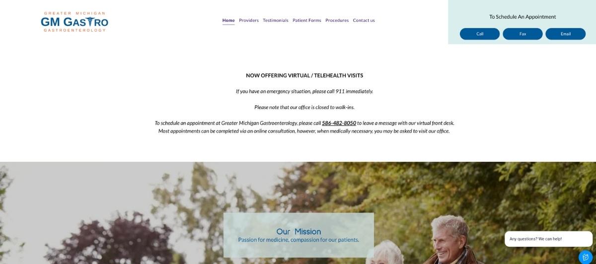
Greater Michigan Gastroenterology takes a deliberately restrained approach, presenting a few elements at a time and allowing patients to scroll through information at their own pace. For patients who feel anxious about digestive symptoms or upcoming procedures, this unhurried browsing experience reduces cognitive pressure and mirrors the kind of patient-centered care the practice presumably offers in person.
13. Texas Digestive Disease Consultants
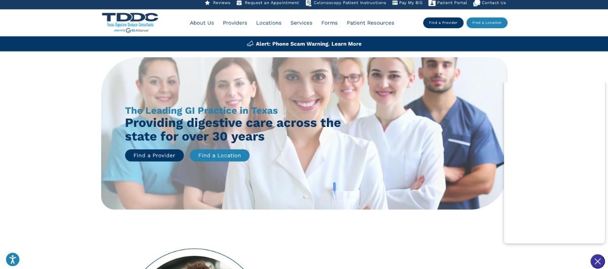
Texas Digestive Disease Consultants demonstrates strong content hierarchy throughout. The most important links and patient resources sit at the top of the homepage where they will be found immediately, while supplementary information occupies lower positions that curious patients can discover on scrolling. A high-quality banner that transitions at a comfortable rate reinforces the professional, unhurried atmosphere that GI patients benefit from experiencing before their first visit.
14. Gastroenterology Specialties, P.C.
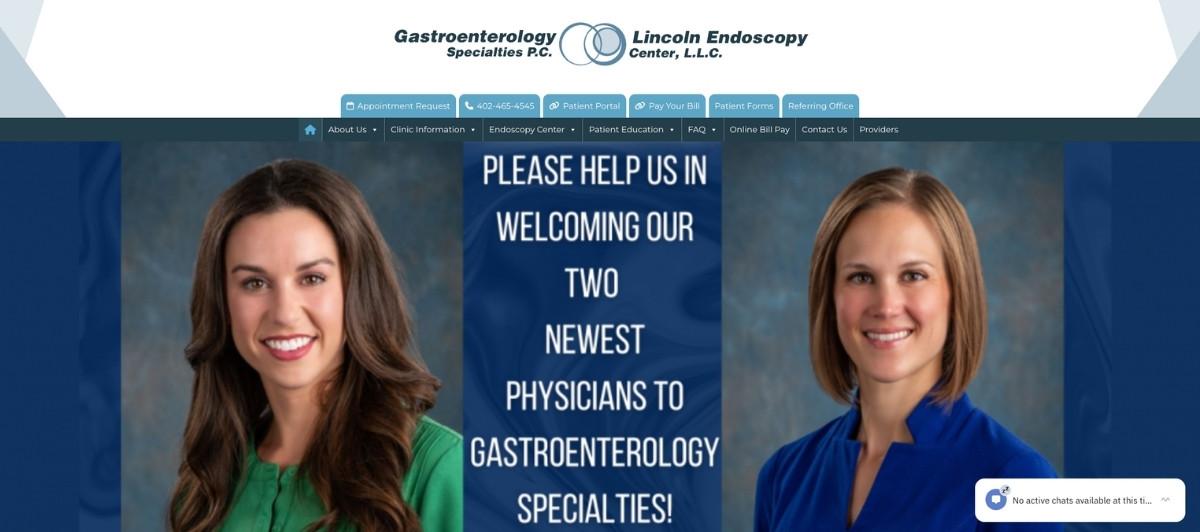
Gastroenterology Specialties, P.C. uses a classic blue-on-white palette alongside large link icons and subtle animation to create a site that feels both trustworthy and easy to use. The icon-based navigation reduces the reading load for patients who arrive with a specific question or concern, letting them identify the right section visually rather than reading through navigation labels. For older patients or those arriving in discomfort, this reduced friction is a meaningful patient experience improvement.
15. Gastroenterology Associates, Inc.
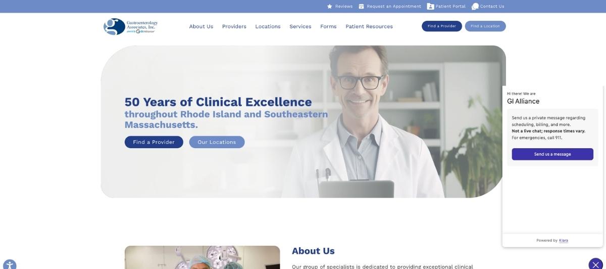
Gastroenterology Associates, Inc. prioritizes one of the most important patient-facing details in GI web design: a prominently displayed phone number. For patients who need to ask questions before scheduling, or who are calling on behalf of an elderly family member, immediate visibility of contact information removes a barrier that costs practices appointments. The two-column layout organizes the remaining content efficiently for patients scanning for specific information.
16. Blount Gastroenterology Associates
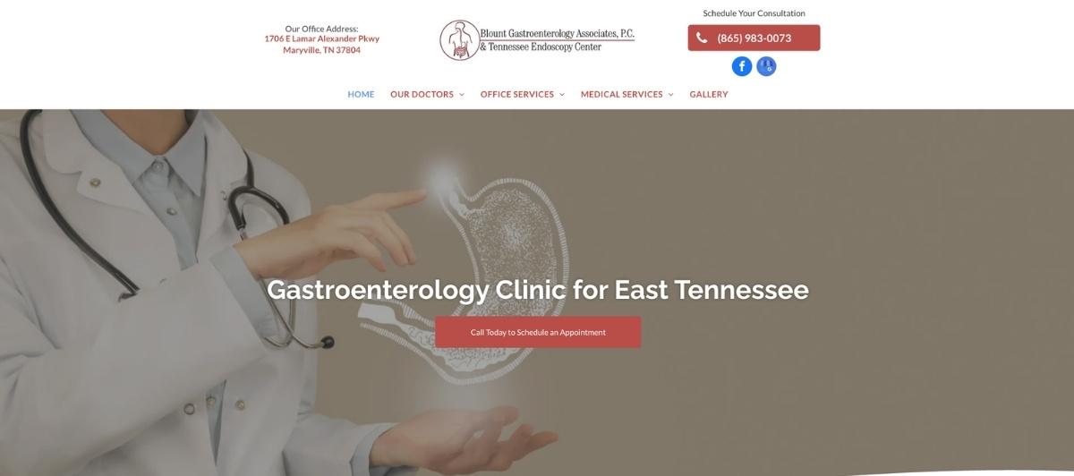
Blount Gastroenterology Associates closes this list with a powerful reminder that simplicity done well is its own form of sophistication. A single banner photo featuring the physician team, paired with straightforward menu choices that direct patients to exactly what they need, creates a homepage that communicates competence and approachability without requiring patients to work to find information. For a specialty where patients often arrive feeling vulnerable, a site that feels effortless to navigate is a patient experience in itself.
17. Grand Teton Gastroenterology
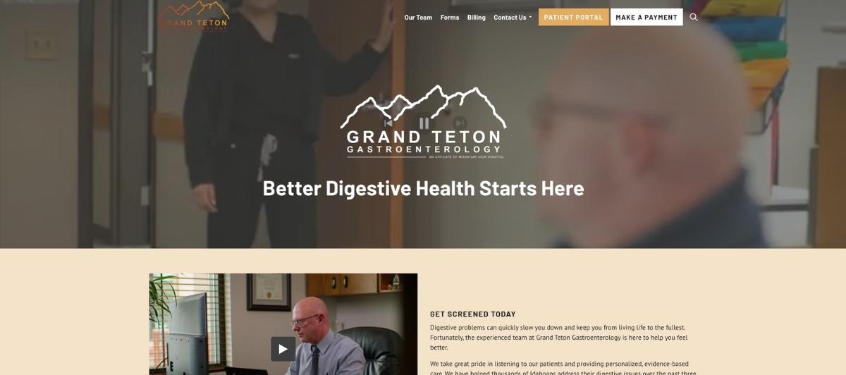
Grand Teton Gastroenterology uses warm orange and red accents against a blue-and-white foundation to create a visual temperature that feels friendlier than standard clinical design without sacrificing professionalism. Menu icons and short paragraphs work together to make the site navigable and informative without demanding too much of patients who arrive already anxious about what their digestive health symptoms might mean.
18. Northern New Mexico Gastroenterology Associates
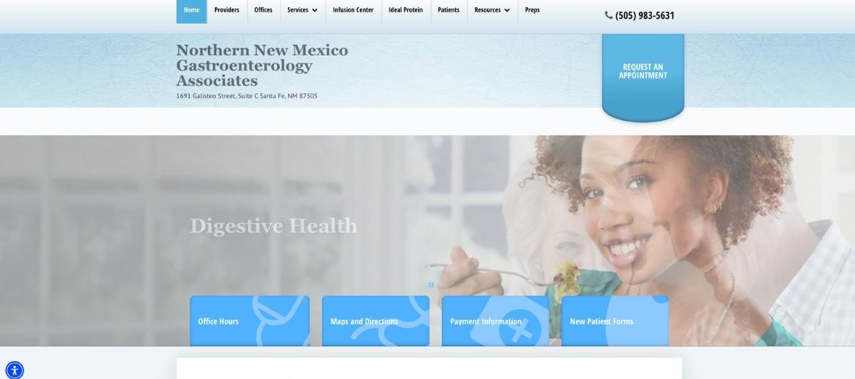
Northern New Mexico Gastroenterology Associates incorporates a small but effective interactive detail: top menu items invert their colors on hover, making navigation options clearly distinct and easy to identify. The easy contact form at the bottom of the homepage serves patients who prefer writing to calling, offering an additional access point for scheduling that accommodates different patient comfort levels with the first contact step.
Design choices worth applying to any gastroenterology website
Looking across all 18 gastroenterologists websites above, several consistent design decisions distinguish the practices that convert anxious patients into scheduled appointments. Here’s what’s worth prioritizing.
Use calming color psychology deliberately
The prevalence of blue across the most effective gastroenterologists websites is not coincidence. Blue communicates trust and clinical competence while also creating a calming physiological response in viewers.
For a specialty where patients arrive managing anxiety about digestive health symptoms, IBS, colon cancer concerns, or upcoming colonoscopy procedures, this color choice does genuine patient-care work. Practices that choose warm accents alongside blue, as Grand Teton Gastroenterology does, strike a balance between clinical credibility and human warmth.
Publish plain-language content about procedures
You can keep patients engaged and build trust by offering valuable resources such as educational blogs, video explainers on treatment options, and downloadable guides. Patients preparing for a first visit with digestive health concerns often arrive after extensive online research that has increased rather than reduced their anxiety.
A GI website that explains colonoscopy preparation, describes what to expect during a first appointment, and provides clear information about colon cancer screening age recommendations and polyp identification gives those patients something far more valuable than design alone. Our SEO services help gastroenterology practices build exactly this kind of patient-serving content strategy.
Make the phone number visible on every page
Gastroenterology patients frequently need to talk to someone before they feel ready to schedule. A prominently displayed phone number in the header, on the homepage, and accessible from every page removes one of the most common barriers between a concerned patient and their first appointment. Gastroenterology Associates, Inc. is one of the clearest examples of this done right on this list.
Design for accessibility, including older patients
Colon cancer screening guidelines recommend regular colonoscopy starting at age 45 for average-risk individuals, which means a significant portion of a GI practice’s new patient base is in their mid-40s to 70s.
Large typography, high contrast, simple navigation, and easy-to-read font choices all serve this demographic and make the site more effective as a patient acquisition tool. Hawaii Gastroenterology Specialists and Associates in Gastroenterology, P.C., both demonstrate what this looks like executed well.
Build dedicated service pages for core GI conditions
Patients searching for specific conditions, including IBS, acid reflux, colorectal cancer, colon cancer screening, and digestive care for specific age groups, need pages dedicated to those topics. These pages serve both the patient’s information needs and the practice’s local search visibility. Our web design team builds healthcare sites with this condition-specific page structure as a standard component.
What every gastroenterology website needs
Whether your GI practice has two physicians or twenty, these are the elements every gastroenterologist website should have in place to serve new patients and grow the practice.
- Online appointment scheduling or a prominent phone number, above the fold. The first action a new patient takes should require minimal effort. Either a direct booking tool or an immediately visible contact number removes the barrier between a patient’s decision to seek care and their first confirmed appointment.
- A clear new patient section. What to bring, how to prepare, what to expect on the first visit, and how to complete intake forms are the questions every new patient has. A dedicated section addressing these reduces pre-appointment anxiety and the volume of calls from patients seeking basic logistical information.
- Physician bios that are human, not just credentialed. Patients choosing a gastroenterologist for a sensitive digestive health concern want to feel some connection to the person they’re about to discuss their symptoms with. A bio that includes not just credentials but a brief note about the physician’s approach to patient care gives new patients that connection before the first appointment.
- Clear information about colon cancer screening and colonoscopy. Colon cancer is one of the most preventable cancers when caught early, and colonoscopy remains the gold standard screening tool. A GI website that explains who should be screened, at what age, and what the procedure involves serves a genuine public health function while also capturing the high-intent search traffic of patients actively researching these topics.
- Mobile-first design and fast load speeds. Most people browse from their phones. A mobile-responsive design ensures the site looks good and functions smoothly on any device. Our WordPress speed optimization service keeps healthcare websites performing well across all screen sizes and connection speeds.
- ADA-compliant design. Gastroenterology patients include a high proportion of older adults and individuals managing chronic conditions. ADA compliance ensures every patient can access the site’s information and scheduling tools regardless of visual or motor limitations. Our WordPress ADA compliance services help medical practices meet these standards without compromising their visual identity.
Your GI practice deserves a website as knowledgeable and reassuring as your team — Freshy builds that
The best gastroenterologists’ websites share one quality: they make anxious patients feel, before a single appointment is scheduled, that they have found a practice that understands their concerns and will treat them with competence and care. Every design decision, from the calming color palette to the plain-language procedure explanations to the accessible navigation, should serve that first moment of trust.
Key takeaways:
- Blue color psychology creates genuine calming effects on patients arriving with digestive health anxiety
- Plain-language explanations of colonoscopy, colon cancer screening, and IBS reduce pre-appointment anxiety and increase scheduling rates
- A prominently displayed phone number on every page serves a significant portion of GI patients who prefer to speak before booking
- Large typography and accessible navigation design serve the older patient demographic that represents a core GI audience
- Physician bios with a human element help patients feel connected to their provider before the first visit
- Dedicated condition pages improve both patient experience and local search visibility for high-intent GI searches
If your gastroenterology practice website isn’t generating the appointments your team’s expertise deserves, start a conversation with us and let’s build something that does. You can also browse our healthcare portfolio to see the standard we bring to medical practice websites.
FAQs
What makes a gastroenterology website effective for new patients?
The most effective gastroenterologists’ websites combine calming color design, plain-language explanations of procedures like colonoscopy and colon cancer screening, prominent contact information, physician bios with a personal element, accessible navigation for older patients, and a clear new patient section that answers logistical questions before the first visit.
Why is color so important on gastroenterology websites?
Patients arriving to research digestive health concerns or schedule GI procedures often carry significant anxiety. Blue color palettes create a calming, trustworthy visual environment that reduces that anxiety before any content is read, which improves the likelihood of a new patient proceeding to contact the practice.
Should gastroenterology websites include educational content about conditions?
Yes. Content covering IBS, acid reflux, colorectal cancer, colon cancer screening guidelines, colonoscopy preparation, and what to expect from a first GI appointment all serve patients who are researching before scheduling. This content also builds the local search visibility that brings new patients to the site in the first place.
How important is accessibility for gastroenterology websites?
Critical. Colon cancer screening recommendations begin at age 45 for average-risk individuals, meaning a significant portion of new GI patients are middle-aged or older. Large fonts, high contrast, simple navigation, and ADA-compliant design ensure every patient can access the site comfortably, regardless of age or ability.
How much does a gastroenterology website cost?
A professionally built gastroenterology website typically costs $3,500 to $12,000, depending on the number of physician profiles, condition and service pages, patient portal integration, online scheduling tools, and whether ADA compliance and local SEO structure are included from the start.
What digestive health information should a GI website include?
The best gastroenterologists websites cover common digestive health topics, including IBS, acid reflux, Crohn’s disease, and general gut health tips. Clear, patient-friendly explanations help visitors understand their symptoms and feel confident seeking care.
How should a gastroenterology website address colon cancer screening?
It should explain who needs screening, starting age guidelines, what a colonoscopy involves, how polyps are identified, and what happens after the procedure. This reduces fear and positions the practice as a knowledgeable, trustworthy resource for colorectal cancer prevention.
How can a GI website improve the patient care experience before the first visit?
By publishing first visit guides, preparation instructions, insurance information, and physician introductions. When patients arrive already informed and reassured, the care experience starts before they walk through the door, reducing anxiety and improving satisfaction from the very first appointment.