

Most contractors rely on word of mouth, Angi, or HomeAdvisor to fill their pipeline. And while those channels have their place, the biggest financial mistake contractors make is building their entire business on a platform they don’t own. When you stop paying, the leads stop coming. Your own website is the one asset that compounds over time.
This article breaks down 50 of the best contractor websites and, more importantly, what makes each one win more business.
Here’s what we cover:
- What separates a high-converting contractor website from a forgettable one
- 50 standout contractor websites, reviewed and analyzed
- The design and trust signals that turn visitors into booked jobs
- What every contractor website needs to generate consistent leads
- How to build a site that works for you around the clock
We’ve built websites for contractors and service businesses across the US, and the team here knows exactly what it takes to turn a site visit into a phone call. Take a look at our work to see what that looks like in practice.
What the best contractor websites have in common
Walk into a job site with sloppy equipment, no signage, and no crew in branded gear. Would a client trust you with a $50,000 renovation? Probably not. Your website sends the exact same signals before anyone picks up the phone.
The best contractor websites aren’t necessarily the flashiest. They’re the ones that answer three questions within the first five seconds of landing on them:
- What do you do?
- Do you do it in my area?
- Can I trust you?
Most contractor sites fail at least one of these. Here’s what the top performers get right across every trade, from general contractors to HVAC specialists to industrial subcontractors.
- They lead with outcomes, not services. There’s a real difference between “We offer roofing services” and “We’ve re-roofed over 300 homes across [city] since 2008 with zero callbacks.” One describes a task. The other communicates expertise, scale, and accountability. Potential clients aren’t buying a service. They’re buying a result and the confidence that you’ll deliver it.
- They make their niche undeniable. A contractor passionate about high-end kitchen renovations should own that on every page. A firm with deep experience in industrial builds should make that the centerpiece of their vision and messaging. The more specific your positioning, the more easily your ideal clients self-select, and the less time you spend chasing the wrong ones.
- They treat every page as a landing page. The best contractor sites assume that visitors won’t start on the homepage. A client searching “bathroom remodel contractor [city]” lands on a service page, not a homepage. That page needs to do the full job: communicate the service clearly, show relevant work, build trust, and prompt a next step. Every page in isolation should be able to convert.
- They show the people behind the work. Clients aren’t just hiring a business. They’re hiring someone who’ll be in their house, managing their budget, and leading a team of employees and subcontractors through a process that’s stressful by nature. A face, a name, a story about why you got into the trades, these details create the kind of human connection that a list of services never will.
- They reflect how the market actually searches. Most homeowners don’t Google “general contractor.” They search “kitchen remodel cost [city]” or “licensed HVAC contractor near me.” The best contractor websites are built around the specific language real clients use, with service pages and blog content that connect directly to those searches and bring in organic traffic over time.
50 standout contractor websites, reviewed and analyzed
Being a contractor, you only make money when you work. To get work, you need to put yourself out there. One of the most popular ways to reach people now is through a great website, but what makes a website stand out? A noteworthy website gives people the information they need while selling their services without being off-putting.
If you want to create a great website, you should know what one looks like. Here are the best contractor websites for 2026:
1. House of Bohn

This site has everything a good contractor site should have. It is attractive and clean, and it displays a particular aesthetic. Also, it’s easy to navigate. Even better, it also gives a little insight into the company with a message from the owner, complete with a picture.
2. Acclaim Contractors

Some website designs are a little riskier than others. Acclaim Contractors makes the bold decision to put the whole website in monochrome. This makes the site easy to remember when looking back at the other sites you’ve seen. It’s unique and modern. They use vivid pictures of their work as civil and commercial contractors. They also use buttons at the bottom of the page for people to locate important information easily.
3. The Spaces
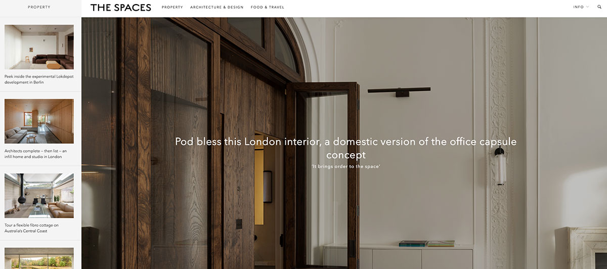
The Spaces’ site uses a clear geometrical design. They use plenty of white space in between high-quality images, which all go together nicely. There are even some pops of red and blue that stand out, and there are a number of links at the top of the page that are easy to navigate.
4. Max Home
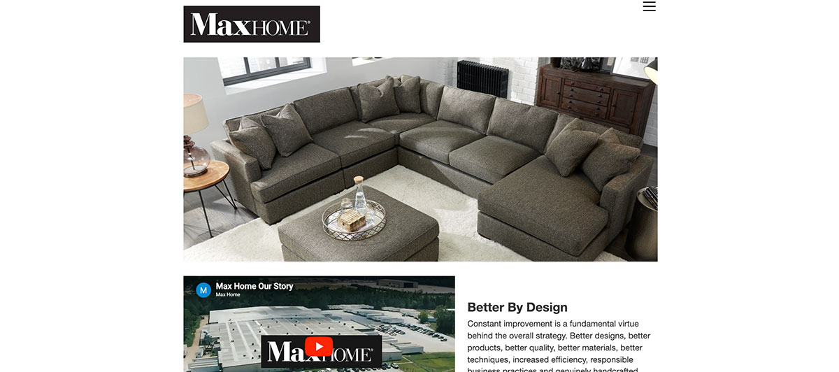
This site is for a construction company that focuses on home improvements. They have a fantastic way of making their services apply to you. The main page even has a picture of a father and daughter, really driving in the fact that the company can make a great home for you and your family. They also place effective calls to action through the site, starting with a large announcement for 60% off installation. That’s sure to get plenty of attention.
5. Contractors Reporting Services
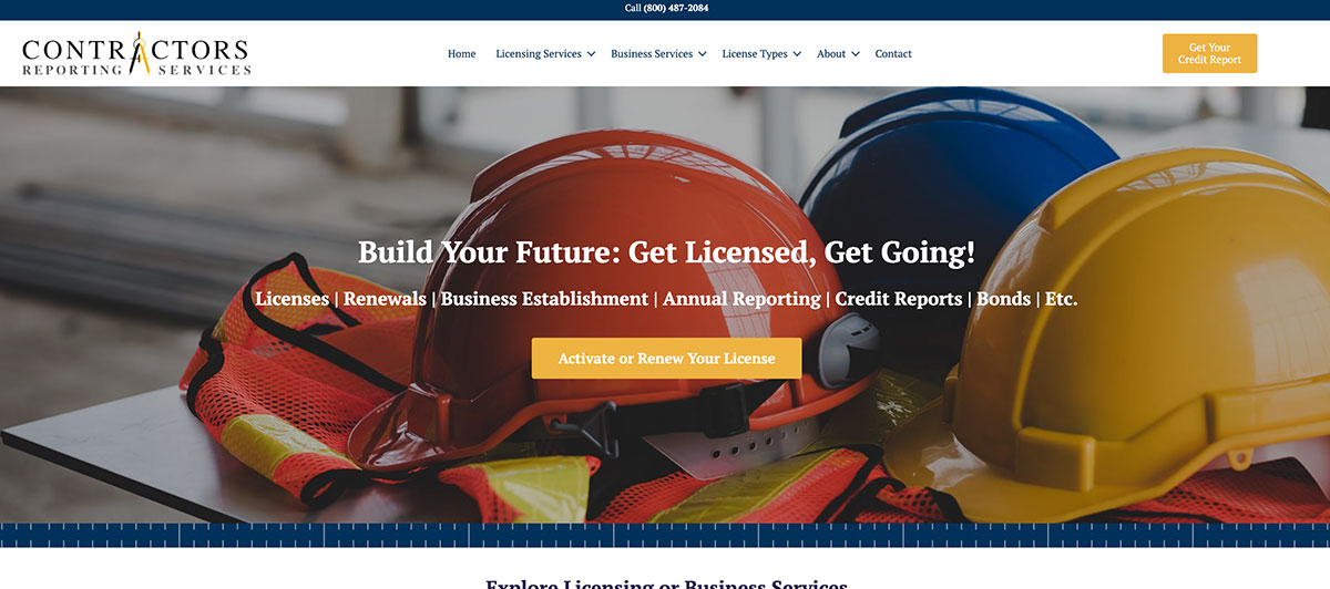
This site puts a lot of information into an extremely simple format. They use links on the top of the page and divide them up into six categories to help separate information. They also use an image on the homepage to add to the visual appeal. There is plenty of white space, so you don’t feel overwhelmed.
6. Sundt Construction
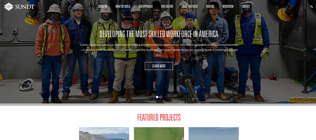
Sundt Construction has been in the business since 1890, and their website communicates that legacy without feeling dated. What makes it stand out is how prominently the company’s employee-ownership model is featured throughout the site. It’s not buried in an About page footnote. It’s woven into the messaging as a core value proposition, signaling to potential clients that everyone on the team has a personal stake in the outcome of every project.
7. Bama Contracting
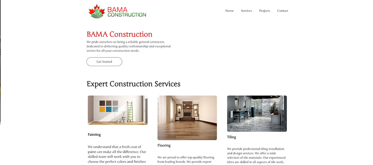
This site uses colors that stand out. The business also makes their site extremely clear and easy to follow. It’s inviting and informative. Even better, they have a very strong call to action. Their tagline, “Building the future, restoring the past” helps you understand their extensive services, too.
8. Continental Electrical Construction

This site does a great job of making it easy for visitors to browse through information. They also do an excellent job of demonstrating what they do with images. The layout is simple, but it’s clear. It also makes good use of the red color.
9. Straub Construction
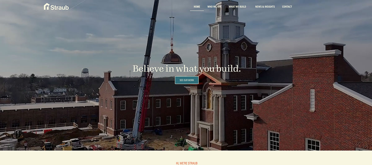
On the main page, you get a portfolio of completed work you can browse through. Elsewhere on the site, you can actually go through some projects in more detail. You can actually see the progress of these. The design also labels different areas on the site quite easily while describing the company values.
10. Daw Green

Daw Green’s website is unique and cool. The layout catches your eye, but it’s also easy to understand. The site uses professional photography that really shows off past work and the company’s office culture. They even point out something that makes them special: their dedication to the environment.
11. Miller Homes

This brand focuses on residential homes for families. They appeal to their audience by including a picture of a young couple on their main page. Using stock pictures can be very effective at times, not to mention inexpensive. They also appeal to their audience with the tagline on the main page, “The place to be.” They include a section on what makes them different right under the featured picture and above another picture of their work.
12. SPIE Matthew Hall
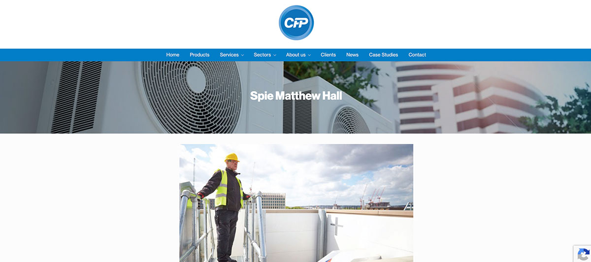
This site helps tell you where to look. There is a high-quality color image of a construction site. Underneath it, every block of information is a different color. This is particularly effective since the menu on the left of the screen is simple and not especially colorful.
13. Jova Construction

This website makes a point to stand out from the crowd. It uses an extremely interesting font that resembles computer code. They also use plenty of pictures to really show you what they can do, which is perfect for people who take in information visually.
14. Laing O’Rourke

This site uses a unique and extremely creative design. As a contractor, this helps validate them as a creative force. They also use a unique name and domain name that makes them easy to find in search engines.
15. B and H Builders LLC
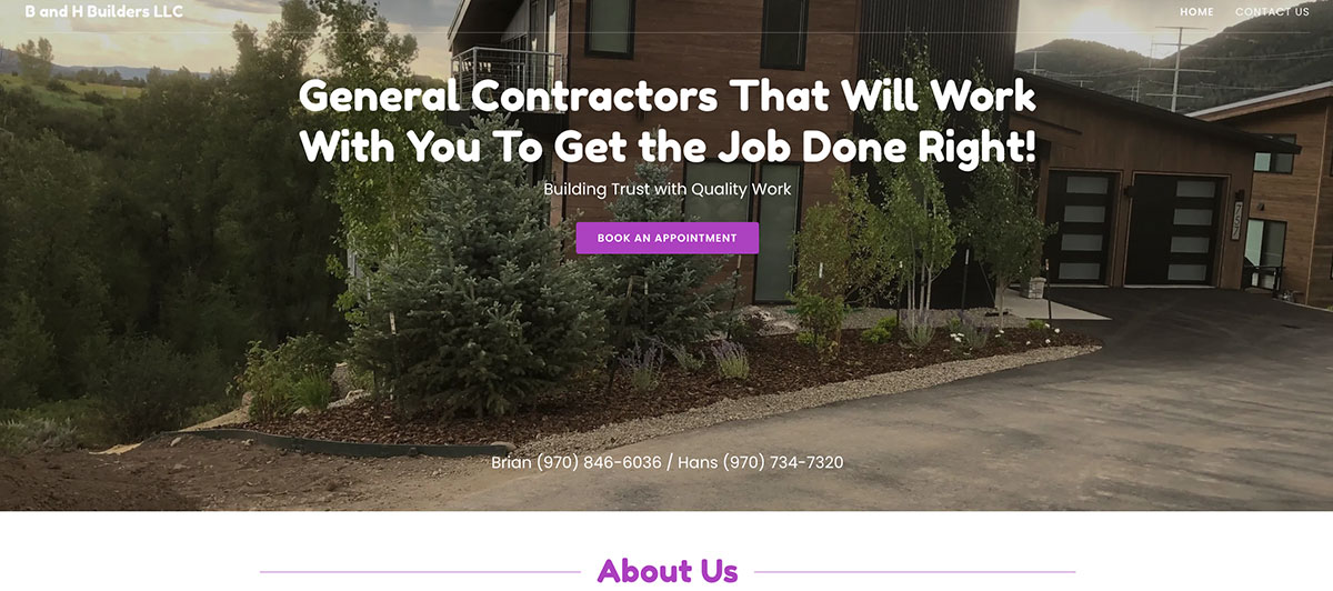
The site uses a simple layout with images of their work done. They have pictures that explain the different services they offer. There’s also contact information at the bottom of each page and a contact page.
16. The Kitchen Master
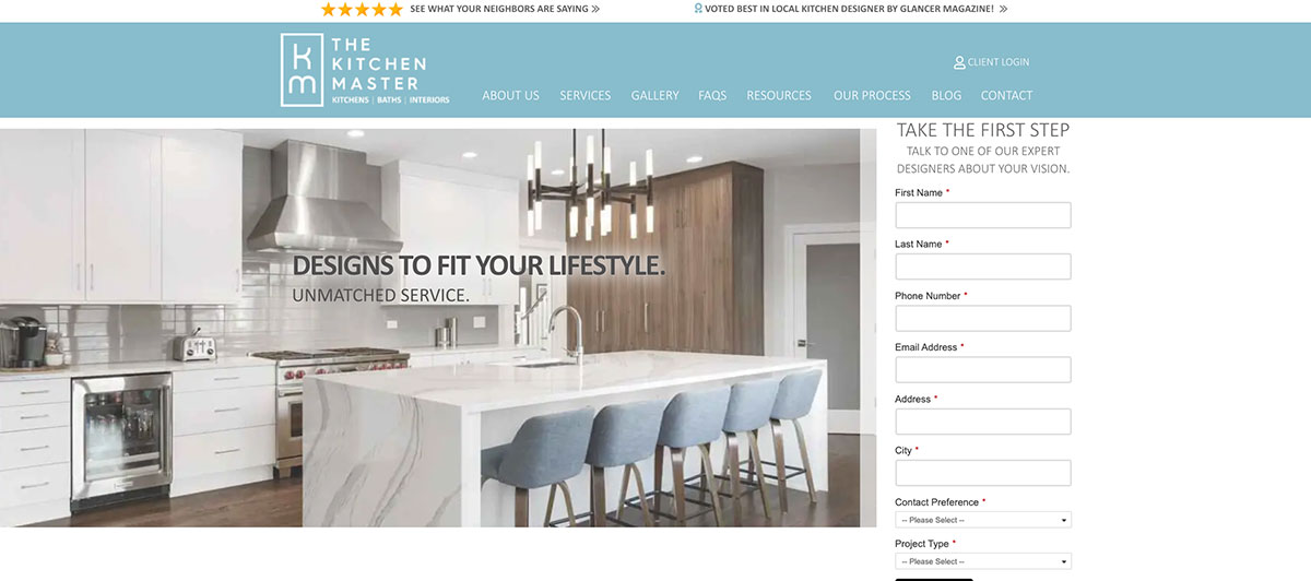
This website understands the concept that sometimes simple is better. The colors are neutral, and the color scheme of the site perfectly matches the main picture. It’s a great showcase of talent. Social media links are on the left side. On the right side, there’s a contact form that also quickly goes over company values.
17. Fredman Design Group
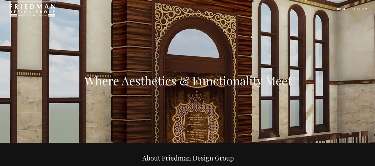
This site is extremely simple. It uses a black background to let examples of the company’s work shine. Under the main picture, they show more examples of their work. They describe the unique aesthetic of each picture, allowing the person looking at the site to pick the one that best matches what they want for themselves.
18. Luck Stone
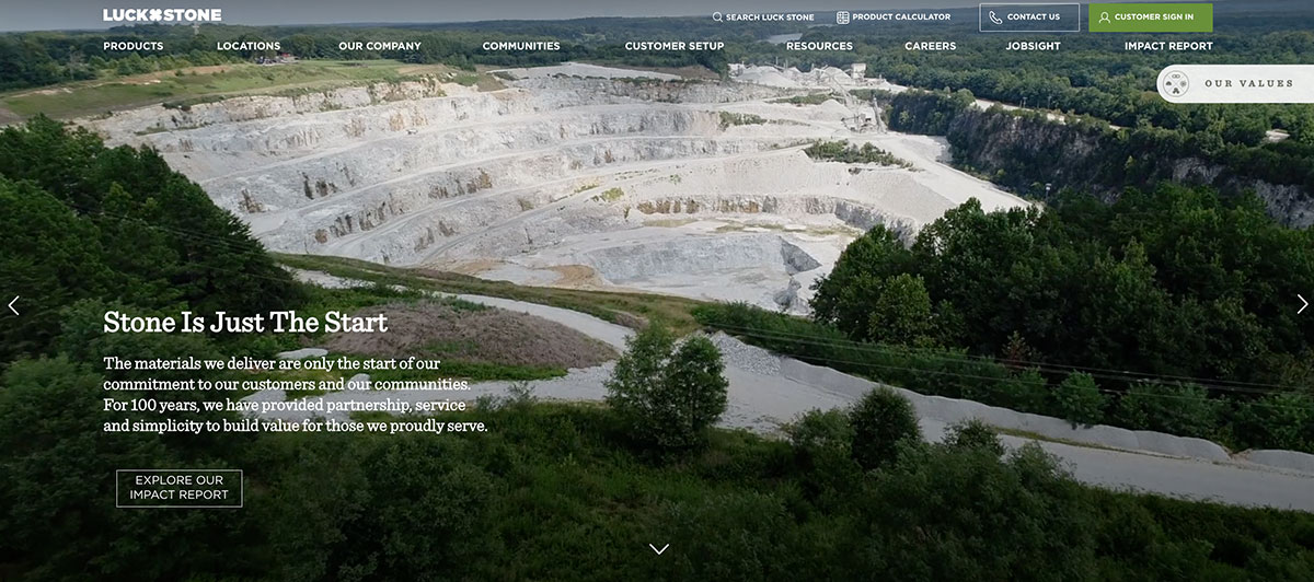
One of the most important parts of construction is stone. This website makes a complicated topic easy to understand. Simply select what you need the stone for, and they can help get you started on your project. You can also see the evolution of the company.
19. First American Roofing
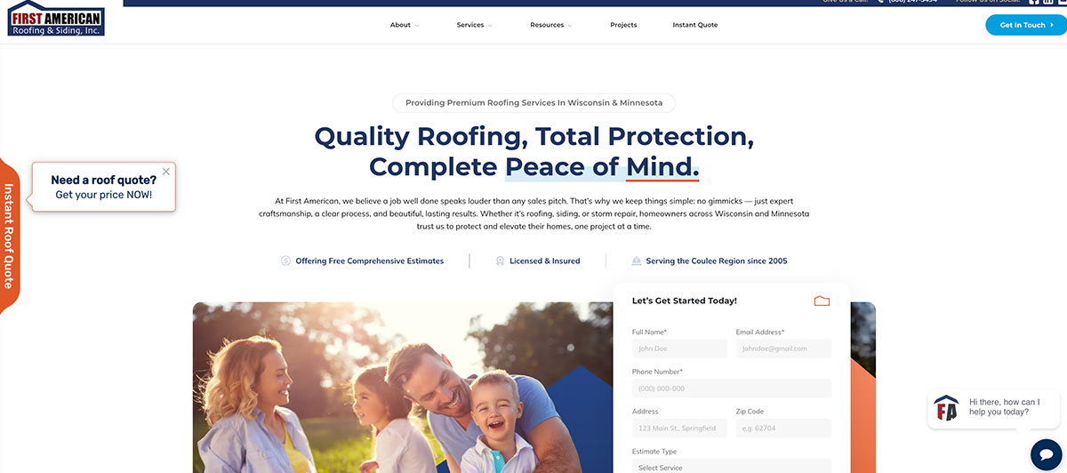
This website uses bright colors and vibrant pictures of the homes they have worked on to grab the viewer’s attention. Answers to many commonly asked questions are presented right on the front page, along with a dialog box to receive text messages from a representative to get more personalized answers.
20. Stonewood Construction

This site uses the imagery of wood to really push the idea of what the business does. It is also extremely easy to navigate. They have four sections on the main page, and you can find a couple of simple links at the top, including projects, testimonials, about, and contact.
21. Weitz
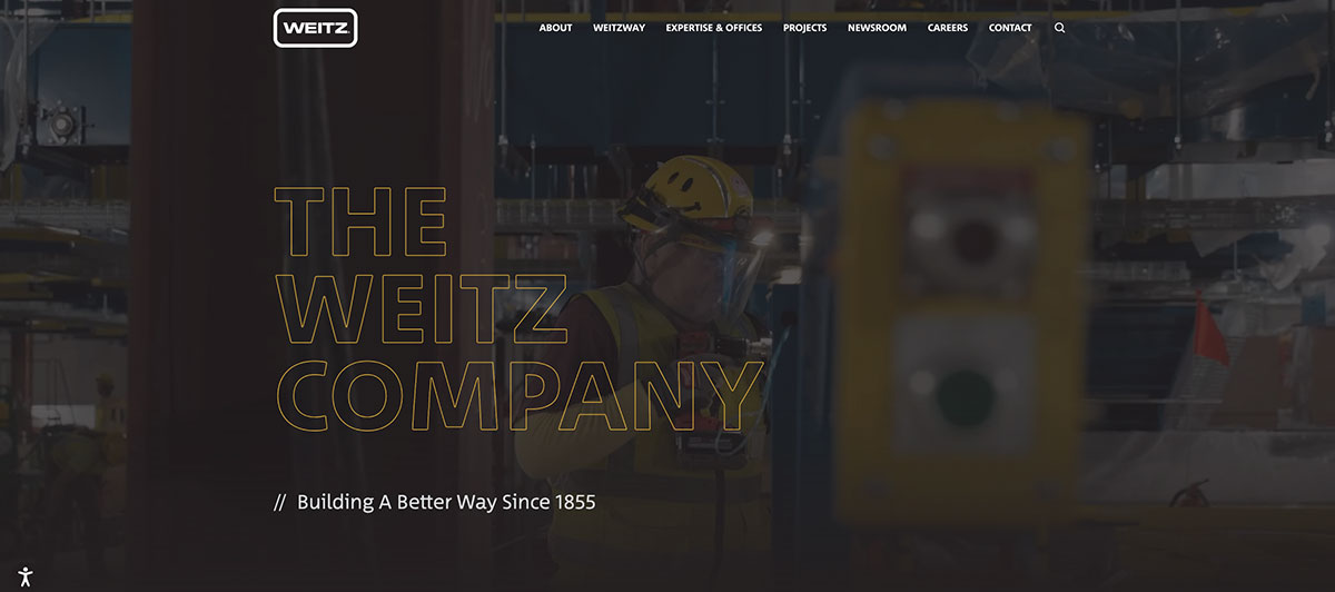
Take a look at five different examples of completed projects right on the main page. They use an attractive and easy-to-read color scheme of black and yellow. There are very simple links at the top of the page, and they also include testimonials toward the bottom of the page.
22. Olso DC
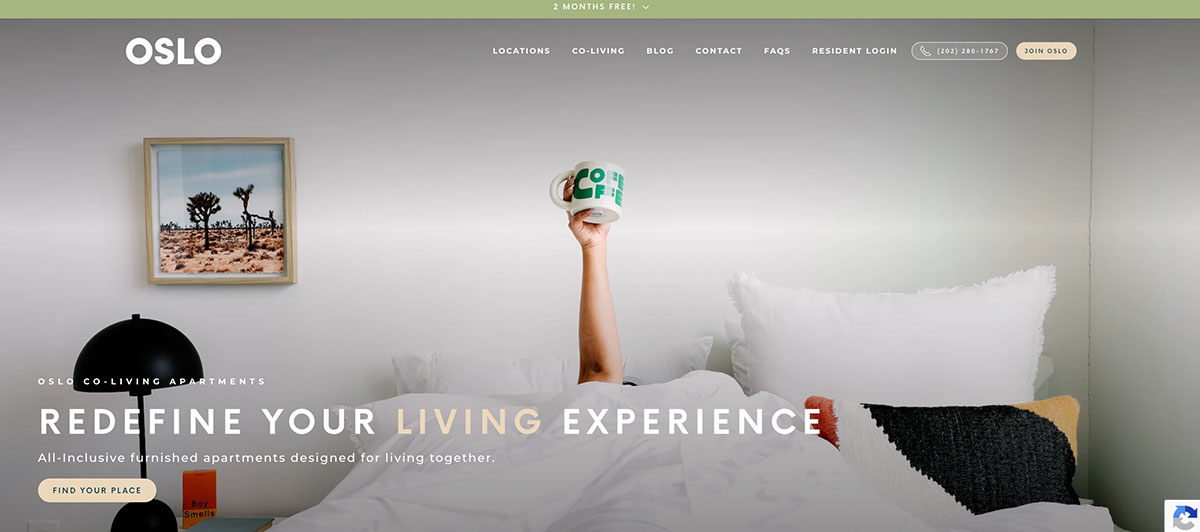
One of the best parts of this website is the extremely impressive collection of pictures of the brand’s work. They separate their work clearly into residential projects and commercial projects. You may have even driven past some of these large, gorgeous buildings. They also make a point to introduce you to the team, which is always nice.
23. Hitachi Construction Machinery

This site is big and busy, and it offers a lot. This mimics the philosophy of the company itself. They use colors that match their machines, making the site look coordinated. While the page has a lot on it, it’s easy to find whatever you may need.
24. Adair Homes

The site explains the services right off the bat by stating they do custom homes. They also have a pretty picture of a home that looks like an average home of one of their customers. They also demonstrate their credibility by saying they’ve been in business since 1969.
25. L. E. Burgess

This page makes it very clear how to communicate with people who visit your site. They put in multiple links that allow the visitor to reach out for more information. They also put their number prominently at the top of the page because there’s an assumption that when someone goes to the page, they want the services.
26. Teague Construction
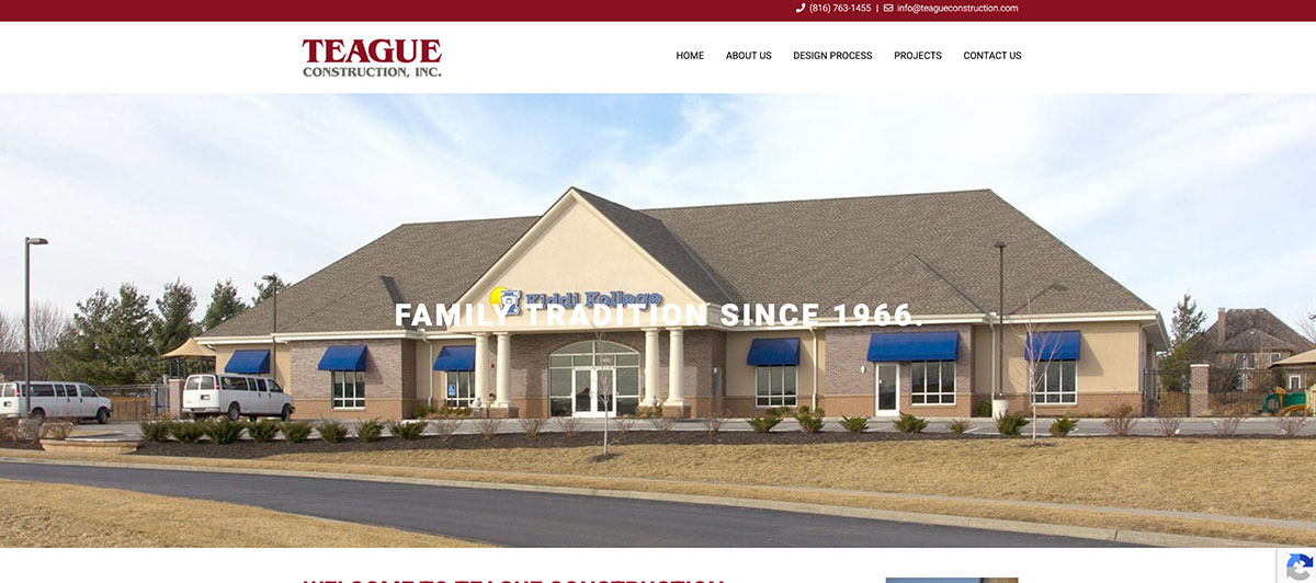
The red color on this site really pops. They, like many others on this list, put their experience, featuring their established date, right on top of the main picture. Of course, the featured image is high in quality and a great demonstration of their experience.
27. JDuggan & Associates
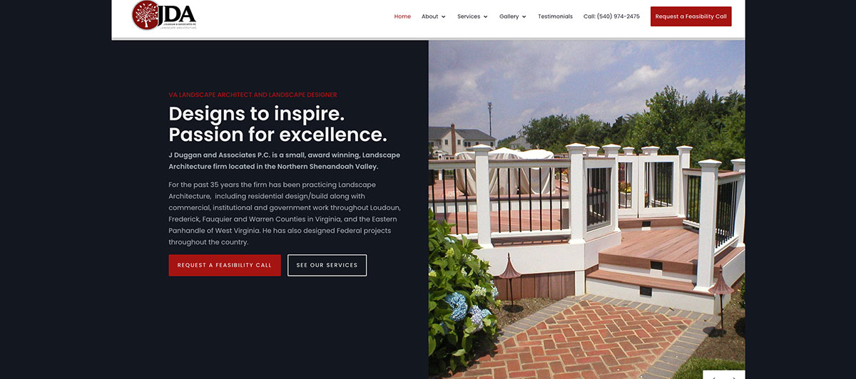
This site uses a fantastic white, red, and black color scheme and separates information using boxes to stand out from other sites. They even scatter the sections a little unevenly without being too chaotic.
28. Square Footage
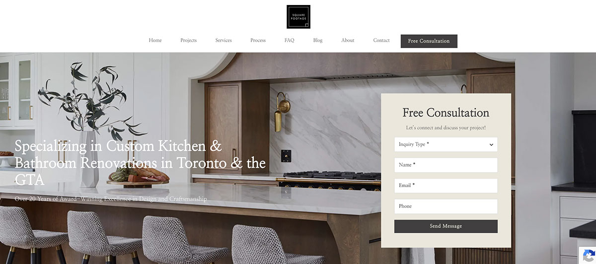
The website makes it clear what they do: renovate kitchens and bathrooms. They even make it clear how they go through the procedure in a detailed, five-step process. Square Footage’s site uses high-quality pictures to show you what they have done in the past. They even add a dog in some of the pictures to really target their audience and make the pictures feel like home.
29. Bechtel

This site showcases the most impressive project of the company right away on the main page. At the top, they have the company logo with a number of different links. One unique feature is the ticker that scrolls through relevant news.
30. Mosaik Design and Remodeling
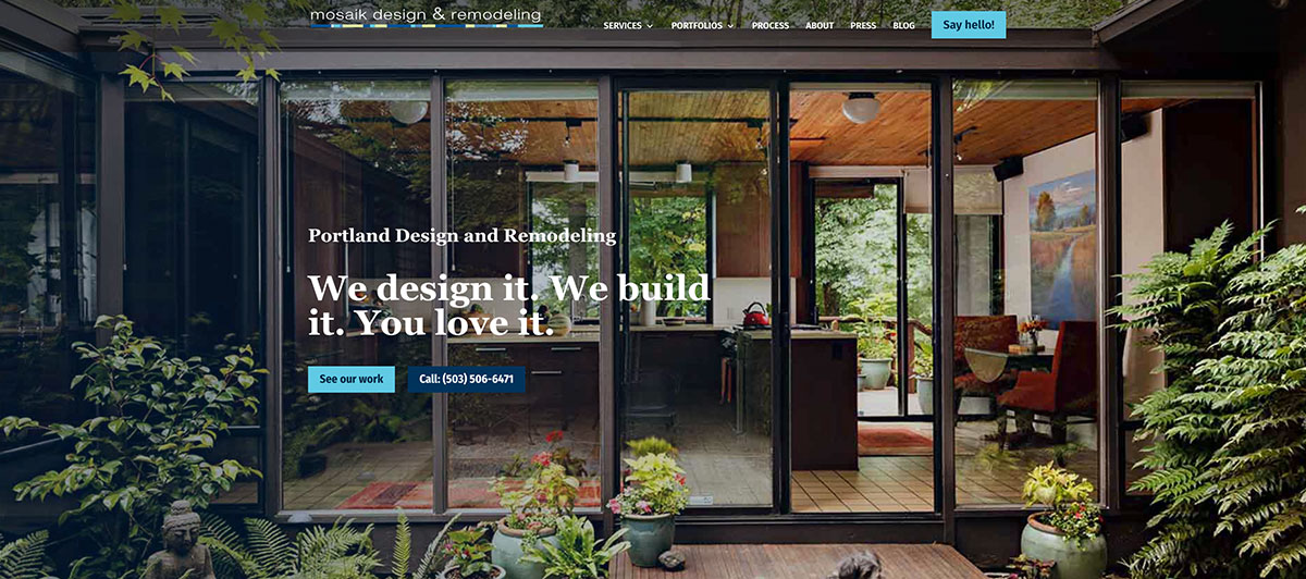
The main picture is high in quality and absolutely stunning. It showcases a house with glass doors and a wooden interior. The outside is surrounded by lush vegetation, a walkway, and a dog. A noninvasive link invites you to look at some more of their work. Further down, you are given all the information you could want about their services in a very clear format.
31. Interserve
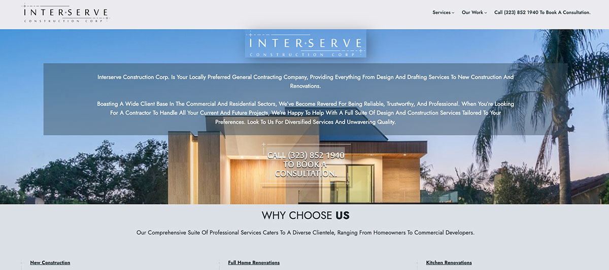
This large business knows that they need a website that can describe everything they have to offer. They have to put a lot of information in a small space, but they also need to make it attractive. This site does all that and more.
32. North American Roofing
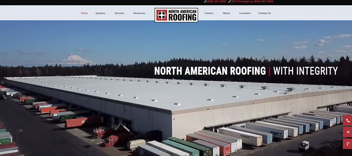
This page understands how important a cool-looking website can be. It uses a 3D style that definitely makes you want to see more. You even see right away that they’ve been in business for 40 years, thus building trust.
33. Adorned Homes
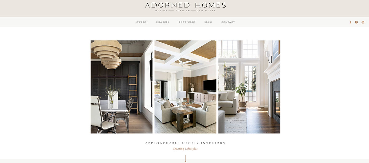
The first thing you’ll notice about the site is the attractive use of the white, silver, and gray color scheme. They even found a high-quality picture that fits into the theme perfectly. There are some clear calls to action on the main page. They also use boxes and clear links to help organize information.
34. Petrine Construction
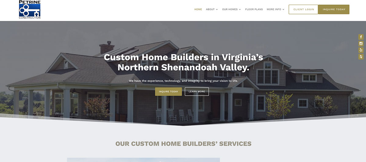
A home should feel comfortable. This site tries to imitate the comfort of home with relaxing colors and a serene picture of the company’s work. They use images throughout the website to help showcase their skills.
35. Treasured Spaces
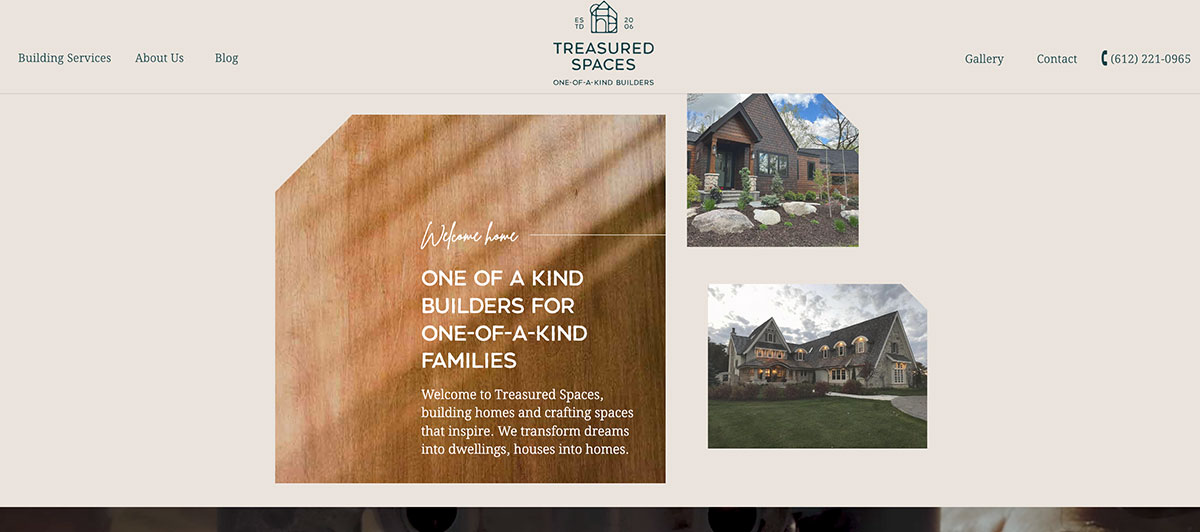
This site makes use of large photos, videos, and customer reviews to focus on their team of experts. The site serves to build trust by highlighting the company’s dedication to exceeding your expectations and ensuring your satisfaction with their work.
36. Hare
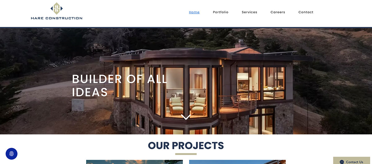
This site starts by showing an impressive-looking building in the construction process. The angles and geometry are especially striking. The picture also helps clarify the type of construction they do, and they use a cool blue and orange color scheme. The blue is pleasing to the eye, while the orange helps add some flair to the site.
37. One Day Doors & Closets
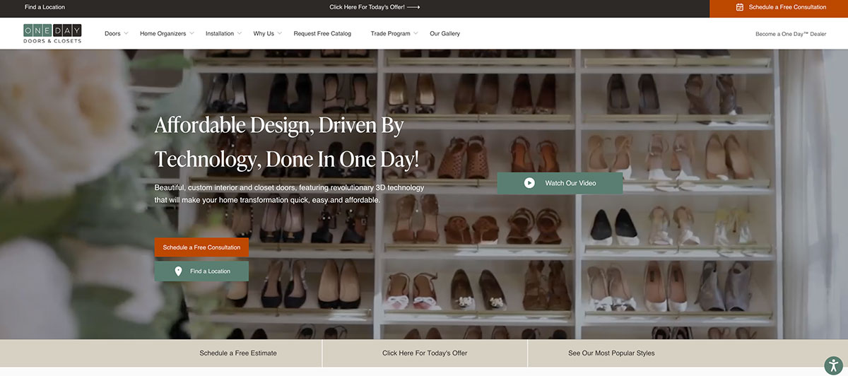
The name is extremely effective and tells you exactly what the company offers. On the site, you can find everything you need quickly. They even incorporate video right on the main page to help answer the most common questions they get.
38. Hercon Construction
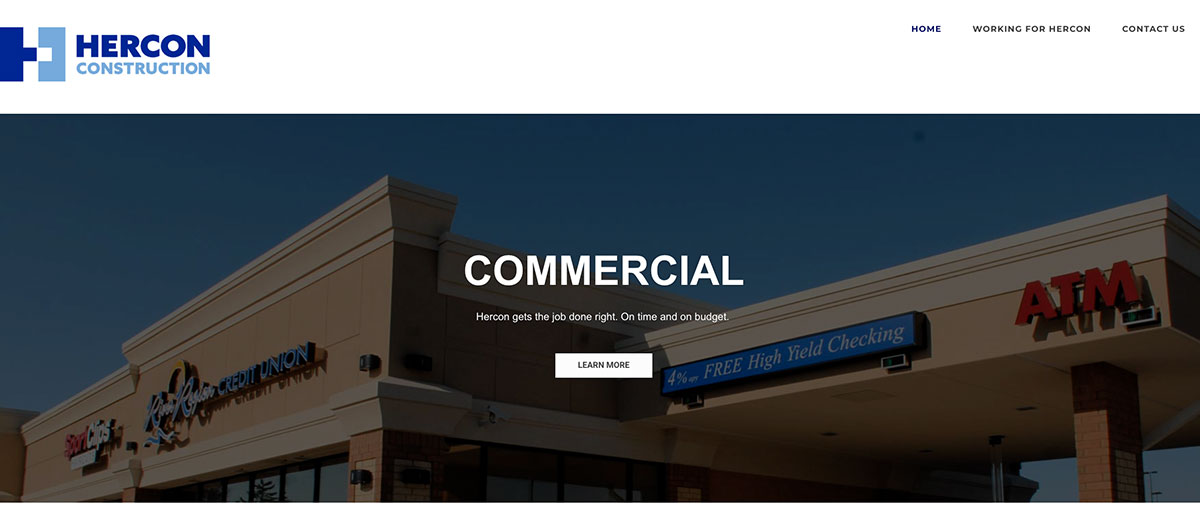
The page starts by dividing services into three main categories: commercial, residential, and historic. The areas are separated with high-quality pictures of previous work. On the main page, Hercon also sets themselves apart by telling the story of the company, making themselves relatable.
39. Siena Construction

This site is all about showing off your skills. Siena Construction uses a creative design concept to showcase their past projects. They show pictures and label the project. If you click on the picture on the right, you can see more of the project. The pictures are asymmetrically placed on top of one another, making the design especially cool.
40. McCarthy Construction

Many companies show pictures of the end result. However, the process is just as important. This company uses a professional picture of the team working together to showcase the values of positive collaboration to complete a project.
41. Kavin Construction
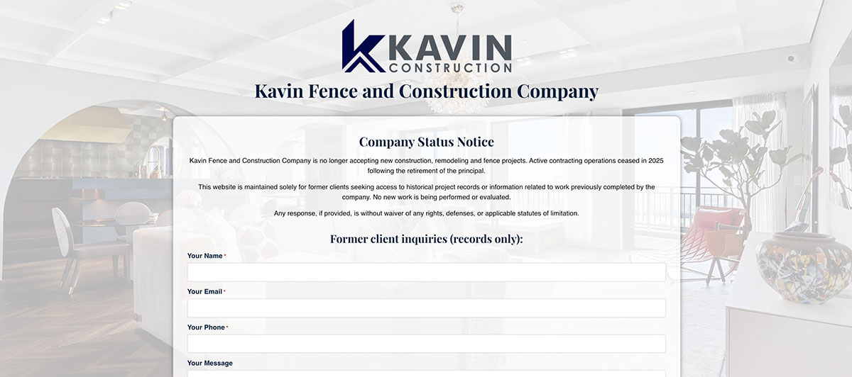
One of the best tactics is to show people what they want to see. Kavin uses the image of an extremely attractive house with a pool that looks like a complete fantasy. It’s perfect when targeting people who want to renovate or build a new home. It’s a simple and straightforward design, but it works.
42. McCownGordon Construction
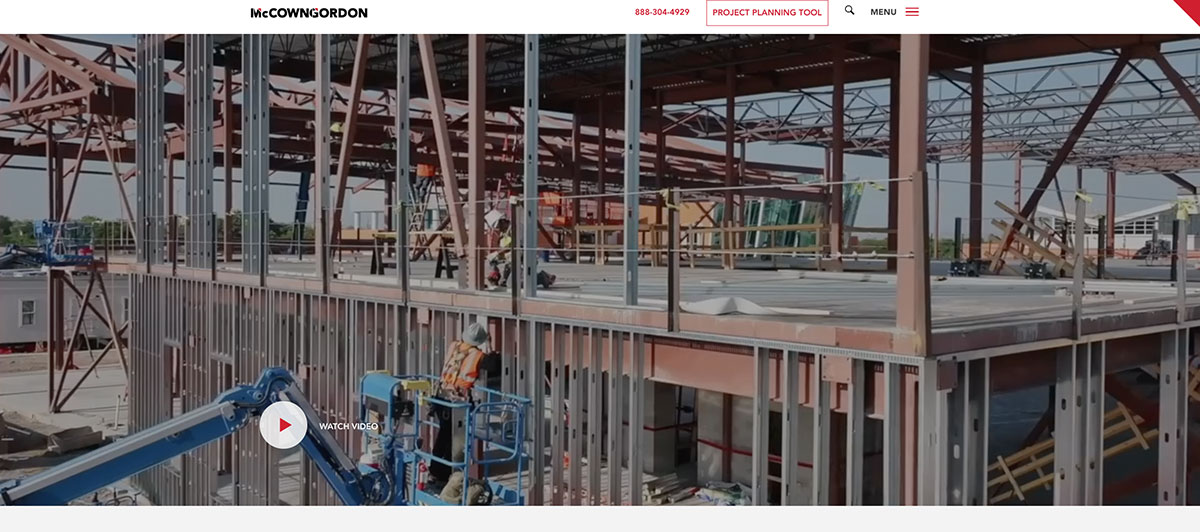
This website grabs your attention right from the start with a picture of a multicolored structure the business created. It works as a good example of their work as well as an example of their taste. They also display a positive company philosophy right on the main page. Their philosophy is, “We build differently.”
Focus Building Solutions
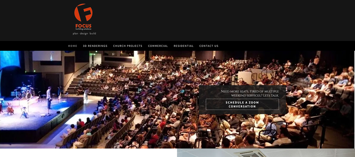
This site looks good and has high-quality images. It also feels very modern, which may also help describe the company’s aesthetic. Some people may even feel the site looks like something they would see on their iPad.
44. Northface Construction
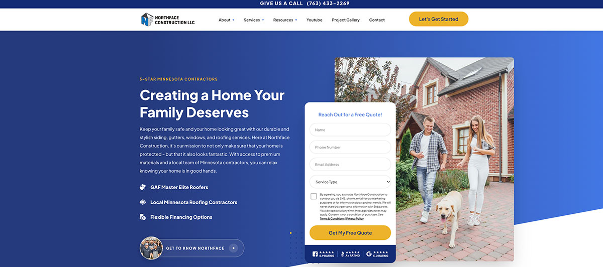
This website makes good use of boxes and white space to help separate different information. They also use a clear color scheme. There is a contact form prominently displayed on the main page to help people get in touch about what work they might need done. They also put their guarantee right on the page with a picture of the owner.
45. NABA Construction
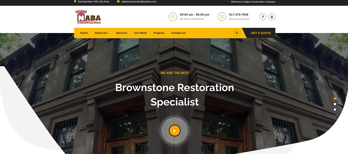
The website has a bright yellow banner that helps capture attention. They also use testimonials from people to show that they do good work and offer excellent service along the way.
46. Yorke Construction

The main picture is effective and sophisticated. The bright orange pop of color not only helps the design but also catches the eye. The company also instills confidence by saying on the main page that they have served the area since 1923. Navigation is clear and simple.
47. RD Construction
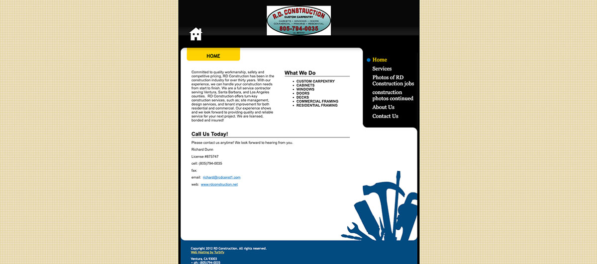
RD Construction uses its website to show off the impressive designs they have pulled off successfully. It’s hard not to stare in awe when you look at the pictures of their work. The style is simple but extremely effective. It acts like a portfolio of previous work. You see that they can create some amazing buildings, but you also see that they really understand image.
48. Maman Corp
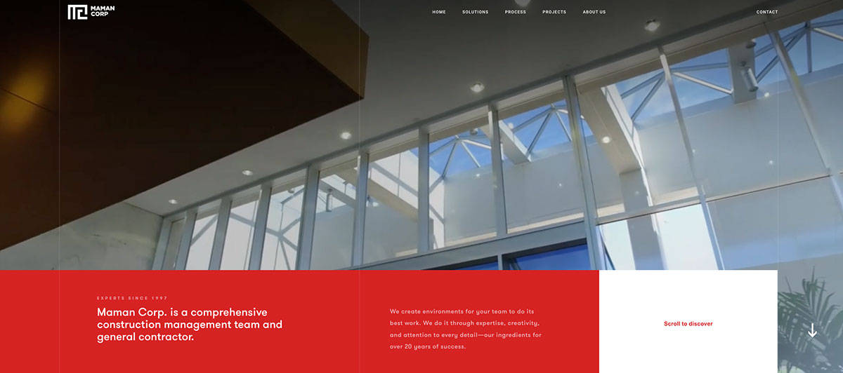
Maman Corp is a New York-based construction management firm that turns their website into an experience rather than a brochure. The site uses scroll-triggered transitions and captivating video to guide visitors through seven distinct pages, each covering a different facet of the company, including history, client commitment, and vision. It reads less like a contractor website and more like an interactive magazine.
49. Rob Mills Architecture

The main site makes it very clear what the company does right from the start. It shows four vivid pictures that describe their different services. The pictures are high-quality and clear, and you can tell that the website was custom-designed.
50. Window World
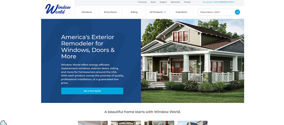
Some companies have a main focus. This page tells you their focus right in the name. There are also SEO tactics throughout the site. They use the proper keywords and have a high rating in search engine results. The gorgeous pictures of the different windows they can do help, too.
All of these sites are both attractive and effective. You should consider hiring a web designer to help you create a custom website. A custom website can help your company stand out. Don’t forget to take some amazing pictures of your work, too.
Trust signals that book more jobs
In the contracting industry, trust is the product. Before a client signs anything, they need to feel confident that you’ll show up, do quality work, stay on budget, and communicate throughout the job. Your website has to build that confidence before a single conversation happens.
Here are the trust signals that actually move the needle:
- License and insurance information are displayed prominently. This is the single most underused trust signal in web design for contractors. Displaying your license number, insurance details, and bonding status filters out the comparison shoppers and signals to serious clients that you operate professionally. It also provides peace of mind around safety, which matters deeply to homeowners.
- Specific, detailed testimonials. Vague praise like “great work, highly recommend” does little. Testimonials that mention the project type, location, timeline, and outcome are far more persuasive. Ask clients for specific feedback and place those quotes near your CTAs, not buried on a separate reviews page.
- Before-and-after project galleries organized by trade. Group your work by service type so potential clients can quickly find projects that match what they need. An HVAC client doesn’t want to scroll through kitchen remodel photos to find relevant examples of your expertise.
- Years in business and project count. “Serving the community since 2009” and “over 400 completed projects” carry real weight. Data points like these translate passion and experience into credible, scannable proof.
- Transparency about the process. Clients hire contractors they can understand. A brief “How We Work” section that outlines what happens from the first call through project completion removes the anxiety that often stops people from reaching out. Transparency here builds relationships before the job even starts.
- Industry certifications and affiliations. Membership in trade organizations, manufacturer certifications, and any awards from the industry signal that your work meets recognized standards. Display these as visual badges, not buried text.
What every contractor website needs
Whether you’re running a two-person operation or managing a crew of employees and subcontractors, these are the non-negotiables every contractor website should have before you drive a single click of traffic to it.
- Dedicated service pages. One page per service, not a single catch-all list. Most homeowner searches are intent-loaded, and those visitors land directly on a service page from Google. That page has to load fast, show relevant work, surface trust signals, and offer an obvious next step. A general contractors page, an HVAC page, and a roofing page all serve different search queries and different clients.
- A project portfolio with real context. Don’t just post photos. Caption each project with the scope of work, location, timeline, and any notable challenges you solved. This gives potential clients a vision of what working with you actually looks like and helps them self-qualify before they ever reach out.
- Local SEO structure. Your site needs to connect your trades to your service area in a way that Google can understand and rank. That means location-specific pages, consistent business information across directories, and a fully optimized Google Business Profile. Our SEO services are built around exactly this kind of local visibility strategy.
- A short, simple contact form. Name, phone number, and a brief description of the project. That’s all you need to start a conversation. Longer forms reduce submissions and cost you more leads than they qualify.
- Google Ads readiness. Your site needs to be built so that paid traffic actually converts. Running Google Ads to a slow, generic homepage wastes budget. Every dollar spent on Google Ads works harder when it lands on a fast, service-specific page with a clear CTA.
- Mobile-first design. Most clients browse on their phones, often in the evening after work. A site that looks polished on desktop but breaks on mobile is quietly costing you jobs every single night.
- Click-to-call functionality. On mobile, your phone number should be tappable. A client who has to manually dial a number they read off a screen will often just close the tab and move to the next contractor in the search results.
Build a site that works while you do
The goal of any contractor website isn’t just to look good at a pitch meeting. It’s to generate consistent leads while you’re on a job site, in a truck, or managing subcontractors on a complex build. Here’s how to make that happen.
- Invest in owned lead generation. Third-party platforms have their place, but they rent you access to clients. Your own website builds compounding value over time. Every blog post, every service page, and every local ranking you earn stays working for you even when you’re not actively marketing. That’s the kind of success that third-party directories can’t replicate.
- Use content to connect with clients early. Most clients don’t search for a contractor the same day they decide to hire one. They research costs, timelines, and what questions to ask weeks before they’re ready to commit. Blog posts that answer common questions, like “how much does a bathroom remodel cost” or “what should I ask before hiring a general contractor,” put your brand in front of potential clients during that research phase and build the kind of authority that converts later.
- Our WordPress web design team builds sites structured to support this content-first strategy from the ground up.
- Prompt follow-up is a conversion tool. A great website that sends inquiries to a Gmail inbox you check once a day loses leads to contractors who respond within the hour. Connect your contact forms to a CRM or, at a minimum, set up instant email and text alerts so you can respond to new inquiries quickly. Speed-to-response is one of the most underrated sales advantages in any trade business.
- Build pages that reflect your vision. The best contractor websites feel like they were built by someone who is genuinely passionate about their craft. They reflect a clear point of view, a defined specialty, and a confident understanding of who the ideal client is. Clients can feel the difference between a site built from a template and one that was built around a real business and real values.
- Use website builders wisely. DIY website builders like Wix or Squarespace are tempting for their low upfront cost, but they tend to fall short when it comes to local SEO performance, page speed, and customization. For contractors who rely on their site as a primary lead source, a professionally built WordPress website almost always delivers better long-term ROI.
- Think about your network. Your website can actively support your referral network, too. A clear “subcontractors” or “partners” page, along with case studies and project spotlights, gives people in your professional communities a reason to share your site with their own connections. Some of the best contractor leads come not from Google, but from another professional who found your site credible enough to recommend.
If you’re ready to build a contractor site that generates real, consistent leads and reflects the quality of work you deliver every day, get a quote and let’s talk about what’s possible. Or take a look at our web design work to see how we approach projects like yours.
Your next job is waiting. Freshy builds sites that find it
The best contractor websites share one thing: they’re built with intention. Every page, every photo, and every CTA is working toward the same goal of turning a visitor into a booked job. Get that right, and your site becomes your most reliable source of new business.
Key takeaways:
- Lead with outcomes and specific expertise, not generic service lists
- Every page should be able to convert independently, not just the homepage
- Real project photos and human storytelling build trust faster than anything else
- Dedicated service pages per trade outperform catch-all layouts every time
- Speed, mobile performance, and local SEO are the foundation, not the finish line
- Owned lead generation compounds over time; rented platforms stop when you stop paying
We’ve spent years helping contractors and service businesses across the US build WordPress websites that generate real, consistent leads. If your current site isn’t pulling its weight, get a quote and let’s build something that does, or explore our portfolio to see what’s possible.
FAQs
Is there a website to find contractors?
Yes. Angi, HomeAdvisor, Houzz, and Thumbtack are key platforms helpful for finding licensed local contractors across most trades and project types.
How much does a contractor website web design cost?
A professional contractor website typically costs $2,000 to $10,000. Annual revenue goals and competition in your market are key factors when deciding your budget.
What is the website for self-employed contractors?
Self-employed contractors prefer platforms like Thumbtack or Houzz to find work. Marketing experts also recommend a personal WordPress site to reduce competition and own your leads.
What is the best website builder for construction general contractors?
WordPress offers the most flexibility and long-term SEO value. It’s the top choice for helping contractors inspire trust, rank locally, and drive consistent annual revenue growth.
Does a contractor need a website for better annual revenue?
Absolutely. Hear this from marketing experts: without a site, you’re invisible to most clients. Innovation in your trades means nothing if potential clients can’t find you online.



)