Searching for a neurologist usually happens during one of life’s more uncertain moments. Patients land on your website looking for two things at once: medical credibility and a sense that someone here actually cares. A clunky layout or buried contact form can quietly cost a practice dozens of consultations a month, even when the medical expertise is top-tier.
This roundup pulls together 30 neurologist web designs that nail both, so you can borrow the best ideas for your own practice site.
30 standout neurologist websites with quick design breakdowns
Trust-building features that turn anxious visitors into patients
Layout, imagery, and content choices that work in healthcare
Common neurology website mistakes worth avoiding
Smart design patterns competitors aren’t using yet
When you’re ready to translate inspiration into a real, patient-ready site, Freshy builds custom WordPress websites for medical practices across the U.S. We’ve helped hundreds of healthcare clients turn dated, hard-to-navigate sites into modern, HIPAA-conscious tools that actually book appointments.
The most popular websites for Neurologists in 2026
When you need a neurologist, you are likely frightened and worried. You need the best, most professional information, and you are looking for a doctor who will both heal and comfort you. When you check a neurologist’s website for more information, that website must be well-designed in order to encourage you to call and make an appointment.
Here’s a collection of neurologists’ websites that excel by delivering essential information in visually appealing formats.
1. Texas Institute for Neurological Disorders
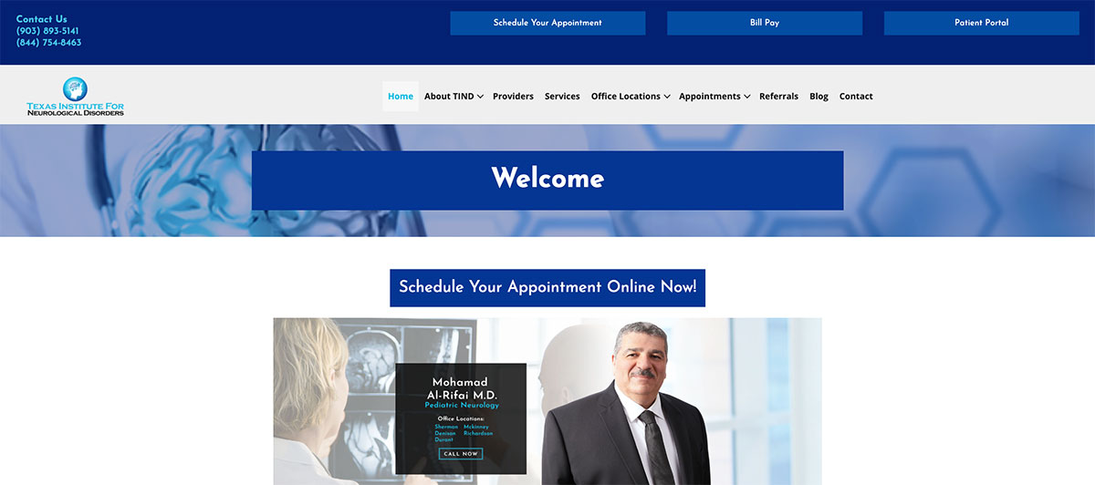
The Texas Institute for Neurological Disorders website has a variety of sharp aspects. Its geometric design flows well with its pleasant blue color scheme. It is updated in a timely fashion and advertises telemedicine services above its menu. It also offers a great blog that contains a variety of useful information.
2. NC Neurology Consulting
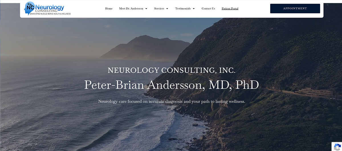
NC Neurology Consulting has some eye-catching, colorful images of the brain and neurons scrolling in the background. These are a great way of getting your attention. The information on the home page is highly relevant and includes the disorders the doctor treats and facts about the practice.
3. NY Neurology Associates
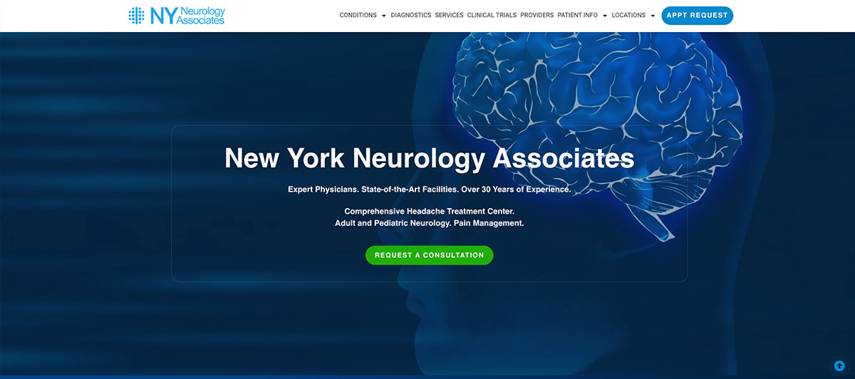
NY Neurology Associates leans in on its New York location with a menu that features conditions they treat superimposed over a picture of the city. The website also has a great trailer, embedded from YouTube, that highlights what they do at the practice and how they can help you.
4. Dr. Dexter Sun

The opening picture shows a serious, engaged Dr. Dexter Sun, dressed in a white lab coat, talking with colleagues. It’s a great picture that inspires confidence. The graphics load perfectly and note a variety of features about the practice and Dr. Sun, including his fluency in multiple languages.
5. First Choice Neurology
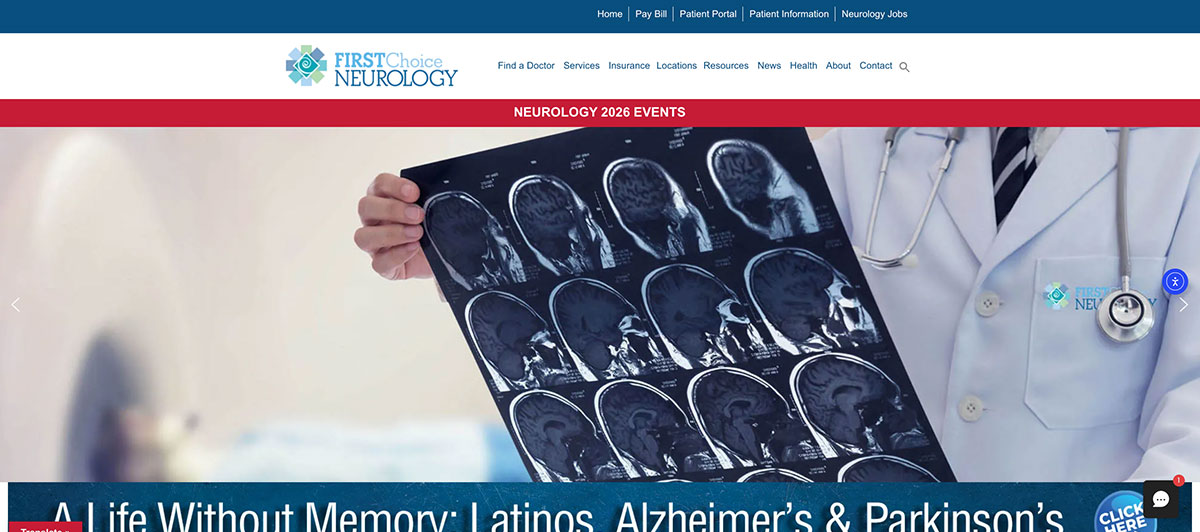
The website for Andrew M. Lerman MD takes advantage of white space, and they do a great job of highlighting important features like what they treat and how you can make an appointment. The appointment-making feature is easy to find on the website, as it is literally front and center on the main page.
6. Simon Neurology Clinic
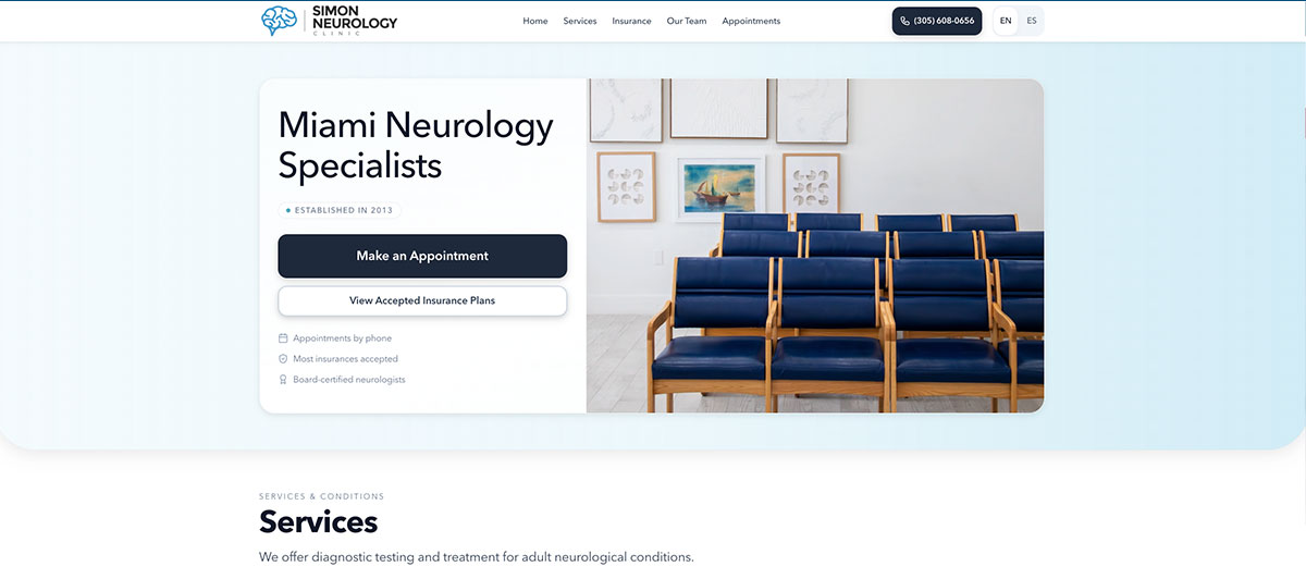
Simon Neurology Clinic offers a sleek image of a brain in motion on a background reminiscent of a night sky. It directs your attention to the fact that these two doctors have a combined 50 years of experience. As you scroll down, simple graphics mark information about health insurance, preparing for your visit, and the neurologists at the practice.
7. WeMind Institute

WeMind Institute specializes in pediatric neurology. Their website is kid-friendly and shows almost exclusively photos of children and teens; you can tell who their target audience is before you read a word. Scrolling down, you learn about disorders treated and meet the team.
8. Miami Neuroscience Center
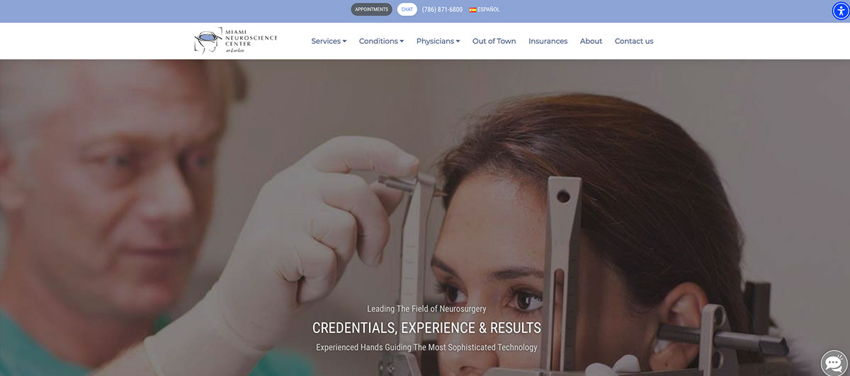
The Miami Neuroscience Center uses a photo of a doctor using a piece of equipment on a patient to illustrate the concept of experienced hands guiding technology. Graphics fade in smartly, and information is displayed in order of importance, including the various advantages of visiting this practice.
9. Neurology Consultants of Arizona
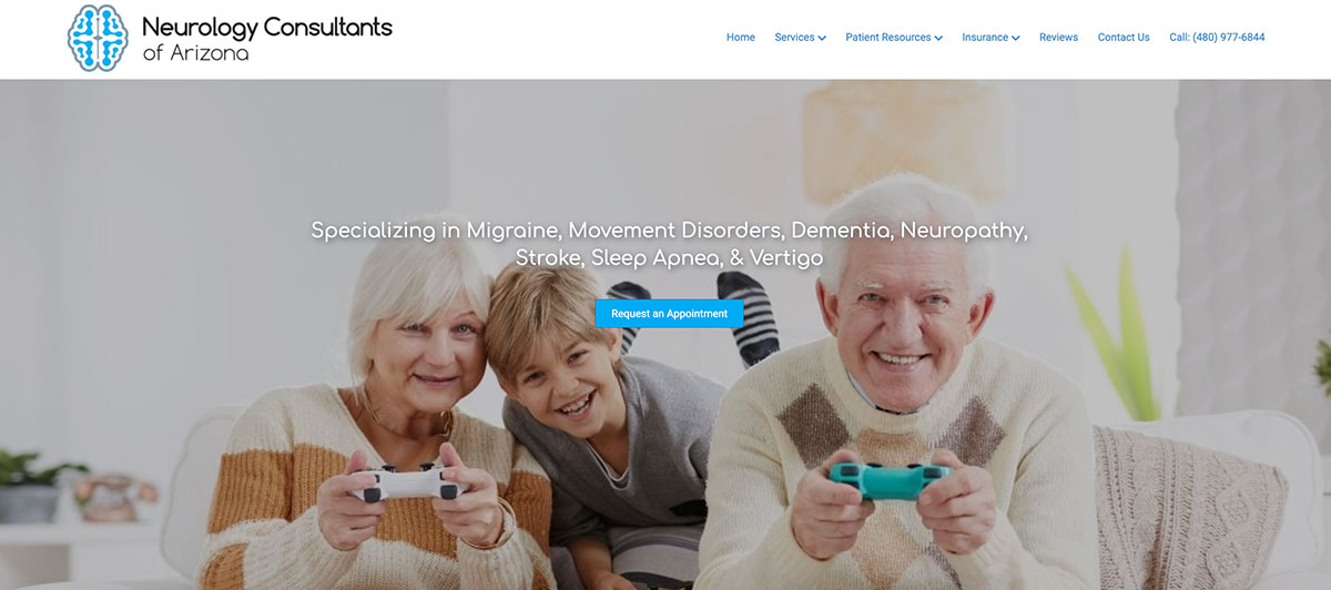
Neurology Consultants of Arizona are quick to announce their specialties: migraines, multiple sclerosis, dementia, and several others. Clicking on links in a block of photos depicting them allows you to get more information about these disorders or easily book an appointment.
10. Neurology Associates
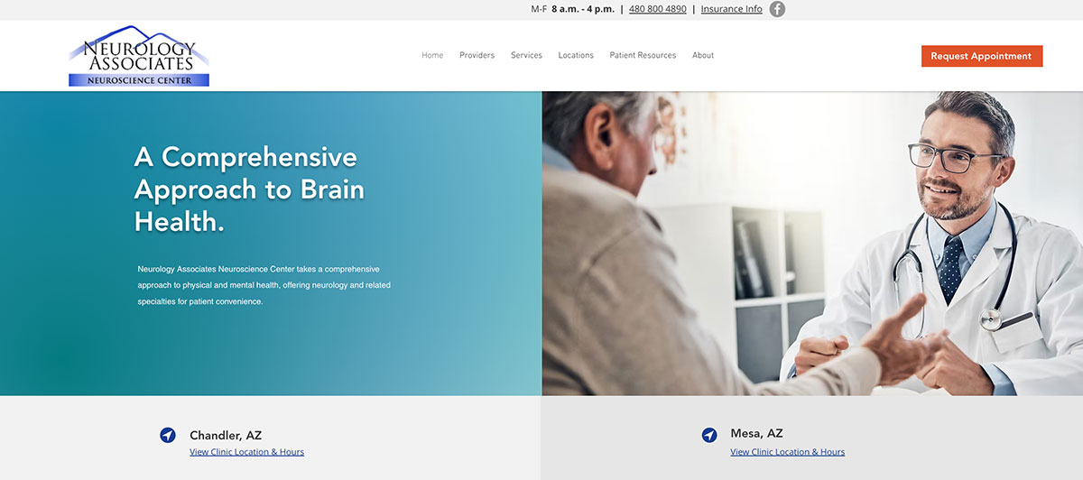
Neurology Associates has a variety of sharp, easy-to-click buttons, including one for telehealth and another for requesting an appointment. This convenience makes it simple to find the information you want. The clinic also has multiple locations, and the website design makes it easy to find.
11. Carefree Neurology Clinic
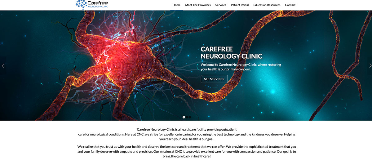
Carefree Neurology Clinic greets you with a gorgeous picture of a neuron as you arrive at the website. Its menu strikes the balance between unobtrusiveness and ease of navigation. It also has some great pages, like a patient portal and a screen devoted to educational resources.
12. Neurology Center of New England
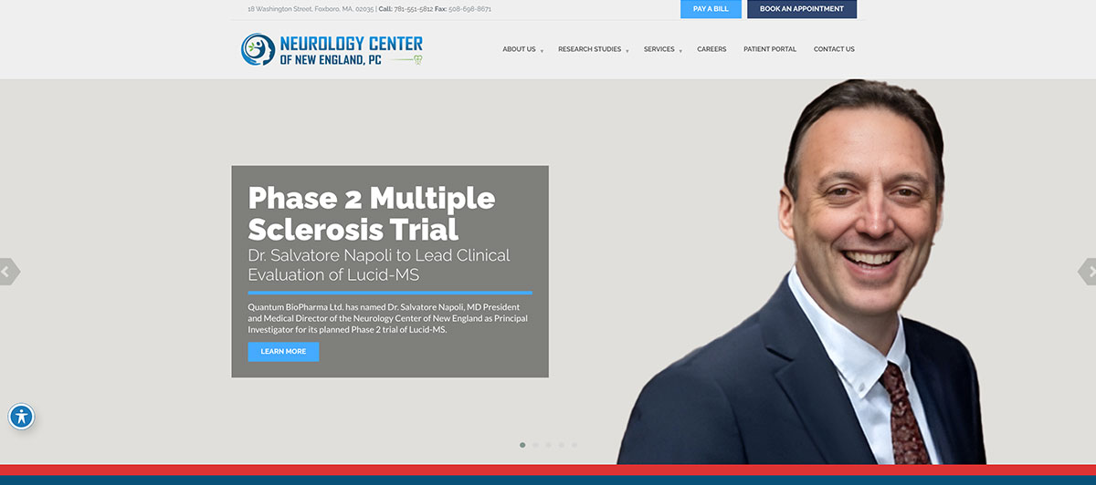
Neurology Center of New England has an attractive scrolling carousel of images, including some of the practice, inside and out. Its graphics load nicely, and you can click on several tabs highlighted by images to prepare for your visit and see their “Top Doctor” awards.
13. BlueSky Neurology

BlueSky Neurology displays two YouTube videos almost as soon as you load the front page, featuring interviews with practitioners and how to deal with strokes. Video is often a great way of drawing someone into a website, and this works well.
14. Cherry Creek Neurology
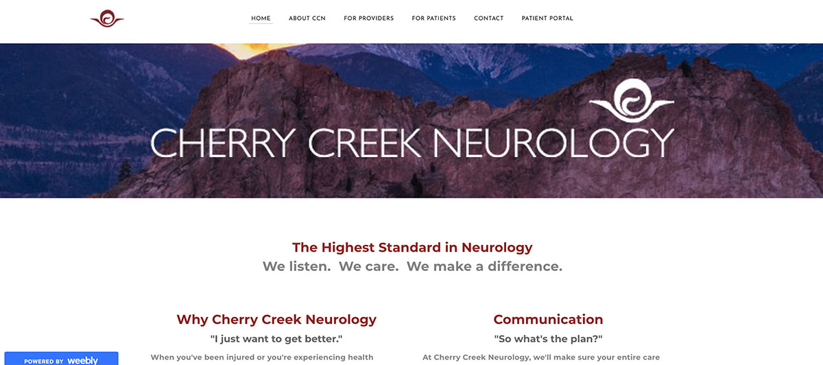
Cherry Creek Neurology may have the best-loading screen of any of the websites on this list. Their slogan — “We listen. We Care. We make a difference.” — loads one sentence at a time, followed by the buttons. The website also has two unique buttons: “New patients” and “Follow-up patients.” Both give interesting and helpful information.
15. NeuroOne Neurology Specialists
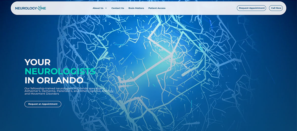
NeuroOne Neurology Specialists takes a refreshingly direct approach to homepage design. Instead of a traditional menu-heavy layout, the site relies on large, clearly labeled buttons for Schedule An Appointment, Find A Location, and Conditions We Treat.
It’s a clean break from cluttered medical websites and makes navigation feel intuitive even for first-time visitors. The calming blue palette and generous whitespace reinforce a sense of clinical professionalism without feeling cold.
16. Neuroveda Health Center for Healing Neurology
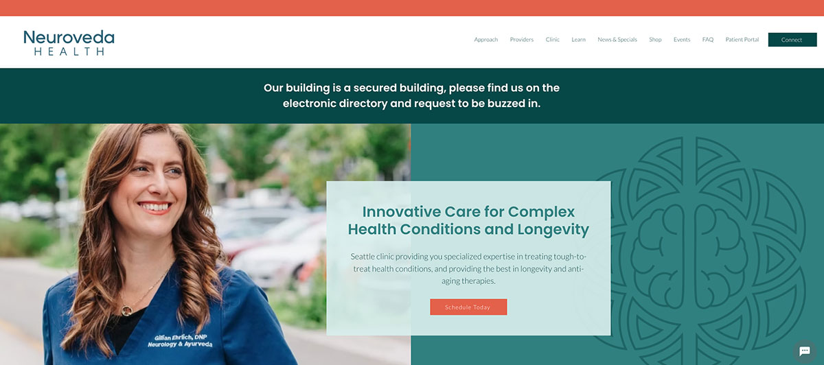
The Center for Healing Neurology website opens with a YouTube video about their practice. They also take a different tack that reflects current conditions: The first service they advertise is immune system support. The menu also advertises other special services, like oxygen support.
17. Seattle Neurosciences
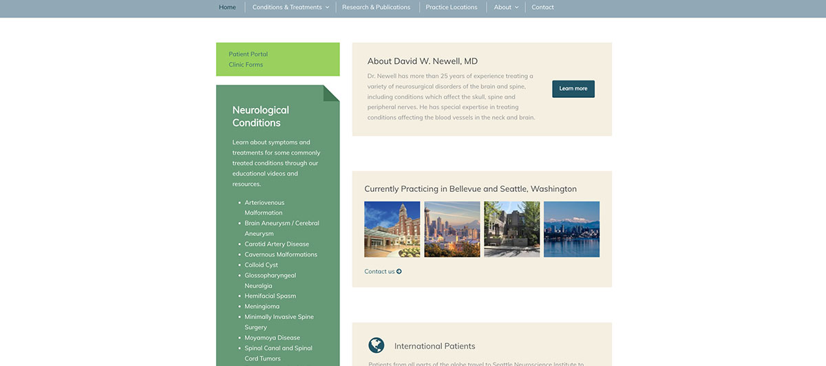
This website highlights Seattle Neurosciences’ patient-centered and academic credentials. Instead of showing their news or reviews, the home page discusses the various treatments that they offer and the academic journals in which the practice’s doctors have been published.
18. Las Vegas Neurology Center
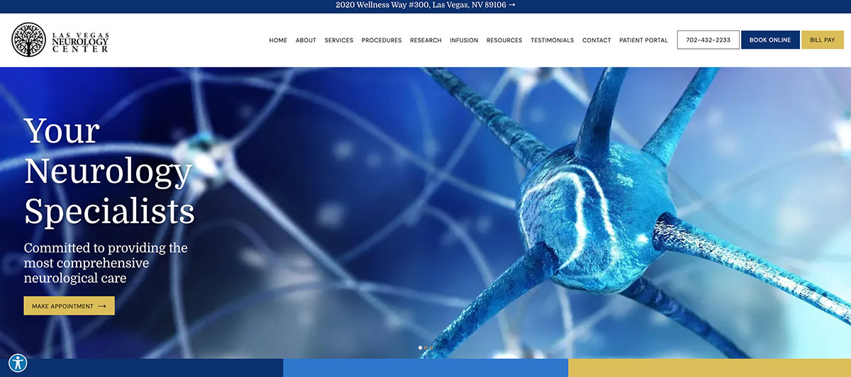
The Las Vegas Neurology Center website has a short home page. It also has a menu that smoothly moves from the top of the page to the bottom. Most impressive is its Procedures drop-down, which allows you to learn more about the various services the center can offer you.
19. Neurology Center of Nevada
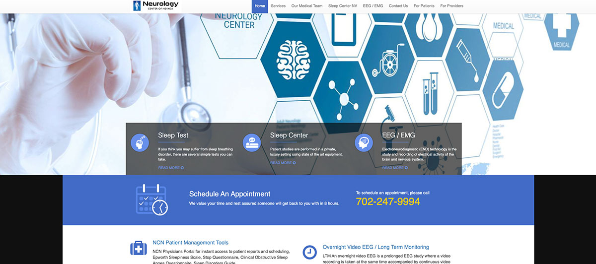
The Neurology Center of Nevada uses its home page to highlight a few specific items, such as sleep testing and EEG services. Scrolling down reveals more information, including the seven doctors on the medical team. You can click on each of their pictures to get more information.
20. Medical Neurology of Las Vegas
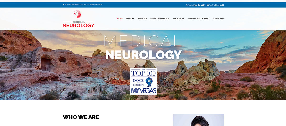
The Medical Neurology of Las Vegas main page prominently features the Nevada skyline and Dr. Bess Chang, noting her biography, expertise, and accolades near the top. This website is an informational one; clicking on the conditions treated reveals even more information about a variety of disorders.
21. Carolina Neurology

Carolina Neurology takes a unique marketing-led approach by featuring a free phone consultation option directly on the homepage, paired with same-week appointment availability. It’s an effective way to differentiate from competitors who lock all access behind a contact form. The site combines this offer with clean, calming branding and easy-to-find condition pages, making the practice feel both approachable and clinically competent at first glance.
22. Premier Neurology & Wellness Center
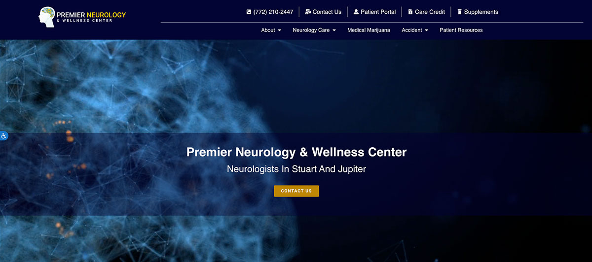
Premier Neurology & Wellness Center uses a center-aligned layout with bright, energetic accent colors that grab attention without overwhelming the page. The menu stays limited and uncluttered, while the phone number and Schedule An Appointment button sit prominently at the top of every page. The clean format encourages calls and direct contact rather than burying users in deep navigation, making the entire site feel responsive and accessible at first glance.
23. Intermountain Neurology & Sleep Center
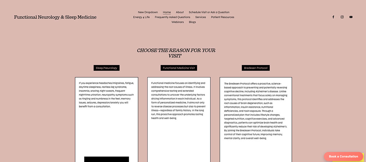
The Intermountain Neurology & Sleep Center has a huge button encouraging you to “request your appointment today.” It also uses a gentle video of the natural beauty in the area of the clinic. This looks professional and creates a peaceful mood that suits a sleep center.
24. Tri-Star Medical Group

Tri-Star Medical Group has a menu with big, round buttons prominently displayed near the top of the home page. This is a unique design element and one that encourages you to click further for more information. As you scroll down, a photo and another button reinforce the practice’s emphasis on telehealth.
25. Midtown Pediatric Neurology
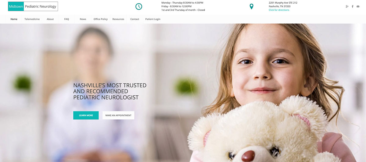
Midtown Pediatric Neurology has an adorable picture of a little girl with a teddy bear next to two big buttons inviting you to “Learn More” and “Make An Appointment.” These buttons themselves lead you to a ton of information that is highly relevant to whatever you need.
26. Nashville Neurology Associates
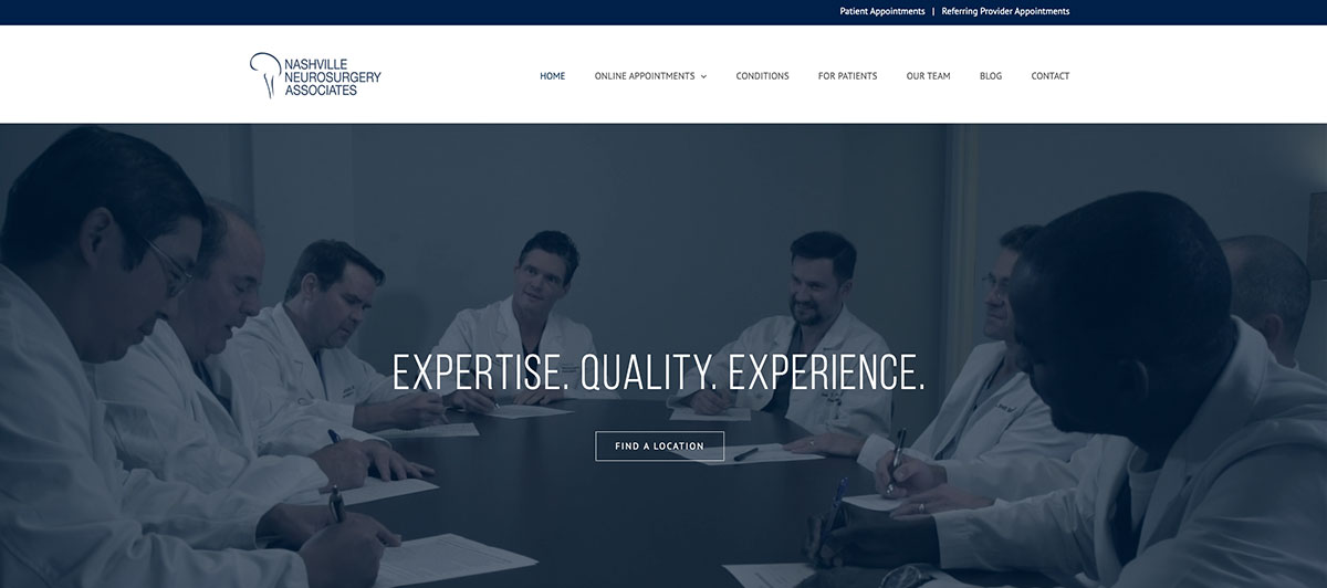
Nashville Neurology Associates is one of the few web pages on this list to display a background video. They do so using relevant scenes, like a digital picture of a spine and their doctors practicing. This works well to draw you in, and clean, clear graphics and text add to this favorable impression.
27. Nashville Brain and Body
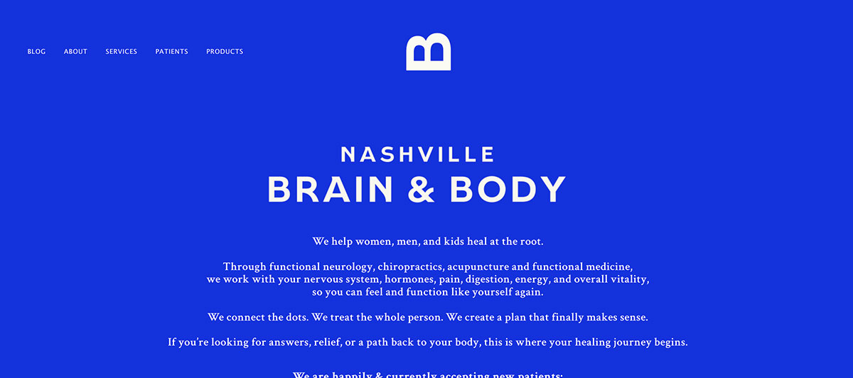
Nashville Brain and Body features a pop-up that makes it easy for you to join their email list and get more information. Like other good websites, this one also makes it easy to book an appointment: You can start the process with a single click.
28. Nashville Brain Institute
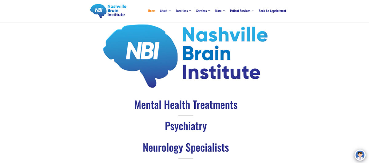
Nashville Brain Institute has a series of gorgeous, artistic pictures of the brain and people that fade into each other. Scrolling down reveals more information about their practice, locations, and the disorders they treat.
29. Neurology Consultants of Dallas
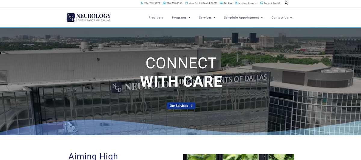
Neurology Consultants of Dallas has a short home page that gives the basics about who they are and what they offer. Interestingly, above their menu is a narrow banner touting the research studies they offer. This is not only a great service but also helps to showcase the clinic’s academic credentials and expertise.
30. Barrow Neurological Institute
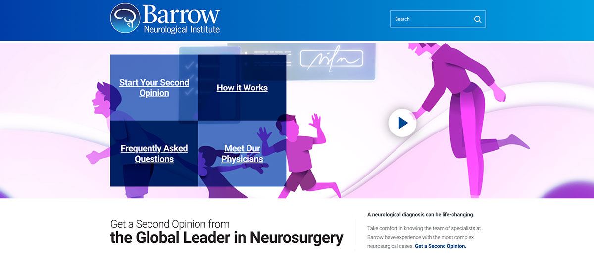
Barrow Neurological Institute has fantastic and consistent branding. Important text is located in sharp, easy-to-read graphic designs, and the home page makes it easy to learn about who practices at this clinic and how they can help you.
Trust-Building Features That Turn Anxious Visitors Into Patients
When someone lands on a neurology website, they’re often scared. They might be researching symptoms like persistent headaches, numbness in their nerves, or memory concerns that have crept up over time. Your job as a healthcare provider is to make them feel seen and reassured before they even pick up the phone.
- Real Photos of Your Team: Stock photos of generic doctors signal that you’re hiding something. Professional photography of your actual physicians, office, and clinical spaces builds immediate trust. Patients want to see who they’ll meet, not a model from Shutterstock.
- Credentials Without the Jargon: Display board certifications, hospital affiliations, and academic credentials prominently, but pair them with plain-English summaries. Board-certified in neurology with 20 years of treating complex neurological conditions, lands harder than a string of letters most users can’t decode.
- Patient Reviews and Testimonials: Embed Google reviews and verified testimonials on the homepage. Anxious users want answers to one question: Did this provider actually help people like me?
- Easy Access to Online Appointment Scheduling: If patients have to call during business hours to schedule appointments, you’ll lose the ones browsing at 11 p.m. with concerns. Online appointment scheduling, ideally tied to your EHR or patient portal, removes friction and increases conversions.
- Educational Content That Builds Authority: Patient education content (blog posts, condition guides, symptom checklists) signals expertise while helping users self-evaluate before booking. It’s a powerful tool for SEO and trust simultaneously.
- Visible HIPAA Compliance Signals: A site that handles sensitive patient data needs SSL encryption, secure forms, and a clear privacy policy. Patients won’t say it out loud, but they notice. Our WordPress security services and WordPress ADA compliance team handle the technical side so your site meets the standards of healthcare demands.
Layout, Imagery, And Content Choices That Work In Healthcare
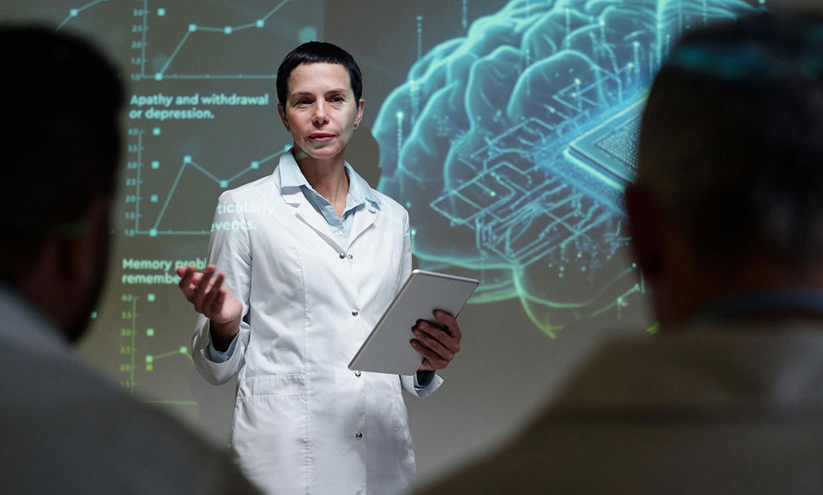
Healthcare design isn’t the same as e-commerce design. The pace, tone, and visual choices need to match what an anxious patient actually wants to see. Here’s what consistently works across the best neurology websites.
Calming Color Palettes
Blues, soft greens, and warm neutrals reduce visual stress. Bright reds and aggressive oranges feel jarring on a site about brain health. The color scheme sets the emotional tone before users read a single word.
Hero Sections That Lead With Empathy
Your hero shouldn’t be a stock photo of a brain scan. Lead with imagery of real interactions: a doctor listening to a patient, hands gently performing an evaluation, or a clinical space that feels welcoming rather than sterile.
Conditions And Services On Their Own Pages
Every major neurological condition you treat deserves its own page. Migraines, multiple sclerosis, epilepsy, dementia, neuropathy, all of them. This structure helps SEO, helps patients self-identify, and helps you educate before they ever call.
Multi-Location Friendly Navigation
If you run a multi-location practice, location pages need to be fast and easy to find. A dropdown by city, an interactive map, and clear directions matter more than fancy animations.
Mobile-First Layouts
Most patients searching for a neurologist are on their phone, often during a stressful moment. Slow load times, broken menus, or text that requires zooming will lose them in seconds. Our WordPress design team builds healthcare sites with mobile-first responsive layouts as the default, not an afterthought.
Educational Resources Hub
A dedicated resource hub with patient education guides, symptom info, and FAQs helps educate visitors and positions your practice as the trusted authority in your specialty.
Common Neurology Website Mistakes Worth Avoiding
Even credentialed practices with strong clinical reputations often have websites that quietly push patients toward competitors. These are the mistakes worth fixing first.
Heavy Medical Jargon
Patients searching for help don’t know what paresthesia or demyelination means. Use plain language to describe symptoms, conditions, and treatments. You can include the medical term, but always pair it with a patient-friendly explanation.
Buried Contact Information
Phone numbers, addresses, and appointment links should sit in the header on every page. Forcing users to hunt for the office address or click through three menus to schedule appointments is a fast way to lose them.
Outdated Or Broken Pages
A page that hasn’t been updated since 2018, broken links, or expired physician bios make the entire practice look neglected. Patients quietly assume that if you don’t maintain your website, you might not maintain other things either.
Skipping HIPAA Compliance
Any form that collects patient information needs to follow HIPAA regulations. That includes contact forms, intake forms, and other forms that handle sensitive patient data. Standard plugins won’t cut it. Our WordPress maintenance and HIPAA-conscious build process handle this from the start.
Ignoring Accessibility
Patients with disabilities (visual, motor, or cognitive) deserve equal access to your site. ADA compliance isn’t optional for healthcare in 2026. Skipping it is both an ethics issue and a legal one. Our ADA compliance services make accessibility a baseline, not an upgrade.
No Clear Path To Schedule
Every page should have an obvious way to book. Schedule Appointment buttons in headers, footers, and mid-content sections remove friction and lift conversion rates significantly.
Smart Design Patterns Competitors Aren’t Using Yet
Most neurology websites stop at clean and clinical. The practices winning new patients in 2026 are pushing further. Here’s what’s actually moving the needle.
Symptom-Based Navigation
Instead of organizing by service, organize by what the patient is experiencing. I have headaches, I have numbness, and I have memory concerns. Symptom-led navigation matches how patients actually think and search the internet.
AI-Powered Pre-Screening Tools
Some practices are adding short, conversational pre-screening tools that help users self-evaluate before booking. Done right, these tools educate patients, qualify leads, and reduce no-shows.
Video Introductions From Physicians
A 60-second video from each physician introducing themselves and their approach beats a paragraph of biography every time. Video humanizes the provider and reduces anxiety before the first visit.
Patient Portal Front And Center
Existing patients shouldn’t have to dig for the portal login. Featuring it in the main navigation gives returning patients a fast path back, while new patients see that the practice has invested in technology.
Multilingual Support
A growing number of practices are adding Spanish, Mandarin, and other language options for major patient populations. It signals inclusivity, expands reach, and earns trust with users whose first language isn’t English.
Embedded Analytics And Performance Tracking
The smartest practices monitor what’s actually working. Google Analytics, heatmaps, and conversion tracking reveal where users drop off and which pages drive bookings. Without it, you’re guessing. A well-built WordPress site from Freshy bakes analytics into the foundation so every design decision can be measured and improved over time.
Build A Neurology Website Patients Actually Trust With Freshy
Your website is often the first conversation a worried patient has with your practice. The 30 examples above show what builds trust quickly: clean design, clear navigation, calming visuals, and easy paths to book. Steal what fits and skip what doesn’t.
Here are the key takeaways:
- Lead with empathy and real photography of your team
- Display credentials, reviews, and trust signals prominently
- Build dedicated pages for each condition and location
- Make appointment scheduling visible on every page
- Prioritize HIPAA compliance, accessibility, and mobile speed
- Avoid jargon, buried CTAs, and outdated pages
A great neurology site doesn’t happen by accident. Freshy has helped 2,400+ businesses, including medical practices, turn outdated sites into patient-winning tools. Get a free quote to start your redesign, or browse our portfolio to see what we’ve built for clients in healthcare and beyond.
Frequently Asked Questions
What makes a good neurology website design?
A good neurology website design is accessible on any device, easy to navigate, and built around patient trust. Calming visuals, clear conditions pages, and visible appointment scheduling are crucial features.
Why is website security important for neurology practices?
Website security protects sensitive patient data and signals professionalism. SSL encryption, HIPAA-compliant forms, and regular updates are crucial for healthcare professionals handling diagnosis information, medical records, and online intake forms.
How often should a neurology website be updated?
A well-designed website should be updated at least quarterly. Refreshing physician bios, conditions content, and security patches keeps the site accurate, secure, and effective at converting visitors into patients.
How do I know if my neurology website is effective?
Track form submissions, appointment bookings, and bounce rate. A clear sign of effectiveness is steady growth in patient inquiries, mobile visits, and time spent on conditions or treatment pages.
Should a neurology website be ADA-compliant?
Yes. ADA compliance ensures the site is accessible to patients with disabilities on any device. It’s both a legal requirement and a crucial trust signal for modern healthcare professionals.