
A moving company’s website is the digital equivalent of a salesperson who never sleeps. It pitches your brand at 2 a.m. when someone’s stressing over a cross-country move. It collects leads while you’re loading a truck. The catch? Most movers’ sites look like they were built in 2009 and treat conversion like an afterthought.
This roundup breaks down 50 of the sharpest movers’ websites on the internet and what makes each one work, so you can borrow the smart bits for your own redesign.
Here’s what we will talk about in this guide:
- 50 standout movers websites with design breakdowns
- Conversion-focused features that drive quote requests
- Branding tactics that build instant trust
- Layout, imagery, and content choices worth stealing
- Common design mistakes movers should avoid
When you’re ready to turn inspiration into a real site that ranks and converts, Freshy builds and maintains WordPress sites for movers and small businesses across the U.S. Over 2,400 clients trust us to handle the design, development, and the boring-but-critical stuff like hosting and security.
50 standout movers websites with design breakdowns
The moving industry is competitive, crowded, and trust-driven. Your website has to do the heavy lifting before the truck ever rolls. Below are 50 movers’ websites worth studying, each with a quick breakdown of what works and the design lesson worth borrowing.
Skim through, take notes, and bookmark the ones that match your brand.
1. Pure Moving Company

Pure Moving Company makes a strong impression with real photography of their team in action: packing boxes, loading trucks, and interacting with customers on actual moves. The homepage pairs that authentic imagery with client testimonials and trust badges, which together build credibility quickly. The contact form sits prominently on the left, balanced with a welcoming slogan on the right, and the entire site is fully mobile-responsive.
Design takeaway: Real team photos crush stock imagery for trust and conversions.
2. New City Moving
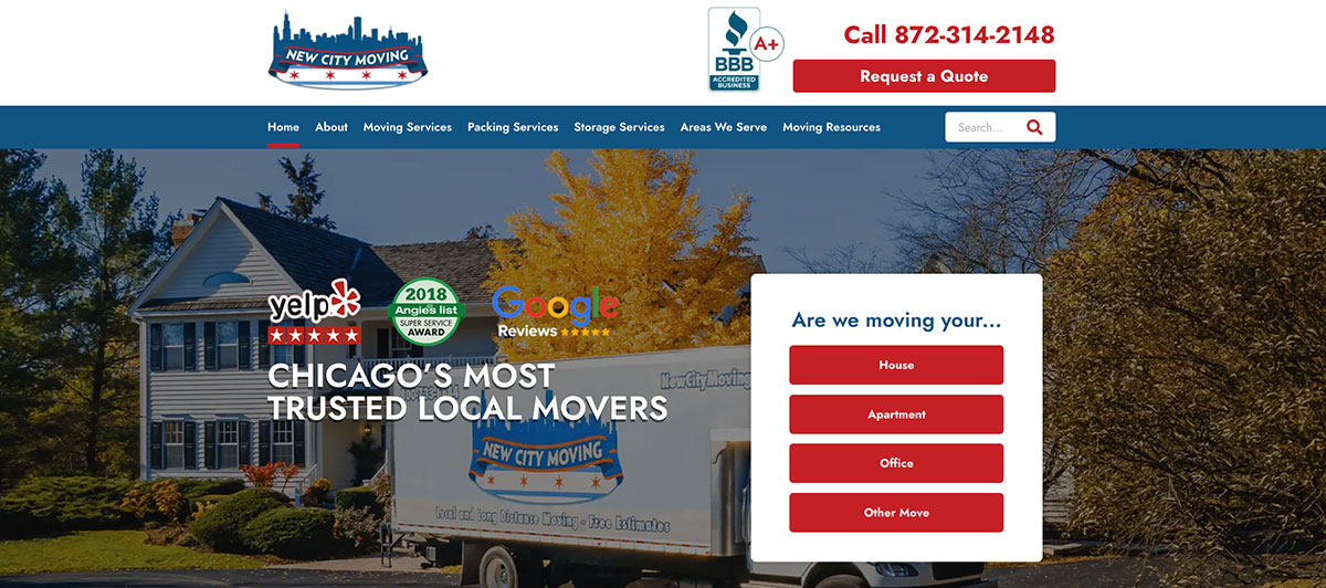
New City Moving leads with a warm, neighborhood-oriented vibe that repeatedly references Chicago and its surrounding suburbs. The free estimate flow is visible early and reinforced across multiple sections of the homepage. Service pages segment by local, long-distance, insurance, and niche moves, letting visitors drill down quickly. A dynamic locations map reinforces service coverage while reminding visitors whether the company serves their zip code.
Design takeaway: Layered local content turns broad services into hyper-relevant ones.
3. National Van Lines

National Van Lines uses a color scheme of red, white, and blue to create a strong sense of brand while placing their branding tagline at the forefront of the homepage. The viewer’s eye is instantly drawn to the quote fields, which prompt them to enter their zip code. The website balances dark images and white fields that keep the focus on the text.
Design takeaway: A patriotic palette can carry serious brand weight.
4. Moving Squad

The Moving Squad’s website catches the eye with bright yellow offset by a lighter background. While the mid-section provides detailed information about their service, the top leads with a playful image of an animated mover and a moving truck heading toward its destination. Although they aren’t as prominent as on some other websites listed, the quote form and phone number are well placed.
Design takeaway: Personality-led design can still convert when CTAs are positioned smartly.
5. American Van Lines
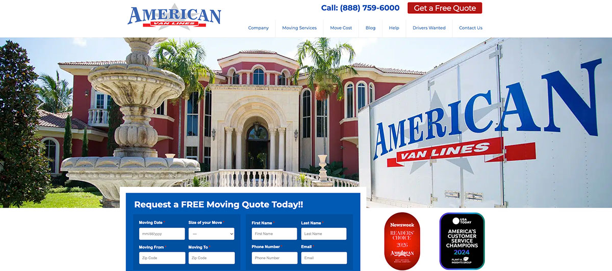
The imagery on this mover’s website is personalized to represent the American Van Lines brand. They highlight their Newsweek award for providing exceptional customer service and draw attention to their moving services with eye-catching images. The quote form is top and center and allows them to collect names, email addresses, and phone numbers for marketing purposes.
Design takeaway: Awards belong above the fold, not buried in an About page.
6. Allied Van Lines
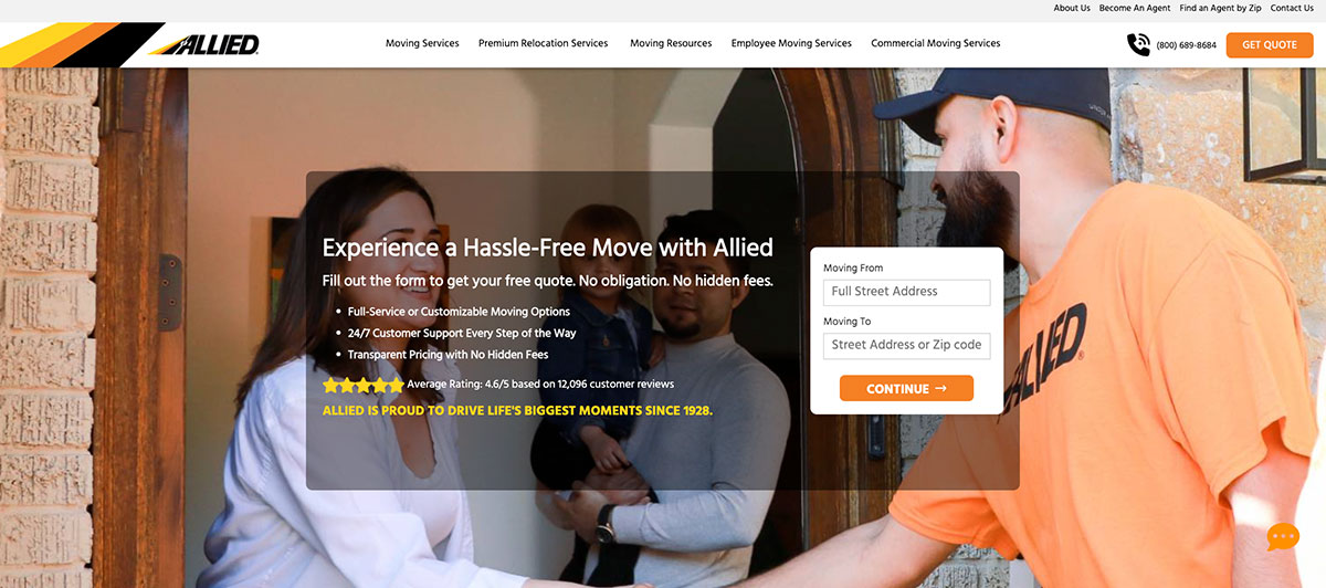
This moving company website design is easy to scroll through and draws the viewer’s eye to brand-specific information. That includes the number of years that Allied has been in service, plus their satisfaction rate and total number of moves completed. The homepage delivers a lot of information without using large blocks of text.
Design takeaway: Numbers convert. Show them off.
7. PODS

This well-known moving and storage company uses a solid white background with more spacious side borders than most other 2026 web designs. It clearly explains how the Pods system works with branded images. The homepage also features a video testimonial featuring real customers.
Design takeaway: Real customers on video beat written testimonials almost every time.
8. Safebound Logistics
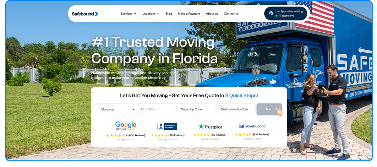
Safebound takes a personal approach by adding a picture of their leading salesman along with a short bio on the homepage. The bio is full of personality and creates a sense of the brand’s lighthearted, approachable work atmosphere. The site still provides easy access to phone numbers, quote forms, and other valuable information.
Design takeaway: Putting a face on your brand builds trust faster than a logo.
9. Moving.com
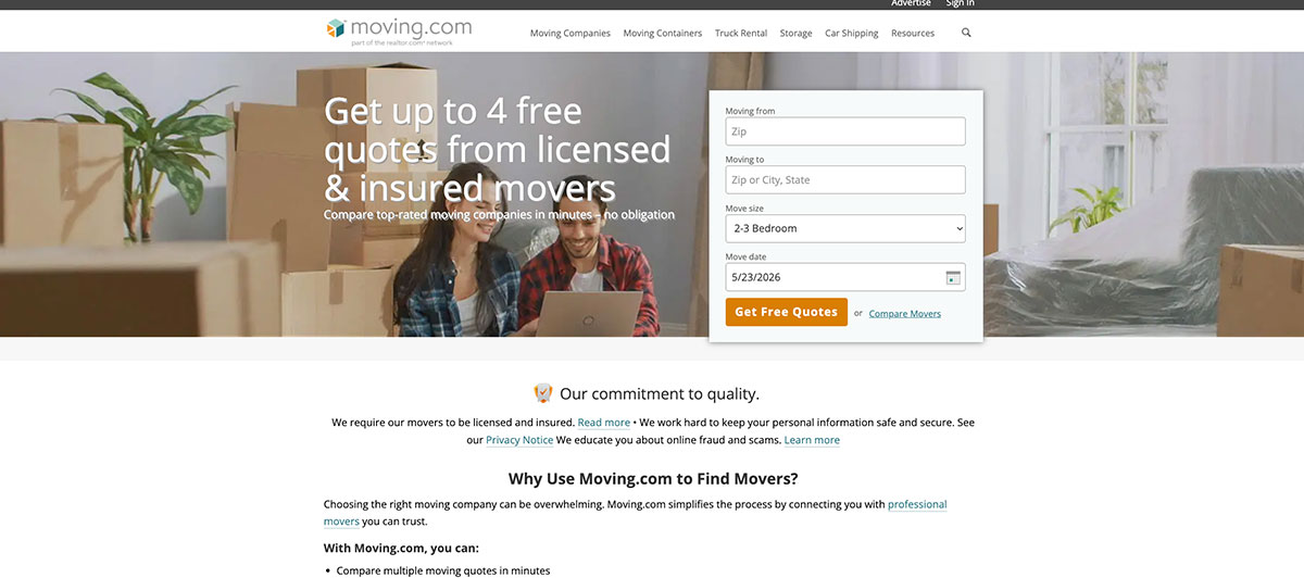
Moving places more emphasis on written content right from the homepage. It keeps to the standard of featuring the quote form on the header image, but then moves to a large section of text that tells viewers why they should use the service. They provide a clear call to action followed by images and graphics that point the way to additional information.
Design takeaway: Copy-driven design can outperform image-driven design when the writing is sharp.
10. Moving APT

This website may seem rather standard until you notice the sidebar that pops out, allowing visitors to enter their phone number to receive a prompt call back from Moving APT. This is a unique way to provide a call to action while making it easy for potential customers to contact the company for more information. The quote form is also easily accessed.
Design takeaway: Callback widgets are an underused conversion tool.
11. Square Cow Movers
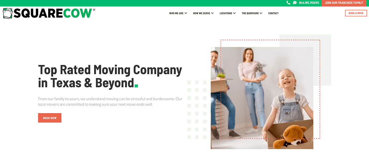
This is a great example of a website that leads with the personality of the brand. The design transitions between fields that span the full length of the page to smaller sections while utilizing a color scheme and creative wording to keep the viewer’s attention. Terms like “Austin movers” are used for SEO purposes without distracting from relevant Square Cow Movers information.
Design takeaway: Local keywords belong in your copy, not just your meta tags.
12. All My Sons Moving & Storage

All My Sons uses images sparingly, but the top picture is oversized and brand-related. The quote form takes a less obvious approach by simply asking potential customers if they’re moving to an apartment, house, office, or other type of property. A visitor may answer that question even if they aren’t ready to enter their contact information, so it makes the site more interactive and subtle.
Design takeaway: Start with low-commitment questions, then ask for contact info.
13. Gentle Giant Moving Company

Gentle Giant leads with a video as their homepage header rather than an image. It shows their movers in action with an emphasis on proper packing, gentle care of items, and speed. The site’s color scheme uses opposing colors that are slightly jarring yet attention-grabbing. Every page of the site is easy to scan with a balance of text blocks and colorful images.
Design takeaway: Video heroes humanize your service in seconds.
14. Cheap Movers Los Angeles
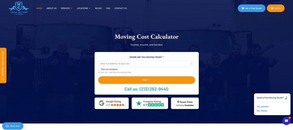
Cheap Movers keeps it simple but elegant with bright blue fields offset by a solid white background. The design utilizes slanted lines and short fields of text to keep attention while building a sense of brand. The quote form appears in two places and prompts potential customers to enter personal contact information along with move details.
Design takeaway: Repeat your quote form. Don’t make people scroll back.
15. NorthStar Moving Company
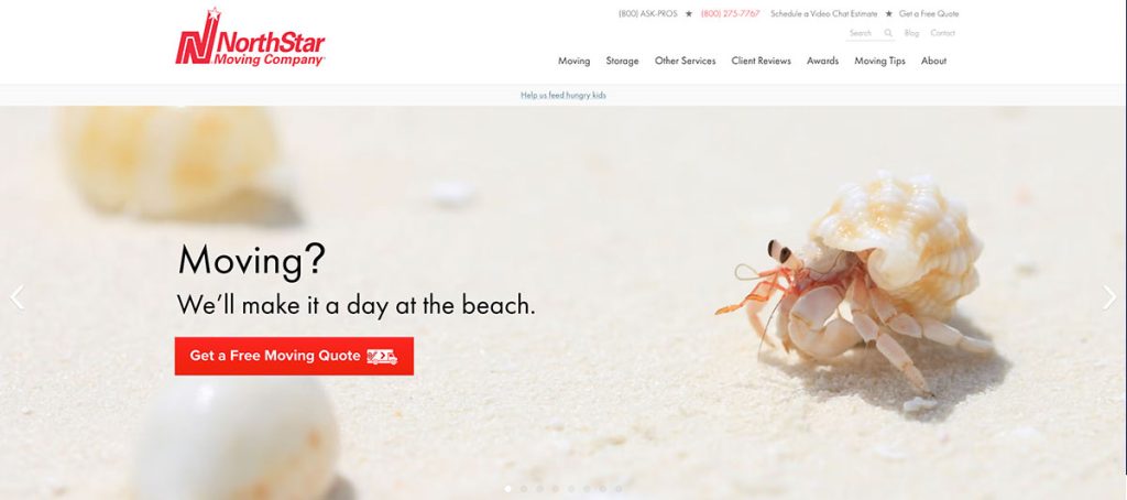
NorthStar leads with a slider filled with images of animals, landscapes, and travel rather than focusing on the typical imagery of home, family, and moving trucks. The images are layered with fun taglines that grab attention and introduce some humor to the website, which is great for branding. The rest of the page is less structured and utilizes no section dividers.
Design takeaway: Skip the trucks-and-boxes stock photos. Be different.
16. Meathead Movers

Meathead Movers includes detailed location pages, each starting with a bit of text rather than filling the top of the page with an image or video. The homepage is image-rich and easy to scan, and the location pages are a delicate mix of graphics and longer blocks of text. This is a good web design for moving companies serving a long list of geographical locations.
Design takeaway: Multi-location movers should treat location pages like mini-homepages.
17. Wirks Moving
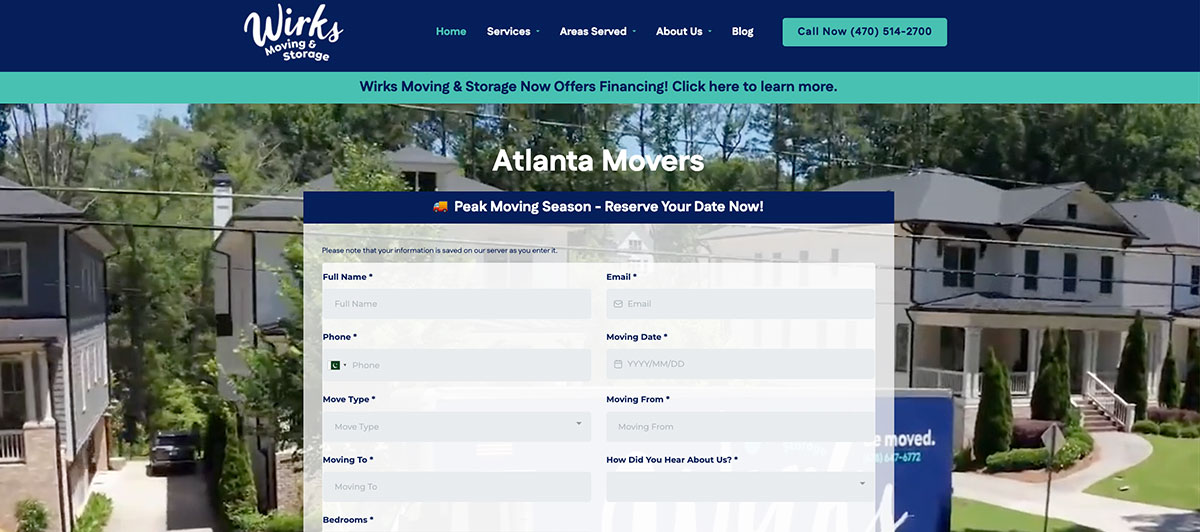
Wirks Moving stands out for its interactive self-pricing calculator that lets visitors price their own move without waiting for a callback. The teal and navy color scheme creates a modern, trustworthy feel, while the rest of the site uses graphics and short text blocks to make information digestible. Small clips of content positioned around clean illustrations keep visitors engaged, proving that interactive design beats walls of text every time.
Design takeaway: Interactive tools that solve buyer problems convert better than static pages.
18. Bellhop

Bellhop has a clean website design that places all the emphasis on the text. All design elements are consistent from the homepage to the location and service pages. Brand-boosting information is quickly conveyed along with contact information and introductions to service features and even individual movers.
Design takeaway: Consistency across pages reinforces brand professionalism.
19. Unpakt

If you don’t want to clutter your website with images and graphics, Unpakt has a good sample web design. There are no images on the front page, but a bright, solid background color is used to grab and keep attention. Viewers are easily led from the quote form to information about the company and a breakdown of how the service works. There are a few distractions with this design.
Design takeaway: A strong color and clean layout can replace heavy imagery.
20. Bin It

Check out the unique graphic at the center of the Bin It homepage. It features the outline of a storage container that is filled with different items as the image flips. This is a great way to bring a simplistic website to life. They also use fun graphics and a top image to break up the solid white background.
Design takeaway: One memorable animation beats ten generic stock photos.
21. 24/7 Logistic Services
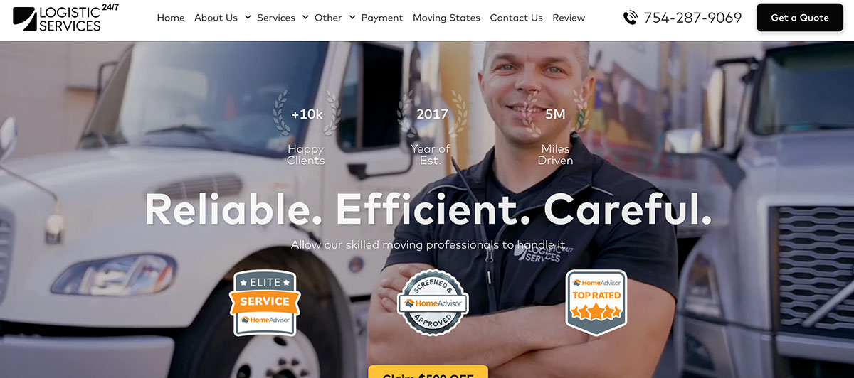
Logistic Services has a website header worth studying. It’s fainter than most and seems to bleed off into the background for a more dramatic effect that grabs the eye instantly. It also allows the text and quote form to stand out more, so viewers are more likely to notice them.
Design takeaway: Subtle hero treatments can make CTAs pop harder.
22. Colonial Van Lines

Colonial Van Lines uses a rather basic web design, but they shake it up with a cut-out image of movers having fun and colorful service boxes at the center of the homepage. The design is simple enough to present valuable information with little distraction, but it provides some unique features for personality.
Design takeaway: A simple base design plus a few personality moments equals memorable.
23. Zen Movers
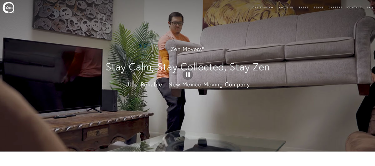
Zen Movers brings an unusually calm energy to the moving industry with a tagline that promises a stay-calm experience. The site ditches the typical large hero image in favor of a side-aligned layout that puts the tagline, phone number, and free quote button right at the center of attention. The minimalist palette and generous whitespace make the entire homepage feel breathable, while consistent Best of Santa Fe recognition badges reinforce credibility quickly.
Design takeaway: Side-aligned heroes free up space for direct CTAs without sacrificing brand personality.
24. Suddath

Suddath uses a navy and gold palette that projects institutional gravitas, fitting for a company that handles entire corporate office relocations. The site has a deeply segmented structure, with menu items for residential, commercial, military, and international services that make it clear this isn’t a one-size-fits-all operation. Visual layering through overlapping images, text blocks, and badge overlays adds depth without clutter, and the Track Your Shipment link is prominently featured for client transparency.
Design takeaway: Strategic third-party endorsements turn external credibility into conversion fuel.
25. Trinity Relocation Group
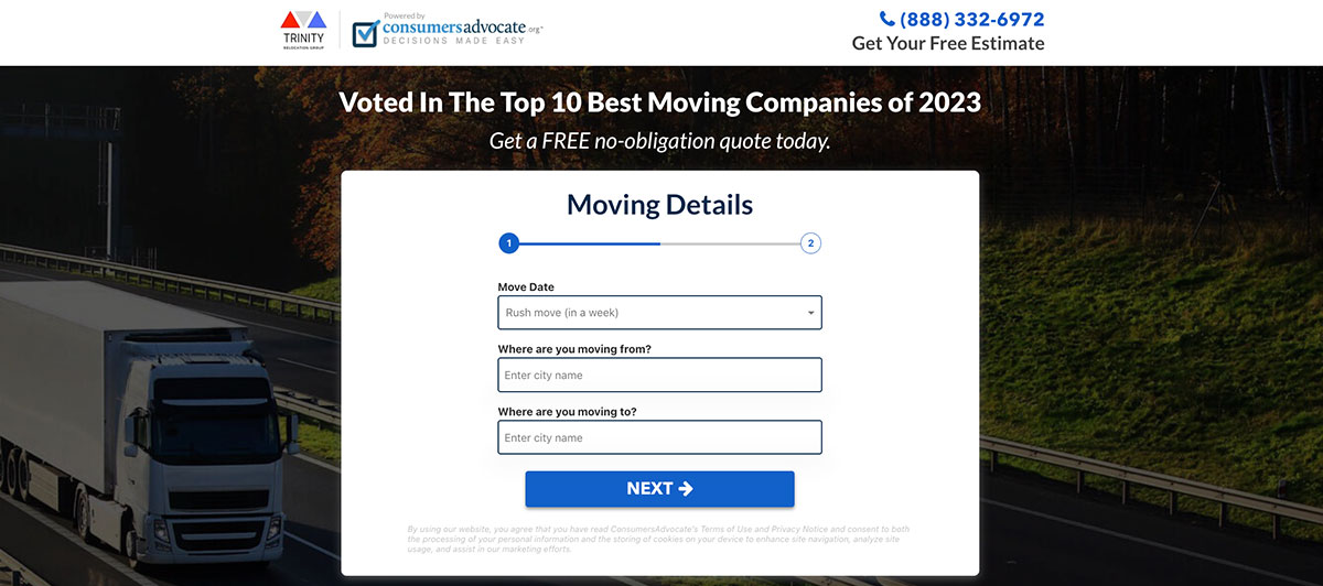
Images are used to add some personality to this otherwise simple web design. It rotates between background images that span the full length of the screen and partial images that fade into the white background. That allows the Trinity Relocation Group to present more text in some fields while keeping their quote box and call to action prominent.
Design takeaway: Flexible hero treatments help long-form content breathe.
26. Gold Standard Relocation

The quote form is what you see first when you download the Gold Standard Relocation homepage. It’s a simple form that requires less personal information than many other websites, so visitors are more likely to fill in the blanks before looking further. Presenting the company’s logo as a watermark in the background at the center of the page is also a nice touch that catches attention.
Design takeaway: Shorter forms lift conversion. Always.
27. Solomon & Sons Relocation Services

The Solomon & Sons website is a good example of how images are effectively altered for a personalized appearance that catches the eye. It features a large top image like many other websites, but it’s elevated with simple blue streaks that are in line with the company’s brand. The homepage provides all the information potential customers need to size up the business and make contact.
Design takeaway: Branded design accents personalize generic templates.
28. TransWorld Van Lines

The header image on the TransWorld Van Lines website takes up more space than usual and creates the effect of a moving truck speeding down the highway. It represents the speed of the company while adding visual interest for the visitor. The overlapping quote form is designed to contribute to the visual effect as well.
Design takeaway: Hero imagery can communicate brand values implicitly.
29. Flat Rate Moving
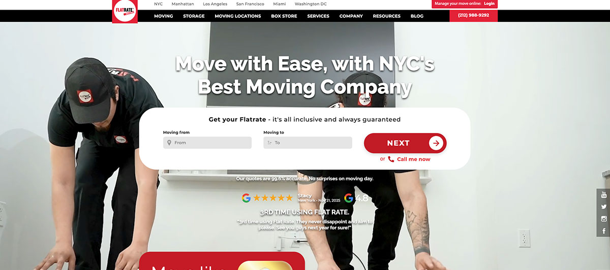
Flat Rate Moving puts a 4.9 out of 5 rating from thousands of reviews front and center, paired with a New York Yankees partnership that cements its position as a premium NYC mover. Built with Elementor, the website balances professional credibility with conversion optimization, and every page guides visitors toward requesting a quote. Specialty services like art and piano moving are highlighted to signal expertise that justifies premium pricing.
Design takeaway: Pairing high review counts with recognizable partnerships builds an instant case for trust.
30. Cheap Movers Houston

Branding on the Cheap Movers Houston website starts with the large header image that represents Houston. The “get started” button is clearly presented at the top in a contrasting color from the image behind it. The middle of the page offers unique shapes and logos that seem to jump down the page along with the eye. It creates the illusion of an interactive website with simple design elements.
Design takeaway: Visual flow can mimic interactivity without the development cost.
31. U-Haul

U-Haul uses their signature branding colors to bring life to an otherwise simplistic website design. The site utilizes a slider at the top that provides a variety of images with clips of information for potential customers. The rest of the page consists of simple boxes with imagery and text to provide valuable information in an easy-to-scan format.
Design takeaway: Strong brand colors can carry minimalist layouts.
32. United Van Lines
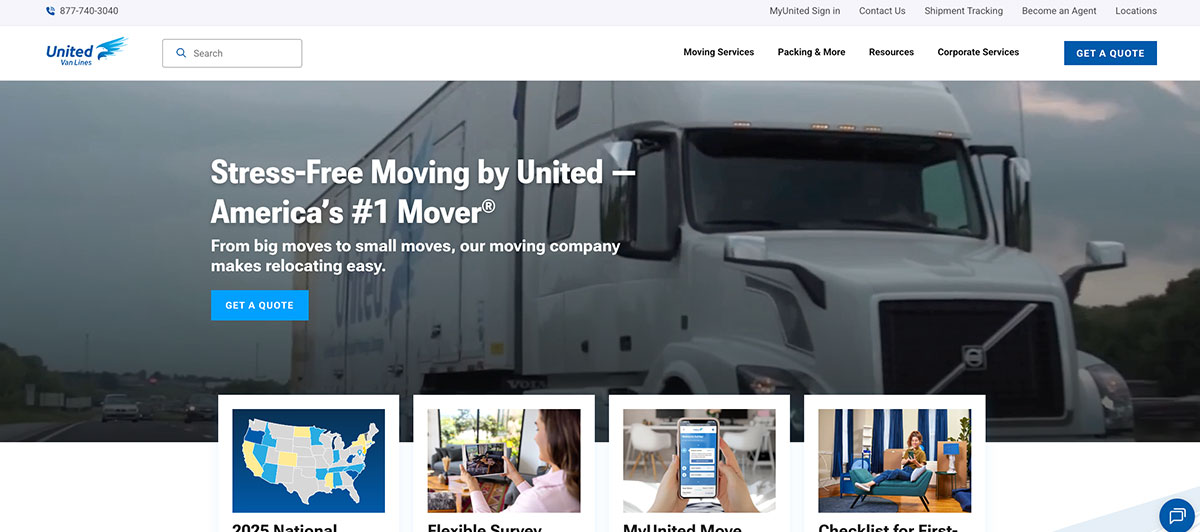
This website brings boxes, images, and graphics together to create a sweeping homepage that naturally progresses the eye from one field to the next. It has a professional feel with ample white space and lots of text to provide detailed information about United Van Lines.
Design takeaway: Generous white space signals premium positioning.
33. Relief Movers
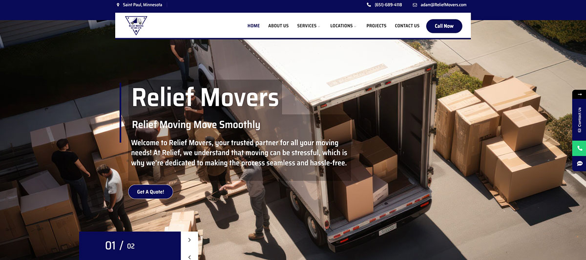
Everything is bigger with the Relief Movers website. It has a professional appearance with oversized text and large images throughout the homepage. It’s easy to read and has a standout color scheme that grabs attention. The top image also places the company’s slogan front and center with a bright highlight on the “request a quote” button.
Design takeaway: Oversized elements work when paired with restraint elsewhere.
34. Arpin Van Lines

Arpin Van Lines has an attention-grabbing website that uses color blocking to progress the viewer down the homepage. Images aren’t used as heavily as with other moving website designs, but there’s enough to break up the text and keep the reader’s attention.
Design takeaway: Color blocking can replace heavy imagery for visual rhythm.
35. Coffey Bros Moving
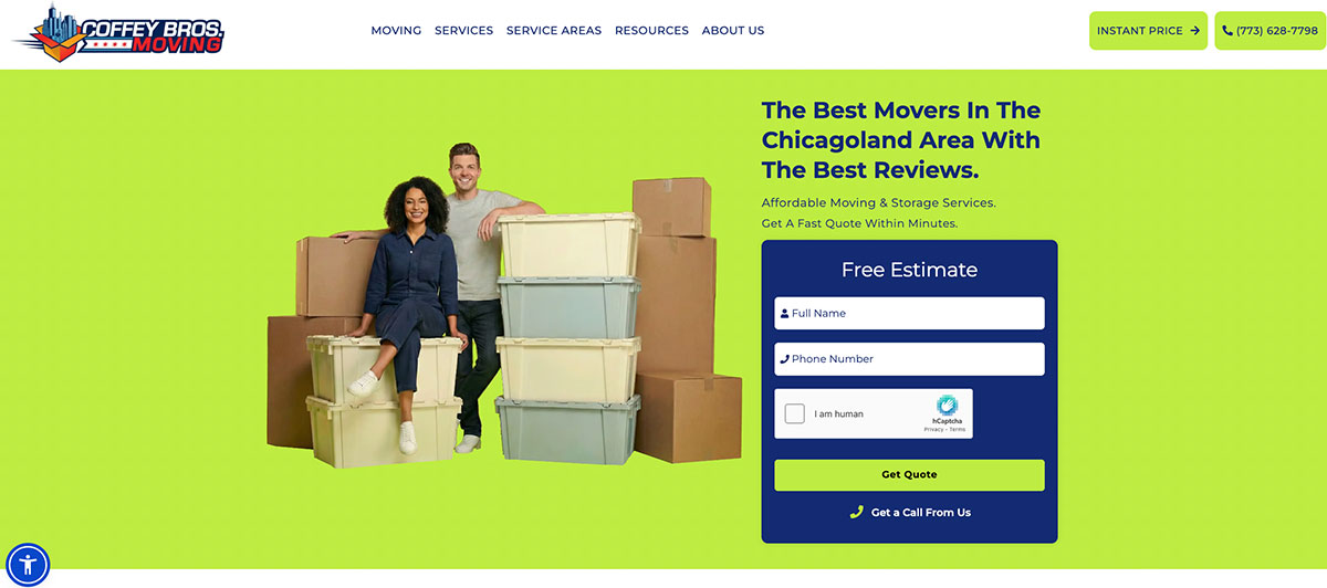
Coffey Bros Moving serves the Chicago area with residential and commercial moving, wrapped in a dark blue and lime green color scheme built with the Avada theme. The color combination is bold and energetic, matching the hustle required to navigate Chicago’s tight streets.
The family business feel comes through in the branding, with Bros signaling a personal, accountable operation where the owners are directly invested in every move’s success. Family-oriented imagery, team photos, and personal touches anchor the homepage with warmth.
Design takeaway: Family branding plus team photos creates relatability that big corporate movers can’t replicate.
36. Mayflower
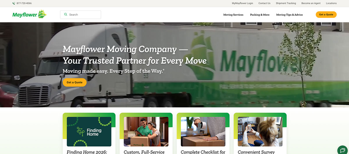
Simple graphics centered around Mayflower’s color scheme make this website bright, entertaining, and focused. The slider at the top of the homepage provides all the information consumers need to make an educated decision, and the “get a quote” button is prominently featured throughout the page. While few images are used, the ones chosen are focused directly on the brand.
Design takeaway: Repeated CTAs increase the odds of a click.
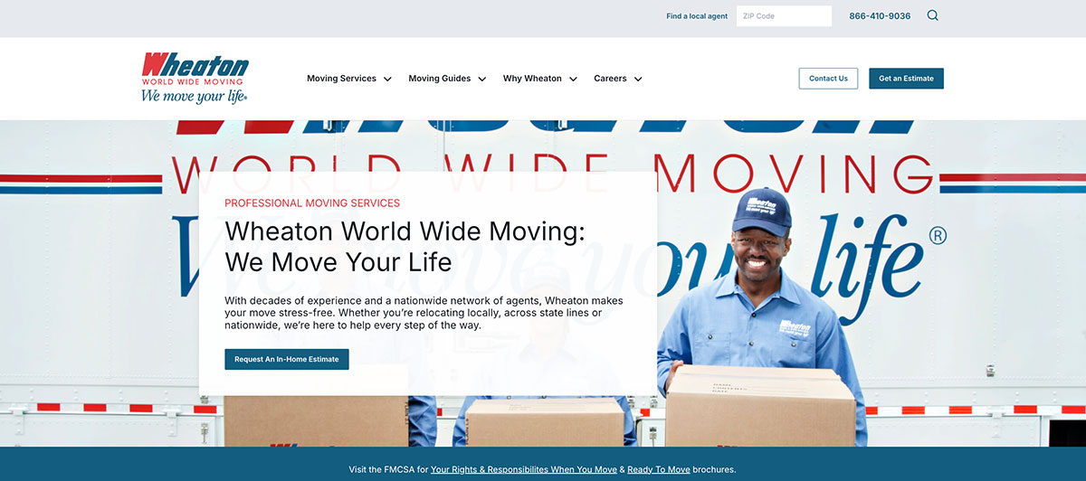
37. Wheaton Worldwide

This web design presents Wheaton Worldwide in a sleek, professional light. The design includes a lot of white space in the background, which is offset by side boxes in bright colors with white text. Plenty of information is presented in short clips, allowing the viewer to progress down the page quickly.
Design takeaway: Side boxes are great for breaking copy without breaking flow.
38. Two Men and a Truck

Two Men and a Truck stands out with an attention-grabbing header video that leads the viewer’s eye to the rest of the page with an arrow-shaped sloped line across the bottom. The company’s slogan is placed right at the top, and fun, colored circles with moving-related graphics pull the viewer into small clips of information at the center of the page. Less emphasis is placed on the quote button than on other websites.
Design takeaway: Sometimes secondary CTAs work better when the brand story leads.
39. Bekins

Elegance and entertainment come together on the Bekins moving website. The simple slogan is prominently positioned atop a video that shows their movers in action, instantly connecting with potential customers. The website is simple but uses a lot of branded graphics that deliver a professional look and feel.
Design takeaway: Video plus tight slogans equals memorable hero design.
40. Big Ben’s Moving & Storage
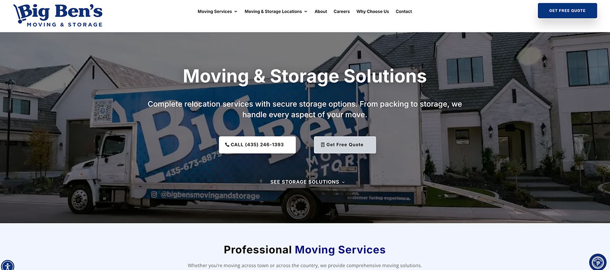
Big Ben’s embraces their California location by using images of local hot spots as a background for their quote form, which clearly shows visitors that the quote is a four-step process. This simple yet effective web design breaks the homepage content into small blurbs with images and icons that encourage viewers to read. A sidebar offers viewers easy access to more detailed content through their blog and news page.
Design takeaway: Localizing imagery turns broad services into neighborhood services.
41. Accurate Express Movers
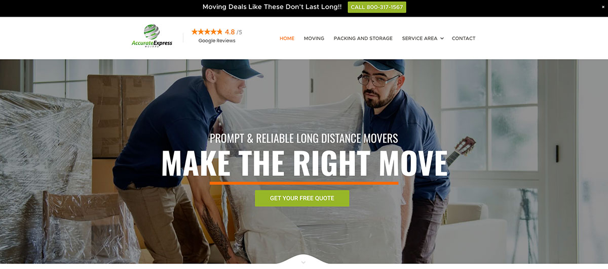
This Indianapolis moving company has a sleek website that uses large image fields balanced with open white space and listing boxes. A lot of Accurate Express’s content is delivered, but the most important features grab attention and pull the eye down the page. It’s easy to skim yet provides relevant details for viewers with the time to read. Their moving process is easily displayed, and all images portray a hardworking team.
Design takeaway: Layered information serves both skimmers and serious researchers.
42. JK Moving Services

JK Moving Services uses custom images and bright colors to create a warm welcome for visitors while utilizing their branding color scheme. The content incorporates catchy slogans, which are in large, bold letters, speaking to the visitor even if they don’t spend much time reading the smaller text. This is a good alternative to the common web design that places a large photo, video, or slider at the top of the homepage.
Design takeaway: Bold typography can do the work of a hero image.
43. Allegiance Moving and Storage

If you want to keep it simple yet elegant and professional, this web design is a potential role model. The colors are in line with the Allegiance Moving and Storage brand. The content is concise and positioned at the center of the page with graphics that make it more approachable. Viewers have access to the quote form at the top and bottom of the page, but the top doesn’t feature a full form like on many other mover’s websites.
Design takeaway: Bookend your CTAs at the top and bottom of every page.
44. Michael’s Moving & Storage

This moving website leads with a simple keyword phrase and a few numbers that make the Michael’s Moving & Storage brand reliable. That well-placed phrase helps with SEO while clearly telling visitors that they are a Boston moving company with “clear pricing” and “affordable rates.” The image at the top is darkened to create a backdrop that doesn’t distract from their primary message.
Design takeaway: SEO copy and brand copy don’t have to live in different places.
45. Einstein Moving Co.

If you want to keep it simple while adding a personal touch, check out these Dallas movers. Einstein Moving keeps their web design basic with a lot of white space, but images and small bursts of color are used to pull the eye to important information like the quote form. That form is presented throughout the page, so visitors never have to scroll back to the top or bottom to find it. Pictures and names of the individual movers give the site a personal touch.
Design takeaway: Repetition of key forms removes friction at every scroll point.
46. Bold Moving and Storage
This website puts simplicity on display. Bold Moving and Storage leads with a large image of the company’s team smiling and giving a thumbs up. Scrolling down, you find some basic content that starts with a definition of the term “bold.” Visitors can quickly learn about the company and decide if they want to get a quote without wasting time on advanced design features or marketing jargon.
Design takeaway: Direct copy beats clever copy when speed matters.
47. Cross Country Moving Group Inc.
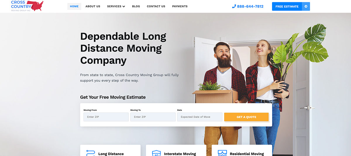
The Cross Country Moving Group uses images and white space to split content into sections, but then they allow boxes to overlap sections for a unique look. This is a crisp website that creates a professional and respected image for the company. Slogans and the quote form are prominently placed, but you also learn more about the company and the services they offer just by scrolling through short snippets of content.
Design takeaway: Overlapping elements add depth without complicating the layout.
48. International Van Lines

International Van Lines uses large image boxes to keep the visitor’s attention as they scroll the homepage. The top image isn’t static, so it brings the page to life with movement and flashing color. A colored header bar drops down and scrolls with the viewer, so they can jump to a deeper page within the website at any moment.
Design takeaway: Sticky navigation pays off on long-scroll sites.
49. IMRG

If you want to introduce yourself properly right from your homepage, the IMRG website is a good example of how it’s done. This mover’s website features a much longer “get to know us” section than you will find on other websites, but it still offers a sleek design that is easy for visitors to skim if needed. It places the quote form in a prominent location and uses images to send the message that they’re professional and hardworking.
Design takeaway: Longer About sections work when paired with a sharp design hierarchy.
50. Stevens Worldwide Van Lines
The website for Stevens Worldwide Van Lines displays a great balance between brand-boosting imagery and in-depth content. They use color blocks on the side of the page to entice visitors into asking for a ballpark estimate, but only after presenting some information related to their service. This is a rather simple website with modern appeal and a friendly welcome to new customers.
Design takeaway: Earn the click. Educate first, then ask for the conversion.
What these 50 sites have in common
Pull back from the individual designs, and you’ll see a few patterns repeating across the best movers websites:
| Common Feature | Why It Works |
| Quote form above the fold | Captures intent at peak motivation |
| Trust signals (awards, stats, reviews) | Reduces hesitation in a high-stakes purchase |
| Real photography over stock | Builds authentic, human connection |
| Repeated CTAs throughout | Removes friction at every scroll position |
| Mobile-responsive layouts | Most moving searches start on mobile |
| Clear local references | Captures local search intent and signals expertise |
If your current site is missing more than two of these, you’re leaving money on the table. The good news? Each of these elements is straightforward to implement on a properly built WordPress site. The agency behind your build matters, though, and our WordPress design team at Freshy has helped hundreds of service businesses turn outdated brochure-style sites into lead-generating machines.
What to look for on a mover’s website before booking

Design inspiration is one side of the coin. The other is knowing what to look for as a buyer visiting these sites, since the same features that make a mover’s website great also make it trustworthy.
- Transparent Pricing Information: Look for sites that publish pricing tiers or breakdowns instead of forcing you to call. Professional movers cost varies, but reputable moving company websites will at least give ranges or a calculator. If a site hides pricing entirely, expect surprises in the final cost.
- Clear Service Listings: The best long-distance moving companies break out customizable services on dedicated pages: packing, long-term storage, vehicle transport, corporate relocation, and moving containers. Vague we do everything messaging is a red flag. Strong sites show exactly what’s offered, helping buyers compare professional movers side by side.
- Coverage and Protection Details: A good website spells out coverage options upfront. Full value protection should be visible on service pages, not buried in the fine print. Cross-country movers and interstate movers especially need this transparency since long-haul moves carry more risk.
- Booking And Move Date Tools: Top sites let you check availability, lock in your move date, and book online without back-and-forth phone tag. Whether you choose United Van Lines, Colonial Van Lines, or a regional carrier, this self-service capability signals a modern, well-run operation.
- Educational Resources: Strong movers’ websites publish free moving tips, packing guides, and timeline checklists. Resources like Colonial Van Lines University set the bar by educating customers before they book. It’s a trust signal that says the company actually cares whether your move goes well.
A great site reflects a great moving company. A weak site is usually a warning.
Conversion-focused features that drive quote requests
Looking pretty isn’t enough. The best movers’ websites are built to convert curious visitors into booked moves, and that starts with a few non-negotiable features.
Above-the-fold quote form
Your quote form should be visible without scrolling. Visitors planning long-distance moves are usually comparing three or four interstate moving companies at once, so making them dig for the form means losing them to a competitor.
Click-to-call phone numbers
For local moves, urgency is everything. A tappable phone number on mobile, paired with a sticky header that follows the scroll, captures buyers ready to talk now.
Instant online estimates
Static contact forms are dying out. Buyers expect a moving estimate or at least a ballpark range without waiting 24 hours. Tools that calculate based on home size, distance, and packing services convert at much higher rates than email-and-wait flows.
Multiple CTAs per page
Repeat your Get a Free Quote button at the top, mid-section, and bottom of every page. The further someone scrolls, the warmer the lead, so giving them another chance to convert pays off.
Live chat or callback widgets
For full-service moves involving long-term storage, car shipping, or international moves, buyers have questions before committing. Live chat or callback widgets reduce friction and capture leads who would otherwise bounce.
A strong WordPress build can handle all of these natively. Our WordPress development team integrates conversion-focused forms, payment gateways, and CRM hooks so every quote request flows directly into your sales pipeline. If you’re stuck on a slow, clunky platform, a migration to WordPress usually pays for itself in lead volume within months.
Branding tactics that build instant trust

Moving is high-stakes. People are handing strangers their entire life in boxes, so trust gets built or broken in the first few seconds on your homepage.
- Lead With Real Photography: Stock photos of generic moving trucks scream unreliable. Real photos of your moving crew in branded uniforms, your fleet, and your warehouse build credibility instantly. Buyers want to see who’s actually showing up.
- Show Off Your Numbers: Years in business, total moves completed, customer satisfaction percentages, BBB ratings, and review counts all do heavy lifting. A homepage stat block like 25 years in service, 50,000+ moves, 4.9/5 from 6,000 reviews tells a buyer more than a thousand words of marketing copy.
- Display Industry Affiliations: Memberships with the American Trucking Association, ProMover certification, FMCSA registration, and partnerships with national companies like North American Van Lines or United Van Lines signal legitimacy. They also help separate professional moving companies from fly-by-night brokers.
- Feature Real Reviews: Embed Google reviews, Yelp feeds, or video testimonials directly on the homepage. Don’t hide them on a buried Testimonials page. Buyers want proof now, not after three clicks.
- Use Consistent Branding: Your trucks, uniforms, website, and business cards should match. When prospects compare a few moving companies side by side, the one with sharp visual consistency looks more reputable, even if the services are identical.
A polished WordPress build keeps all of this on-brand and easy to update. Freshy’s WordPress design services help service businesses translate offline trust signals into digital ones, so your site reflects the quality of your operation.
Layout, imagery, and content choices worth stealing
The cleanest movers’ websites all borrow from a similar visual playbook. Here’s what to copy.
Hero section that earns the scroll
Your hero needs three things: a clear value proposition, a quote form or CTA, and an image or video that humanizes the brand. Skip the generic moving truck stock photo. Show your team, your service area, or your work in progress.
Modular service pages
Each service deserves its own page. Local moves, long-distance moving services, packing and unpacking, auto transport, long-term storage, and corporate relocation all have different buyer intents. Lumping them onto one page tanks SEO and confuses visitors.
Location pages for multi-city movers
If you serve multiple cities, build out dedicated location pages. Each one should reference local landmarks, common move routes, and city-specific pricing. Generic pages don’t rank for local search.
Comparison tables
Buyers researching movers love side-by-side comparisons. Use tables to break down what’s included in each service tier:
| Service Tier | What’s Included | Best For |
| Basic Move | Loading, transport, unloading | Local moves under 50 miles |
| Standard Move | Loading, transport, packing materials, and unloading | Mid-distance moves with some packing |
| Full Service | Packing, loading, transport, unloading, unpacking, debris removal | Long-distance and full-service moves |
Image galleries before the CTA
A short gallery showing your trucks, your crew, and completed moves builds trust before asking for the conversion. Pair galleries with short captions that highlight your differentiators.
For more on smart layout choices, our guide on improving website user experience breaks down what actually moves the needle on engagement and conversions.
Common design mistakes movers should avoid
Even movers with great service often have websites that actively work against them. These are the design mistakes that quietly cost you bookings every month.
- Cluttered Homepages: Stuffing the homepage with every service, every promotion, every testimonial, and every certification creates decision paralysis. Strip it down to one clear message, one strong visual, and one obvious next step.
- Buried Quote Forms: If a visitor has to scroll, click, and search to find your quote form, you’ve already lost half your traffic. Forms belong above the fold, in the sidebar, and in the footer, on every page.
- Slow Load Times: Heavy images, unoptimized code, and bloated plugins kill mobile rankings. Most mover searches start on a phone, and a site that takes more than three seconds to load loses the click. Our resource on why a WordPress website slows down walks through how to fix it.
- No Local SEO Foundation: If your site doesn’t reference your service cities, neighborhoods, or surrounding zip codes, you’re invisible to local searches. Local moves depend on local visibility.
- Weak Mobile Design: A site that looks fine on desktop but breaks on mobile is a site that loses bookings. Responsive design isn’t a bonus feature anymore. It’s the floor.
- Outdated Security: Movers handle credit card payments, customer addresses, and personal information. A site without SSL, current plugin updates, or proper backups is a liability. Freshy’s WordPress security services and maintenance plans handle the boring-but-critical work so you don’t have to think about it.
Avoiding these mistakes won’t make your site great, but ignoring them will absolutely make it bad.
Build a mover’s website that actually books jobs with Freshy
Your website is the first impression every prospect has of your moving company. The 50 examples above show what works: clean layouts, obvious quote forms, real photos, and trust signals that convert.
Here’s what to take with you.
- Lead with a quote form above the fold
- Use real team photos over stock imagery
- Display reviews, certifications, and stats prominently
- Build dedicated service and location pages
- Prioritize mobile speed and responsive design
- Avoid clutter, buried CTAs, and weak security
Tired of a website that looks dated and barely brings in leads? Freshy builds custom WordPress sites for movers and service businesses, handling everything from design to security. Talk to our team or explore our work to see what’s possible.
Frequently asked questions
What is the best website for moving?
The best moving websites belong to full-service movers like Allied Van Lines, Atlas Van Lines, and United Van Lines. They offer competitive pricing, binding estimates, and shipment tracking for stress-free local and long-distance moves.
What are the red flags with movers’ websites?
Red flags include no physical address, no federal government licensing info, no cargo insurance details, vague hourly fees, no in-house team mentions, and pressure to skip a home survey before quoting moving costs.
What is the hardest room to pack, even for professional movers?
The kitchen is the hardest room to pack. Fragile dishes, glassware, and small appliances often need custom crating, careful padding, and slow handling. Most service movers recommend tackling it last for stress-free packing.
Should I choose a moving company or a truck rental for long-distance moves?
Choose long-distance movers or full-service movers if you want a stress-free move with vehicle shipping, free storage, and an entire team handling the work. Truck rentals save money but require heavy DIY effort.


