
There’s a common belief that local stores can’t compete with big-box retailers online. Wrong. The best local retail websites are more than just online stores. They’re digital community hubs that offer quality products, faster local delivery, and the chance to keep money circulating within your own community. The gap between a small shop and a polished online shopping experience is closer than most people think.
This article showcases 9 of the best local retail websites and what makes each one worth your time and your money.
Here’s what we cover:
-
What separates a great local retail website from a generic online store
-
9 of the best local retail websites, reviewed and linked
-
The design and community-building choices behind each site
-
What every local shop needs online to compete and win
-
How to build a local retail site that turns browsers into loyal buyers
We’ve helped local businesses across the US build WordPress websites that punch well above their weight online. Take a look at our small business web design work to see what’s possible.
What the best local retail websites get right
Big online stores have scale. Local retailers have something far harder to replicate: story, personality, and genuine community connection. The best local retail websites lean into all three of those advantages while delivering an online shopping experience that holds up against any national brand.
74 percent of online shoppers expect personalization and transparency when choosing where to spend. Local retailers who deliver both through their websites, and pair that with fast local delivery, curbside pickup, and same-day delivery options, have a real competitive edge.
Here’s what separates the best local retail websites from forgettable ones:
-
They communicate the store’s story instantly. A local shop’s biggest competitive advantage over Amazon is its why. Who started it? What do they curate? What does the neighborhood look like? The best local store websites answer these questions through imagery, copy, and homepage design before a visitor even clicks on a product category.
-
They make online shopping genuinely convenient. Local delivery, curbside pickup, same day delivery for customers nearby, and local pickup from the physical location are the features that convert online shoppers who might otherwise default to a national retailer. Friction-free checkout, quick shop features, and multiple ways to pay all contribute to online sales that stick.
-
They build community around the physical store. Events calendars, mailing list signups, blog content, live social feeds, and local pickup options all create an online experience that feels connected to the physical location rather than separate from it. Local shops that do this well convert digital visitors into in-person regulars.
-
They curate, not overwhelm. Unlike national online stores with thousands of SKUs, the best local retail websites showcase a carefully selected range of quality products with photography that gives each item the attention it deserves. Restraint in product presentation actually increases buyer confidence.
|
Generic online store |
Best local retail website |
|---|---|
|
Thousands of products, hard to browse |
Curated categories, easy to explore |
|
No community connection |
Events, classes, mailing lists, blog |
|
No local delivery or pickup options |
Same day delivery, curbside pickup, local pickup |
|
Impersonal brand story |
Real founders, real story, real neighborhood |
|
Competing on price alone |
Winning on personality, quality, and convenience |
9 best local retail websites of 2026
With the biggest holidays of the year just a few weeks away, we know you’ve got your mind focused on shopping. And, while we definitely advocate spending the season enjoying family and friends more than things, we also know that there are some seriously awesome stores across the United States that really deserve your business. Not only do local stores and businesses truly support the community that you live in, but we also find that so many of them tend to be more aware of important things, like sustainability, ethics, giving back, and the environment.
The best local stores also know how to do, or to seek out, website design the right way.
By creating an enjoyable online experience, one that supports their physical location while simultaneously cultivating a digital community, the best local store websites really are an incredible source of inspiration, especially if you’re looking to redesign or develop your own website.
Want a peek at our favorites?
Here are the thirteen best local store websites online in 2026, all wrapped up with a bow on this easy-to-scroll list just for you.
1. Apple and Oak
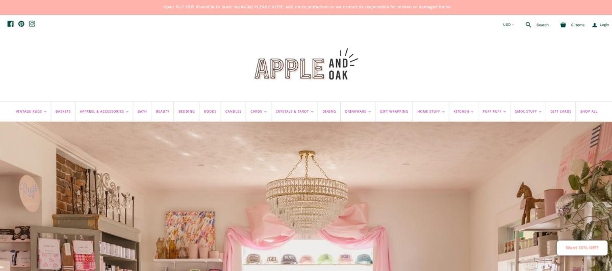
Apple and Oak have a personality that comes through in every line of copy. From novelty gifts to vintage Turkish rugs, the product range is eclectic, and the website leans into that with copy that is genuinely funny and specific to its audience.
Multiple payment options make it easy for every type of buyer to complete their purchase. The layout itself is fairly standard, but the personality injected throughout the content makes the experience fun in a way that most local retail websites never achieve. It’s a reminder that voice and character are design elements too.
2. Play

Play is a toy store website that feels exactly like a toy store should. Colorful, enthusiastic, and genuinely fun to discover, the site features photography of actual children playing with toys and a Mister Rogers quote that immediately sets the store apart from big-box alternatives.
While online shopping is not available, in-store services like gift wrapping, call-ahead ordering, local delivery, and toy assembly are prominently featured. The one-page layout is easy to navigate via scroll or direct menu links. It’s local commerce done with passion and personality, and visitors can feel the difference.
3. Frock Boutique

Frock Boutique in Asheville, North Carolina, takes a counterintuitive approach: no online shopping. The site gives potential customers everything they need to understand the store’s clothing styles and brands while deliberately creating the anticipation of an in-person visit.
It’s a calculated commitment to the physical location and local community that actually deepens the brand’s identity. For local shops with a strong in-store experience worth protecting, Frock Boutique is proof that not every retail website needs to sell directly to be effective at driving sales.
4. Books Are Magic
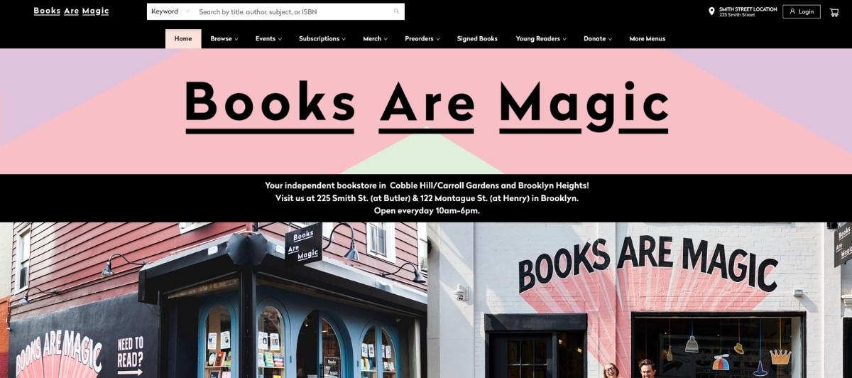
Books Are Magic, the beloved New York bookstore owned by author Emma Straub, is one of the most community-centered local retail websites online. An interactive events calendar, a compelling mailing list signup, and curated book categories make the site genuinely enjoyable to explore.
The blog, while not updated as frequently as it could be, features thoughtful content ranging from book club tips to themed reading lists. For any local shop looking to build a thriving online community around a physical location, this site is one of the most complete examples of how to do it well.
5. Take Heart

Take Heart in Austin, Texas, uses a minimal and modern layout to create a warm, personal online shopping experience. Lifestyle photography emphasizing texture and shadow sets a casual mood that matches the store’s identity. Five clean product categories in the main menu make browsing feel effortless.
A search tool in the upper corner supports discoverability for shoppers who know what they’re looking for. Footer details for the physical location and social links connect the online store back to the community it serves, making this site a strong example of local online commerce done with genuine style.
6. Encinitas Surfboards
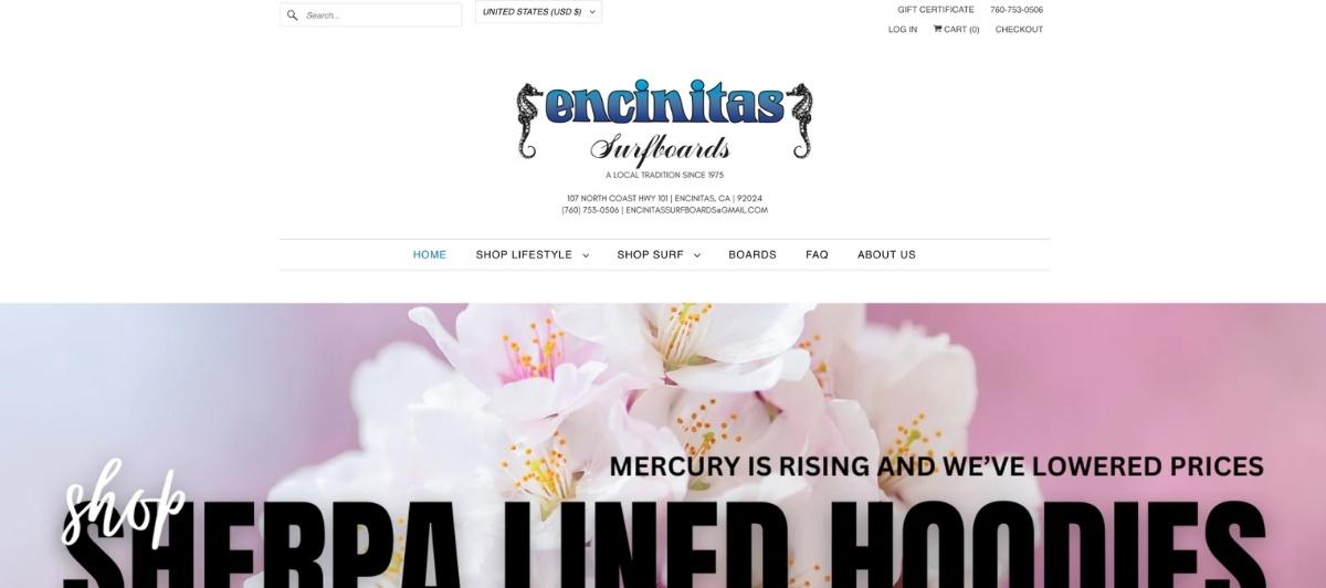
Encinitas Surfboards runs on Shopify and carries its laid-back identity through every design decision. The traditional menu, expected footer, and effortless navigation mean online visitors get from browse to purchase in the shortest time possible.
A Quick Shop feature lets customers add products to their cart without visiting individual product pages, a small detail that meaningfully reduces friction for online orders, especially on slower connections. It’s a surf shop that understands its audience well enough to know that a relaxed buying experience is worth more than a flashy one.
7. Dog Eared Books
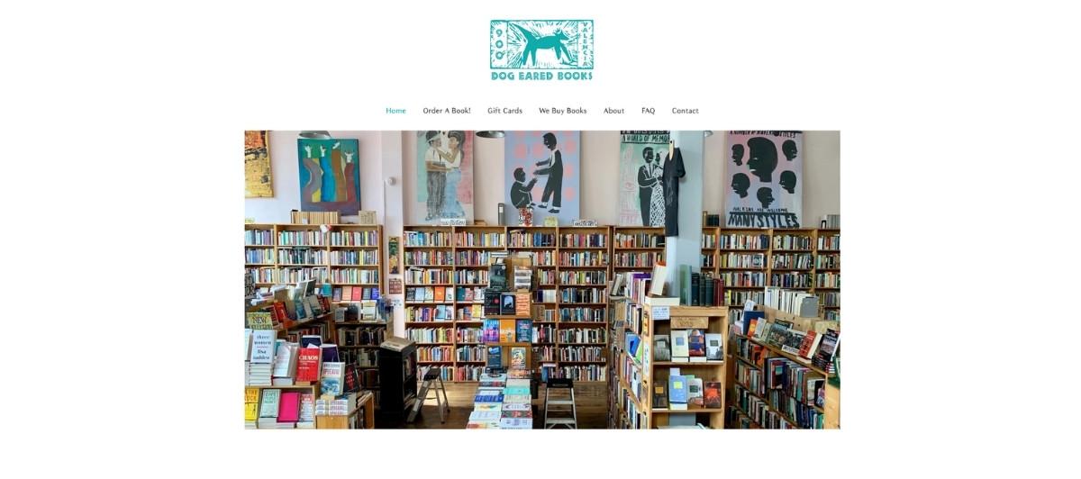
Dog Eared Books in San Francisco uses its homepage to do something most bookstore websites don’t bother with: it makes the store feel live. A regularly updated “Dog Eared Bestsellers” section, a live Instagram feed, and information about current in-store art all communicate that something is always happening here worth visiting for.
The content strategy alone is a model for any local retailer looking to build an online presence that functions as a community hub rather than just a product catalogue. When a website makes you want to visit the store, it’s doing its job perfectly.
8. University Bicycles
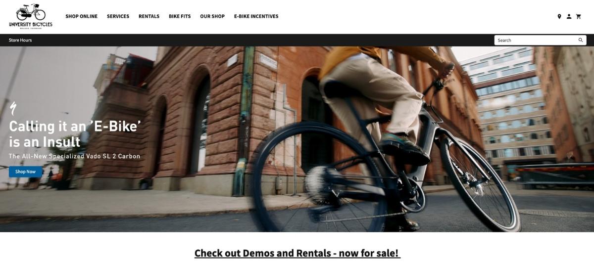
University Bicycles in Boulder has been a neighborhood staple since the 1980s, and the website channels that community tenure into its identity. Headlines like “Unrelenting Friendliness” and a dedicated section about the store’s bike museum, featuring bicycles from the 1800s, give this site a warmth and depth that pure product-focused retail websites lack.
It’s not a flawless design, but the authenticity more than compensates. Any local retailer unsure whether to invest in personality-driven content should look at this site as proof that homegrown character is a conversion tool in its own right.
9. Burro
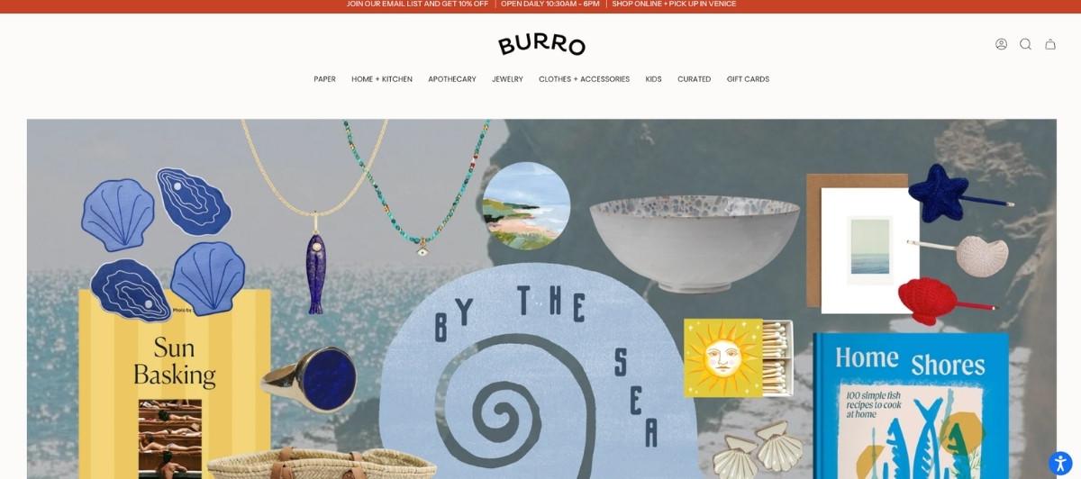
Burro in Venice, California, balances online shopping with in-store discovery beautifully. Intelligently sorted product collections make it easy to buy local online, while generous photography of the physical store tempts visitors to come in person when they can.
Ample white space and high-quality product images prevent the browsing experience from feeling overwhelming, and a Quick Shop feature alongside Amazon Pay checkout makes completing online orders frictionless. For a local shop with a strong visual identity, Burro’s website is a near-perfect model of how to let quality products speak while making the buying process effortless.
What every local retail website needs to compete online
Across all 9 of the best local retail websites above, certain features appear consistently on the sites that convert online shoppers into loyal customers. Here’s what every local shop should prioritize.
A clear, genuine brand story on the homepage
Local businesses compete on personality, not price. The homepage should tell a visitor who started the store, why, and what makes it worth choosing over a convenient national alternative. A brief founder story, a neighborhood reference, or a simple statement of values communicates authenticity that online shoppers actively seek from local retailers.
Local delivery, same-day delivery, and curbside pickup options
The convenience advantage that national brands hold over local stores shrinks considerably when local shops offer same-day delivery, curbside pickup, or local pickup from the physical location. Displaying these options prominently on the homepage and product pages removes one of the biggest reasons online shoppers default to larger platforms instead of buying local online. Our WooCommerce development services support exactly this kind of local fulfillment integration.
Curated product categories, not overwhelming catalogues
Local retailers often have a smaller product range than national competitors, and the best local retail websites treat that as a feature rather than a limitation. A carefully curated set of categories, each with excellent photography and clear descriptions, gives online shoppers a more satisfying browse experience than scrolling through thousands of undifferentiated products. Make it easy to explore and even easier to decide.
Community-building content alongside the shop
Events, classes, mailing list signups, a blog, and an active social feed all give local online shoppers a reason to return to the site beyond completing a purchase. Local shops that build community online extend the relationship between buyer and store well beyond the transaction. Our SEO services help local retailers build the content strategy that keeps this community engaged over time.
Mobile-first design and fast checkout
Mobile-first design is non-negotiable for local retail websites, ensuring fast load speeds and responsive layouts for the majority of shoppers who browse and buy on their smartphones. Quick shop features, one-click checkout options, and multiple ways to pay, from credit cards to digital wallets, reduce the friction that costs local retailers online sales every day. Our WordPress speed optimization service keeps local retail sites loading fast on every device.
Your neighborhood shop deserves an online home that’s just as special — let’s build it
The best local retail websites don’t try to out-Amazon Amazon. They win by being more: more personal, more curated, more community-connected, and more worth supporting than any algorithm-driven marketplace can replicate. The gap between a local shop and a great online store is smaller than you think, and the returns, in loyal customers and real community impact, are bigger than most local retailers realize.
Key takeaways:
- A genuine brand story on the homepage converts browsers faster than any discount or promotional banner
- Local delivery, same-day delivery, and curbside pickup options directly compete with national retailers’ convenience
- Curated product ranges with excellent photography outperform large catalogues for local online shoppers
- Events, classes, and community content turn a transactional website into a neighborhood destination
- Quick shop features and frictionless checkout reduce online order abandonment significantly
- Mobile-first design is not optional when the majority of local shoppers browse and buy on their phones
If your local shop is ready to take its online presence as seriously as its in-store experience, we’d love to be part of that. Tell us about your store, and let’s talk about what a site built around your community could look like. Or browse our small business portfolio to see the kind of work we do for independent brands just like yours.
FAQs
Why do local retail websites matter?
Local retail websites help local businesses reach online shoppers, offer convenient local delivery and curbside pickup options, and build community around a physical store, keeping more money circulating locally rather than flowing to national retailers.
What features should a local retail website include?
The best local retail websites include online shopping, same-day delivery or local pickup options, curated product categories, a clear brand story, community events or a blog, mobile-friendly design, and multiple ways to pay at checkout.
Can local stores compete with Amazon’s online shopping?
Yes, and effectively. Local retailers win by offering same-day delivery, curbside pickup, genuine brand personality, curated quality products, and a community connection that large online stores cannot replicate, regardless of their scale or advertising budget.
How do local retail websites build customer loyalty?
The best local retail websites combine a compelling brand story, community events, mailing list sign-ups, an active blog, and social media integration to give online shoppers ongoing reasons to return, engage, and buy local again and again.
How much does a local retail website cost?
A professionally built local retail website typically costs $2,500 to $8,000, depending on the number of products, ecommerce features like local delivery and curbside pickup integration, and whether a full WooCommerce or Shopify build is required.


)