An architecture firm’s website is a built work in its own right. It carries the same burden a finished building does: it has to balance aesthetics with function, express a clear philosophy, and hold up under scrutiny. Yet many architecture firms treat their site as an afterthought, even as more of the profession transitions to an online sales model where the homepage is the first impression.
Here’s what this guide covers:
- The 7 best architecture firm websites for 2026, reviewed
- The three categories every architecture website falls into
- How top firms structure a project archive that visitors actually explore
- Why photography and load speed are in constant tension, and how the best sites solve it
- Where the discipline is heading, from AI-powered tools to biophilic design
At Freshy, we build high-performing WordPress websites and craft portfolios that showcase built work beautifully. If any of these sites spark an idea for your own, we can help bring it to life.
A few firms that balance artistry and technical know-how
Many architecture firms don’t necessarily think about the quality of their website as an expression of their business’s character and standards. Below are seven that get it right, marrying technical depth with the artistic vision their work demands.
1. Olson Kundig
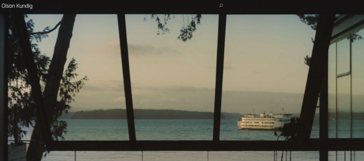
A collaborative global design practice between many firms, Olson Kundig works with the whole spectrum of residential and commercial property designs. Their homepage’s landing video does fantastic work making visitors feel like they’re immersed and viewing the actual locations instead of getting a general vibe of what they all look like.
The site uses an even block structure to sequence examples of their work and service descriptions, which lets each design feel equal in merit and more part of an excellent system of architectural services rather than a company focusing on just one specialty.
2. GLUCK+
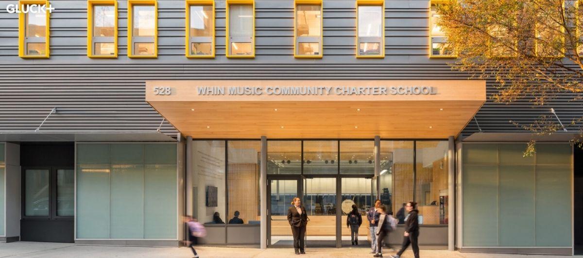
GLUCK+ has a uniquely horizontal grid design by default, but their header bar offers three different viewing methods, including a simplistic vertical list for visitors who want to scroll through many projects at once without pictures. Their instructional videos do an impressive job breaking down their design process step-by-step so viewers are both entertained and more prone to trust their professional credibility.
Despite the site’s complex appearance and vibrant yellow and gray color choices, the only homepage sections are “process” and “projects,” and each is richly packed with beautiful examples and informative methods.
3. SOM

A collective of designers, architects, and engineers, the Skidmore, Owings & Merrill (SOM) firm designs some of the worlds most technically advanced buildings and public properties. Their website is packed with information about their projects, descriptions of their philosophy as a business, and trending architectural news.
Their homepage’s full-screen video loops are sped up to cleverly show the busy world around their stoic buildings and recreational areas, and every project has detailed information available to anyone on the site, including hard data, ongoing project descriptions, and relevant design techniques.
4. Architizer

Architizer focuses on aiding and promoting different architects’ work and is one of the largest platforms for digital architecture. Their homepage’s slogan very clearly describes their work in concise language, and the background image of especially angular rooftops over a clear blue sky helps depict their interests in style and comfort.
They include a helpful virtual assistant to answer questions, and the header bar lays out each section clearly even at a glance. Joining as an architect, manufacturer, or consultant is easy with a calls to action in the footer bar, and the homepage’s partitions offer distinct examples of business partners, articles about the general architectural design process, and portfolios of their clients’ work.
5. ArchDaily
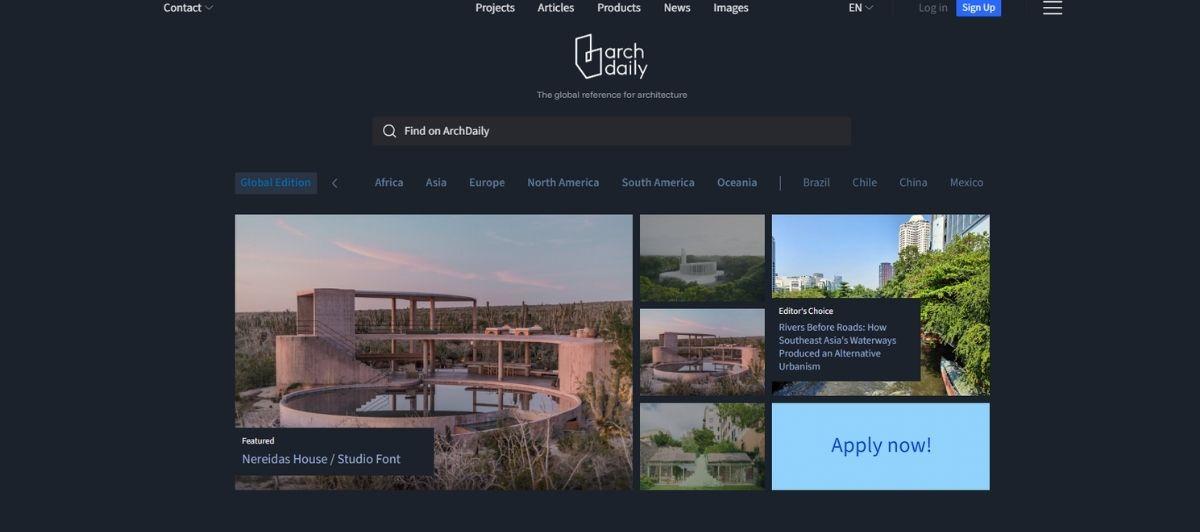
ArchDaily is a blog that publishes and promotes news about architectural projects and tools for professionals looking to expand their work or study examples online. Their homepage keeps mobile devices in mind with a narrow presentation and plenty of white space at the margins. The landing page shows their most recent entries with descriptive technical information and plenty of beautiful progress shots for each project.
One of the most striking features of the site is their “competitions and opportunities” section, which lists many competitions for specific projects around the world.
6. Sergey Makhno
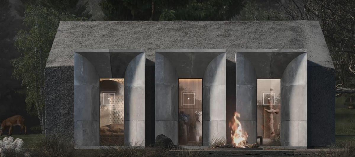
The Sergey Makhno website delivers an impressive hamburger menu and homepage opening animation that isn’t graphically intense, but still fun. Their visual style takes an initially odd, scattered approach to sequencing information. Each section organizes pictures and text around the center of the blank page instead of directly in it, giving a playful tone that describes their company character.
Scrolling through the sections triggers custom animations for each page that enlarge or shrink text and image sizes to catch your eye and express their individuality as a firm.
7. BIG
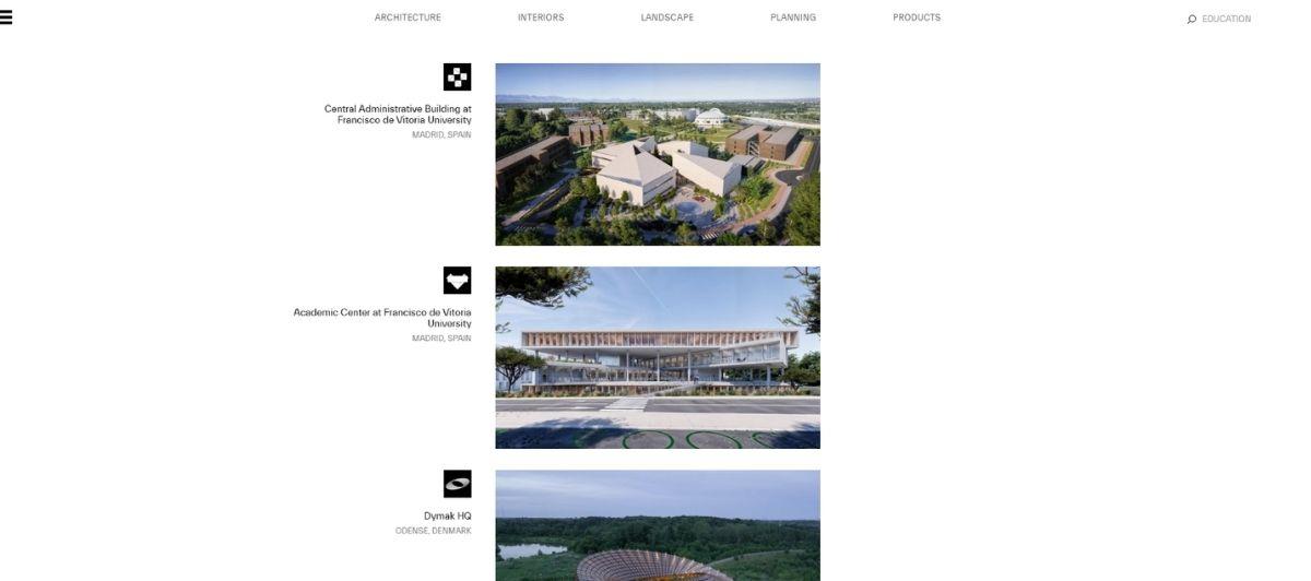
The Bjarke Ingels Group (BIG) believes cutting-edge architecture needs to be able to adapt to the changing world around it, and their site’s design expresses that adaptability unlike any other. At first, their homepage doesn’t look like anything an architectural firm would want, with a brightly-colored grid of over one hundred small tiles that look like pixels.
But moving the mouse cursor around quickly shows that each tile is a clickable project that expands into informative progress pictures and descriptions. Each corner of the screen includes simple, expanding sections for a more traditional view of their services to help visitors navigate their unique project menu.
The three worlds of architecture on the web
Not every architecture website is trying to do the same job. Once you look closely, the best architecture websites fall into three distinct categories, and knowing which one you’re building (or browsing) changes everything about what good looks like.
| Category | What it does | Leading examples |
|---|---|---|
| News platforms | Daily coverage of projects, industry news, and analysis | ArchDaily, The Architect’s Newspaper, Dezeen |
| Niche blogs and publications | Deeper editorial, theory, and thought leadership | Designboom, Metropolis Magazine, Divisare |
| Firm portfolios | Showcase a single practice’s built work and philosophy | Olson Kundig, SOM, BIG |
News hubs move the conversation
The news tier sets the industry’s daily agenda. ArchDaily is one of the world’s most visited architecture websites, offering global project coverage alongside competitions and tools for professionals. Dezeen reports on contemporary design and technology trends and draws over 3 million monthly visitors.
The Architect’s Newspaper rounds out the tier with up-to-date news and sharp analysis. Archinect adds a community dimension, doubling as a hub for career resources and job listings.
Niche publications go deep
Where news platforms cover breadth, publications like Designboom, Metropolis Magazine, and Divisare go for depth. Designboom covers innovation with a sustainability focus, Metropolis sits at the intersection of architecture, design, and urban planning, and Divisare is recognized for its meticulously curated photography and project documentation. These platforms are where architects and students go for theory, not just headlines.
Firm portfolios sell the practice
The third world is the firm portfolio, and it plays by different rules. Its job isn’t traffic, it’s trust. A great portfolio reflects a firm’s character and standards so convincingly that a prospective client feels the expertise before reading a word. That’s the tier most of our seven examples live in, and it’s where thoughtful WordPress development makes the biggest difference.
How top firms structure a project archive
The single hardest design problem in architecture web design is the project archive. A firm might have hundreds of projects, each with dozens of stunning images, and somehow the site has to make all of it explorable without overwhelming the visitor. The best sites have converged on a few smart patterns.
- Long project pages beat card summaries: The industry is moving decisively toward long, immersive project pages over quick card summaries. Instead of a thumbnail and two lines of text, leading firms give each building its own richly detailed page with progress photography, technical data, and the story of the design process. SOM does this exceptionally, making hard data and ongoing project descriptions available for every entry.
- Filterable archives help visitors self-navigate: When a practice has a deep catalog, filterable archives are essential. Foster + Partners lets visitors filter projects by typology and region, so a hospital client and a museum client each find their relevant work in seconds. Filterable project archives respect the visitor’s time and keep them exploring longer.
- Interactive galleries express personality: Some firms turn the archive itself into a statement. BIG’s grid of over one hundred clickable project tiles is unmistakably its own, and Sergey Makhno’s custom scroll animations turn browsing into an experience. These interactive project galleries do double duty, showcasing work while expressing the firm’s individuality.
- Treat the site as a living document: Snohetta is known for treating its website as a living document, updating it continuously rather than launching it once and forgetting it. That mindset keeps a portfolio current as new built work completes, which is exactly what ongoing WordPress maintenance is built to support.
Photography and performance: the two-second problem
Architecture websites live and die by their imagery, and that creates a genuine engineering tension. High-quality photography is the primary asset of any architecture website, the thing that makes a visitor stop scrolling. But those large, detailed images are heavy, and heavy pages load slowly.
Here’s the tension in plain terms:
- Photography is non-negotiable. For a discipline this visual, compromising image quality to save load time defeats the entire purpose. Divisare has built its whole reputation on curated, high-resolution documentation.
- Speed is also non-negotiable. Effective architecture websites should load in under two seconds despite their image weight. Past that, visitors leave and search rankings drop.
The firms that solve this don’t choose between the two. They use modern image formats, lazy loading, content delivery networks, and fast hosting to deliver full-quality photography that still loads instantly. This is precisely where WordPress speed optimization and managed hosting earn their keep, letting an image-heavy architecture site stay both beautiful and fast.
Getting this balance right also directly boosts a firm’s online visibility, since page speed is a ranking factor that image-rich sites too often neglect.
Where the discipline is heading in 2026
Architecture media doesn’t just report on the profession, it reflects where the profession is going. Three shifts stand out for 2026, and the sites that engage with them are positioning themselves as thought leaders rather than just galleries.
AI moves into the design process
AI integration is a growing trend across architecture media and practice alike. Tools like Autodesk Forma are becoming crucial for AI-powered site analysis, helping architects test sunlight, wind, and noise conditions before a single line is drawn. Publications covering these innovative ideas are enhancing how the profession approaches the design process itself.
Sustainability becomes the default
Sustainability is now a central focus of architectural design, with net-zero and low-carbon buildings shaping the conversation. Closely tied to it is biophilic design, which emphasizes natural materials and genuine connections to nature. Firms whose sites foreground sustainable design and building performance speak directly to where clients and the public now expect the industry to be.
Sites become community platforms
By 2026, architecture websites are increasingly platforms for community engagement and thought leadership, not just static portfolios. Comment sections, career boards, competitions, and editorial content turn a site into a destination professionals return to.
Emerging architecture platforms have to balance editorial quality with real professional utility, and the ones that manage both, like ArchDaily and Dezeen, are expected to stay the most influential.
For any firm building toward this future, strong SEO ensures the thought leadership actually gets found.
Build an architecture site worthy of your work with Freshy
The best architecture websites all do the same core things: they treat the site as built work, structure their project archive for exploration, balance stunning photography with fast performance, and engage with where the discipline is heading.
Here are the key takeaways from this guide:
- Know which category you’re building: news platform, publication, or firm portfolio
- Favor long, immersive project pages over shallow card summaries
- Add filterable archives and interactive galleries so visitors self-navigate deep catalogs
- Deliver high-quality photography that still loads in under two seconds
- Treat your site as a living document, updated as new work completes
- Engage with AI tools, sustainable design, and biophilic principles to lead the conversation
Freshy builds high-performing WordPress websites for design-driven firms across the country, with portfolio-caliber project showcases and ongoing support and maintenance. If your architecture firm’s website is ready to match the quality of your built work, get in touch.
Frequently asked questions
What makes a great architecture firm website?
Great architecture websites pair high-quality photography with fast load times, structure projects into detailed, filterable archives, and clearly express the firm’s design philosophy and character to build trust with prospective clients.
What are the best architecture news websites?
ArchDaily and Dezeen lead global architecture coverage, with ArchDaily among the most visited and Dezeen drawing over 3 million monthly visitors. The Architect’s Newspaper and Archinect are also widely respected for news and career resources.
How fast should an architecture website load?
An effective architecture website should load in under two seconds despite its heavy imagery. Modern image formats, lazy loading, and fast managed hosting make full-quality photography and quick performance possible together.
How should architecture firms organize their project portfolios?
The best firms use long, immersive project pages instead of brief cards, add filters by typology and region for deep catalogs, and update the site continuously as new built work is completed.
How is technology changing architecture websites in 2026?
AI-powered tools like Autodesk Forma are entering the design process for site analysis, sustainability and biophilic design are becoming central themes, and sites are evolving into community platforms for thought leadership.