
When it comes to websites, health care providers have a lot to consider. Not only should health care websites find a balance between inviting and professional, but they need to provide critical information while simultaneously offering education to both their current and prospective clients. And, because everyone is fluent in tech these days, health care websites also need to be highly responsive, incredibly fast, and easy to use and navigate.
Sound like a tall order?
It is. And, when you look around at the hundreds of health care websites online right now, you’ll see that the majority of sites are falling short. While they might be beautifully designed, they lack intuitive navigation or clear calls to action. Or, for those built by a tech-savvy team, the websites function well but are far from visually appealing.
Of course, there are those health care websites that get everything just about perfect — from their design to the navigation, the bold buttons and the integrated feeds.
Want to see what we’re talking about?
Here are the five best health care websites we’ve found online right now…
The 5 Best Health Care Websites Online Right Now
-
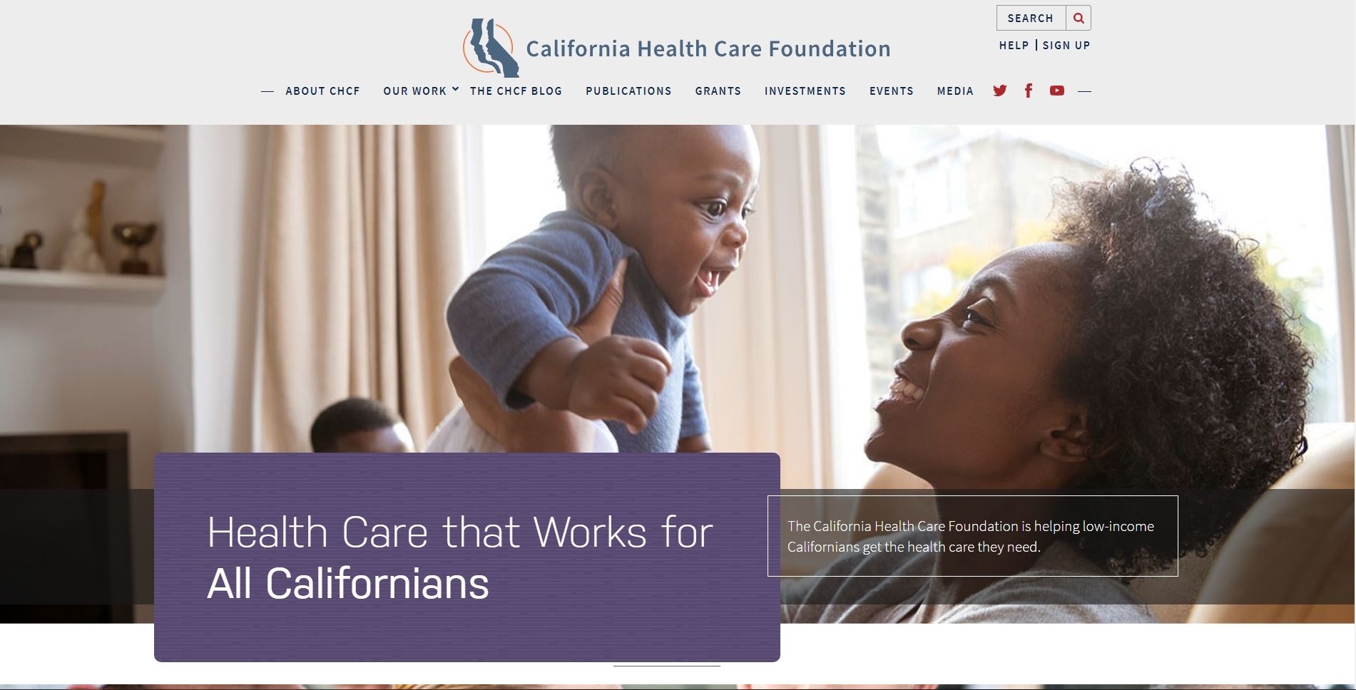
California Health Care Foundation
One of the best things this West Coast health care website does is immediately capture your attention with its large, friendly image of a mother holding her baby. Immediately, the website provides triggers, especially for women, remaining them that, yes, health care is important. Even more important? Finding a health care provider you can trust, which is exactly where the California Health Care Foundation comes in. An easy-to-read menu with calming neutral colors helps to alleviate any fear and anxiety a visitor might have, while the bold search bar, “Help”, and “Sign Up” buttons create clear calls to action for anyone looking to get somewhere fast. Another great thing about this health care website? It states its mission upfront, letting visitors know almost immediately if they are in the right place. As you scroll down the homepage, the footer menu provides other crucial information, including convenient features like directions to their two locations and social media links.
-
St. David’s Health Care
From its scrolling banner to its thoughtful menu, the website for St. David’s Health Care is a great example of what it looks like to be friendly and professional. Keeping the colors consistent and neutral allows the information on the page to take centerstage, which means a visitor will never feel overwhelmed when they land on the website. Knowing their audience, the website offers other great features, including a regularly updated ER wait time just below the main menu. St. David’s also leverages the power of media by integrating several videos on their homepage, giving visitors plenty to engage with from the moment they arrive. Additionally, their “Live Healthy Austin” blog (which unfortunately hasn’t been updated in a few months) provides informative content for their audience (and definitely helps with search engine rank, too).

-
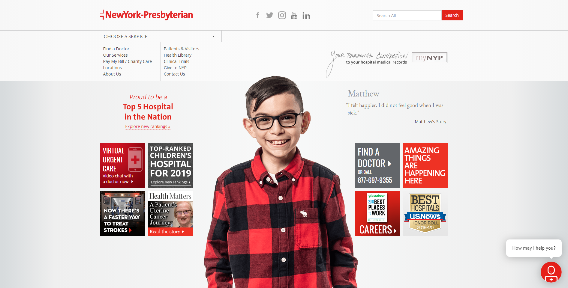
New York Presbyterian
If you think that a huge health care website can’t be minimal, think again. Or, even better, take a look at what New York Presbyterian has done with their website. The homepage, which is barely scrollable, creates a unique experience for each visitor by immediately having you choose where to go next. Rather than trying to create a homepage that appeals to everyone, New York Presbyterian intelligently chooses to keep the design as bare-boned (but beautiful) as possible. The result is an attractive, inviting, unique experience that honors the fact that everyone needs or wants something a little different. Other design elements to take note of are the good-looking fonts, the multiple calls to action, and the unassuming brags about just how great they really are. As far as healthcare websites go, this by far has to be one of the best, most unique designs we’ve seen this year.
-
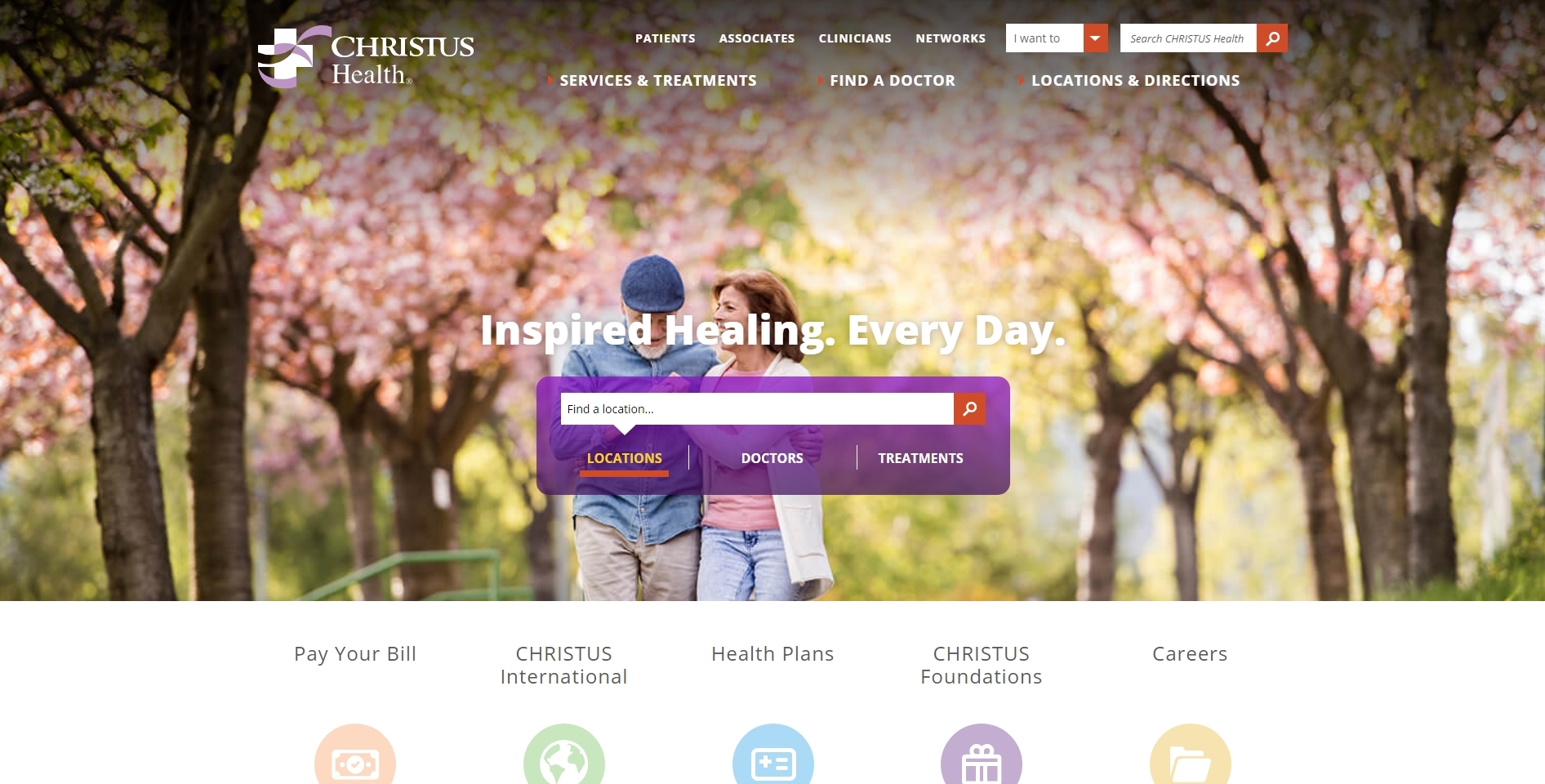
Christus Health
An attractive website from top to bottom and across all pages, one of the most appealing features of the Christus Health website is its unique take on navigation. Rather than having a separate, divided menu at the top of the page like almost every website you see these days, Christus Health uses a more integrated approach, blending its header menu with the main image and the navigation bar. Another unique aspect on the website’s homepage is that it uses a friendly “I want to” dropdown menu to help visitors find what they’re looking for, including options like “Find a Career”, “Send Flowers”, and “Pay My Bill Online”. In order to keep the first impression as relaxing and inviting as possible, Christus’s website makes good use of the footer menu, placing the majority of its information in organized columns at the bottom of the page.
-
Penn Medicine
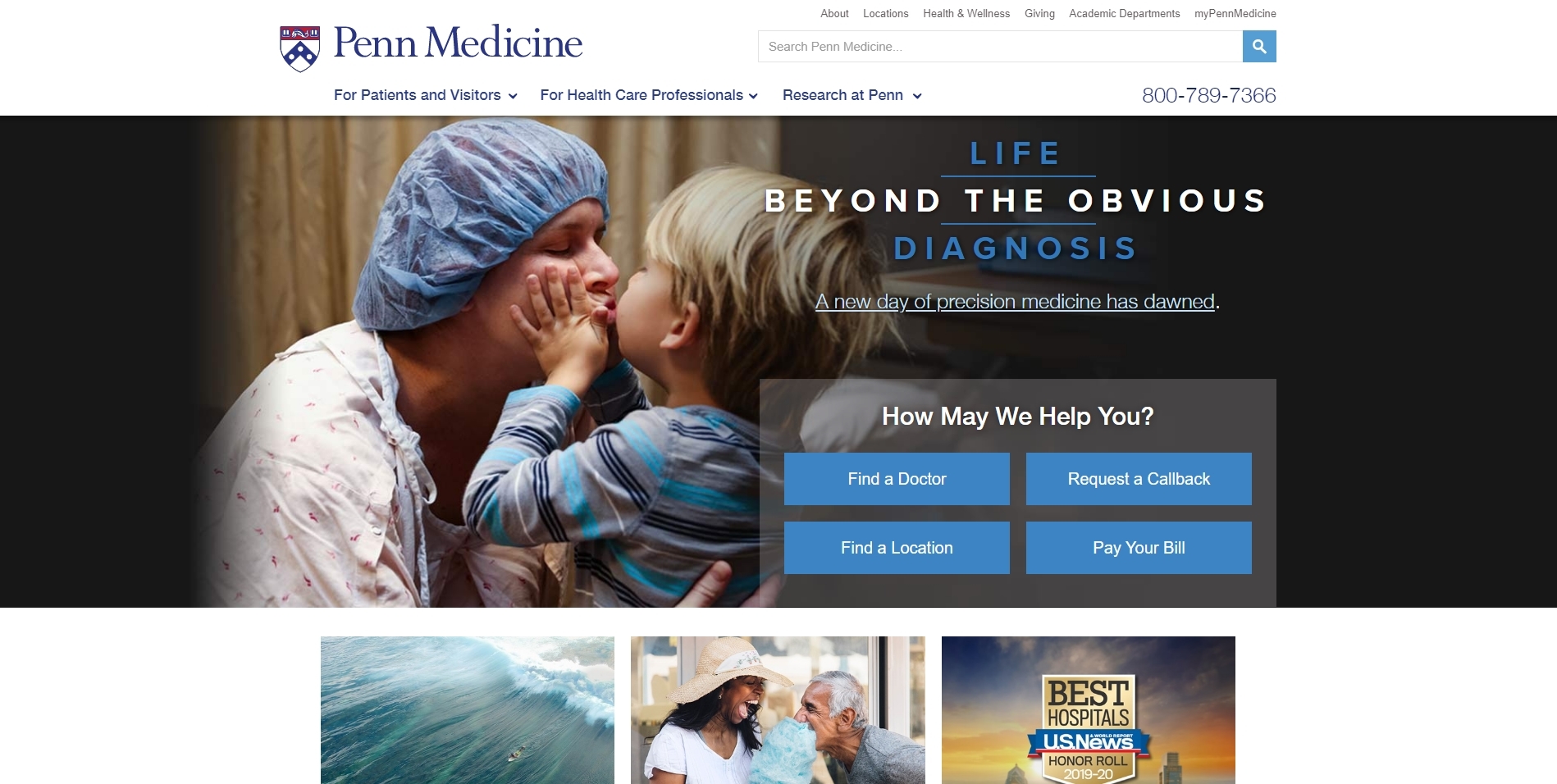
Penn Medicine’s website understands the power of a picture – and it has chosen its main picture wisely. Not only do you almost immediately smile upon landing on the homepage because of the image, but the emotional triggers are effective for a wide range of visitors, appealing to parents, doctors, health care professionals, and donors across the board. A great headline (“Life Beyond the Obvious Diagnosis”) provides hope and inspires curiosity, while the “How May We Help You?” section manages to be bold without crossing into overwhelming territory. Other features, like a clickable phone number and intelligent color scheme (blue and white), make navigating the entire website easy and enjoyable.


