A patient decides in seconds whether to trust your practice, and they’re deciding on your homepage, not in your waiting room. 75% research providers online before booking, so your website does more work than your front desk.
We broke down 47 of the best. Here’s what’s inside:
- Standout healthcare sites organized by category
- What each does exceptionally well
- Design trends worth stealing in 2026
- Elements every healthcare site needs
- Pitfalls that quietly lose patients
At Freshy, we build WordPress websites for healthcare practices and enterprise hospitals. If any of these spark an idea, we can bring it to life.
The 47 best healthcare websites to study right now
We combed through hospitals, urgent care clinics, telehealth platforms, and specialty practices to find the sites doing it right. Each one earned its spot for a different reason, whether it’s clean navigation, smart use of patient stories, or a booking flow that just works. Here they are, in no particular order.
1. Mayo Clinic
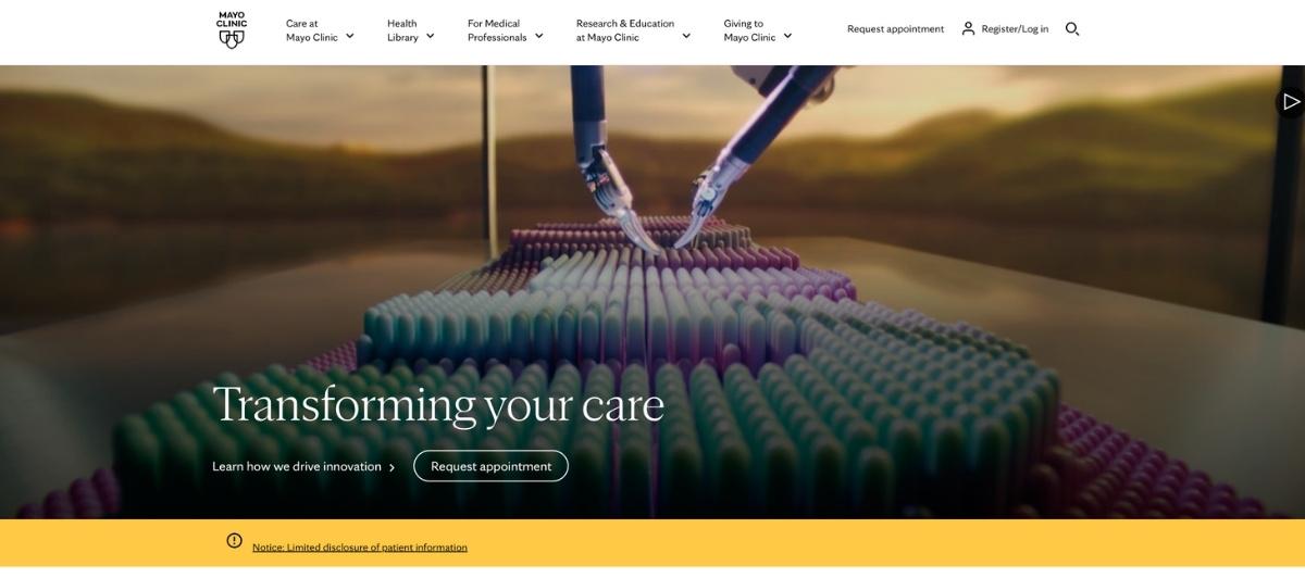
The Mayo Clinic is a renowned health care center that has locations throughout the United States. Its website design includes vibrant pictures, a clean layout and updated information. From the home page, site visitors can access information about patient care, departments, products, services and educational resources.
2. Cleveland Clinic
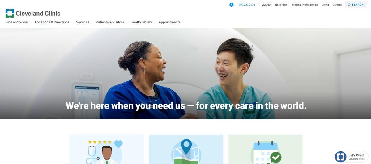
The Cleveland Clinic’s website offers streamlined mobile and desktop designs. The information on the site is clearly segmented for patients and doctors. That makes it easier for site visitors to find the exact information that they need. The site’s health library includes videos, articles and health tools.
3. Johns Hopkins Medicine
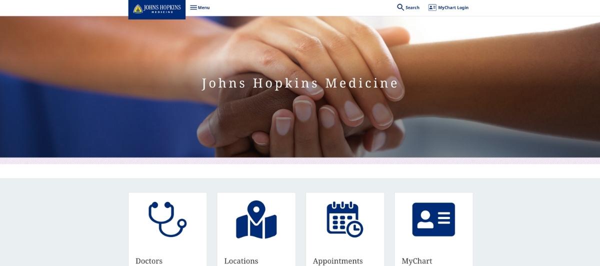
Johns Hopkins Medicine is a respected leader in the medical field. Its website reflects the hospital’s expertise. On this site, visitors can easily request an appointment, find a physician or get health information. It includes videos of patients’ stories, testimonials and medical procedures.
4. ZocDoc
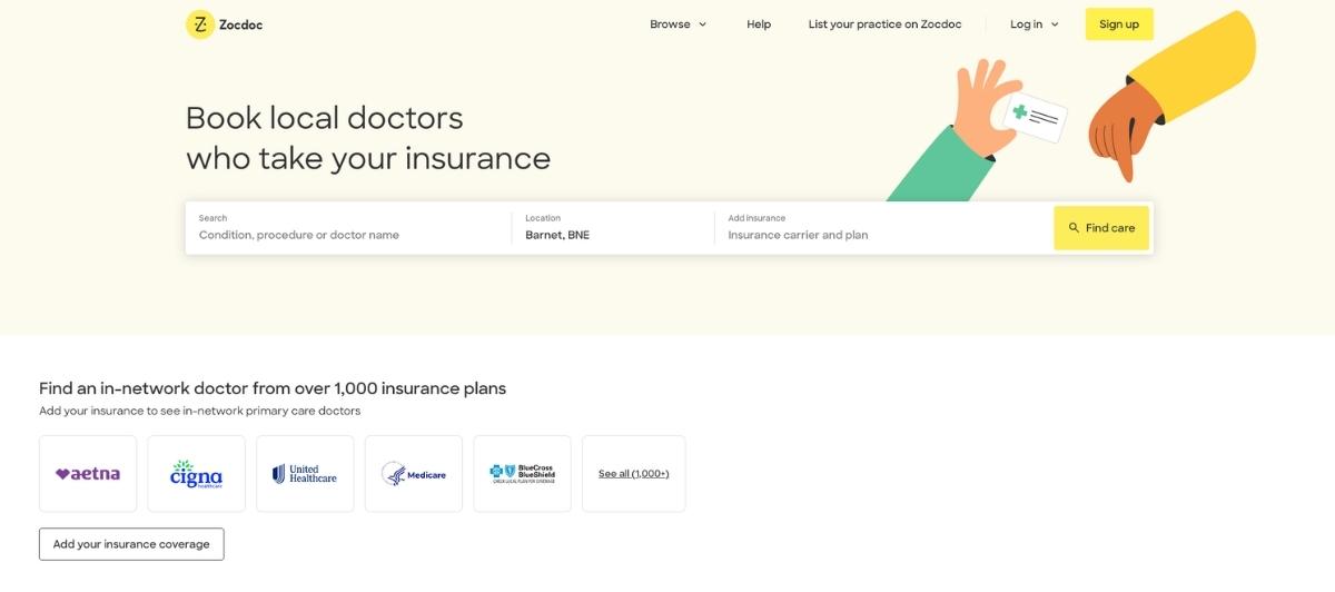
ZocDoc is a hub for physicians throughout the United States. On this site, patients enter personal information such as their condition, city, zip code and insurance carrier. This referral site creates a list of doctors that fit their search query requirements. ZocDoc provides patient ratings for each doctor in the network.
5. National Holistic Center

National Holistic Center’s website is optimized with keywords and an intuitive design. Website features include educational resources, a subscription newsletter and patient events.
6. TrustCare Family Healthcare

TrustCare is an urgent care walk-in clinic. The site offers updated blog articles and specialty care information. Its minimalist design features more information than pictures. The TrustCare website layout is clean and easy to navigate. Visitors can pay their bills and view TrustCare locations online.
7. Rush University Health
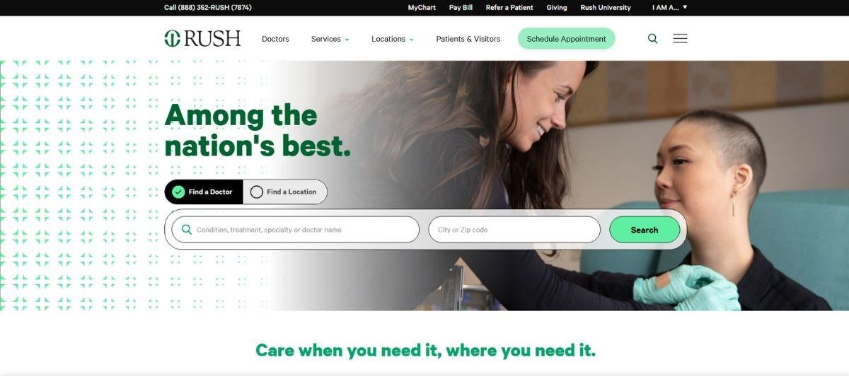
Rush University Health Medical Center is a top hospital with a website to match. Its clean design offers a quick way for site visitors to find a doctor, access health/wellness information and make an appointment. Patients can access their health records using its online portal.
8. Infinite Medical Express

Infinite Medical Express offers a minimalist website that’s full of relevant information. Site visitors can quickly access the patient portal and plan wellness visits. It offers wellness tips and videos that are accessible from the site’s home page. Patients can make one-time payments on this website.
9. Lockport Express Medical

Lockport Express Medical is a highly acclaimed center for urgent care services. The site’s home page provides immediate access to the medical center’s services, payment policies and contact information. There is a video that provides a preview of what patients can expect when they visit the urgent care center.
10. Maryland Physicians Care
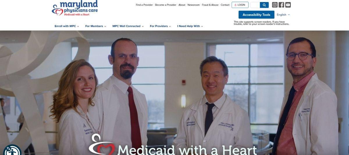
Maryland Physicians Care is a managed care organization. Its website has a mobile-friendly design that is easy for users to navigate. The site includes plenty of white space that reduces website clutter. On the Maryland Physicians Care site, visitors can find a health care provider, renew benefits and check the status of a claim.
11. LifeBridge Health
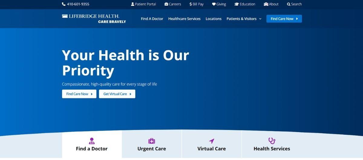
LifeBridge Health has a network of over 2,900 physicians in over 100 locations throughout Maryland. Patients can find a doctor, locate a specialty center and make an appointment. The site offers an overview of its specialties and quick links to external sites. Patients can use the portal to make payments.
12. Mercy Virtual Care Center

Mercy Virtual Care Center offers telehealth services for patients. The site provides 24/7 access to patient care services. It contains helpful videos, a list of services and health updates. Patients use the site to consult with medical practitioners about mental wellness, strokes and other medical conditions.
13. iCliniq Virtual Hospital
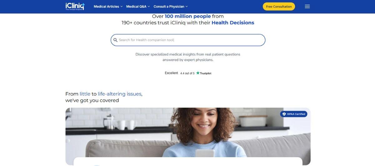
The iCliniq Virtual Hospital site provides a way for visitors to chat with a doctor online. It even lets you know how many doctors are available. On this site, visitors can find a local physician and get real-time health information.
14. NextCare Urgent Care

NextCare’s streamlined website provides access to its walk-in clinics, physicians and wellness programs. The NextCare home page includes information about medical forms, insurance, locations and medical discount programs. Patients can save time at the clinic by checking in online.
15. Righttime Medical Care
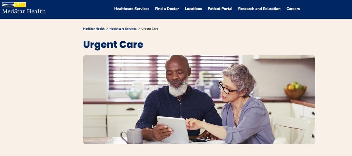
Righttime Medical Care offers a comprehensive urgent care program for patients. On the site’s portal, patients view their X-rays and pay their bills. Scheduling appointments online is easy on this website. The online portal is secure and encrypted to protect patients’ privacy.
16. Stanford Health Care
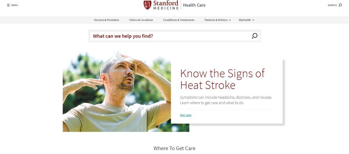
Stanford Health Care’s website provides a wealth of information about patient services, health conditions and care options. The site includes helpful health videos, locations and clinics. Patients and visitors can use the site to access medical records, join support groups, check into the hospital and get financial assistance.
17. Altus Emergency Centers
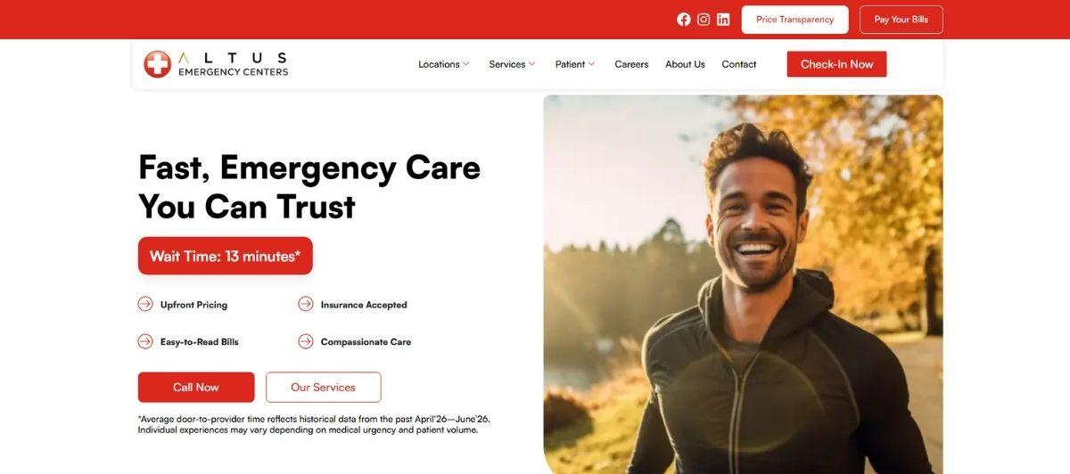
Altus Emergency Centers offer a state-of-the-art website for patients and visitors. The user-friendly design makes it easy for patients to check in online and take care of their bills. It features an updated blog that serves as a helpful medical resource. From the menu, patients can quickly access different sections of the website.
18. Ascension Emergency Care
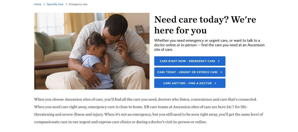
Navigating the Ascension Health website is straightforward. The menu provides direct access to center locations, bill pay options, doctors, specialty care services and primary care services. It includes patient portals for each state. Site visitors can use the search feature to immediately access the information they need.
19. Health South Florida
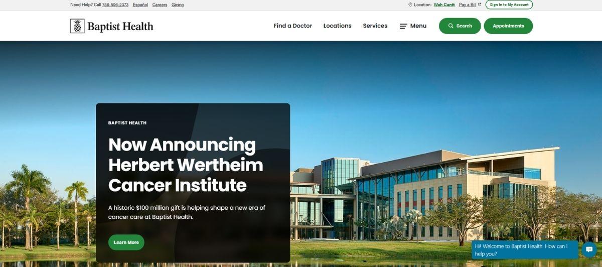
Baptist Health South Florida’s website is the information hub for 50 outpatient clinics and seven hospitals. The site loads quickly. Its clean design segments information about each facility in the network. It features a timer that shows the estimated emergency room wait time. Patients can make appointments and pre-register on this site.
20. George Washington University Center for Integrative Medicine
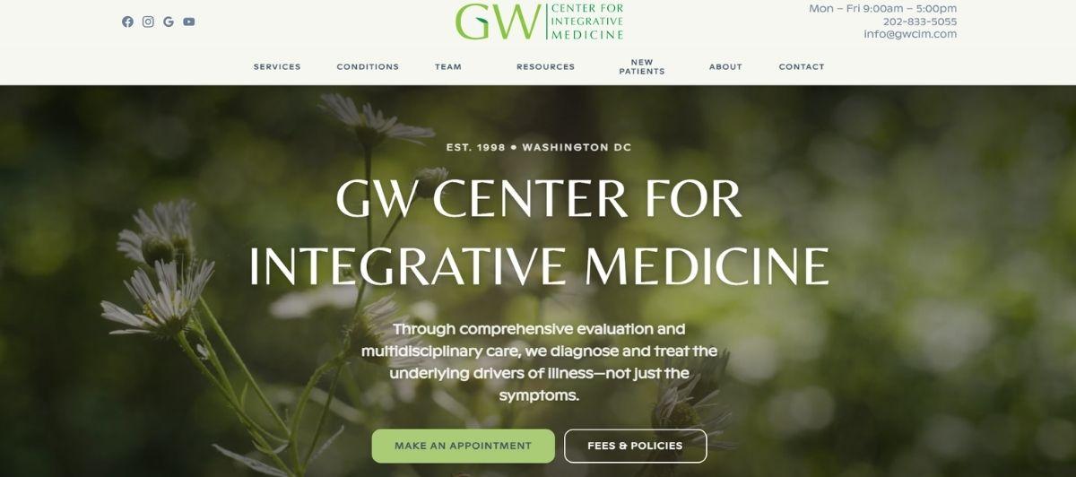
The George Washington University Center’s website is functional with a clean design. The navigation bar includes information about the center, patient care options and a contact page. Visitors can view classes and schedule appointments online.
21. National Institute of Health Clinical Center
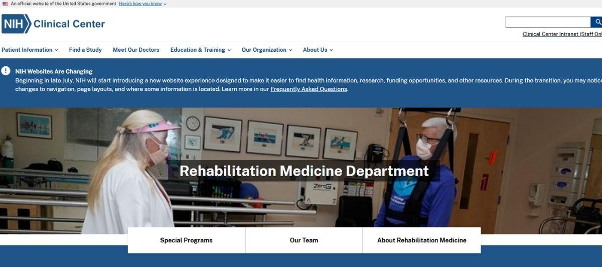
The National Institute of Health Clinical Center’s website contains plenty of information about the hospital. Visitors can find information about research, medical studies and physicians. The website’s navigation bar provides quick access to the clinic’s department directory.
22. Boston’s Children’s Hospital

From the search engine results page, site visitors can search the page for relevant information. Boston’s Children’s Hospital’s home page includes family-friendly pictures of actual patients. The menu bar provides quick access to health care professionals, treatment options and research information. Site visitors can request an appointment and take a virtual tour of the hospital.
23. Cedars-Sinai Medical Center – Los Angeles
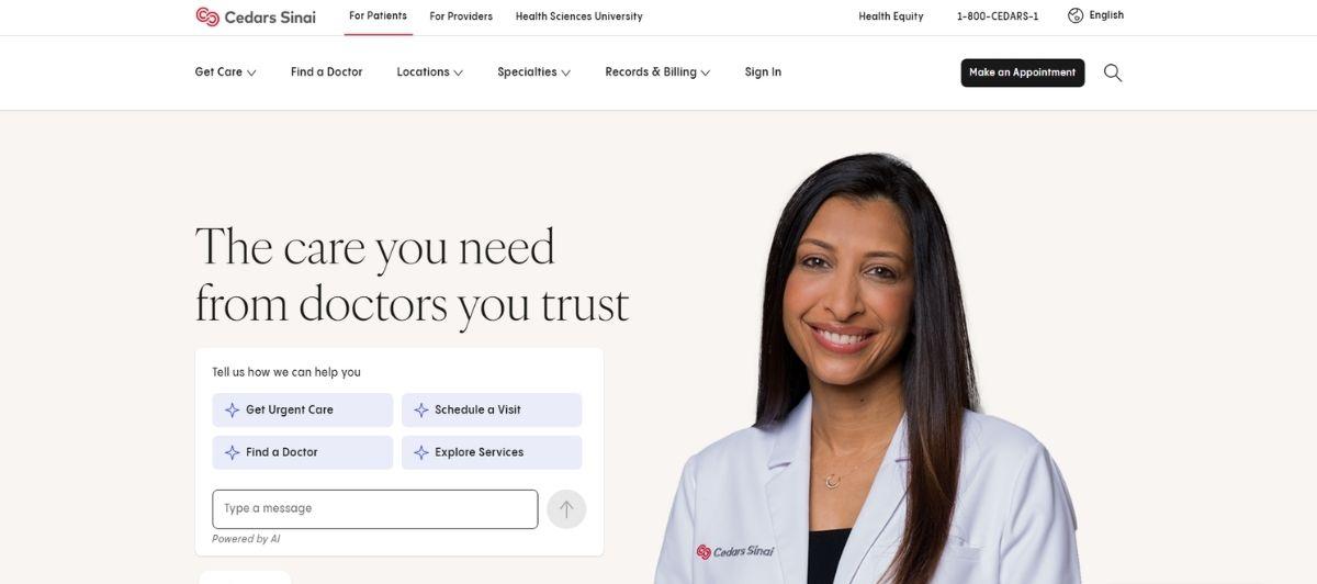
Cedars-Sinai’s mobile-friendly website features an information portal, community medical news and patient stories. Patients can browse the health library to assess health risks, calculate body measurements and research health conditions. The site includes a physician directory and location finder.
24. Children’s Hospital of Philadelphia

The main picture on the top of the Children’s Hospital of Philadelphia’s home page is warm and inviting. This site includes a patient portal and heartwarming patient stories. Visitors can access information by clicking links on the header and the footer.
25. Duke Health

Patients and visitors can connect with researchers and doctors on the Duke Health website. The site’s menu includes clickable links for locations, staff directory, treatments and a blog. Patients can access the Duke MyChart portal by signing in with a password and username.
26. MedStar Georgetown University Hospital
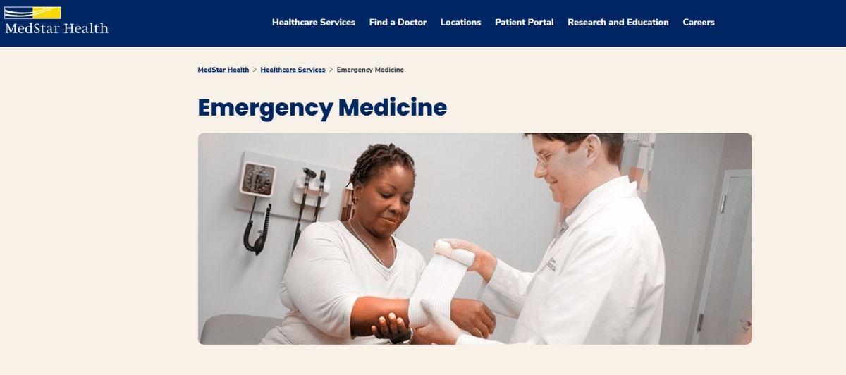
MedStar Georgetown University Hospital’s website includes vivid colors and family-friendly pictures. Patients can find a doctor, obtain parking information and learn about health care services on this site. It gives patients the ability to manage appointments, renew prescriptions, see test results and connect with their health care providers.
27. George Washington University Hospital

The top of the George Washington University Hospital’s site’s home page features a patient story. This minimalist site provides enough information for visitors to make an informed decision without overwhelming them. On this site, patients can locate a doctor, view their health records and pay medical bills.
28. Houston Methodist Hospital
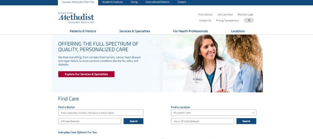
Houston Methodist Hospital’s website offers instant access to its services and locations. Patients can use the website to schedule doctor appointments, find a doctor and learn about the latest news. Patients can pay their medical bills on the website.
29. Washington Institute of Natural Medicine

The Washington Institute of Natural Medicine’s home page contains dozens of links to other pages on the site. Key features include an ailment guide, patient testimonials and videos. Patients can ask questions and request appointments online.
30. NYU Langone Health

This mobile-friendly website loads quickly. Visitors can use the NYU Langone site to access over 4,000 doctors. The site includes patient forms, a patient portal and current events in the medical field.
31. Spine Centers of America
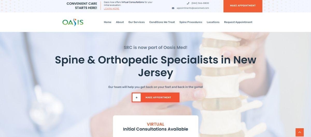
Spine Centers of America features testimonial videos and success stories. On this site, patients can learn about spine surgical procedures and spine pain evaluation procedures. The site includes educational videos and research tools. Patients can download health history forms before their appointments.
32. The Spine Hospital at the Neurological Institute of New York
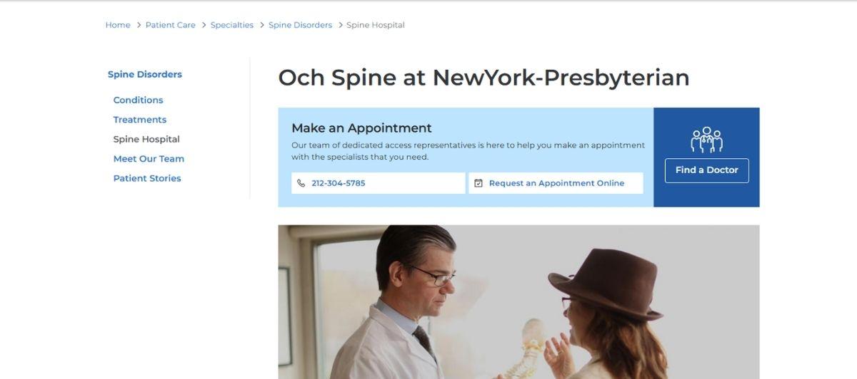
The Spine Hospital’s home page includes a library of patient stories, vivid pictures and recent news. The streamlined menu provides information about the hospital’s team, conditions and spine treatments. Visitors will find a comprehensive list of the website’s links on the footer of the home page.
33. National Spine and Pain Centers

The National Spine and Pain Center’s website has a minimalist design. Visitors can book an appointment at the top of the home page. The site includes a spine and pain center search bar. Other key website features include success stories, patient resources, directions and website feedback.
34. Boston Medical Center

The Boston Medical Center’s website showcases pictures of patients and their families. The navigation bar includes links to patient care services, programs and center information. Patients can click a link to access the patient portal, pay a bill or book a doctor’s appointment.
35. Anaheim Regional Medical Center

On the Anaheim Regional Medical Center’s website, patients can find a doctor, pre-register online, pay their bills and access the patient portal. The site includes a comprehensive video library and a section that provides details about upcoming events. The website’s footer includes quick links to social media pages, affiliated facilities and services.
36. Lakewood Regional Medical Center
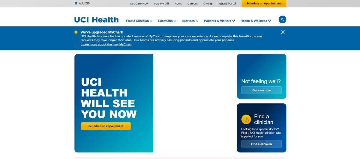
Using the Lakewood Regional Medical Center’s website, visitors can find a doctor, learn about health assessments and schedule an appointment with a health care professional. The emergency room portal allows patients to check into the emergency room at designated times.
37. Women’s Health Texas
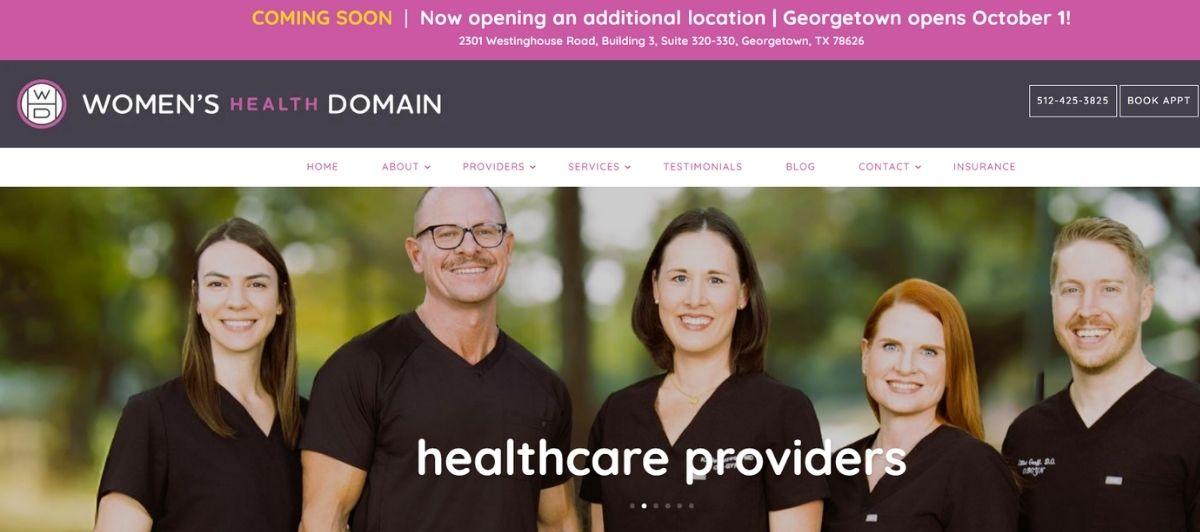
The home page of the Women’s Health website features clickable links to request an appointment and access the patient portal. The site includes a health care provider spotlight and an informative blog. Patients can search old medical records and pay bills on this website.
38. Northwestern Medicine

Finding cardiovascular care is easy on the Northwestern Medicine website. The site includes an overview of the services and clinical trials. Patients can sign into the MyChart portal to pay a bill, send a message to their doctors and access health information.
39. Bayside Physical Therapy and Sports Rehabilitation Center
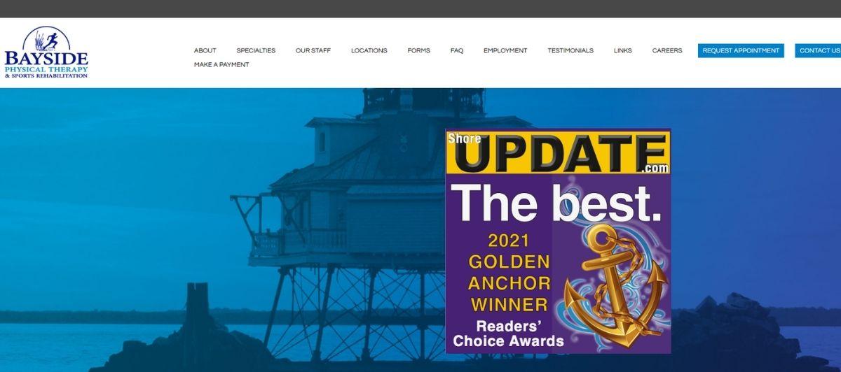
Bayside’s website includes physical therapy resources, information about center locations and service descriptions. The site offers a functional layout that is user-friendly. On the site, patients can download medical forms and functional outcome questionnaires. Its FAQ page provides answers to common physical therapy questions.
40. Center for Orthopaedics and Sports Medicine
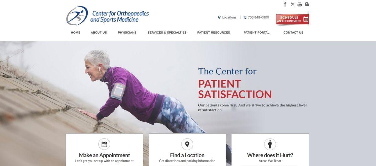
The Center for Orthopaedics and Sports Medicine offers a functional website that’s designed for quick access to important features. At the top of the home page, patients can use drop-down menus to find a location or make an appointment. Its patient education section includes videos and patient stories. Patients can download registration and procedural forms from the site.
41. Women’s Sports Medicine Center

The Women’s Sports Medicine Center’s website offers a way for patients to schedule appointments on the site by clicking a link. Key website features include a streamlined design, video testimonials and a resource library. The website features the medicine center’s Instagram feed.
42. Sentara Healthcare
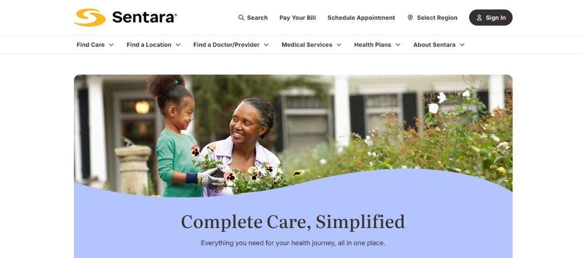
Sentara includes immediate access to patients’ health information through a secure portal. The site’s navigation bar includes urgent care, virtual care, primary care and emergency room options. Visitors can learn about services, treatments and Sentara health care providers.
43. Children’s Hospital of Colorado

The Children’s Hospital of Colorado’s website includes vibrant hues and pictures of smiling children. From the navigation bar, visitors can plan their visits and access information about doctors. Key features include online bill pay and patient profiles.
44. ATI Physical Therapy Services

ATI Physical Therapy’s website offers a sleek design with vibrant colors. Visitors can get information about therapy services and schedule an appointment online. The center’s blog includes updated information about therapy services.
45. Walk-In Medical Care
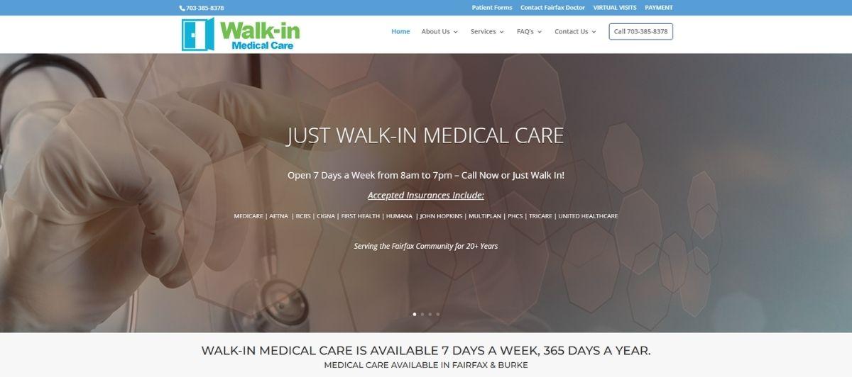
Walk-In Medical Care’s navigation bar includes links to medical news and services. Patients can download medical forms from the site. The site’s footer includes details about center locations.
46. NOVA Orthopaedics and Sports Medicine
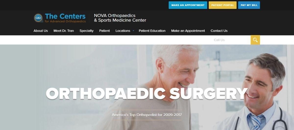
NOVA Orthopaedics makes it easy to schedule appointments on the website. This user-friendly site includes a list of providers, locations and health resources. Patients can complete surveys to rate their experiences.
47. Parsley Health
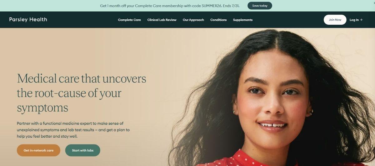
Parsley Health’s website offers an attractive design. Key website features include patient testimonials, doctor profiles and health care plan options. The site offers live chats and video visits.
What each site does exceptionally well
No two sites on this list are great for the same reason. Some win on speed, others on trust, others on how easy they make it to actually book care. Here’s a breakdown of the patterns that separated the standouts.
Search-first navigation that respects patient time
The strongest sites treat the search bar like the front door. Mayo Clinic, ZocDoc, and iCliniq put provider or condition search front and center, so patients don’t have to hunt through menus to find what they came for.
NextCare and NYU Langone follow the same rule for locations, using zip-code or “nearest clinic” filters within a click of the homepage. The lesson is simple: if someone lands on your site with a symptom or a specialist in mind, don’t make them scroll.
Booking flows that reduce phone calls
The sites that convert well pair short forms with clear availability. ZocDoc lets patients filter by insurance, specialty, and time slot before they book. ATI Physical Therapy, NOVA Orthopaedics, and Righttime Medical Care all put “schedule an appointment” links inside the top nav, not buried in the footer. Cedars-Sinai and Ascension go a step further with same-day booking flags that let patients grab an open slot without picking up the phone.
Recent industry data shows 42% of patients now prefer booking online over calling, which puts phone-first sites at a quiet disadvantage.
Patient portals worth logging into
Portals only work when they’re easy to reach and easy to use. LifeBridge Health, Righttime Medical Care, and Sentara Healthcare all embed the portal login in the top-right corner, where users expect it. Stanford Health Care and Duke Health push it further with MyChart integration that pulls test results, bill pay, and secure messaging into one place. Boston Medical Center and George Washington University Hospital keep the login flow short, two clicks and you’re in.
Our team built Obtelecare, a telehealth platform where secure patient access sits at the heart of the entire experience.
Real stories that build real trust
Testimonials aren’t decoration. Children’s Hospital of Philadelphia, George Washington University Hospital, and Boston Medical Center weave patient photos and stories into the homepage itself, giving new visitors an immediate sense of who the practice serves.
Spine Centers of America and Bayside Physical Therapy go video-first, letting patients tell their recovery stories in their own words. The Center for Orthopaedics and Sports Medicine layers the two, pairing stories with educational content in one library.
Social proof carries more weight in healthcare than almost any other industry, since patients are choosing who touches their body.
Design that leans human, not clinical
The best-looking sites drop the sterile white-and-blue formula. Parsley Health uses warm neutrals and generous white space to feel calm rather than sterile. Cedars-Sinai and NYU Langone rely on vivid patient photography to make the sites feel like real places, not lobbies. TrustCare and Righttime keep the layouts minimalist so the eye lands on what matters. Even hospital giants like Cleveland Clinic and Stanford have moved away from stock medical photography toward real staff and real patients.
Educational content that actually teaches
The sites doing content well treat visitors like they came to learn, not to be sold to. Mayo Clinic’s Health Library is the gold standard, packed with searchable articles, videos, and tools that get cited by other outlets. Cleveland Clinic runs a similar model at scale.
Stanford Health Care, Sentara, and Cedars-Sinai keep their libraries updated with fresh research, not last decade’s press releases. The National Institutes of Health Clinical Center takes the academic angle further with direct access to studies and physician research.
Well-organized content is also the foundation of strong healthcare SEO, which pulls in patients who start their journey on Google or in an AI-generated answer.
Telehealth that meets patients where they are
Virtual care is now a baseline expectation, not a differentiator. Mercy Virtual runs one of the first fully virtual care centers in the country. iCliniq lets users chat with a doctor online in real time. Parsley Health leans into video visits as a core part of its care model. Sentara Healthcare puts virtual visits directly in the main navigation, right next to in-person options.
For any healthcare brand launching or scaling telehealth, Freshy’s WordPress development team can build the flows and integrations behind the scenes, from booking to HIPAA-compliant video handoffs.
A quick summary of standout strengths
| Category | Sites setting the standard |
|---|---|
| Search-first navigation | Mayo Clinic, ZocDoc, iCliniq, NextCare, NYU Langone |
| Streamlined booking | ZocDoc, ATI, NOVA Orthopaedics, Righttime, Cedars-Sinai |
| Patient portal UX | LifeBridge, Stanford, Duke, Sentara, Boston Medical |
| Story-driven trust | Children’s Philadelphia, GWU Hospital, Spine Centers of America |
| Human-first design | Parsley Health, Cedars-Sinai, TrustCare, Cleveland Clinic |
| Deep educational content | Mayo Clinic, Cleveland Clinic, Stanford, NIH Clinical Center |
| Telehealth integration | Mercy Virtual, iCliniq, Parsley Health, Sentara |
Design trends worth stealing in 2026
Healthcare website design has shifted fast in the last few years. The clinical, blue-heavy look that dominated most hospital websites for a decade is being replaced by warmer palettes, real photography, and interfaces that treat patients like people, not case files. Here are the trends worth borrowing from the top healthcare websites right now.
Calming palettes are replacing hospital blue
Green, warm neutrals, soft pastels, and dark themes are showing up on medical websites that used to lean on the same clinical blue. Maven Clinic’s site is a good example, using a distinct color system and custom illustrations to feel more like a lifestyle brand than a clinic. The goal is emotional connection, not sterile clinical authority. A calmer palette can reduce patient anxiety before the appointment even starts.
Real photography over stock
The best medical websites have swapped stock doctors-in-lab-coats for photos of their actual staff, patients, and spaces. This one shift does more for clinical credibility than any badge or certification. Sterile clinical imagery reads as generic, and prospective patients notice.
Custom illustrations that carry the brand
Illustrations are back, and healthcare providers are using them to break down complex concepts and reinforce brand identity in one move. Whether you’re a mental health platform explaining a treatment path or a medical device manufacturer showing how a product works, custom art makes complex medical products easier to understand.
Hyper-personalization powered by AI
Personalization used to mean pulling a patient’s name into an email. In 2026, it means adapting the user journey based on behavior. Platforms like One Medical and Oscar Health use contextual design to match the right tools to the right visitor.
Someone landing from a mental health search sees different navigation than someone comparing health insurance plans. AI-powered features like symptom checkers, chatbot triage, and personalized content recommendations are now standard on great healthcare websites.
Outcome-driven messaging over feature lists
The top healthcare websites lead with what patients get, not what the practice offers. Instead of “Full-service dental practices in three locations,” the headline reads “Get pain-free by Friday, book in under two minutes.” The message centers on results, not medical services. This one framing shift moves visitors through the patient journey faster.
Interactive elements that invite exploration
Subtle animations, hover effects, expandable service cards, and product demos let visitors explore at their own pace. Interactive elements project a confident, innovative image and increase the time patients spend engaging with your site. For a medical device or healthcare platform selling to enterprise buyers, animated product walkthroughs replace ten paragraphs of copy.
Freshy’s purpose-built WordPress design work brings these trends into healthcare projects without sacrificing the technical foundation the industry demands.
Elements every healthcare site needs
A great healthcare website isn’t defined by its trends. It’s defined by the basics done well. Miss any one of these and even the prettiest site will lose prospective patients before they book. This list applies whether you’re building for a private clinic, an enterprise hospital, or a technology company selling into healthcare providers.
A prominent search bar
Most patients arrive with a specific question or specialist in mind. A prominent search bar on the homepage lets them find what they need without navigating menus. Enterprise hospital systems with hundreds of departments benefit even more from this than small clinics do.
Fast appointment booking
Online booking is now a baseline. Platforms like Doctolib, which serves 80 million patients across Europe, have set the standard. If your site still routes booking through a phone number only, you’re losing patients who want to book at 9 p.m. after their kids are asleep.
A secure patient portal with MFA
Patients need one place to view records, message providers, pay bills, and handle healthcare communication with their care team. A HIPAA-compliant patient portal with multi-factor authentication is non-negotiable. If your portal fails a security audit, so does your medical brand.
Visible doctor credentials
Board certifications, training, publications, and years of practice belong front and center on every provider bio. Visible doctor credentials shorten the trust gap between a stranger landing on the site and someone ready to book. Include headshots, biographies, and links to peer-reviewed research where relevant to establish medical authority.
Trust signals and certifications
Award badges, HIPAA compliance marks, insurance networks accepted, and Google review scores work as visual shorthand for competence. Trust signals should be prominently displayed above the fold, not buried in the footer. Exceptional healthcare websites treat this as a homepage priority.
Multilingual content
Practices serving diverse communities need content in the top three languages spoken in their area. This is especially critical for family health providers and community clinics whose target audience isn’t all English-first.
Screen reader compatibility
Screen reader compatibility, alt text, keyboard navigation, sufficient color contrast, and proper heading structure all matter. Beyond accessibility as a moral obligation, ADA lawsuits filed against healthcare organizations have climbed sharply. Freshy’s ADA-compliant WordPress builds meet WCAG 2.1 AA standards out of the gate.
Clear CTAs at every scroll depth
Clear CTAs improve user action across the board. “Book an appointment,” “Call now,” “Message a provider,” or “Start a virtual visit” should appear naturally throughout the page, not just once in the header. Every scroll depth deserves a next step.
Contact forms and click-to-call
Contact forms should be short, mobile-friendly, and easy to find. Every phone number needs to be a click-to-call link on mobile. Small friction adds up across the user journey.
Fast load times
Google research shows 53% of mobile visitors abandon sites that take longer than three seconds to load. For healthcare searches, that number is likely higher, since a slow site during a symptom search feels like a warning sign.
Telehealth booking integration
By 2027, virtual visits are as expected as in-person options. Healthcare websites must integrate telehealth booking alongside standard appointment booking, not push it to a separate microsite.
Here’s a quick-reference summary:
| Element | Why it matters |
|---|---|
| Prominent search bar | Cuts navigation time for symptom or specialist searches |
| Online appointment booking | Meets patients where they already are |
| Secure patient portal with MFA | Protects sensitive data, meets HIPAA compliance |
| Visible doctor credentials | Establishes clinical authority in seconds |
| Trust signals | Reduces decision friction for prospective patients |
| Multilingual content | Serves diverse communities and expands reach |
| Screen reader compatibility | Meets ADA requirements and expands audience |
| Clear CTAs | Guides visitors through the user journey |
| Contact forms and click-to-call | Removes friction from first contact |
| Fast load times | Prevents mobile abandonment |
| Telehealth booking | Meets 2026 patient expectations |
For teams building these features into a WordPress environment, Freshy’s hardened WordPress security work handles portal integration, HIPAA-friendly infrastructure, and compliance audits so your team can focus on care.
Pitfalls that quietly lose patients
Some mistakes tank a healthcare website before it ever converts a visitor. Most aren’t obvious in a design review. They only show up in bounce rates and unanswered booking forms. These are the ones we see most often on medical websites that need help.
Sterile clinical imagery
Nothing kills emotional connection like a stock photo of a doctor with a stethoscope holding a tablet. Sterile clinical imagery signals “generic healthcare organization” instead of “the practice that will actually take care of you.” Real photos of real staff always outperform.
Complex medical jargon
Medical professionals talk to each other in shorthand. Patients don’t. Copy full of clinical terms alienates the target audience before they get to the booking button. Great healthcare websites present complex medical information simply, using plain language backed by expert authority. If a phrase would need a footnote for a middle-schooler, rewrite it.
Slow load times
We already covered the 53% mobile abandonment stat, but it bears repeating. Every second past three costs you most patients. Bloated images, heavy scripts, and cheap hosting are the usual culprits. Our WordPress speed optimization work squeezes out those seconds without breaking existing features.
Buried contact information
Phone numbers, addresses, hours, and directions belong in the header, the footer, and often in the middle of the page too. Making patients hunt for a way to reach you is the fastest way to send them to a competitor.
Weak or missing CTAs
If a visitor lands on your homepage and can’t tell what to do next in one glance, you’ve lost them. Vague CTAs like “Learn more” or no CTA at all leave prospective patients wandering. Every page needs one clear next step.
Skipping accessibility
Accessibility compliance is essential for healthcare websites, and skipping it opens up real legal risk. ADA lawsuits filed against healthcare organizations continue to climb. Beyond the legal exposure, poor accessibility shrinks your audience by excluding patients with vision, hearing, or motor impairments.
Overwhelming intake forms
A 12-field form to book an appointment is a form that doesn’t get filled out. Ask only what you need at first contact, and save the medical history for after the booking is confirmed. Reducing patient anxiety at every step of the funnel matters.
Missing trust signals
Sites that don’t display credentials, insurance networks, awards, or reviews leave prospective patients guessing. People making healthcare decisions want to see clinical credibility and social proof before booking anything.
Ignoring telehealth demand
Most hospital websites now include virtual visits, but many private practices, especially dental practices and mental health providers, still don’t. Skipping telehealth in 2026 signals your practice is behind, even if it isn’t.
Set-and-forget maintenance
Healthcare sites break down slowly. Broken booking widgets, outdated provider bios, expired certificates, and stale medical information all erode trust. Consistent WordPress maintenance keeps the site working and the content accurate long after launch day.
Build your next healthcare site with Freshy
Your website is the first appointment. Every site on this list earned its spot by making patients feel welcome before they ever walked through the door, and the patterns are clear.
Key takeaways
- Lead with search and booking, not menus and walls of text
- Replace stock imagery with real staff and real patient stories
- Design for speed, accessibility, and mobile-first behavior
- Display credentials, certifications, and reviews above the fold
- Integrate telehealth alongside in-person booking
- Write for patients, not for other medical professionals
Freshy has been building WordPress websites for healthcare organizations since 2011, from single-provider clinics to enterprise hospital systems. If one of these 50 sites sparked something, reach out and we will make it yours.
Frequently asked questions
What makes a healthcare website stand out in 2026?
The best healthcare websites combine fast load times, clear booking flows, trust signals, and human-centered design. Industry leaders prioritize accessibility and telehealth integration above everything else.
What should healthcare professionals prioritize when redesigning a site?
Healthcare professionals should prioritize mobile speed, ADA compliance, online booking, and a secure patient portal. These four elements drive the most measurable improvement in patient acquisition.
How is advanced technology shaping healthcare web design?
Advanced technology like AI-powered chatbots, personalized content delivery, and telehealth integration is now standard in healthcare web design across leading platforms and enterprise hospital systems.
What do healthcare buyers look for in a medical website?
Healthcare buyers evaluate credibility signals, HIPAA compliance, clear service pages, and intuitive navigation. A professional, fast-loading site signals operational competence before any conversation begins.