
When someone searches “café near me” on Google, they have maybe 45 seconds to decide whether your café is worth visiting. Your website gets one chance to answer that decision. Most cafe websites waste it with slow load times, buried menus, or photography that looks like it belongs in a stock image database.
The best cafe websites don’t just look good. They make you feel something, and then they convert that feeling into a visit.
Here’s what we cover:
- What separates a high-converting cafe website from a pretty but ineffective one
- 15 of the best cafe websites reviewed and analyzed
- The design choices and conversion tactics are worth borrowing
- What every cafe website needs to turn browsers into regulars
- How to build a site that works as hard as your best barista
We’ve built websites for restaurants, cafes, and hospitality businesses across the US, and the team here knows what it takes to translate a physical experience into a digital one. Take a look at our work to see what’s possible.
What makes a cafe website actually convert
Most cafe website design gets one thing right and three things wrong. The photography is stunning, the color palette is warm and inviting, but the menu is buried in a PDF, the hours are nowhere to be found, and the page loads like it’s still 2012. WindanSea Coffee saw a 214% boost in conversions and a 24% drop in bounce rate after a UX overhaul. Design alone didn’t do that. Strategy did.
Here’s the real difference between a pretty cafe website and one that fills seats:
| Pretty But Ineffective | High-Converting Cafe Website |
| Beautiful food photography with no CTA | Food photography linked to an online order button |
| Complex navigation with 10+ pages | Five focused pages covering 95% of what customers need |
| PDF menus that don’t work on mobile | Scannable, mobile-friendly menu with prices displayed |
| No hours or directions above the fold | Essential information visible within three seconds |
| Generic “about us” copy | A real origin story that gives visitors a reason to choose you |
Three questions your homepage must answer in under five seconds:
- What kind of coffee shop or cafe is this?
- Where are you and when are you open?
- How do I order, reserve, or visit?
If your current site can’t answer all three instantly on any device, that’s where conversions are slipping. Over 70% of cafe customers research on a mobile phone. A cafe website design that isn’t built for mobile is leaving a significant portion of its potential customers at the door.
15 of the best cafe websites reviewed and analyzed
We looked online this month to find the best examples of cafe websites, and here are the top fifteen for your perusal pleasure.
1. Denver Biscuit Company

If you’re going to take the time to go to a cafe these days, especially considering the convenience of services like GrubHub and DoorDash, you want to ensure that the trip is going to be worth it. In other words, you want a real experience. The Denver Biscuit Company, which has locations across the country, gives you just that the moment you land on their website.
Greeted by a fast-paced video that shows the creation and consumption of the famous biscuits, the website adds a bold logo, a simple menu, and a “we’ve-been-featured-on-some-major-publications” type of section to let you know just how good they really are. And, in case you don’t pick up on that vibe immediately, the over-the-top, somewhat-messy images of their equally outrageous dishes will do the trick.
2. Lilac Patisserie

Every successful cafe needs an angle. Some go the “you’ll have an awesome experience” route, others follow the tried-and-true path of “the food is just that good”, while others still opt for the “fancier-the-better” credo. Of course, there are other options, and Lilac Patisserie in Santa Barbara, California, knows. Owning the “gluten-free” space, their website conveys their freedom from gluten in seconds, alerting customers so that the right ones know they are in the right spot.
Beyond their angle, the Lilac Patisserie website is simple, bordering romantic, offering the right amount of frills to hint at the sweet experience that awaits. And, because the cafe and bakery understand that their target audience is definitely a tribe, the website offers a stay-in-touch type of mailing list to further cement the budding romance.
3. Mr. West Cafe Bar

Advertised as an “ultramodern fixture”, the website for Seattle’s Mr. West Cafe Bar follows through on the promise, offering online visitors a unique experience that would definitely qualify as modern. Relying on bold font and stunning photographs that tempt even the most pretentious of foodies, Mr. West Cafe Bar really is a hipster paradise, both in its physical location and online real estate.
The gallery section, which offers a glimpse of the storefront, is everything you would hope an “ultramodern” cafe would be, complete with an airy interior, open shelves filled with succulents, and craft cocktails waiting patiently on the tables. To add to the experience, the cafe ensured that its menu is easy to find and read (and aesthetically beautiful), allowing hungry patrons to pre-plan their brunch strategy with friends.
4. Perennial

The definition of simple in terms of website design, Perennial, a cafe out of Chapel Hill, North Carolina, demonstrates that less really is more sometimes. Using a botanical illustration and modern-looking font (complete with plenty of space between each character) to anchor the website’s homepage, Perennial starts to create its digital atmosphere before you ever even know what kind of food they serve.
While the website’s menu is simple and user-friendly (putting the actual menu right at a visitor’s fingertips), the photographs featured in a simple scroller really say it all. Perennial is a straightforward, handcrafted, food-first, casual ambiance that’s perfect for impromptu get-togethers and standing weekend brunches.
5. Hanamizuki

A great cafe website doesn’t have to be difficult. While some designs truly are spectacular, you don’t have to feel the need to do everything, especially if you’re working with a smaller budget or simply less time! One of the best parts about Hanamizuki’s website is that it nails the simplicity factor.
By leaving a lot of white space, rather than trying to put too much information in one small place, the website feels focused and professional. From the unique font for the logo to the curated selection of only eight photos, the homepage evokes curiosity, without giving too much away.
The result? A website that appeals to its audience, provides all of the pertinent information, and comes off feeling just the right amount of aloof, a cafe that knows it’s cool, and has just invited you over for breakfast.
6. Café No Sé

The majority of the best cafe websites understand the power of a picture, which is why so many of them use several awesome photos in order to convey what really goes on at their establishments, from the food to the table settings.
The website for Austin’s Café No Sé is minimal and beautiful, thanks to the gorgeous photos that take up eighty percent of the homepage. Focusing on the food and the ambiance, the images tell visitors exactly what to expect, making them eager to sit down and enjoy.
And, thanks to the simplified menu contained on the left-side of the homepage, sitting down and enjoying this cafe’s website is just as much fun. Still want more? The social media links in the lower third take you to active accounts that definitely entice you to join their club.
7. City Place Cafe
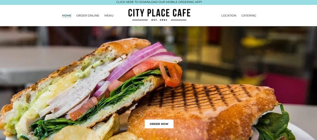
Although a lot of the best cafe websites choose to keep their homepages short, City Place Cafe’s website has a slightly longer homepage – and it works. Rather than making the menu the target for clicks, City Place Cafe invites visitors to scroll, enjoying stunning photographs, a concise “about” section, and a full menu that takes all of the guesswork out of figuring out what it is you want to eat exactly.
Located in Washington DC, the cafe also has a large map embedded on the homepage, knowing that many of its visitors will either come on foot. The beauty of the website is that it repurposes so much of the content that is already used in the cafe, which means that there is complete consistency between the online and in-house experience, and so much time saved in the website design process, too.
8. Cloud City Coffee
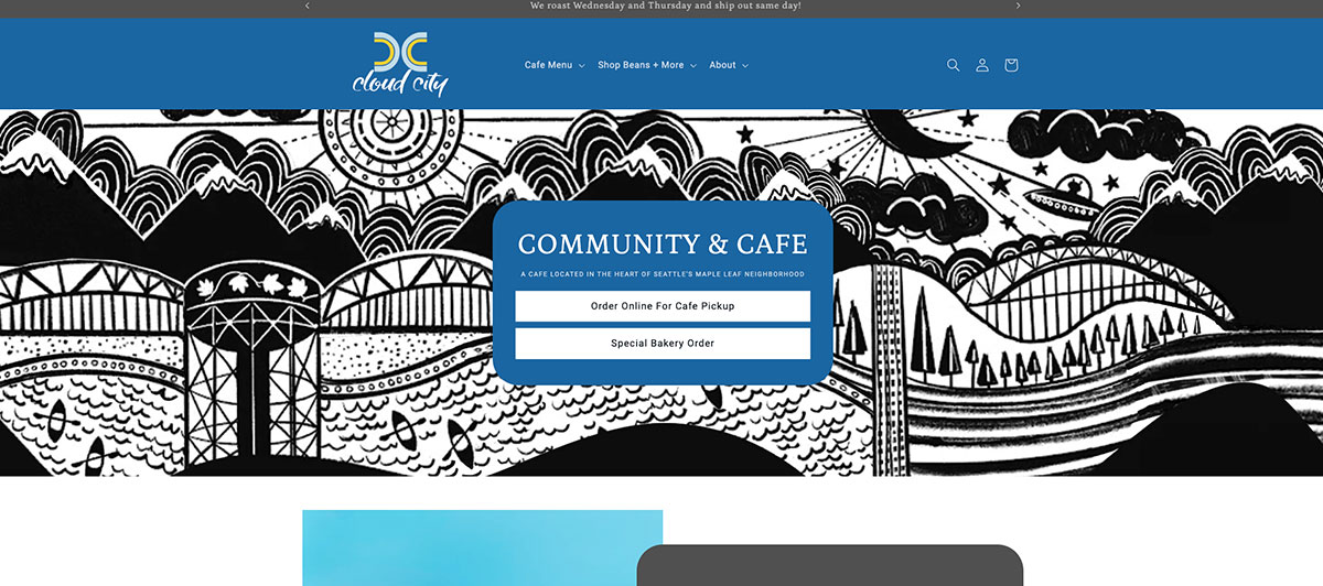
If you’re wondering if your cafe’s logo really matters, the website for Seattle’s Cloud City Coffee cafe is proof that, yes, it does. While the website is attractive, albeit a bit generic, the logo adds instant personality and character, making visitors feel like they’re somewhere special.
Simple and bold enough to stand out, the logo is repeated several times on the website, which makes for great branding. We also love the integrated menu on the homepage, which gives visitors a sneak peek at drinks and food (and prices). The website is organized so that all of the most important information is at the top, with the less important (although still interesting) located at the bottom.
This strategy ensures that visitors in a hurry will find what they’re looking for without frustration, while new customers or those with more time will have the opportunity to learn more about the company, laying the seeds for a great relationship (and repeat business).
9. Hen House Eatery
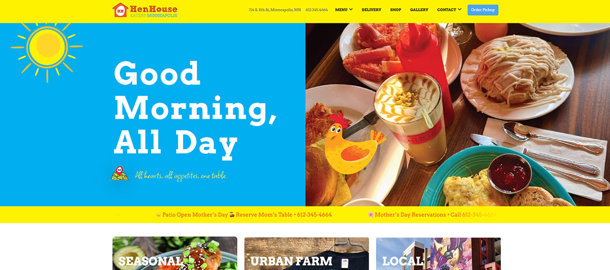
A totally unique website with loads of personality, the Hen House Eatery knows how to make an impression online. Brightly colored and with funky illustrations, the Hen House Eatery website is organized and concise so that the details are fun, definitely not overwhelming.
The cursive freehand font continues the whimsy vibe, but it’s the images on the website that anchor everything, giving visitors something real to sink their teeth into. And, if you take a peek at their About section, you’ll be pleasantly surprised to find personal stories, and a great photo of the trio, too.
10. Little Goat Diner

Think all of the best cafe websites look the same? Little Goat Diner in Chicago is here to prove you wrong. Not only does it completely break the mold when it comes to design and layout (think all black background and somewhat creepy animations), but its unconventional take makes a statement that gets people talking, and that’s a really good thing in the food world.
Filled with animation and cartoons, the drawing of the restaurant is interactive, its features are clickable, so that you literally explore the restaurant as you move through the website. While arguably not as practical as some website designs, the Little Goat Diner understands the importance of being different, and its easy-to-navigate menu at the top of the page ensures no one really gets lost.
11. Magnolia Table

An extension of Chip and Joanna Gaines’s Magnolia website, Magnolia Table is a beautiful example of a simple cafe website done right. (No surprise there.). One of the features we love most about the Magnolia Table website (aside from the beautiful design) is the integrated wait-time section, which delivers visitors with a live expected wait time.
Not only does this let visitors know what to expect, but it’s also brilliant for the staff at Magnolia Table, as they’re bound to receive fewer calls asking about wait time for a table. Unlike many of the cafe websites we see, Magnolia Table’s online real estate chooses to have an FAQ section, as well as a section dedicated to the history of the cafe’s location. For a website relegated to one page, it definitely does a great job at conveying a unique and friendly experience.
12. Zinc Cafe and Market

Featuring a few different locations around the Newport Beach area in California, the website for Zinc Cafe and Market is a beautiful example of how to pack a lot of content in one very short page. Using block sections to make navigation simple, the website requests that users choose their location first and foremost.
But, rather than making visitors select from a narrow list of choices immediately, the website offers three more enticing options: Viewing the blog, shopping, and ordering online. The footer menu provides even more information, ensuring that no one is required to hunt for long before finding just what they need.
One of the most unique features on the website, however, is the “Places We Love” section, which lists nearby shops, restaurants, and experiences for visitors to explore. It’s a great way to build community (and goodwill) with other local businesses in the area!
13. The Corner Table

A small cafe located in Nantucket, The Corner Table’s website actually makes you smile, which is a unique feat in the online world, especially when it comes to cafe websites. Its careful selection of images is one of the main reasons the website presents itself as friendly and inviting, but the obvious commitment to the community is another reason why locals love this establishment.
Well organized and with a simple theme, exploring the website for The Corner Table is fun and easy, allowing you to stumble upon sections like featured classes with chefs and the charming story behind the family owners and the cafe’s historic building.
14. Parakeet Cafe

The color scheme on this website is enough to make you want to redesign your own, especially if you felt like the only practical and professional choice was black and white. Filled with colors that are bright and natural at the same time, La Jolla’s Parakeet Cafe has a great website worth checking out.
Although simple in design, the extra details, like the cafe logo and wallpaper-inspired backgrounds, make it feel special. And, with nearly 14,000 followers on Instagram, the cafe clearly has a loyal following in sunny southern California.
15. Two Hands

Not sure what to feature on your website’s homepage? Use New York City’s beloved Two Hands cafe as an example and try to put as little as possible! Sound strange? It is. But it also really works. With just a handwritten-style logo and a menu, the homepage for the Two Hands cafe leaves a whole lot to the imagination, which is exactly what it wants to do.
With the first pictures showing up on the About page (and only three at that), the website clearly wants you to spend your time at the establishment, not online. But, if you really want to get curious before you check it out IRL, the small black and white Instagram icon in the lower third will take you to the cafe’s social media home, giving you a more personal peek into the Two Hands world, and the tempting food its kitchen produces.
Design tactics worth stealing
These are the specific choices made by the best cafe websites that you can apply directly to your own coffee shop website design.
Invest in real food photography
Stock images of generic lattes won’t cut it. The sites that convert consistently use real food photography of their actual space, their actual pastries, and their actual team. If visitors can almost taste the latte or imagine themselves seated by the window, you’ve already won half the battle. Budget for a professional shoot before you launch or redesign.
Build your menu for the web, not for print
A PDF menu is not a web menu. It doesn’t load well on every device, it isn’t searchable, and it puts friction between your customer and the decision to visit. Structure your menu by category, display prices clearly, and include a photo for your hero items. Flag allergens. Include the portion context. Make it scannable in under 30 seconds.
Use warm, organic color palettes
Earth tones, creams, terracotta, muted greens. These colors work for a cafe website design because they communicate comfort, warmth, and authenticity. They also serve as a visual signal that the experience inside the cafe will match the experience on the website.
Keep navigation to five pages maximum
Homepage, Menu, About, Location, and Contact. That’s the foundation. Add an events or blog page if your coffee shop hosts community activities or publishes content regularly. Anything beyond that is likely overkill for most independent cafes.
Place your CTA where the eye goes first
“Order Now,” “View Menu,” “Book a Table.” One primary CTA per page, displayed prominently, above the fold. The best cafe websites use sticky navigation bars that keep ordering or booking options accessible as visitors scroll, removing friction at the exact moment someone decides to act.
Tell the story behind the cup
The modern coffee movement has made origin stories a genuine source of competitive differentiation. Where are your beans sourced? Who roasts them? Why did you open this shop? A short, honest answer to these questions on your About page or homepage builds the kind of loyalty that keeps customers coming back week after week.
What every cafe website needs
Whether you run a single-location bistro or a growing coffee shop with multiple sites, these are the non-negotiables for any effective cafe website design.
- Hours and location, immediately visible. Not at the bottom of the Contact page. Not inside a PDF. On the homepage, above the fold, easy to read on any device. This is the single most common reason people leave a cafe website without converting.
- A mobile-optimized menu. Divide into clear sections: Breakfast, Lunch, Beverages, Specials, Dietary Options. Show prices next to every item. No surprises when they arrive. Your menu page is doing more work than you think. Customers study it before they visit, sometimes days in advance.
- Online ordering or a reservation system. Not every cafe needs full ecommerce functionality, but every cafe benefits from making it easy to act online. Even a simple “Order Pickup” button connected to a platform like Square or Toast changes the customer experience meaningfully.
- A click-to-call phone number. On mobile, your phone number should be tappable. If a customer has to manually dial, you’ve added unnecessary friction at a critical moment.
- Tappable directions. Your address should open Google Maps automatically when tapped on a mobile device. Visitors looking for directions want them instantly, not after copying and pasting an address into a separate app.
- Real photography of your space. Not just your drinks. The tables, the light, the atmosphere. People visit cafes to feel something, not just to get a cup of coffee. Your website needs to sell the experience before they arrive.
- An email sign-up or loyalty prompt. A simple prompt to “join our newsletter for specials” or “sign up for loyalty rewards” turns a one-time visitor into a recurring customer. Feature it as a secondary CTA rather than a pop-up that fires before anyone has seen anything.
Make your site work like your best barista
Your best barista knows what a customer wants before they finish their sentence, makes them feel welcome the moment they walk through the door, and sends them away wanting to come back. Your website should do the same thing, around the clock, on every device.
Here’s how to build a cafe website that functions like your strongest team member:
- Start with platform clarity. WordPress is the most flexible choice for coffee shop website design and gives you long-term control over SEO, design, and content. Squarespace works well for design-focused owners who update content themselves. Shopify makes sense if online ordering and merchandise are significant revenue streams. The right platform depends on your goals, not on what your neighbor’s cafe used. Our WordPress web design team helps hospitality businesses choose and build on the right foundation every time.
- Protect your site with proper hosting and maintenance. A cafe website that goes down during a busy weekend or gets hit by a security issue doesn’t just cause headaches. It costs real revenue. Managed WordPress hosting and regular maintenance services protect your site the same way you protect the rest of your business.
- Optimize for local search. When someone searches “best coffee shop near me” or “cafe open Sunday in [town],” your website needs to appear. That means local SEO fundamentals: your Google Business Profile fully completed, your address and hours consistent across every directory, and location-specific language throughout your site content. Our SEO services are built around exactly this kind of local visibility strategy for food and hospitality businesses.
- Keep it current. A study of high-performing cafe websites consistently shows one shared trait: they’re updated regularly. Seasonal menus, new event listings, fresh photography from recent gatherings. A site that looks current signals a business that is active, cared for, and worth visiting. A stale website full of last October’s specials does the opposite.
- Use your website as a source of ongoing connection. Email newsletters, event announcements, loyalty program sign-ups. These are not complex features to enable. They’re simple additions that turn a static website into a living communication channel between your coffee shop and its community. The best cafe websites don’t just attract new visitors. They deepen the relationship with existing ones and give regulars a reason to keep checking back.
If your current site isn’t doing any of that, it may be time for a conversation about what a better one could look like. Get a quote and let’s talk through what your cafe website needs to start pulling its weight.
Your cafe deserves a website as good as your coffee. Freshy brews that up
The best cafe websites share one quality: they make you feel something before you ever walk through the door. From food photography to mobile menus, every element should move a visitor from curiosity to visit. Get that right, and your site becomes your most consistent source of new customers.
Key takeaways:
- Answer location, hours, and ordering options within five seconds of landing on the page
- Mobile-first design is non-negotiable when over 70% of cafe searches happen on phones
- Real food photography of your actual space converts far better than stock images
- Web menus organized by category with prices displayed outperform PDF menus every time
- A clear origin story builds the kind of loyalty that keeps customers coming back
- Keep navigation to five pages maximum and place one primary CTA per page
We’ve built websites for restaurants, cafes, and hospitality businesses that balance beautiful design with real conversion strategy. Our WordPress web design team knows how to translate the warmth of a great coffee shop into a digital experience that fills seats. Get a quote and let’s build something worth visiting.
FAQs
What is a web cafe?
A web cafe, also called an internet cafe, is a public space where customers buy time on computers alongside food, drinks, and cookies, often serving joe and light bites.
What should a coffee shop website design have?
Essential features include hours, location, a mobile-friendly menu, online ordering, food photography, contact details, and subscription options for loyalty programs or newsletters to inspire repeat visits.
How much does a cafe website design cost?
Cafe website design ranges from $200 to $800 for DIY templates to $2,000 to $10,000 for a professionally built site with a full collection of custom features and integrations.
Are internet cafes still a thing?
Yes, though far less common. Internet cafes still operate in many countries where personal devices are less accessible. Most now buy revenue from food and drinks rather than computer time.


)