
Recently, on a client’s website, we wanted to pull in featured images for posts. Our goals were to do a variety of different things to handle a few different situations that could come up — to ensure the output of the columns were always handled with care, and in an appearance that made sense to the user and the client.
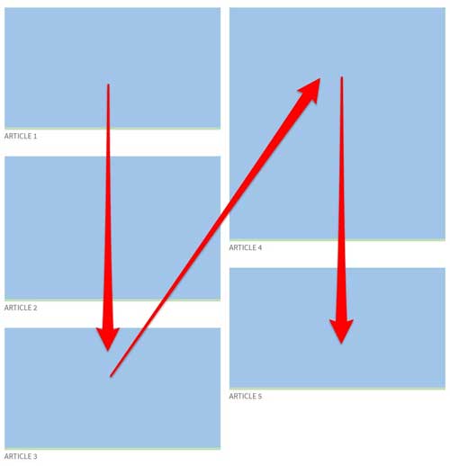
- Arrange the featured posts in two columns
- Split the content evenly among the two columns, even though the featured images were not all the same height
- Display the posts in order from top to bottom in column one, then top to bottom in column two, so there wouldn’t be gaps between various image sizes when the posts tiled
I had trouble finding good information on how to do this with columns instead of rows. Some people suggested flexbox, but I didn’t find any references about how to limit flexbox to two columns. I was hoping for something similar to a masonry layout, but a simpler solution to what seems like a simple layout.
When the page loads, the images may not be done loading before a CSS calc() runs, so instead, I used JavaScript to dynamically calculate the height after the window was fully loaded to be sure we get an accurate result.
When the client chooses to feature different posts, the heights of the content boxes will change based on the new images. Using JavaScript to calculate the height makes the layout adjust to keep the two columns at relatively equal heights.
You may need to adjust the percentage used to best fit your typical sizes.
Here’s the code we used:
In the child theme template file:
<div id="featured-articles">
    <div class="featured-article">
        <a href="#"><img src="https://freshysites.com/wp-content/uploads/red-landscape.jpg" /></a>
        <br /><a href="#">Article 1 Title</a>
    </div>
    <div class="featured-article">
        <a href="#"><img src="https://freshysites.com/wp-content/uploads/pexels-photo-164226.jpeg" /></a>
        <br /><a href="#">Article 2 Title</a>
    </div>
    <div class="featured-article">
        <a href="#"><img src="https://freshysites.com/wp-content/uploads/pexels-photo-27403.jpg" /></a>
        <br /><a href="#">Article 3 Title</a>
    </div>
    <div class="featured-article">
        <a href="#"><img src="https://freshysites.com/wp-content/uploads/trailblazer-header.jpg" /></a>
        <br /><a href="#">Article 4 Title</a>
    </div>
    <div class="featured-article">
        <a href="#"><img src="https://freshysites.com/wp-content/uploads/butterfly-header.jpg" /></a>
        <br /><a href="#">Article 5 Title</a>
    </div>
    <div class="featured-article">
        <a href="#"><img src="https://freshysites.com/wp-content/uploads/sunset-beach-header.png" /></a>
        <br /><a href="#">Article 6 Title</a>
    </div>
</div>
In the child theme style.css file:
#featured-articles {
    /*max-width: 1000px; may not be needed depending on the width of the container */
    display:flex;
    flex-direction: column;
    flex-wrap:wrap;
    align-content:space-between;
}
#featured-articles .featured-article {
    width:49%;
    padding:0 0 30px 0;
    position:relative;
}
#featured-articles .featured-article img {
    padding: 0 0 5px 0;
}
#featured-articles .featured-article a {
    text-transform:uppercase;
}
@media (max-width: 480px) {
    #featured-articles {
        height:auto;
    }
    #featured-articles .featured-article {
        width:100%;
    }
}
In the child theme functions.js file:
   var _window = jQuery( window );
   jQuery(window).on('load', function () {
        if(_window.innerWidth() > 767){
	    if(document.getElementById('featured-articles') !== null) {
		var featured = jQuery("#featured-articles").height();  console.log('total height: '+featured);
		var featuredhalf = parseInt(featured * .60);/* Adjust this percentage to accommodate your situation best */
		jQuery("#featured-articles").height(featuredhalf); console.log('new height: '+featuredhalf);
            }
	}
    });
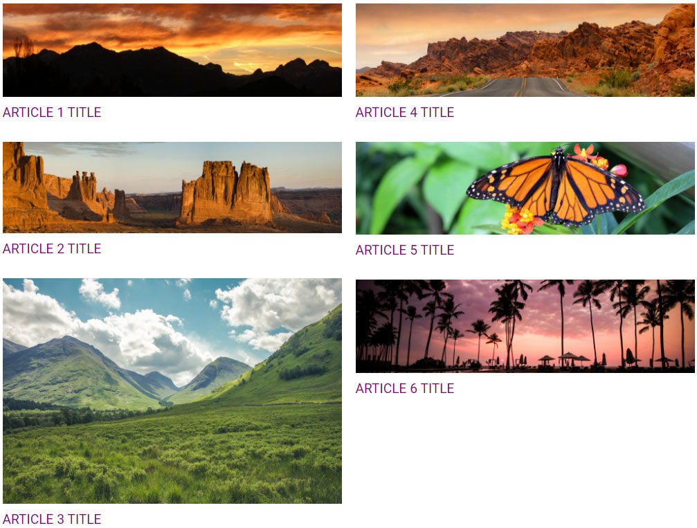
And here is what the end result looks like:
Have you used flexbox for similar layouts on your website? Any tips to share, or issues you ran into? Let us know!


