Money is personal, and often stressful, which makes a financial services website one of the hardest design challenges out there. It has to feel authoritative enough to trust with someone’s financial future, yet human enough to ease the anxiety that comes with managing money. The best financial websites strike that balance, putting visitors at ease without ever losing credibility.
Here’s what this guide covers:
- The 7 best financial service websites of 2026, reviewed
- The psychology of color and trust in finance web design
- The security and transparency signals that convert prospective clients
- The interactive tools and fintech trends defining the sector
- The range from personal finance to enterprise banking, and what each does well
Designing for the financial sector means earning trust in seconds while explaining complex products clearly, a balance our team works in constantly. As a finance web design agency, we build the kind of sites the examples below exemplify.
The top financial service websites
Financial institutions like banks, credit unions, and wealth management companies have very in-demand services with a lot of technical education required to do their jobs well, and because working with money is a sensitive topic for nearly anyone, it’s especially important that such businesses market themselves with a strong website.
The following financial service sites do some of the best work around articulating their financial specialties without losing the emotional side of dealing with money.
1. SGUA
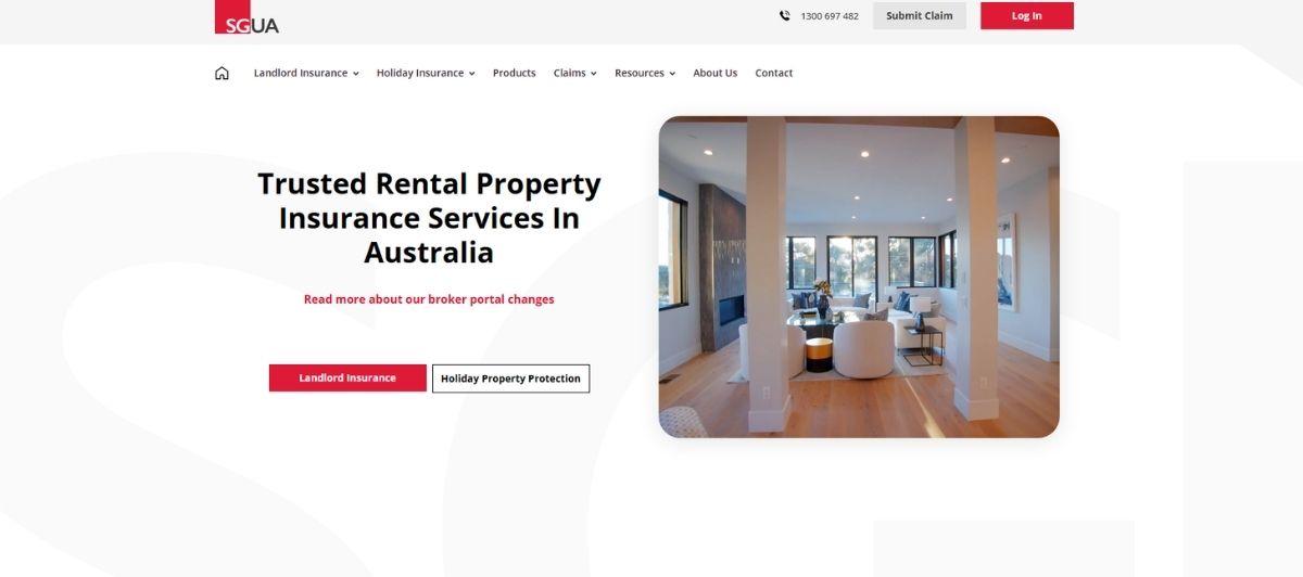
SGUA‘s design places brightly-colored calls to action throughout the site’s pages and uses a simple red and black palette to make important aspects seem to pop out. Their homepage slider looks clean and concise while sticking to concrete information about their services, including quotes, payments, and easy-to-access forms to join their mailing list.
From the homepage, their first clickable call to action places visitors in a snappy action flow about investing, comparing insurance products, and getting proper landlord protection.
2. Personal Capital
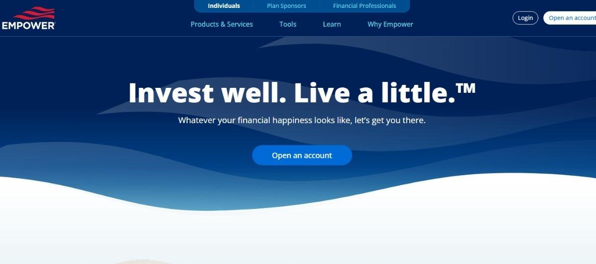
Personal Capital‘s website has a contemporary look and a welcoming landing page with a unique fly out left hand menu. Their website gets straight to business by offering solutions and tools up front. Each section is meant to show the visitor how they are at the fore front of what is happening in the world today and that they are eager to help.
3. Morgan Stanley
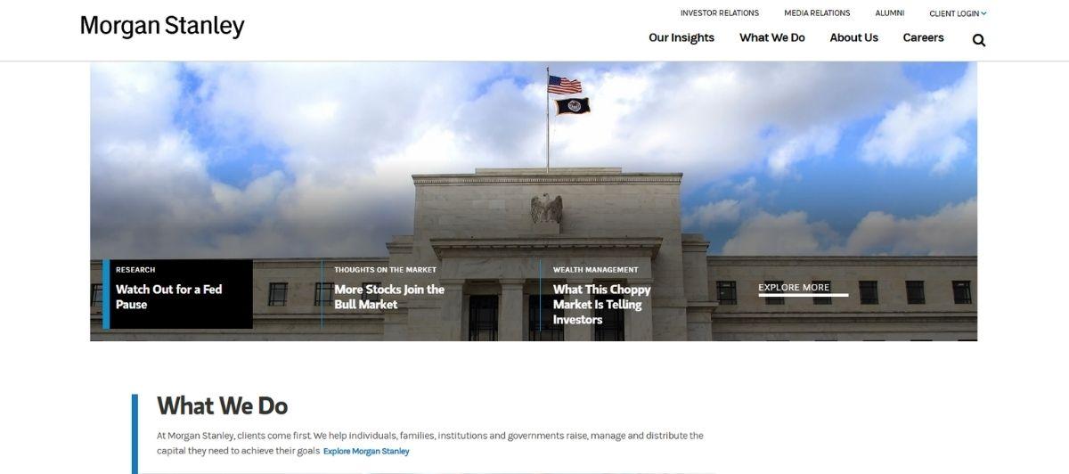
Morgan Stanley‘s design enlightens and informs customers rather than trying to pitch them a particular financial service from the get-go. Their homepage is filled with a grid-design news block that keeps readers up to date regarding events in the financial sector, including new laws, guides for starting businesses, and international trade deal details that affect a wide variety of citizens.
Their “clients” tab presents juicy information to visitors about money management and investment opportunities.
4. Money Strands
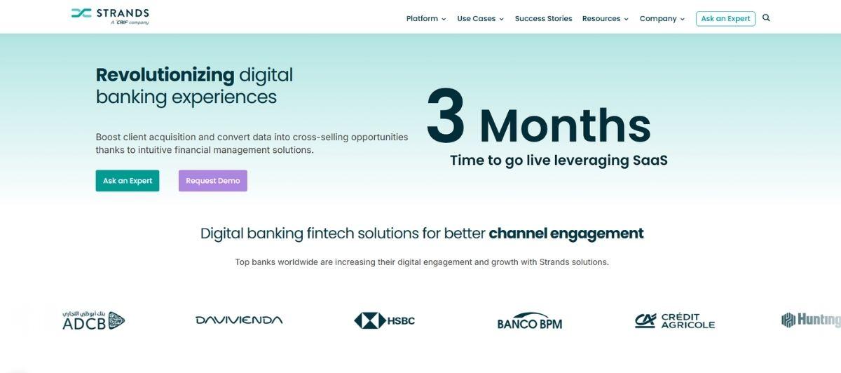
The Money Strands presentation uses gentle, visually appealing colors that are consistent with the greens of American bills and the gentle pastels that help calm a more sensitive subject. Their slogan, “Your Money Never Looked So Good,” sits right in the center of their homepage slider, and scrolling down brings visitors to concise descriptions for each financial area of expertise they provide.
In general, the bright, warm graphics help sell their gentler attitude about managing finances to build a little initial credibility with new readers.
5. My Rate Plan

My Rate Plan has a website focused on helping you compare money-saving options toward choosing a cell phone provider that most benefits you. Visitors quickly learn that they can compare everything from internet speeds to screen resolutions to the average lifespans of specific models. Their navigation menu is large and impossible to miss, while their Bundles section presents the latest discounts and bulk deals for popular phones around the country.
6. Barclays

The Barclays banking site focuses on using the business’s bright blue and white colors across their design, and their particular use of a lighter blue shade gives the distinct impression of level-headed, dependable advice from an optimistic source.
Barclays offers a plethora of financial services, and the initial information about each product is displayed in a boxed-grid style via the home page with plenty of spacing for engaging graphics and icons.
7. Kashoo
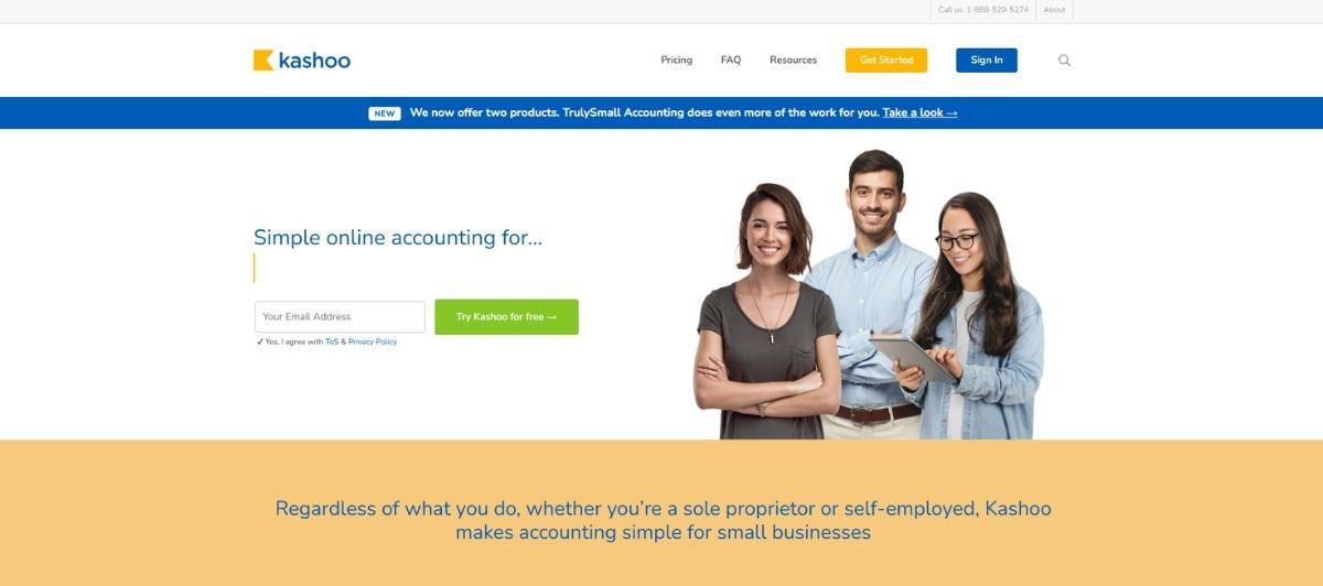
Kashoo is an online accounting business that specializes in providing their software for quick and effective financial management. Their site uses a green and blue palette for a natural look and provides extensive screenshots of using their software to enhance credibility about what it specifically can do to better your financial experiences.
They have arguably the best slogan on this list, jovially claiming to have finally fixed accounting software for the benefit of everyone.
The psychology of trust in finance web design
More than almost any other industry, finance sells trust before it sells a product. A visitor deciding where to put their savings or which financial advisor to call is making an emotional decision dressed up as a logical one. The best financial website designs understand this and use every design choice to build confidence.
Color is the most powerful lever. Notice how the sites above lean on it:
- Blues and greens dominate for a reason. These colors evoke trust, stability, and calm, which is why Barclays anchors its site in dependable blue; Money Strands and Kashoo reach for the reassuring greens of currency. Across the financial sector, blues and greens are the go-to palette.
- Subdued, considered palettes signal seriousness. A restrained, professional color scheme reads as level-headed, exactly the first impression a financial institution wants to make.
- Clean typography and clear hierarchy build credibility. Morgan Stanley’s grid-based news layout and Personal Capital’s contemporary type both use clarity to convey expertise.
- Authentic imagery beats stock photos. Real, authentic images build trust far more effectively than generic stock photography, making a brand feel genuine rather than manufactured.
That marriage of emotional reassurance and professional polish is the heart of strong finance web design, and it’s what separates a site visitors rely on from one they bounce off. A thoughtfully designed WordPress site built around these principles turns a first impression into lasting credibility.
Security and transparency signals that convert
In finance, trust isn’t just a feeling; it’s a set of concrete signals a visitor scans for, often unconsciously, before handing over any information. Leading financial platforms make these signals visible and turn them into a competitive advantage. Getting them right directly drives conversion.
Trust signals belong above the fold
Prospective clients look for reassurance immediately. The strongest financial websites place trust signals, certifications, security badges, and regulatory credentials above the fold where they’re seen first. Professional website design itself functions as a trust signal, since a polished, credible site implies a credible institution behind it.
Transparency around fees and security
Two things build trust faster than almost anything else in financial services:
- Transparent fee structures. Being upfront about costs, rather than burying them, signals honesty and respect for the customer. Leading platforms even use interactive calculators to help users understand fees clearly.
- Visible security infrastructure. Multifactor authentication is now a key component of financial security, and top websites increasingly highlight AI-driven fraud detection to reassure users their money is protected.
Clarity in navigation and calls to action
A confused visitor never converts. Effective financial websites prioritize user-friendly navigation that helps people quickly find what they need, whether that’s a loan product, an investment strategy, or a financial advisor.
Clear calls to action then guide them toward the next step, measurably improving conversion rates. Keeping all of this secure and reliably online is where dependable managed hosting and maintenance quietly earn their keep.
Interactive tools that turn browsers into clients
Static brochures don’t cut it in finance anymore. The best websites engage visitors with interactive tools that provide genuine value, drawing users deeper into the site while helping them make informed decisions about their finances. Top financial websites integrate these tools precisely because engagement is what builds the relationship.
The tools that work hardest include:
| Tool | What it does for the user |
|---|---|
| Retirement calculators | Helps users plan toward financial independence and freedom |
| Fee calculators | Makes costs transparent and easy to understand |
| Investment comparisons | Lets users weigh investment opportunities side by side |
| Real-time market updates | Keeps investors informed with live financial news and market insights |
| Budgeting dashboards | Aggregates accounts so users manage finances in one place |
Personal Capital leads with tools and solutions up front, while Morgan Stanley’s news grid delivers real-time market insights that keep visitors coming back. Educational resources like retirement calculators do double duty: they help users plan smart decisions about their financial future while positioning the company as a knowledgeable partner.
Increasingly, AI-driven personalization tailors these experiences to each individual, and personalized financial planning powered by AI is expected to grow in importance across the sector. Building these interactive features takes real technical depth, which is where an experienced WordPress development team makes the difference.
The fintech trends reshaping financial services
The infrastructure behind financial websites is evolving as quickly as the design on the surface. Digital payments reached $6.6 trillion in 2021 and continue to climb, pushing financial institutions to modernize how their platforms are built. Staying ahead of these shifts is what keeps a financial services website competitive.
Real-time, global, mobile-first
Money now moves instantly and across borders, and websites have to keep pace:
- Real-time global payments are a defining trend, with platforms like Wise serving 14.8 million customers across more than 80 countries
- Mobile-first design is essential, since a growing share of users manage money primarily on their phones
- Reliable transaction processing and real-time notifications are now baseline expectations for any high-quality financial platform
Open banking and cloud infrastructure
Behind the scenes, the plumbing is changing. Open banking APIs are becoming increasingly relevant, letting users securely connect and aggregate services so they can manage all their finances more effectively. Meanwhile, cloud-native banking infrastructure enhances operational efficiency for financial institutions, allowing them to innovate faster and scale reliably.
Sophistication that still feels effortless
The best sites wrap all this complexity in a simple experience. Stripe’s homepage, for instance, uses an animated gradient that signals technical sophistication without overwhelming the visitor. That’s the balance modern fintech strikes: robust services delivered through a seamless, accessible interface.
Accessibility and inclusive design are now priorities for leading platforms, ensuring every user, regardless of ability, can navigate with confidence.
From personal finance to enterprise banking
One of the most interesting things about the financial sector is its sheer range. The same list of “best finance websites” can include a solo-focused budgeting app and a global investment bank, and each serves a completely different visitor. The best websites know exactly who they’re speaking to.
Here’s how the range breaks down:
| Category | Examples from the list | Primary focus |
|---|---|---|
| Personal finance and comparison | Money Strands, My Rate Plan | Helping individuals save and make smart decisions |
| Wealth and investment | Morgan Stanley, Personal Capital | Investment strategies and market insights |
| Banking and insurance | Barclays, SGUA | Everyday banking and financial products |
| Financial software | Kashoo | Tools for effective money management |
Whether a company offers online stock trading, wealth management, or accounting software, the winning formula is consistent: understand the visitor’s emotional relationship with money, communicate expertise with clarity, and make the path to financial freedom feel achievable.
Money Strands calms a sensitive subject with warm design, while Morgan Stanley leads with education over the hard sell. For any financial business, from a local advisor to a global institution, a site that reflects its specific audience is what converts a curious visitor into a committed client.
Build a financial website that earns trust with Freshy
The best financial service websites all do the same core things: they build trust through considered design, prove their security and transparency, and guide visitors toward smart decisions with genuinely useful tools.
Here are the key takeaways from this guide:
- Use blues, greens, and clean typography to convey trust and stability
- Place trust signals, certifications, and security badges above the fold
- Be transparent about fees and highlight security like multifactor authentication
- Offer interactive tools like retirement and fee calculators to engage visitors
- Build mobile-first with reliable, real-time transaction processing
- Match your design to your specific audience, from personal finance to enterprise banking
Whether you’re an independent financial advisor or a growing financial institution, your website should make visitors feel confident about their financial future from the first click.
As a dedicated finance web design agency, Freshy builds high-performing WordPress websites backed by ongoing support and maintenance. When you’re ready to give your financial brand a site that earns trust, let’s start a conversation.
Frequently asked questions
What colors work best for financial websites?
Blues and greens dominate financial web design because they evoke trust, stability, and calm. Subdued, professional palettes signal seriousness, while authentic imagery builds more credibility than stock photos, reassuring visitors about a sensitive subject.
How do financial websites build trust with visitors?
They place trust signals, certifications, and security badges above the fold, offer transparent fee structures, highlight security like multifactor authentication and AI fraud detection, and use clean, professional design with clear navigation to convey credibility.
What interactive tools should a financial website include?
Effective financial sites offer retirement calculators, fee calculators, investment comparisons, real-time market updates, and budgeting dashboards. These tools engage visitors, provide genuine value, and help users make informed decisions about their financial future.
Why is mobile-first design important for financial services?
A growing share of users manage money primarily on their phones. Mobile-first, responsive design ensures reliable transaction processing, real-time notifications, and a seamless experience, which are now baseline expectations for any quality financial platform.
What fintech trends are shaping financial websites in 2026?
Key trends include real-time global payments, open banking APIs, cloud-native infrastructure, AI-driven personalization, and enhanced fraud detection. Platforms like Wise, serving 14.8 million customers across 80+ countries, show how global and instant finance has become.