
Patients searching for an ENT specialist are usually dealing with something that has been disrupting their daily life for weeks: chronic sinus issues, persistent hearing loss, a sleep apnea diagnosis, recurring ear infections, or allergy treatments that aren’t working.
By the time they search online, they’re ready to schedule. The question is whether your website gives them confidence that you’re the right practice to trust with their care. Over 70% of patients check a provider’s website before booking, and ENT care is a high-consideration specialty where that first impression carries real weight.
This article reviews 27 of the best ear, nose, and throat (ENT) websites and what each one does to earn that trust.
Here’s what we cover:
- What makes an ENT website convert anxious patients into scheduled appointments
- 27 of the best ear, nose, and throat (ENT) websites, reviewed and linked
- Design and content choices that distinguish the top otolaryngology practices online
- What every ENT practice website needs to serve new and existing patients well
- How to build a site that reflects your team’s expertise and comprehensive care
Our healthcare web design work reflects over 15 years of building medical practice websites that convert. If your ENT practice is due for a redesign, take a look at what we do before you start.
What makes the best ear, nose, and throat (ENT) websites earn patient trust
ENT practices serve a remarkably broad patient population. Children with ear infections, adults managing hearing loss, patients seeking allergy treatments, those dealing with sleep apnea or snoring, and individuals facing head and neck surgery all arrive at an ENT website with different needs and different levels of anxiety. The best ENT websites serve all of them without losing clarity for any of them.
An informative and engaging website can give your ENT practice a significant advantage over the competition. Prospective patients will judge the quality of your website when they are deciding whether to make an appointment, so providing them with a great online experience is one of the most effective ways to build confidence and get them through the door.
Here’s what the best ear, nose, throat websites consistently get right:
- They communicate medical expertise and credentials immediately. ENT is a complex specialty. Board certification, fellowship training, subspecialties in audiology, head and neck surgery, or facial plastics, and years of experience in otolaryngology are all trust signals that patients rely on when choosing a provider for sensitive care. The best ENT websites surface this expertise above the fold, not buried in an About section.
- They organize conditions and treatment options clearly. Ear, nose, and throat care spans an enormous range of conditions. Patients researching sinus issues are not the same visitors researching hearing aids or seeking a voice disorder specialist. Clear navigation organized by condition, dedicated pages for each treatment area, and plain-language explanations of what patients can expect from their first visit all help the right patients find their way to the right care quickly.
- They make scheduling immediate and effortless. An appointment request button visible above the fold, a phone number in the header on every page, and a patient portal link for existing patients are the minimum baseline for any modern ENT practice website. Telehealth and virtual visit options have become equally important as part of comprehensive care delivery.
- They use photography and video to introduce the team as people. Patients entrusting their hearing, their throat, their children’s ear infections, or their sleep apnea care to a physician want to feel they know that person before the first visit. Real team photography, physician video interviews, and personal bios that communicate both credentials and warmth consistently outperform stock imagery in building the patient confidence that converts a site visit into a scheduled appointment.
| Weak ENT website | High-converting ENT website |
|---|---|
| Generic medical stock imagery | Real physician photos and team bios |
| One general services page | Dedicated pages for ear, nose, throat, allergy, audiology |
| No scheduling CTA above the fold | Appointment booking and phone number immediately visible |
| No patient testimonials | Reviews near CTAs throughout the site |
| No condition-specific content | Plain-language pages covering hearing loss, sinus issues, sleep apnea, and allergic conditions |
The 27 best ear, nose, and throat (ENT) websites of 2026
An informative and engaging website can give your ENT practice a big advantage over the competition. Prospective patients will judge the quality of your website when they are deciding whether to make an appointment, so providing them with a great online experience can be an excellent way to build trust and get them in the door for that initial consultation. Here are sites that demonstrate various methods that succeed in attracting people to use ENT services.
1. Pacific Eye & Ear Specialists
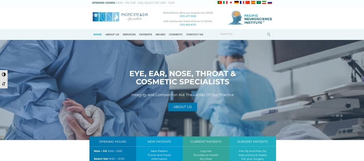
Pacific Eye & Ear Specialists closes this list with one of the most thoughtful patient accessibility features available: a row of flags at the top of every page that allows patients to translate the entire site into their native language in less than 60 seconds.
For a specialty serving the whole family across a diverse patient population, this feature directly communicates an inclusive approach to ENT care and removes a significant barrier for non-English-speaking patients seeking ear, nose, and throat or audiology services.
2. Biltmore ENT, Facial Plastics & Allergy
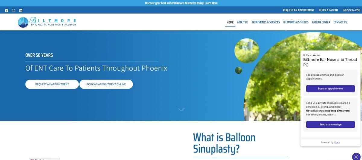
Biltmore ENT establishes credibility from the first second through a combination of staff credentials displayed prominently on the main banner and a large, warm group photo of the physician team. This dual signal, clinical expertise, and human approachability, is exactly what anxious patients need to see before scheduling for conditions as personal as hearing loss or throat care. The menu bar makes direct calling or online scheduling accessible from every page without navigation effort.
3. New England Ear, Nose & Throat
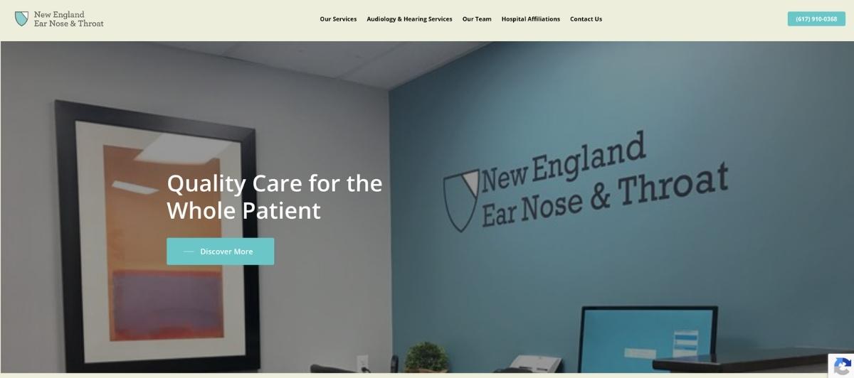
New England ENT earns trust through design precision. Interactive specialty graphics, well-organized specialty boxes, and a consistently polished visual approach throughout the site communicate indirectly that this is a practice that takes quality seriously at every level.
For ENT practices where medical expertise is the core differentiator, this approach to design as a trust signal rather than simply an aesthetic choice is worth studying closely.
4. North Atlanta ENT & Allergy
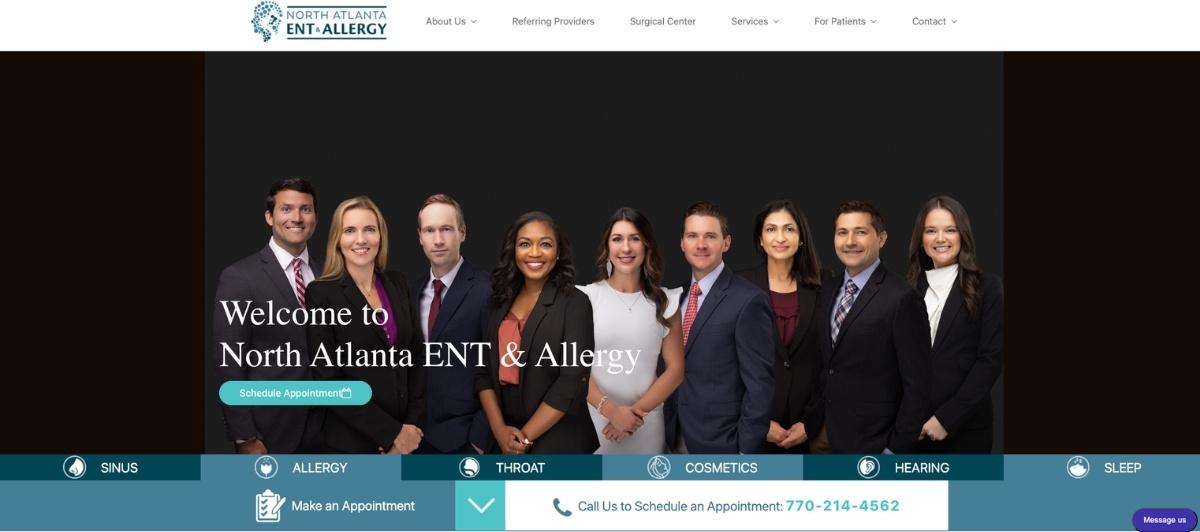
North Atlanta ENT & Allergy packs comprehensive specialty information into cleanly organized pages that are all accessible from the homepage menu bar. Each specialty page features a live chat icon, so patients with specific questions about allergy treatments, hearing aids, or sinus procedures can connect with a staff member immediately without navigating to a separate contact page. A single-click patient portal serves existing patients efficiently alongside new patient acquisition.
5. Mid-South Ear, Nose & Throat PC
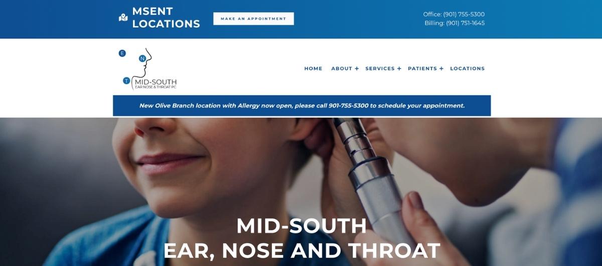
Mid-South Ear, Nose & Throat PC was clearly designed around the practical questions patients ask before their first visit and between appointments. Registration forms, billing information, insurance details, and the practice’s complete service list are all immediately accessible, reducing the phone inquiry volume that administrative staff typically handle while improving the patient experience for those who want to manage their ENT care independently.
6. Los Angeles Center For Ear, Nose, Throat, and Allergy
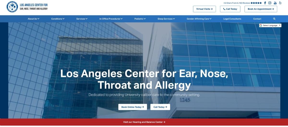
LA ENT uses video clips throughout the site to create an immersive experience that makes patients feel familiar with the practice before they arrive. All scheduling options, including virtual visits for appropriate ENT consultations, are clearly visible alongside social media links and patient reviews at the top of every page. For a specialty that includes both routine and complex conditions, offering telehealth alongside in-person scheduling reflects the kind of cutting-edge technology and comprehensive care approach that distinguishes top ENT practices.
7. Vernick & Gopal, LLC
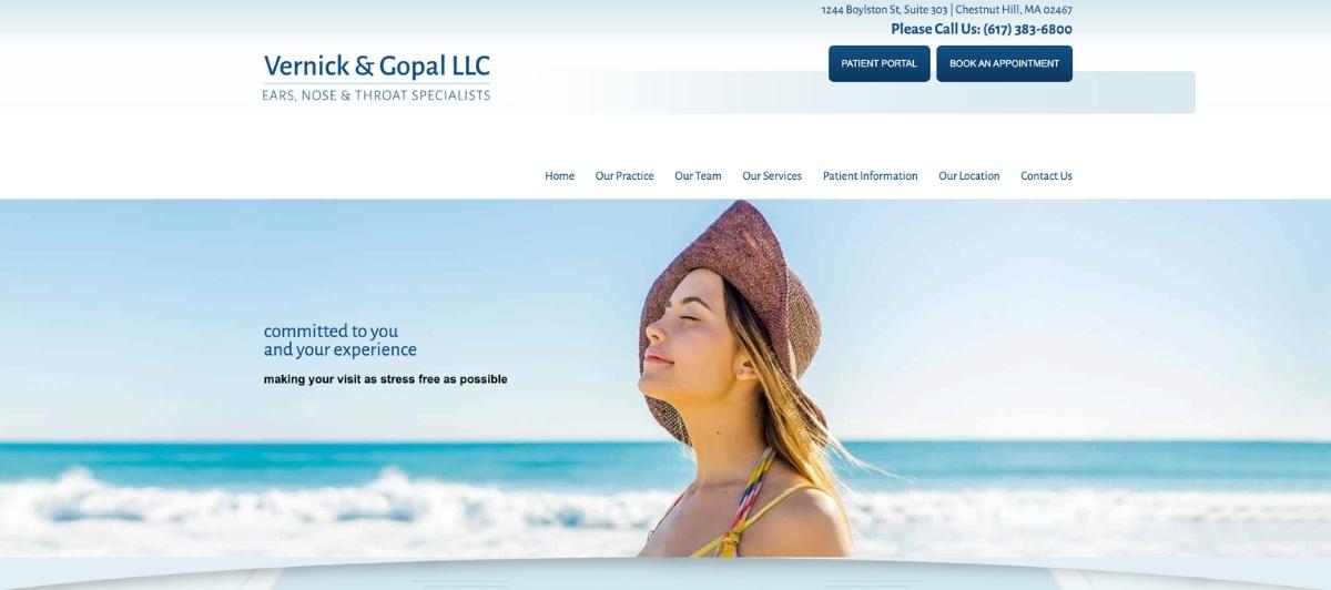
Vernick and Gopal uses a clean, minimal white and light blue palette that creates exactly the kind of calm, professional atmosphere appropriate for patients researching conditions like hearing loss, sleep apnea, or throat disorders. The font choices are large enough to be comfortable for older patients, a significant share of any ENT practice’s patient population, and a convenient contact box at the bottom of every page ensures no visitor leaves without a clear way to connect.
8. Greater Miami ENT

Greater Miami ENT stands out for its color-coded conditions and treatment options list, which allows patients to browse ENT specialties visually rather than reading through a text-heavy menu. The creative, colorful approach is distinctive without being distracting, and the underlying structure serves patients who arrive knowing their condition as well as those still trying to understand whether an ENT specialist is the right type of doctor for what they’re experiencing.
9. Peak Ear, Nose, Throat & Voice Center

Peak ENT and Voice Center uses subtle interactive design elements with notable effect. Social media links, email, and phone number all turn bright white on hover, creating a small but memorable moment of engagement that also guides patient attention toward contact options. For a practice serving voice disorders alongside standard ENT conditions, this interactive attention to detail mirrors the precision patients hope to find in the clinical care itself.
10. Integrated Ear, Nose & Throat
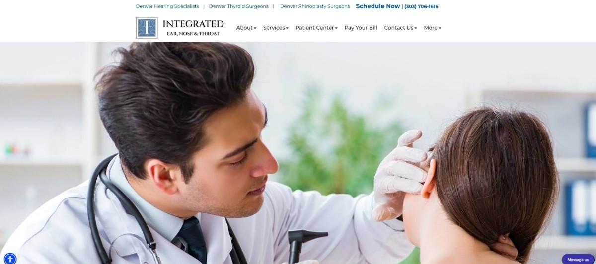
Integrated ENT makes an immediate impression through simplicity. The appointment request button sits front and center against a blue-toned mountain image, creating both visual calm and immediate conversion accessibility. The overall color scheme communicates prestige and professionalism without the cold, clinical aesthetic that can make medical websites feel intimidating rather than welcoming for patients seeking relief from chronic sinus issues or ear infections.
11. Ear, Nose & Throat of Georgia South
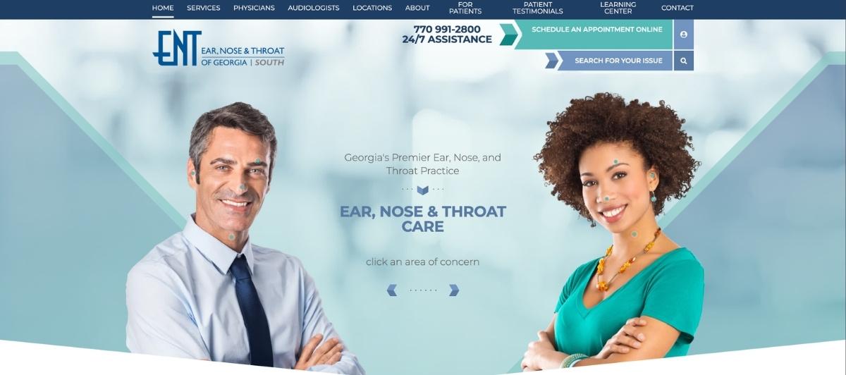
ENT of Georgia South takes one of the most creative educational approaches on this entire list. Rather than describing conditions in text, the site uses interactive anatomical diagrams that patients can click to access information about specific concerns in the ear, nose, or throat. For a specialty where patients often arrive uncertain about which part of their anatomy is causing their symptoms, this approach helps them self-navigate to relevant information in a genuinely useful way.
12. Chicago ENT

Chicago ENT pairs a friendly, approachable presentation with a genuinely useful diagnostic tool: a complimentary questionnaire that helps prospective patients narrow down their symptoms before scheduling. This pre-consultation resource reduces patient anxiety, improves appointment readiness, and positions the practice as one committed to personalized care from the first digital interaction. A simple chat box for additional questions completes a homepage designed around reducing patient hesitation at every stage.
13. ENT Specialists of The Rockies
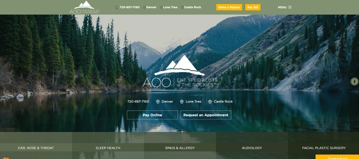
ENT Specialists of The Rockies uses an earthy green color palette and calming landscape graphics to create an immediate sense of ease that is psychologically appropriate for patients managing chronic conditions like allergic conditions, sleep apnea, or hearing disorders. Patient testimonials below the fold provide the social proof that gives prospective patients confidence they’ve found an ENT care provider committed to delivering results that improve quality of life.
14. Sinus Relief Center
Sinus Relief Center opens with an online survey for new visitors that serves dual purposes: it engages patients who arrive with sinus issues and helps them understand their symptoms, while simultaneously reducing the site’s bounce rate, which supports search rankings over time. The visually clean design with effective white space reflects the clinical precision patients associate with expert ENT care.
15. South Florida ENT Associates (sfenta.org)
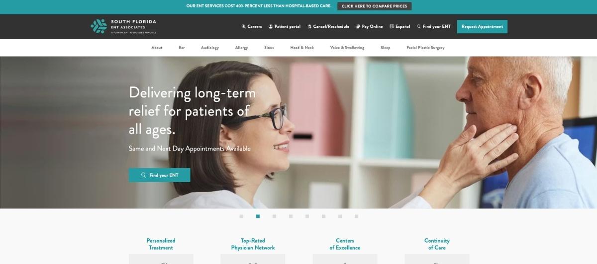
South Florida ENT Associates uses bullet points with unusual discipline and effectiveness. Rather than burying the practice’s key advantages in paragraph text, the site surfaces its main selling points immediately in scannable form. As patients scroll, bright colored icons link to specialty information, creating a navigational layer that serves both the hurried patient and the thorough researcher equally well.
16. Mile High Otolaryngology
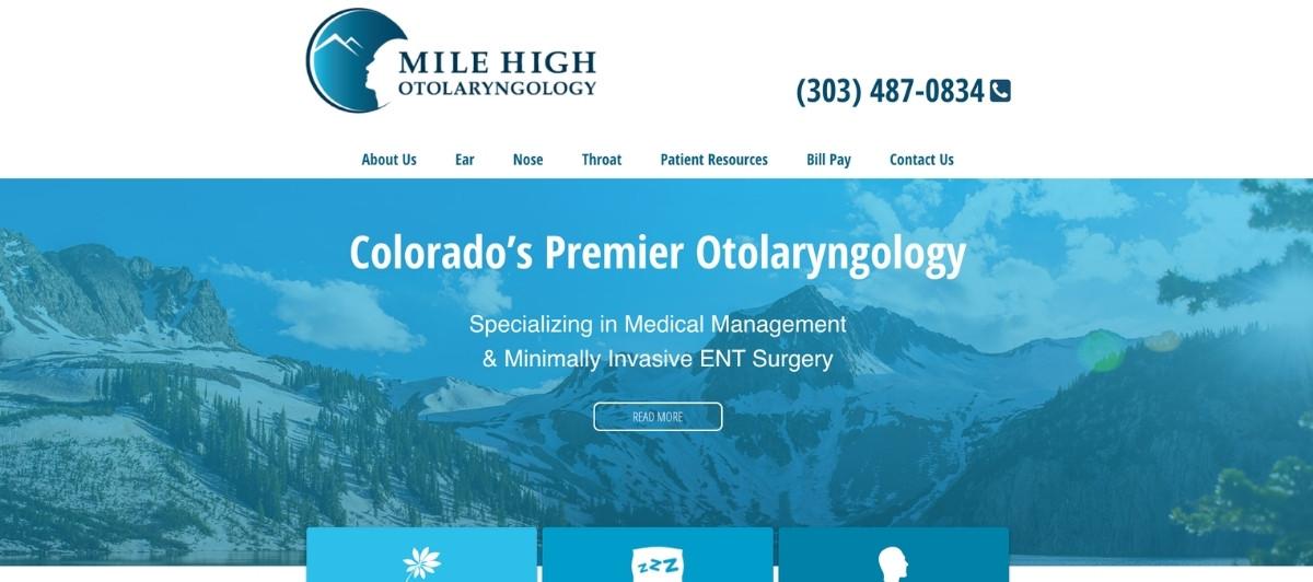
Mile High Otolaryngology demonstrates that a minimalist ENT website can outperform a content-heavy one when the few elements present are chosen carefully. A simple menu engages visitors immediately, and the large clickable phone number hyperlink, which simultaneously tracks call conversions, is a practical lead generation detail that most ENT practices never implement despite its simplicity.
17. Shea Clinic
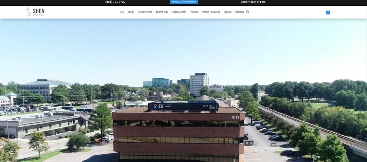
Shea Clinic uses generous white space throughout to create the relaxed, reassuring visual environment that patients dealing with hearing loss, ear disorders, or audiology concerns benefit from before they even read a word of content. Multiple calls to action above the fold serve patients at different stages of their decision-making process, and an easily accessible Facebook link supports ongoing patient community engagement.
18. Massachusetts Ear, Nose, and Throat Associates
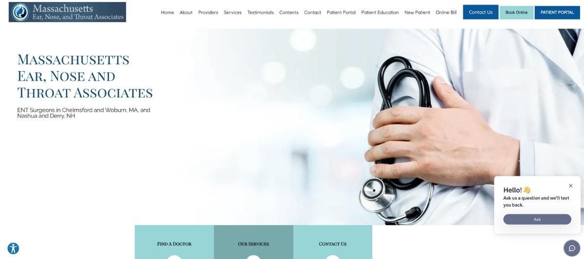
Massachusetts Ear, Nose, and Throat Associates solves one of the most common challenges in ENT web design: serving both new and returning patients from a single homepage without overwhelming either. The large blue tab system draws immediate visual attention and routes different visitor types to the relevant content quickly, without requiring patients who already know what they need to scroll past information that doesn’t apply to them.
19. Mani H. Zadeh, M.D.

Dr. Mani H. Zadeh demonstrates what a solo physician practice website can accomplish when it leads with the physician rather than the practice name. Credentials and awards are highlighted immediately, and a video interview beneath his biography creates the kind of personal connection that reduces patient anxiety about scheduling with a specialist they’ve never met. This video approach is one of the highest-trust conversion tools available to any solo practitioner in the ENT field.
20. North Shore Ear, Nose, and Throat
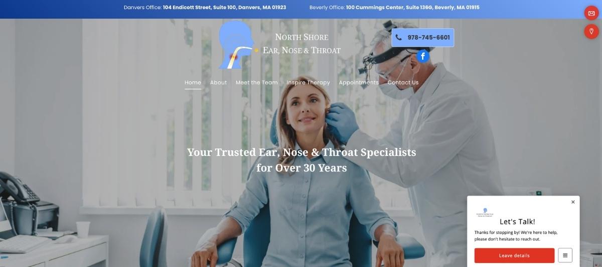
North Shore ENT uses a clean template to deliver a fast-loading site with a homepage slideshow of expressive, authentic photography. The engaged team photos that appear on scrolling communicate the warm, community-connected culture of the practice in a way that branded photography of treatment rooms never could. Fast load speeds combined with genuine imagery reflect the kind of reliable, personal ENT care the practice delivers.
21. Arizona ENT
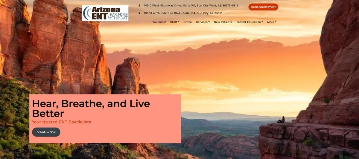
Arizona ENT uses a distinctive dark-green header banner on every page that creates immediate brand recognition and strong visual contrast with the clean white content sections below. The patient education portal, equipped with a convenient search feature, positions the practice as an educational resource rather than simply a scheduling destination, which builds the kind of ongoing relationship with patients that drives referrals and return visits.
22. New England ENT & Facial Plastic Surgery
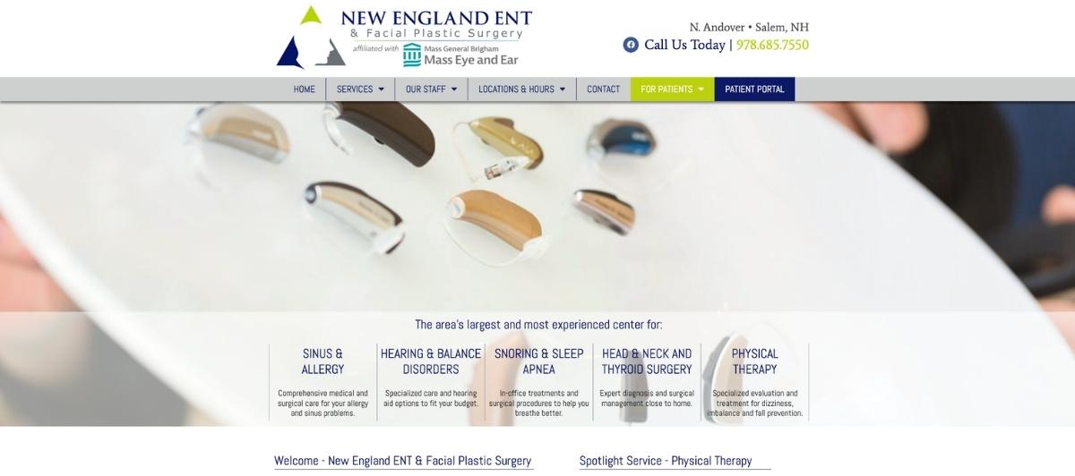
New England ENT & Facial Plastic Surgery makes an exceptional first impression through a main menu that uses contrasting colors to highlight different service categories, including facial plastics, alongside standard ENT specialties. The warm, welcoming homepage tone combined with a rotating patient testimonials slideshow creates both emotional connection and social proof at the most conversion-critical point of the page.
23. St. Louis Sinus Center

St. Louis Sinus Center uses a deep purple, black, and white palette to create a visually distinctive site that feels authoritative without being cold. The hover-activated service description bubbles add an interactive engagement layer that keeps patients on the page longer while making specialty information accessible without overwhelming the homepage layout. For patients managing chronic sinus issues who arrive with specific questions, this approach makes finding relevant information feel effortless.
24. Colorado Voice Clinic
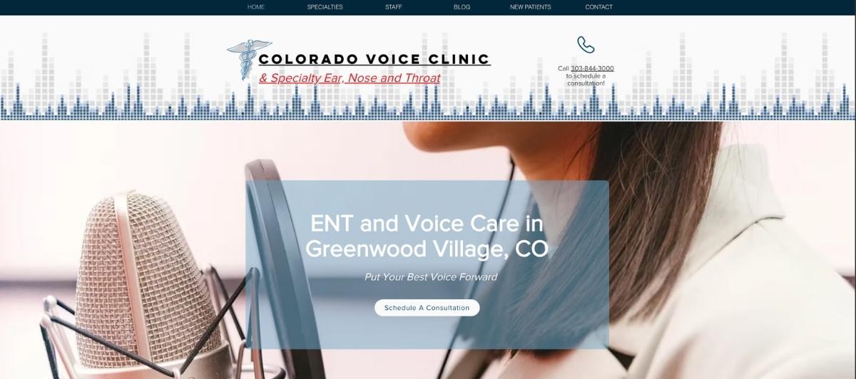
Colorado Voice Clinic combines an avant-garde visual presentation with a consistently updated blog covering ENT topics from robotic surgery advances to practical advice on hydration for throat health. The breadth of blog content serves both patient education and long-term organic search visibility, positioning the practice as the most knowledgeable voice and ENT resource in its region. A rotating banner of patient testimonials gives immediate social proof alongside the distinctive design.
25. Plymouth Ears, Nose & Throat

Plymouth ENT is one of the few ENT practices using email newsletter opt-in as a homepage conversion tool, which offers a meaningful patient acquisition advantage. By capturing email addresses from visitors who aren’t yet ready to schedule, the practice builds a marketing list that can be used for patient education content, seasonal allergy treatment reminders, and hearing health awareness campaigns at no incremental cost.
26. South Denver ENT & Allergy
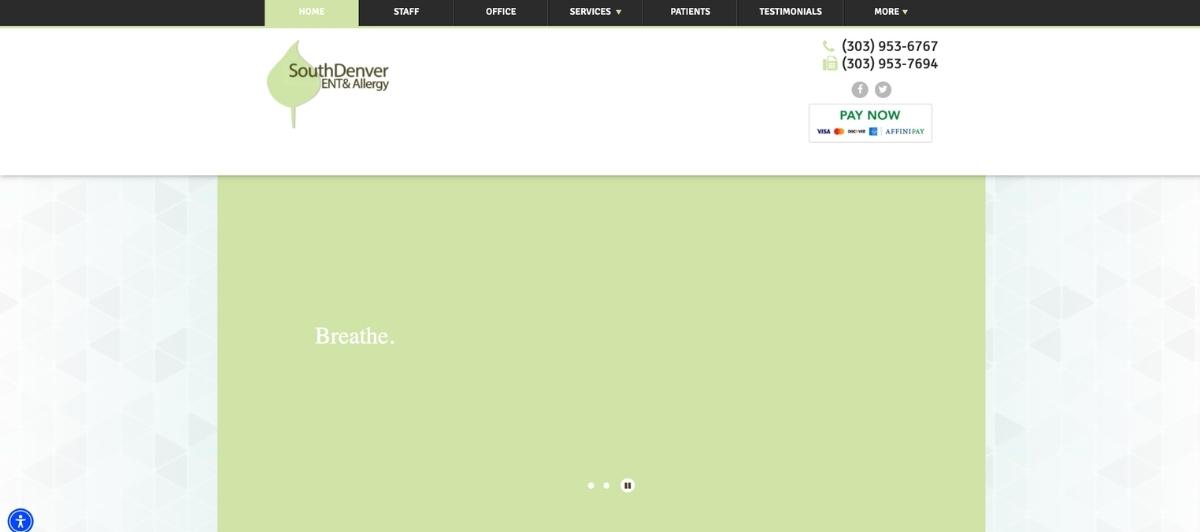
South Denver ENT & Allergy uses the tagline “Rest. Breathe. Live.” paired with beautiful landscape photography to immediately communicate what ENT care actually delivers: an improved quality of life. For patients who have been managing sleep apnea, breathing difficulties, or allergic conditions for months or years, this outcome-focused messaging connects emotionally before any service list appears. Round service icons on the homepage maximize mobile usability as well.
27. AOC Head & Neck Surgeons
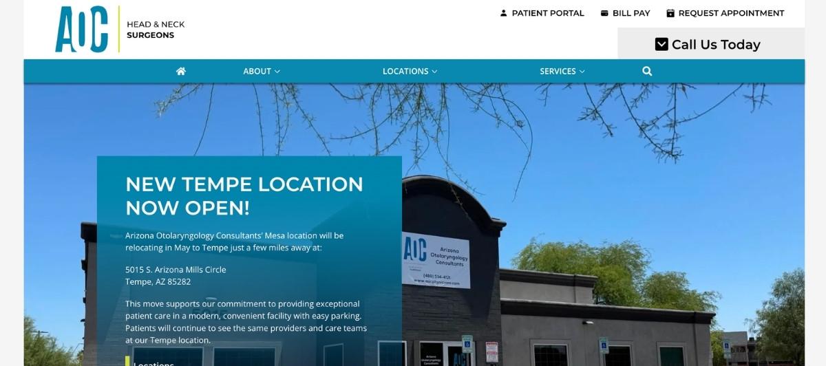
AOC Head & Neck Surgeons makes a distinctive visual choice by using striking black-and-white photography rather than the colorful imagery common across ENT websites. The effect is a more authoritative, clinical authority signal that suits a practice specializing in complex head and neck surgery. For patients facing serious diagnoses in this subspecialty, the confident, institutional quality of the design mirrors the level of expertise they’re seeking.
Design choices worth applying to any ENT practice website
Looking across all 27 of the best ear, nose, throat (ENT) websites above, consistent design and content decisions separate the practices that convert anxious patients into scheduled appointments.
Lead with the physician team, not the practice brand
Patients choosing an ENT specialist are choosing a person they’ll trust with sensitive, sometimes frightening diagnoses. Practices like Dr. Mani H. Zadeh and Biltmore ENT demonstrate that leading with real physician photography, credentials, and video introductions builds more patient confidence than any institutional branding element. For practices with a multidisciplinary team, group photos that communicate a dedicated, cohesive team of providers serve the same purpose at scale.
Organize content around conditions and subspecialties
Patients arrive searching for their specific condition: hearing loss, sinus issues, ear infections, sleep apnea, allergic conditions, voice disorders, or head and neck concerns. Each of these conditions deserves its own dedicated page with a plain-language explanation of the condition, available treatment options, what to expect from a first visit, and a clear CTA to schedule. Our SEO services help ENT practices build condition-specific content that serves both patient needs and local search visibility.
Use interactive and educational tools to reduce anxiety
Chicago ENT’s symptom questionnaire and ENT of Georgia South’s anatomical diagrams both demonstrate that interactive educational tools serve ENT patients in a uniquely meaningful way. Patients who can explore their symptoms or understand their anatomy before a consultation arrive with less anxiety, better questions, and more confidence that they’ve found the right practice for their ENT care.
Publish educational content that builds long-term visibility
Colorado Voice Clinic’s active blog is one of the strongest examples of a content strategy that serves both patient education and sustained search engine visibility. Regular posts covering the latest advances in ENT care, seasonal allergy treatment guidance, hearing health awareness, and what to expect from common ENT procedures all attract organic traffic from patients researching before they’re ready to schedule. Our WordPress web design team builds this content infrastructure into healthcare sites from the start.
What every ENT practice website needs
Whether your practice is a solo otolaryngologist or a large multidisciplinary team serving patients across multiple locations, these elements belong on every ENT practice website.
- A physician bio section that communicates both credentials and personality. Board certification, fellowship training, subspecialties including audiology, facial plastics, or head and neck surgery, and a personal note about the physician’s approach to patient care all serve the patient decision-making process. A video introduction from the physician takes this further and is one of the highest-trust conversion tools available in healthcare web design.
- Dedicated pages for each ENT subspecialty. Ear care and audiology, nose and sinus conditions, throat and voice disorders, allergy treatments, sleep apnea and snoring, hearing aids and hearing loss, and head and neck surgery each attract different patients with different search intent. Individual pages for each subspecialty support both patient experience and organic search visibility.
- Online scheduling and a telehealth option, prominently displayed. Patients expecting comprehensive care expect to be able to schedule without calling during business hours. A visible scheduling button, a patient portal link, and a telehealth booking option all serve different patient preferences and remove friction from the appointment conversion process.
- Patient reviews and testimonials throughout the site. Reviews that speak to the quality of care, the compassion of the team, and the relief patients felt after treatment are the most persuasive content on any ENT website. These should appear near appointment CTAs, on physician bio pages, and on condition-specific pages rather than only on a standalone testimonials page.
- ADA-compliant, mobile-first design. ENT patients include older adults managing hearing loss, adults with chronic conditions, and parents seeking ENT care for children. ADA-compliant design serves every member of this diverse patient population, and mobile-first performance ensures patients can access information and schedule care from any device. Our WordPress ADA compliance service integrates these standards into every healthcare website we build.
Your ENT practice delivers expert care — Let Freshy build the ENT website your practice deserves
The best ear nose throat ENT websites share one quality: they make patients feel, before a single appointment is scheduled, that they have found a practice with the expertise, the compassion, and the commitment to help them overcome whatever has been disrupting their health and quality of life. Every design choice serves that moment of trust.
Key takeaways:
- Physician photography, video introductions, and credential displays build more patient trust than any institutional branding element
- Condition-specific pages for hearing loss, sinus issues, allergy treatments, sleep apnea, and head and neck surgery serve both patient needs and local search performance
- Interactive educational tools like symptom questionnaires and anatomical diagrams reduce patient anxiety and improve appointment readiness
- Online scheduling, telehealth booking, and a patient portal must all be immediately accessible from every page
- Patient reviews near CTAs convert undecided patients faster than a standalone testimonials page
- ADA-compliant, mobile-first design ensures every patient in your community can access your site and your care
If your ENT practice website isn’t converting the patient visits your team’s expertise deserves, start a conversation with our team and let’s build something that does. You can also review our healthcare portfolio to see the standard we bring to medical practice websites.
FAQs
What makes the best ear, nose, and throat (ENT) websites effective?
The most effective ENT websites combine real physician photography with clinical credentials, condition-specific pages for each subspecialty, prominent scheduling options, patient reviews near CTAs, and educational content that helps patients understand their symptoms and treatment options. Design choices that reduce patient anxiety, including calm color palettes, clear navigation, and interactive tools, significantly improve appointment conversion rates.
What content should an ENT practice website include?
At minimum: physician bios with credentials and photos, dedicated pages for each ENT subspecialty, including ear care, nose and sinus conditions, throat and voice disorders, allergy treatments, audiology and hearing aids, and sleep apnea. Online scheduling, a patient portal, telehealth options, insurance information, and an educational blog covering the latest advances in ENT care all serve both patient acquisition and patient retention.
Should ENT websites include educational content about conditions?
Yes. Blog posts, condition guides, and video content covering sinus issues, hearing loss management, allergy treatments, sleep apnea, and what to expect from common ENT procedures attract organic search traffic, reduce patient anxiety before consultations, and position the practice as the most knowledgeable ENT resource in its area. Colorado Voice Clinic and Eliot’s Complete Auto Repair are both strong examples of this content strategy executed well.
How important is physician video for an ENT website?
Highly important. A video interview or introduction from the physician creates a personal connection that significantly reduces the anxiety patients feel about scheduling with a new specialist. Dr. Mani H. Zadeh’s video biography is one of the strongest examples on this list of how a physician video increases both engagement time and appointment conversion rates.
How much does an ENT practice website cost?
A professionally built ENT practice website typically costs $3,500 to $12,000, depending on the number of physician profiles, subspecialty and condition pages, patient portal integration, telehealth scheduling, educational content volume, and whether ADA compliance and local SEO structure are included from the start.
How should an ENT website communicate medical expertise to new patients?
The best ENT websites surface medical expertise immediately, not buried in an About page. Decades of combined experience, board certifications, subspecialty training in otolaryngology, and a clear mission statement all signal to patients that this practice is equipped to treat everything from mild sinus issues to severe head and neck conditions. Throat specialists and multidisciplinary teams should each have individual profiles that communicate both clinical credentials and their personal approach to ENT health and medicine.
How should ENT websites present hearing aids and audiology services?
Audiology and hearing aids deserve dedicated pages that cover the full rehabilitation journey, from diagnosis through fitting and follow-up care. Patients researching hearing loss want practical information: treatment options across different severity levels, budget guidance, insurance network coverage, and what the process looks like from first appointment to improved quality of life. Featuring news about the latest advances in hearing technology and linking to relevant ENT health resources positions the practice as a trusted ongoing partner in patient care.


+websites:+what+great+otolaryngology+web+design+looks+like)