As a WordPress designer, you might encounter a mock-up that has the website’s main header UNDER the page’s slideshow/hero section. Essentially, you have a few options on how to accomplish this with Divi. However, none are really “ideal.”
- Start with a Blank Page
- While editing the page(s), you can set the Page Attributes Template to “Blank Page”.
- This will remove the Divi main header from the page — and will also remove the footer from the page. For these reasons, it’s not ideal. You probably wanted to keep the footer. And you’re being forced to re-create the main header (via Fullwidth Menu module).
- Force hide the normal main header
- You could target the page(s) body ID (e.g., #page-id-7), and set the #main-header element to display: none with some CSS.
- This will “hide” the Divi main header from the page. However, this isn’t ideal, because you’re still being forced to re-create the main header (via Fullwidth Menu module). And the main header code is still within the page — so now Google will see two headers — and we’re loading excess code for no good reason.
- Use jQuery to move the main header
- This is probably the best method to accomplish the goal.
- This will target the existing Divi main header, and will move it to below a Section with a specific ID. This is more ideal, since you don’t need to re-create/maintain a separate Fullwidth Menu, and it doesn’t duplicate any code.
Video example: https://i.gyazo.com/2f7ad1b150b7890ef5a00f4290375d88.mp4
jQuery
We add jQuery to the “Footer” section of the Header Footer plugin.
- Basically, we are targeting the #main-header (which is the entire wrapper for all of the header elements).
- Then we’re telling it to inject it directly after the Section module that has an ID of above-header.
- So you will need to add this ID to the Section Module Settings that you want to show above your header.
- Also note the additional classes being targeted on the body element.
- This functionality will ONLY happen on the homepage, and only on desktop devices. The reason for the latter, is to ensure the mobile menu is easily accessible — particularly the hamburger menu dropdown.
<script>jQuery("#main-header").insertAfter("body.home.desktop #main-content article .entry-content #above-header");</script>
CSS
We add additional CSS to our child theme stylesheet area, to help things a little.
Note that the CSS selectors are only targeting the homepage and only on desktop devices — just like our jQuery is doing. An additional few things to note about what the CSS is fixing and helping with:
- Even though we moved the header with the jQuery, Divi still think the header should be fixed to the top, so we override that.
- Since the header is no longer fixed to the top, we need to remove the excess top margin and padding that Divi normally adds to the page.
- Menu items/links are technically list items, and now that the main menu is within the page content area, Divi tries to add bullets before each of the menu links. So, we undo that.
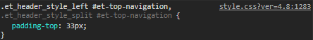
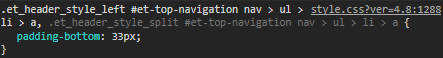
- Even though the header will no longer be “fixed”, Divi still adds the et-fixed-header class to the main header, once the user scrolls. Generally, this causes the height of the main header to shrink. You can avoid the header from shrinking during scroll, by ensuring the top and bottom padding have the same pixel value as the “normal” state of the header. Those padding values are generated by Divi, based on the height you set your header to be — within the Divi Theme Customizer. So you could just use Chrome’s inspector tool, and inspect the header on a page to see what the padding values are, and update them accordingly (mine were 33px). See:
/* we moved the header via jQuery, so we need to get rid of the
excess padding and margin that the theme thinks it still needs,
even though the header isn't fixed anymore */
body.home.desktop #page-container {
	padding-top: 0 !important;
	margin-top: 0 !important;
}
/* we don't want fixed header since it needs to stay below the hero at all times */
body.home.desktop #main-header {
	position: relative !important;
	-webkit-box-shadow: none !important;
	-moz-box-shadow: none !important;
	box-shadow: none !important;
}
/* remove the top padding that containers normally get, when inside the page content */
body.home.desktop #main-content #main-header .container {
	padding-top: 0 !important;
}
body.home.desktop #main-content #main-header .container ul {
	padding: 0;
	list-style-type: none;
}

@media (min-width: 981px) {
	/* even when fixed, let's keep same padding as normal header (which comes from theme settings based on height) */
	body.home.desktop #main-header.et-fixed-header #et-top-navigation {
		padding-top: 33px;
	}
	body.home.desktop #main-header.et-fixed-header #et-top-navigation nav > ul > li > a {
		padding-bottom: 33px;
	}
}
Update (Fixed Header after scroll):
Make header sticky when it gets to the top.
Maybe you still want the desktop header to remain fixed (stuck to the top) once the header hits the top of the viewport? You can add this jQuery code, below. Basically, it detects when the section above has been scrolled through, and then adds the .stucked class to the header element.
    (function($) {
       $(document).ready(function(){
           $(window).bind('scroll', function() {
           var navHeight = $('#above-header').height();
                 if ($(window).scrollTop() > navHeight) {
                     $('body.home.desktop #main-header').addClass('stucked');
                 }
                 else {
                     $('body.home.desktop #main-header').removeClass('stucked');
                 }
            });
        });
    })(jQuery);
@media (min-width: 981px) {
	/* but if it has our new stucked class via jQuery, then do these actually */
	body.home.desktop #main-header.stucked {
		position:fixed !important;
		top:0 !important;
		-webkit-box-shadow: 0 0 7px rgba(0,0,0,.1)!important;
		-moz-box-shadow: 0 0 7px rgba(0,0,0,.1)!important;
		box-shadow: 0 0 7px rgba(0,0,0,.1)!important;
	}
	body.home.desktop #main-header.stucked #et-top-navigation {
		padding-top: 20px !important;
	}
	body.home.desktop #main-header.stucked #et-top-navigation nav > ul > li > a {
		padding-bottom: 20px !important;
	}
	/* add more padding (height of header) to next section to make up for the height of the header that basically came out of the flow */
	body.home.desktop #main-header.stucked + .et_pb_section {
		padding-top: calc(4% + 50px);
	}
}


