
Designing websites for B2B businesses requires a different strategy than most websites. Because you’re dealing with business owners, not just your average consumer, you have to make sure your website specifically conveys what they’re looking for — a reliable partner they can trust.
While similar to other consumers in some ways (for example, they want to be able to trust you and know what you’re offering), business owners tend to be more savvy and less willing to waste their money where they won’t see the return.
In order to earn their business, your website needs to be clean, easy-to-navigate and compelling.
Here are the 10 examples of the best B2B website design for you to look at

asana.com – The project management website Asana is a great example of a well-designed B2B website. Not only is the service provided front and center in their headline, but they also drastically minimize the choices a visitor has to make. Rather than offering a variety of places to click or several paths to follow, Asana directs everyone to one main button: “Learn More.” Because it’s clean and simple, the website instantly puts business owners at ease, making it possible for them to feel comfortable as they explore what Asana has to offer. And, while not all white like many B2B websites, Asana manages to keep the color from feeling distracting by leaving a lot of unused space around the edges.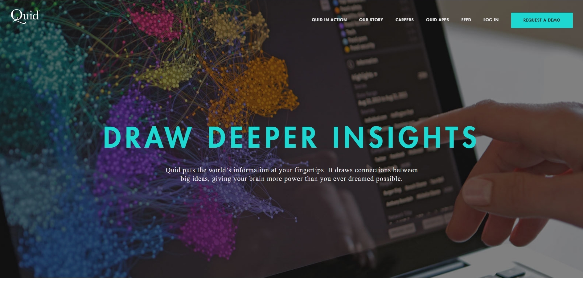 quid.com – A B2B website providing an easy way for business owners to do the research they need to inform their next decision, Quid’s website is smart because it is so simple. While a full-screen pop-up greets new visitors with a clear call-to-action, the main homepage of the site is equally effective, offering concise wording and an easy-to-scroll design. Minimal in nature, the Quid website loads super fast, dramatically reducing bounce rates while increasing their SEO. Neatly organized into sections, the website helps to instantly earn the trust of business owners who visit by including a prominent section called “In the News,” where recent publications about the business are featured for social proof.
www.grammarly.com – The Grammarly website is great because it’s a good example of how a B2B site can fuse fun features with simple design. Clean and minimal, Grammarly’s website adds pops of animation (like an engaging example of how the service works) to add visual intrigue while breaking up the blocks of text. Great headlines (like “Everyone can be a writer.”) demonstrate the benefits of the service, which help business owners (who are notoriously slow when it comes to making purchases) make their decision to buy. Easy-on-the-eye color also helps to put visitors in a calm state of mind, which is exactly where you want them when you’re asking for their business. dstillery.com – The brand management company dstillery takes advantage of the above-the-fold section of its website by creating an interactive image that tells visitors exactly what they do. Scrolling through questions like, “Who are my customers?” and “Where are my customers?” frames the experience a visitor is going to have, letting them know immediately if they are in the right spot. Intriguing and engaging, this simple feature also puts dstillery in the driver’s seat by telling business owners that they are the ones who can solve these questions. While simple, the homepage delivers huge impact by making it easy for business owners to see who some of their prominent clients are (like Comcast, Starbucks and Microsoft), giving Dstillery credibility straight out of the gate.
 www.publishthis.com – Focusing on digital content, PublishThis has designed a homepage that feels more like a journey than a destination. Because the calls-to-action are so clear, visitors to their website understand exactly where to go next, which means PublishThis can predict the order in which pages are going to be viewed. This type of design foresight allows a B2B business to address concerns and present their services in a way that feels cohesive and intuitive, making business owners feel like they’re reading their minds.
  www.yapstone.com – As a payment solution business, Yapstone relies heavily on word-of-mouth marketing from one business owner to the next. Its website design is memorable, but without feeling too avant garde. By integrating unique fonts and illustrations into an otherwise basic layout, Yapstone manages to create an online experience that is both comfortable and exciting. At each section, the website offers a clear call-to-action button, which allows visitors to feel empowered to make a decision about what they need or what they’re wanting to learn about. This type of empowerment helps to build trust between business owners because it eliminates the feeling of being “sold” or “pushed” into making a decision.
  www.verblio.com – If there’s one thing we can be sure of about people online, it’s that they love to scroll. Verblio, a content creation company for businesses, gets that. Their website, which uses a content-heavy (no surprise there!) design with bright pops of color, takes advantage of our desire to scroll by creating a long-form homepage that answers questions while also providing great customer testimonials. Neatly organized and fast to load, Verblio’s B2B website design also does a good job of addressing the fact that different businesses will have different needs, which is one of the things that sets B2B businesses apart from B2C. By addressing these differences immediately on the homepage, they can be sure they’re not accidentally losing customers who assume their services aren’t for them. Another bonus? Verblio’s site features a guided chat box, which is shown to increase the length of visits and conversions.
  www.canva.com – One of the shortest homepage examples out there, Canva assumes that visitors know why they’re there (either because of a personal recommendation or a business feature). A popular design service for businesses of all sizes, Canva doesn’t want to distract visitors from the one thing they came to do: Sign up. Knowing that most of their visitors are ready to get started, the homepage uses minimal copy and simple design to keep the focus on getting people inside and designing.
  pulse220.com – Video content is huge in today’s online world and the Pulse 220 website is a great example of how to integrate this type of media into your website without it feeling overwhelming to your visitors. Knowing their market (the company does “experiential marketing” via live events), Pulse 220 has created a website that is exciting and, as you would expect, feels like an experience. Rather than making the video clips the priority, however, the website design integrates them smoothly into the overall message, still allowing the copy, headlines, testimonials and calls-to-action speak. Almost completely monotone, the website uses its one burst of color at the bottom of the homepage to emphasize the one thing they really want you to do: Connect with them so that they can start a conversation.
  www.batterii.com – Offering business owners an opportunity to collaborate with their consumers, Batterii uses all of its above-the-fold space to direct your attention to their application form. As you scroll, the minimal design helps to explain what their service is and why businesses can benefit. Simple features, like a scrolling bar of example communities and animated icons, keep visitors visually engaged.
If you’re looking for great website design for your own B2B business, then you’re in luck! We offer B2B website design services no matter what size business you are, or who you serve.


