
Responsive design is important so that your Divi website looks good and makes sense from a user experience, on both mobile phones and desktop computers. For this reason, it’s often necessary to adjust the stacking order of columns, once they are at the mobile/tablet width. By default, a right-side column would stack below the left-side column. This may not be ideal in some of your Divi Builder designs on mobile. So let’s see how to change the order of columns.
Add the CSS to Divi
This is the code that we’ll be able to use to utilize the CSS flexbox to change the order of which each column will be placed once the theme starts stacking the column elements. In short, paste the following code into your Divi child theme’s style.css stylesheet, or within Divi > Theme Cusotmizer > Additional CSS area:
@media all and (max-width: 980px) {

	/*** wrap row in a flex box ***/
	.custom_row {
		display: -webkit-box;
		display: -moz-box;
		display: -ms-flexbox;
		display: -webkit-flex;
		display: flex;
		-webkit-flex-wrap: wrap;
		/* Safari 6.1+ */
		flex-wrap: wrap;
	}

	/*** custom classes that will designate the order of columns in the flex box row ***/
	.first-on-mobile {
		-webkit-order: 1;
		order: 1;
	}

	.second-on-mobile {
		-webkit-order: 2;
		order: 2;
	}

	.third-on-mobile {
		-webkit-order: 3;
		order: 3;
	}

	.fourth-on-mobile {
		-webkit-order: 4;
		order: 4;
	}

	/*** add margin to last column ***/
	.custom_row:last-child .et_pb_column:last-child {
		margin-bottom: 30px;
	}

}
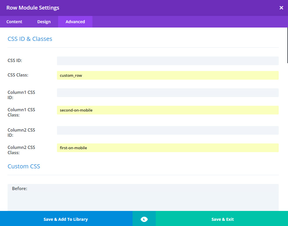
Add the classes to your row and column(s)
Put the class custom_row as the row class and then first-on-mobile, second-on-mobile, etc as the appropriate column class:
Dig in deeper to the understand what’s happening
Elegant Themes, the company behind the Divi theme, has written a detailed article using this same technique: https://www.elegantthemes.com/blog/divi-resources/how-to-change-divis-column-stacking-order-on-mobile-devices


