

A patient researching orthodontic treatment for themselves or their child forms an opinion about your practice within seconds of landing on your website. 72% of internet users search online for healthcare information before booking, and orthodontics is a high-consideration specialty where that first interaction can make or break the consultation booking.
In a competitive market where multiple practices serve the same zip code, the orthodontist website that communicates trust, shows proven results, and makes scheduling effortless wins the new patient inquiry every time.
This article reviews the 10 best orthodontist websites and the specific design choices behind each one.
Here’s what we cover:
- What makes an orthodontic website convert potential patients into booked consultations
- 10 of the best orthodontist websites, reviewed and linked
- The design, color, and content decisions worth applying to any orthodontic practice
- What every great orthodontist website needs to attract more patients in 2026
- How to build a custom website design that reflects your brand and differentiates your practice
We’ve built healthcare and professional service websites that turn first-time visitors into appointments for over 2,400 clients since 2011. Our healthcare web design work and dental practice web design reflect the same principles covered in this article.
What makes the best orthodontist websites convert potential patients
Orthodontic treatment is one of the most significant elective healthcare investments a family makes. Patients researching braces, clear aligners, or Invisalign for themselves or their children arrive at a practice website with specific questions: How experienced is this orthodontist? What treatment options are available? What do results actually look like? How much will it cost, and what financing is available? How do I book a consultation?
Your website is often the first impression potential patients have of your practice, and a well-designed site can make all the difference. The right website helps your practice stand out, attracts the right patients, provides clear information, and makes it easy for them to take the next step.
Here’s what the best orthodontist websites consistently get right:
- They lead with patient outcomes, not clinical credentials. A smile gallery showing real before-and-after photos of completed orthodontic treatment is the single most persuasive content element on any orthodontist website. Potential patients want to see a beautiful smile that could be theirs, not a list of certifications.
- They make scheduling immediate and frictionless. Clear calls to action for a free consultation or new patient evaluation should appear above the fold and throughout every page. Every page of your website should serve a purpose, especially when it comes to guiding visitors toward booking a consultation.
- They build trust through social proof. Patient testimonials, a smile gallery, and detailed service explanations build trust and encourage new patient consultations. Google reviews, before-and-after cases, and video testimonials all serve the undecided patient who is comparing multiple practices before choosing.
- They communicate treatment options clearly. Adults considering clear aligners and parents researching braces for their children have different needs and different questions. The best orthodontic websites present braces, clear aligners, Invisalign, and other treatment options with enough informative content that patients feel equipped to understand their choices before their first visit.
- They are mobile-first and fast-loading. With the majority of traffic now coming from mobile devices, mobile optimization is no longer optional. An effective orthodontist website must deliver a seamless mobile experience with thumb-friendly navigation, click-to-call buttons, and fast-loading pages.
| Weak orthodontist website | High-converting orthodontist website |
|---|---|
| Generic dental stock photography | Real patient smile gallery with before-and-after results |
| No free consultation CTA above the fold | Prominent free consultation offer immediately visible |
| One general services page | Dedicated pages for braces, clear aligners, and Invisalign |
| No doctor introduction or video | Personal orthodontist bio, photo, and video introduction |
| No financing or cost information | Insurance, financing, and payment options clearly described |
The 10 best orthodontist websites of 2026
In today’s fast-paced and digital world, where people utilize their mobile phones more than their computers, having a user-friendly and modern website that is visually stimulating is a prerequisite for gaining and maintaining customers while communicating and conveying important information.
For all medical fields working with patients, including orthodontists, keeping a modern and updated website is paramount for a strong business. A Pew Internet survey revealed that 72% of Internet users looked online for health-care information.
The best orthodontist websites of today provide patients and site visitors with a crisp visual presentation, provide a layout that is effective for fast site navigation, and are mobile and user-friendly by enabling visitors to identify pertinent information quickly.
1. Massih Orthodontics
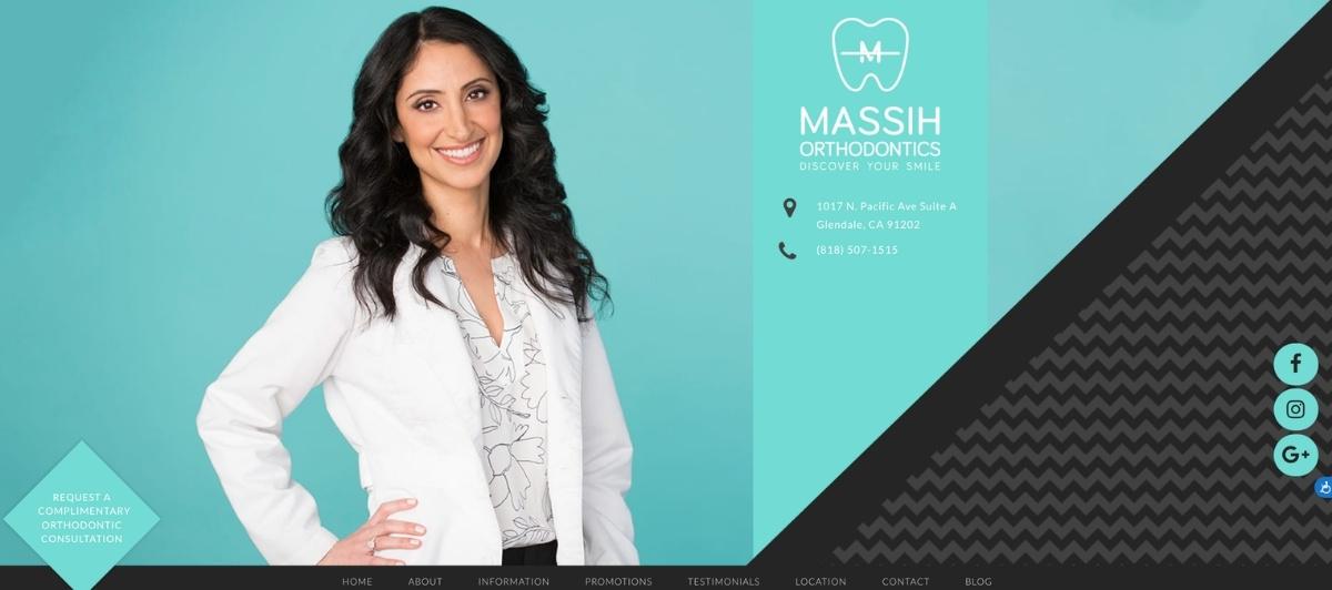
Massih Orthodontics earns the top position on this list through a combination of design intelligence and conversion clarity that few orthodontic websites match. A fresh layout with welcoming textile backdrops creates a site that is impressive on every level, with the teal and black color scheme immediately communicating a practice that is both professional and approachable.
The clean homepage uses clear navigation icons that allow potential patients to find exactly what they need without scrolling through content that doesn’t apply to them. The branding and logo are clever and distinctive, making site visitors feel they are choosing a professional who genuinely cares about their patient experience from the very first interaction. This is the kind of custom website design that converts browsers into consultations.
2. Happy Braces
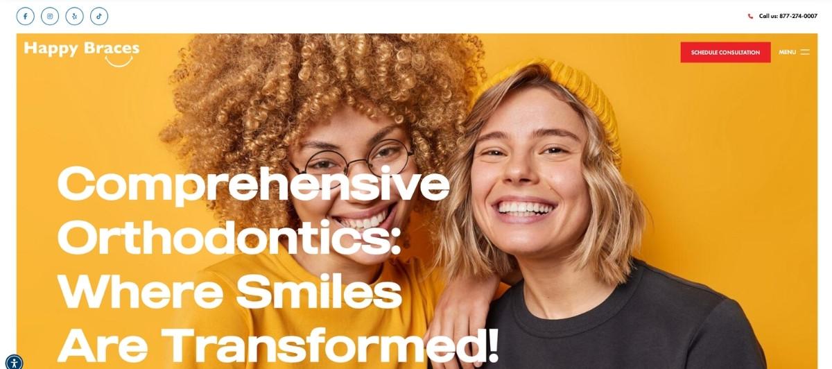
Happy Braces demonstrates how expansive overhead photography layouts paired with strategically placed sidebars can create an orthodontic website that serves both mobile and desktop users with equal effectiveness. The bright, inviting color scheme communicates the kind of positive, family-friendly energy that parents researching orthodontic treatment for their children respond to immediately.
This website has perfected the balance between visual appeal and strategic content layout, with a user-friendly menu that makes navigating between treatment options, patient resources, and scheduling exceptionally efficient.
3. Braces For Us

Braces For Us shows how restraint in homepage content density can actually improve user engagement. By resisting the temptation to fill every pixel with information, the site creates space for visitors to browse comfortably and find answers to their specific questions about orthodontic care at their own pace.
Colorful photos complement the site’s color scheme, creating an aesthetically pleasing experience that reflects the positive outcome patients are seeking, which is a beautiful smile achieved through a process they can trust and understand before they ever schedule a free evaluation.
4. Dr. Robert J. Herman
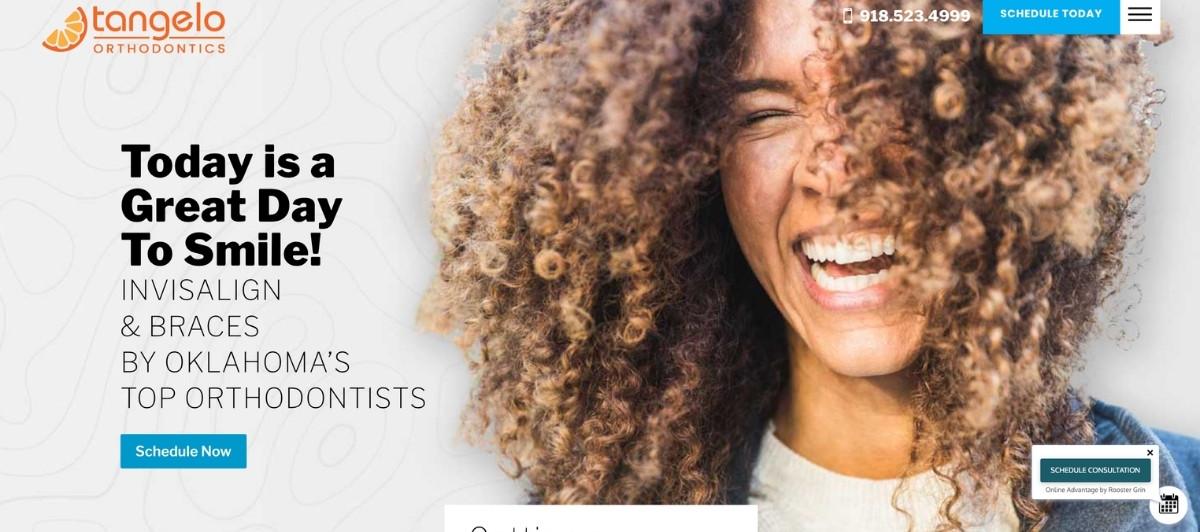
Dr. Robert J. Herman’s website demonstrates that a polished, professional orthodontic web design doesn’t require bright colors or complex interactive elements to build trust. A wide array of information, including an office tour and an opportunity to get to know the orthodontist, is presented against muted, warm colors that pair elegantly with bright photography.
Video content, social media links, and newsletter integration give this site multiple touchpoints for ongoing patient engagement beyond the initial visit, while the straightforward navigation ensures every potential patient can find and access what they need from their first interaction.
5. Wade Williams Orthodontics
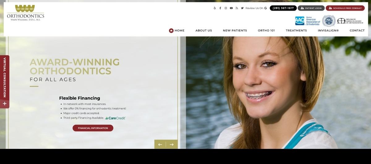
Wade Williams Orthodontics uses a large overhead landing page photograph layered with clickable links to create a homepage that inspires confidence immediately. One-click access to appointment booking and social media, alongside a YouTube video featuring the practice, demonstrates how video content supports both patient engagement and the kind of trust-building that drives consultation bookings in a competitive market. The site contains sufficient content to keep potential patients engaged while maintaining the mobile-friendly performance that most orthodontic website visitors now require.
6. Newpark Orthodontics

Newpark Orthodontics highlights how consistent branding across all aspects of an orthodontic practice makes a powerful cumulative impression on potential patients. Crisp photography, an office tour showcasing the practice environment, and bright colors paired with white space create a site that stimulates ongoing browsing rather than encouraging a quick exit.
The cohesive connection between the website design and the practice’s social media presence, including a linked Facebook page with matching visual identity, communicates the kind of professional consistency that builds trust in a competitive local market.
7. Guthrie Carr Orthodontic Specialist
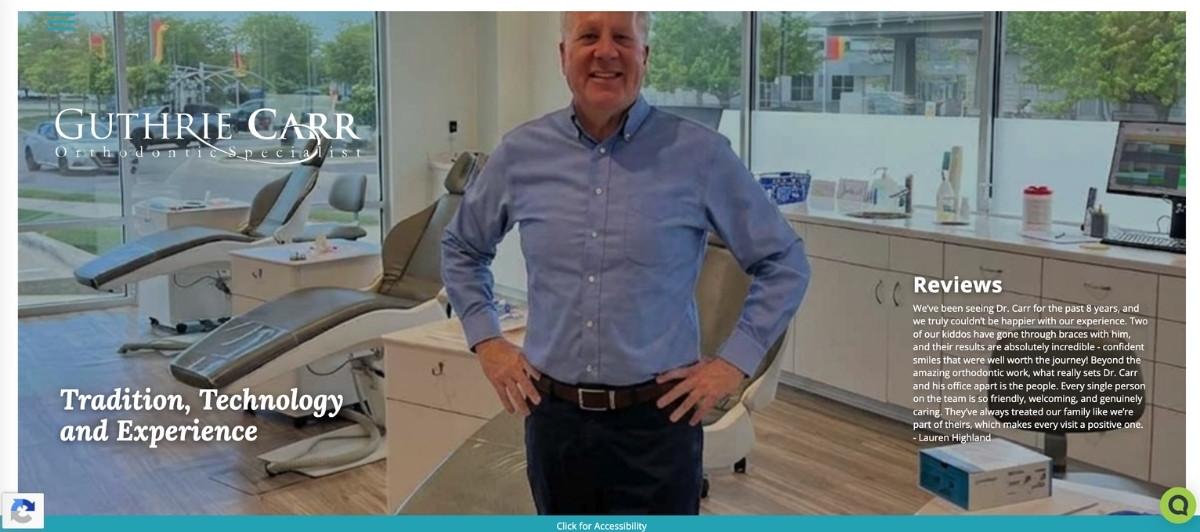
Guthrie Carr Orthodontic Specialist uses a simple but visually distinctive approach: varying shades of blue combined with geometric design elements that give the homepage a three-dimensional quality without visual overload.
The clear, concise homepage with minimal content encourages potential patients to explore the site further rather than feeling overwhelmed by information they haven’t asked for. This restrained approach is particularly effective for reaching adults researching orthodontic treatment for themselves, who often prefer a professional, calm aesthetic over the bright, energetic designs that work well for family-focused practices.
8. Gire Orthodontics
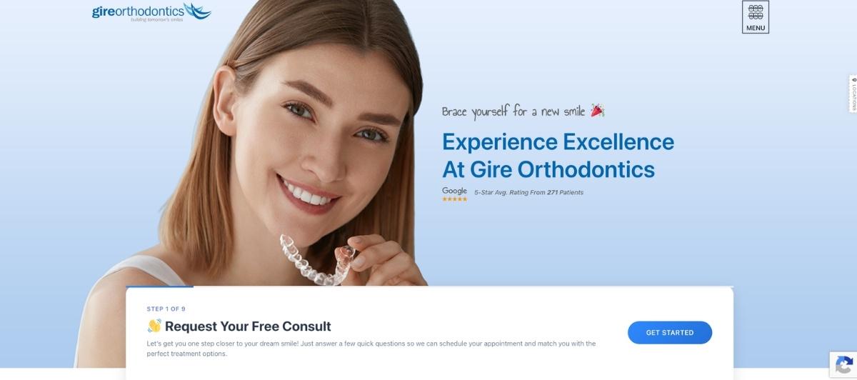
Gire Orthodontics demonstrates that bold color choices in orthodontic web design, when executed thoughtfully, can make a site feel distinctive and memorable rather than unprofessional. The bright colors feel bold and fresh in a way that ties directly into the California-influenced identity of the practice, communicating that this is an orthodontic practice with personality and style alongside the clinical expertise patients are looking for. For practices competing in markets where aesthetic positioning is a genuine differentiator, Gire shows how color can be a strategic brand asset rather than a cosmetic afterthought.
9. Westlake Family Orthodontics
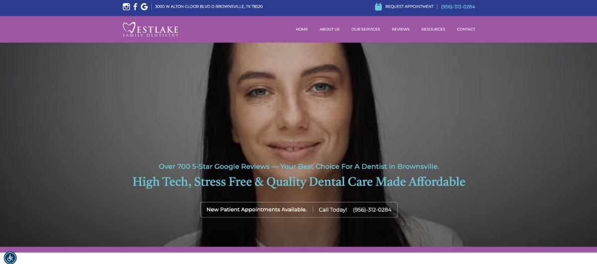
Westlake Family Orthodontics prioritizes mobile-first usability in a way that reflects how most orthodontic patients now research treatment options. Reviews and social media links for Facebook, Instagram, and Yelp appear at the top of the mobile site, giving patients immediate access to the social proof they need to feel confident before scheduling a consultation.
The modern, fresh photos and layout give the site a contemporary quality that communicates the kind of forward-thinking orthodontic care that adults seeking clear aligners and families considering braces both want from the practices they evaluate.
10. Maryland Orthodontics
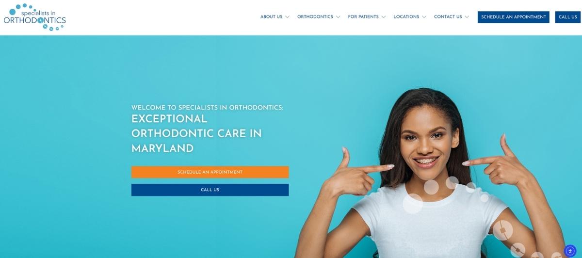
Maryland Orthodontics closes this list as a reminder that simplicity executed with discipline produces effective orthodontic websites. A white backdrop with color splashes from engaging photos of young patients with braces participating in various activities gives the site a fun, accessible energy without visual clutter.
The site is easy to navigate on both desktop and mobile, delivers informative content without a lengthy homepage, and provides a user-friendly experience where every potential patient can quickly find what they’re looking for without becoming lost in excessive content.
Design principles worth applying to any orthodontic website
Looking across all 10 of the best orthodontist websites above, consistent design and content decisions separate practices that attract more patients through their website from those that simply have an online presence.
Lead with the smile gallery
A before-and-after smile gallery is the most persuasive content on any orthodontic website. Real patient results showing the transformation from an overbite, crowded teeth, or spacing issues to a beautiful smile communicate what words and credentials cannot.
Thanks to patient testimonials, a smile gallery, and detailed service explanations, it builds trust and encourages new patient consultations, reflecting their dedication to creating beautiful smiles. Every orthodontic website should feature a prominent gallery organized by treatment type and accessible with one click from the homepage.
Make the free consultation offer impossible to miss
The single most effective conversion tool on any orthodontist’s website is a prominently displayed free consultation or free evaluation offer. This should appear above the fold on the homepage, in the header on every page, and alongside every treatment description.
Clear calls to action remove the hesitation that prevents interested potential patients from taking the next step, especially for adults evaluating treatment options for themselves who may feel uncertain about whether they qualify or what the process involves.
Dedicate individual pages to each treatment option
Braces, Invisalign, clear aligners, retainers, and early orthodontic treatment for children each attract different patients with different search intent and different questions. Individual service pages with clear descriptions of each treatment option, what to expect from the process, approximate treatment timelines, and what a customized treatment plan involves give patients the informative content they need to feel ready to schedule. These pages also support local search visibility for treatment-specific queries. Our SEO services help orthodontic practices build exactly this kind of optimized, treatment-specific content structure.
Introduce the orthodontist as a person
A consistent brand identity cements trust and reinforces your authority as a local orthodontic provider. Part of that brand identity is the orthodontist themselves.
A genuine photo, board certifications including American Association of Orthodontists membership, a brief personal story, and a video introduction from the doctor all build the kind of connection that helps patients feel they already know their orthodontist before the first appointment. For practices with multiple orthodontists, individual profiles for each doctor give patients the ability to find a provider they connect with.
Publish transparent cost and financing information
Treatment cost is one of the most common reasons potential patients delay or avoid booking a consultation. Orthodontic practices that address cost and financing options transparently on their website convert significantly more consultations than those that require patients to call or visit before getting any financial information.
Clear descriptions of insurance partnerships, flexible payment plans, and financing options alongside treatment descriptions remove the hesitation that cost uncertainty creates. Our WordPress web design team builds this financial transparency into healthcare practice sites as a standard conversion optimization element.
What every orthodontist website needs to attract more patients
Whether your practice focuses on children’s orthodontic care, adult clear aligners, or serves the whole family across multiple treatment options, these elements belong on every orthodontic website in 2026.
- A smile gallery with real patient before-and-after results. This is the highest-converting content element on any orthodontic website. Organized by treatment type and accessible from the homepage, a real smile gallery builds the trust and aspiration that motivates consultation bookings.
- A free consultation or free evaluation CTA, prominently displayed. This offer should be visible above the fold and at multiple points throughout the site. The free consultation removes the commitment barrier that prevents potential patients from booking, and it gives the practice a structured first interaction with every prospective patient.
- Dedicated treatment pages for braces, clear aligners, and Invisalign. Each treatment option deserves its own page with a clear description, typical treatment timeline, cost, and financing overview, and a gallery of results achieved with that specific treatment. These pages serve both the patient’s research needs and the practice’s local search visibility.
- A patient portal and online scheduling tool. Existing patients managing their orthodontic treatment need easy access to appointment scheduling, communication with the practice, and treatment progress information. New patients should be able to request a consultation directly from the website at any hour without needing to call during office hours.
- An ADA-compliant, mobile-first design. Orthodontic patients include children, teens, adults, and older adults across a wide range of ability levels. ADA-compliant design ensures every potential patient can access the information and scheduling tools they need. Our WordPress ADA compliance service helps medical and dental practices meet these standards without compromising the visual quality their brand requires.
- Fast load speeds across all devices. Most orthodontic research happens on mobile phones. A site that loads slowly or doesn’t display correctly on mobile loses potential patients before they see the smile gallery or find the consultation request button. Our WordPress speed optimization service ensures orthodontic websites perform well across every device and connection speed.
Build the orthodontist website your practice deserves — Freshy makes it happen
The best orthodontist websites do one thing above all: they make a potential patient feel, before a single consultation is scheduled, that they have found the right practice to trust with their smile. Every design choice, from the smile gallery to the treatment pages to the free consultation CTA, should serve that outcome.
Key takeaways:
- A smile gallery with real before-and-after results is the highest-converting content element on any orthodontic website
- Free consultation offers placed above the fold convert significantly more potential patients than sites without them
- Dedicated treatment pages for braces, clear aligners, and Invisalign serve both patient research needs and local search visibility
- Transparent cost and financing information removes the hesitation that prevents motivated patients from booking
- Mobile-first design and fast load speeds are non-negotiable when most orthodontic research happens on phones
- ADA compliance ensures every potential patient in your community can access your site and your care
If your current orthodontic website isn’t attracting the new patients your practice deserves, tell us about your practice and let’s build a custom website design that does. Browse our healthcare portfolio and dental practice web design work to see the standard we set for medical practice websites.
FAQs
What makes a great orthodontist website in 2026?
The best orthodontist websites combine a prominent smile gallery with real patient before-and-after results, clear calls to action for free consultations, dedicated pages for each treatment option, including braces and clear aligners, transparent cost and financing information, a personal orthodontist introduction, and a mobile-first design optimized for fast load speeds across all devices.
How should orthodontic websites showcase treatment options?
Each treatment option, including braces, Invisalign, clear aligners, retainers, and early treatment for children, should have its own dedicated page with plain-language descriptions, treatment timeline expectations, and before-and-after results specific to that treatment. This structure serves both the patient’s research needs and the practice’s local search visibility for treatment-specific queries.
How important is a smile gallery on an orthodontist’s website?
A smile gallery is the most persuasive content on any orthodontist’s website. Real before-and-after photos of completed orthodontic treatment answer the fundamental question every potential patient carries: can you give me a beautiful smile? A well-organized smile gallery accessible from the homepage converts potential patients into consultation requests more effectively than any written description of treatment options or clinical credentials.
Should orthodontist websites include pricing information?
Yes. Transparency about treatment cost, insurance partnerships, and financing options removes one of the most common reasons potential patients delay booking a free consultation. Practices that address cost openly on their website attract more patients than those that require a call or visit before providing any financial information.
How much does an orthodontist’s website cost?
A professionally built orthodontist website typically costs $3,500 to $12,000, depending on the number of treatment pages, smile gallery organization, patient portal integration, online consultation booking, and whether ADA compliance, local SEO, and mobile optimization are included from the start of the web design project.
How does a great orthodontic website support the full treatment journey?
The best orthodontist websites don’t just win the consultation. They support patients through every stage of orthodontic treatment, from the first evaluation through to the final retainer fitting. A well-structured orthodontic website gives existing patients easy access to appointment scheduling, care instructions, and progress resources, while giving dental specialists and referring dentists a clear picture of the practice’s expertise and treatment philosophy.
For any orthodontic company considering a new website or redesign, investing in a beautiful site that serves both acquisition and retention creates compounding returns over time, attracting more patients at the top of the funnel while strengthening the relationships that drive referrals from dentists and satisfied families alike.

)