WR Nash intranet redesign and HB global portal expansion


Houston Food Bank needed a website that better served the many audiences who rely on it – from neighbors seeking food assistance to volunteers, donors, and community partners. We reimagined the site’s structure, redesigned more than 100 pages, and created a vibrant, mobile-friendly experience that makes it easier for users to find information and take action.
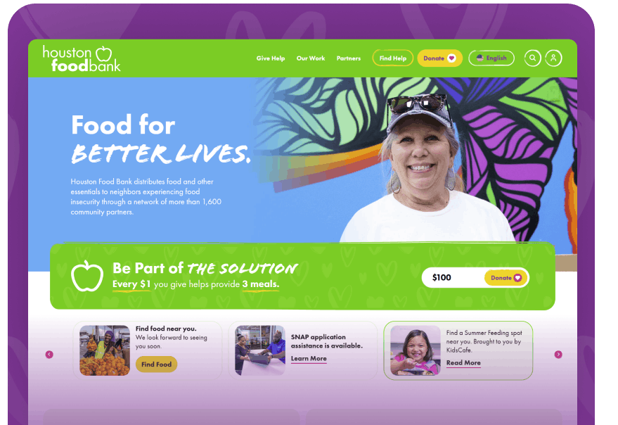


Houston Food Bank’s previous website had grown substantially over time, making it increasingly difficult for visitors to navigate. Rather than simply giving the site a visual refresh, we worked closely with the client to rethink how information should be organized to create a more intuitive experience for each of its primary audiences.
A significant part of the project focused on planning the site’s information architecture. Together, we carefully mapped content into four primary audience groups – neighbors seeking assistance, volunteers looking to get involved, partners collaborating with the organization, and visitors wanting to learn more about Houston Food Bank. This audience-first approach created a more intuitive experience and helped visitors reach the information most relevant to them.
Once the new structure was established, we redesigned and developed over 100 pages throughout the site. The new visual direction embraced bright colors, playful graphics, and modern layouts that better capture the organization’s energy while remaining accessible and easy to navigate. Because of the project’s scale, each page required thoughtful implementation and careful attention to consistency, ensuring the final website felt cohesive while preserving the value of the existing content.
The result is a scalable, user-focused website that better supports Houston Food Bank’s mission, improves usability across devices, and provides a stronger digital experience for every audience it serves.


Meet a few of the minds behind the leading WordPress website design company in the U.S.

