Data without a visual representation is just numbers. Data visualization turns those numbers into graphics like charts and tables that let readers spot trends, compare values, and understand complex information at a glance. On a WordPress website, displaying that data well requires either the right plugin or a custom development approach that fits your specific requirements.
This article covers both. We walk through how the Freshy team built a custom WordPress charts solution using Advanced Custom Fields and Chart.js for a client project, and we review the most popular WordPress chart plugins available in 2026 so you can make an informed decision about which approach fits your project.
Here’s what we cover:
- Why standard WordPress chart plugins didn’t fit our client’s requirements
- How we used Advanced Custom Fields and Chart.js to create dynamic charts
- The complete code walkthrough for each file involved
- The best WordPress chart plugins available in 2026, compared
- Which approach is right for your project
The Freshy team has been solving complex WordPress development challenges for over 2,400 clients since 2011. If you’re facing a data visualization requirement that standard plugins can’t handle, get in touch with our team, and we’ll build the right solution for your specific needs. You can also browse our portfolio to see the kind of custom development work we deliver.
Why we needed a custom WordPress charts solution
WordPress supports embedding external data visualization tools using iframe or embed blocks, and creating visual representations of data helps site visitors spot trends and patterns quickly. For most projects, a plugin handles this well. For this particular client project, the requirements were specific enough that standard solutions fell short.
The requirements were:
- Standardize chart display across a custom post type
- Standardize chart location on every page
- Allow the client to update multiple data points on each page rapidly without leaving the editing area
Plugins we evaluated
We always start new projects by reviewing what already exists. Reinventing the wheel wastes time when a solid existing solution fits the need. Here’s what we reviewed:
Responsive Charts (available on CodeCanyon for $16) make beautiful charts and provide many options, including bar graphs, pie charts, doughnut charts, and line charts. However, charts are managed in a separate area of the WordPress admin, not inside each page’s editing area. For our use case, we needed three or four different charts associated with each page and managed directly inside that page’s editing area.
Using Responsive Charts would have required including shortcodes from each chart into an associated Advanced Custom Field for each data type, creating a complicated switching process between the chart editing area and the page editing area. If you have a handful of charts site-wide or need to reuse the same charts across multiple pages, Responsive Charts is a solid option.
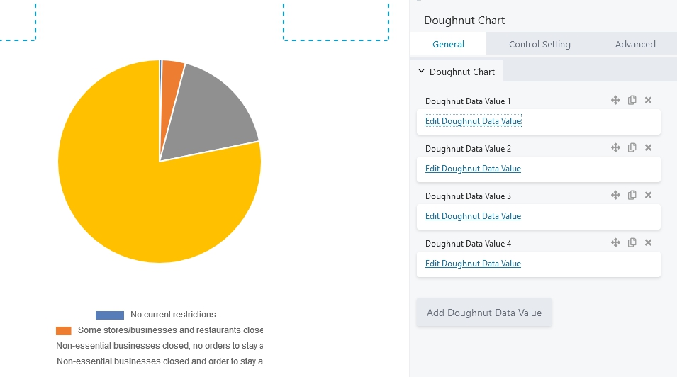
Beaver Charts (free version on the WordPress repository, paid version at $9 annual or $29 lifetime on FlickDevs) works within the Beaver Builder page editor. It requires separate entries to edit for each individual data point, with each number requiring its own click to open an input field. With a small amount of data, this is manageable. With the volume of data our client needed to enter and update regularly, clicking through each number individually would be prohibitively slow.
Neither matched our requirements, which led us to a custom approach.
How we built WordPress charts with Advanced Custom Fields and Chart.js
Further research led us to Charlotte Hyland’s GitHub, which shares a method for creating WordPress charts using Chart.js and Advanced Custom Fields. Charlotte connected the key dots between ACF and Chart.js, allowing us to build good-looking charts with efficient data entry directly in the WordPress admin area.
Our complete files are available at GitHub: wp-charts-acf-chartjs.
Advanced Custom Fields can be used to create blocks that accept client data or CSV uploads, making it one of the most flexible tools in the WordPress ecosystem for associating structured data with specific posts or pages. Chart.js is a powerful JavaScript chart library that renders responsive, interactive charts directly in the browser.
Step 1: Data entry with Advanced Custom Fields
Using Advanced Custom Fields, we created three field groups representing the different charts required on each page:
- Demographics Enrollment Pie Chart
- Graduation Rate
- MCA Proficiency
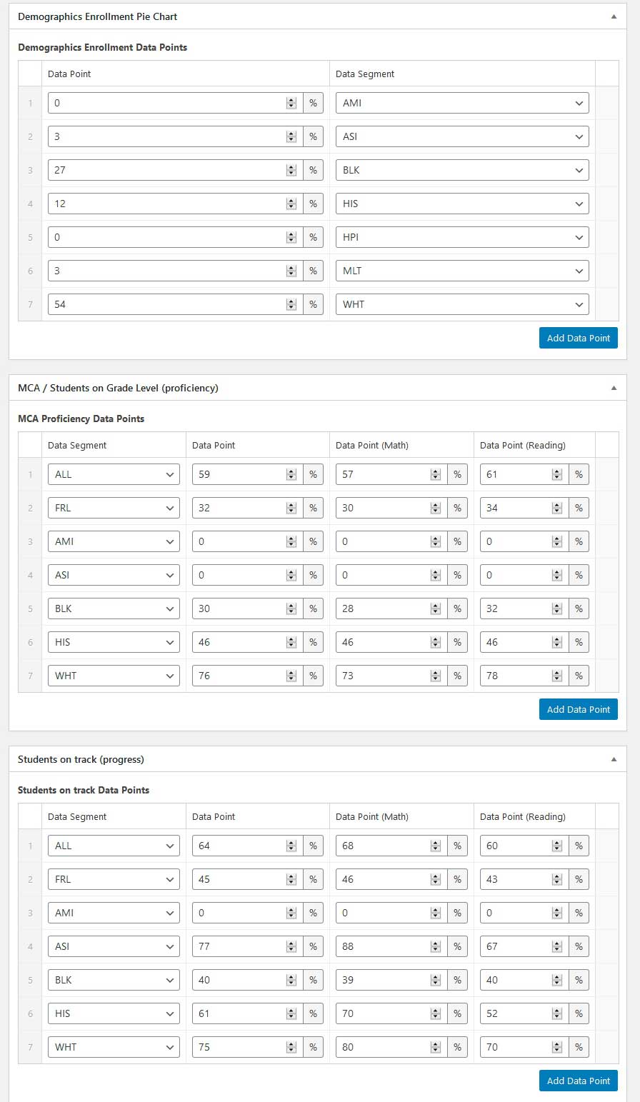
Each field group includes one repeater field called “Data Points.” Each repeater field has a unique name within its field group for easy identification: “Demographics Enrollment Data Points,” “Graduation Rate Data Points,” and “MCA Proficiency Data Points.”
Each repeater field contains two subfields:
- Data Point: A number field with % appended, so the client knows not to include the percent sign when entering data
- Data Segment: A select field offering demographic options in a dropdown, which standardizes the data entered and prevents inconsistent input
These custom fields are set to display on the custom post type. The client can now enter data points directly on each relevant page without navigating away from the editing area.
Step 2: Creating the charts with Chart.js
Three files in the theme folder handle the chart setup:
- functions.php
- inc/chart.php
- w2dc-plugin/templates/frontend/listing_single.tpl.php (template file for the directory plugin; this code can be added to any theme template file)
functions.php
This file enqueues the Chart.js JavaScript library, but only on the custom post type pages to prevent conflicts with other plugins.
//JS Chart scripts
function js_chart_scripts(){
  if ( strpos($_SERVER['REQUEST_URI'], 'school-profile') !== false ) {
    // only load on school profile pages
    wp_enqueue_script( 'chart', 'https://cdnjs.cloudflare.com/ajax/libs/Chart.js/2.7.2/Chart.js', array( 'jquery' ) );
  }
}
//Register hook to load scripts
add_action('wp_enqueue_scripts', 'js_chart_scripts');
Scoping the script load to specific post types is a best practice that avoids performance overhead and reduces the risk of JavaScript conflicts with other plugins, particularly on mobile.
inc/chart.php
This file pulls in the Advanced Custom Field data and creates the charts. It contains two helper functions and two main functions.
<?php
/* Helper Functions */
function get_chart_background_colors( $data_segment_array ) {
  $background_color_array = array();
  foreach( $data_segment_array as $data_segment ) {
    switch ( $data_segment ) {
      case 'ALL': $background_color_array[] = '#5dc5c4'; break;
      case 'FRL': $background_color_array[] = '#5dc5c4'; break;
      case 'AMI': $background_color_array[] = '#50bc81'; break;
      case 'ASI': $background_color_array[] = '#f7e3d6'; break;
      case 'BLK': $background_color_array[] = '#f9d978'; break;
      case 'HIS': $background_color_array[] = '#eab28b'; break;
      case 'WHT': $background_color_array[] = '#8797ae'; break;
      case 'HPI': $background_color_array[] = '#dbe1f1'; break;
      case 'MLT': $background_color_array[] = '#4276b1'; break;
    }
  }
  return $background_color_array;
}

function add_quotes_to_array_items( $arr ) {
  $return_arr = array();
  foreach ( $arr as $item ) {
    $return_arr[] = '"' . $item . '"';
  }
  return $return_arr;
}

/* Data */
function red_get_demographic_data( $data_type = 'demographics_data_points' ) {
  $data = array();
  if ( have_rows( $data_type, $post_id ) ):
    while ( have_rows( $data_type, $post_id ) ) : the_row();
      $data_points_array[] = get_sub_field('data_point');
      $data_segment_array[] = get_sub_field('data_segment');
    endwhile;
    $background_color_array = get_chart_background_colors( $data_segment_array );

    $data_points_array = implode( ', ', $data_points_array );
    $data_points_array = rtrim( $data_points_array, ', ' );
    $data['data_points_array'] = $data_points_array;

    $data_segment_array = add_quotes_to_array_items( $data_segment_array );
    $data_segment_array = implode( ', ', $data_segment_array );
    $data_segment_array = rtrim( $data_segment_array, ', ' );
    $data['data_segment_array'] = $data_segment_array;

    $background_color_array = add_quotes_to_array_items( $background_color_array );
    $background_color_array = implode( ', ', $background_color_array );
    $background_color_array = rtrim( $background_color_array, ', ' );
    $data['background_color_array'] = $background_color_array;
  endif;
  return $data;
}

/* Display Chart */
function red_display_chart( $data = array(), $options = array(), $post_id = null ) {
  if ( empty( $data ) ) { return; }

  $options = wp_parse_args( $options, array(
    'type' => 'doughnut',
    'chart_label' => '',
    'canvas_id' => 'myChart'
  ) );

  if ( $post_id === null ) {
    global $post;
    $post_id = $post->ID;
  }
  ?>
  <canvas id="<?php echo $options['canvas_id']; ?>" width="200" height="200"></canvas>
  <script>
  var ctx = document.getElementById('<?php echo $options['canvas_id']; ?>');
  var myChart = new Chart(ctx, {
    type: '<?php echo $options['type']; ?>',
    data: {
      labels: [<?php echo $data['data_segment_array']; ?>],
      datasets: [{
        label: '<?php echo $options['chart_label']; ?>',
        data: [<?php echo $data['data_points_array']; ?>],
        backgroundColor: [<?php echo $data['background_color_array']; ?>],
        borderWidth: 0
      }]    },
    options: {
      scales: {
        xAxes: [{ display: false }],
        yAxes: [{ display: false, gridLines: { display: false, drawBorder: false } }]      },
      responsive: true,
      legend: { display: false }
    }
  });
  </script>
<?php }
The red_get_demographic_data() function is reusable across all three chart types by passing a different $data_type parameter. The red_display_chart() function accepts a chart type option, so the same function renders both doughnut charts and horizontal bar charts depending on what you pass in.
Template file
We used the Web 2.0 Directory plugin for our listings, adding the chart output inside the template file. This code can be dropped into any theme template:
<span>Demographics</span><br />
<?php
$demographic_data = red_get_demographic_data();
red_display_chart( $demographic_data );
?>

<span>Students on grade level (proficiency)</span><br />
<?php
$grad_rate_data = red_get_demographic_data( 'grad_rate_data_points' );
red_display_chart( $grad_rate_data, array( 'type' => 'horizontalBar', 'canvas_id' => 'myChart-2' ) );
?>

<span>Students on track (progress)</span><br />
<?php
$mca_proficiency_data = red_get_demographic_data( 'mca_proficiency_data_points' );
red_display_chart( $mca_proficiency_data, array( 'type' => 'horizontalBar', 'canvas_id' => 'myChart-3' ) );
?>
The result
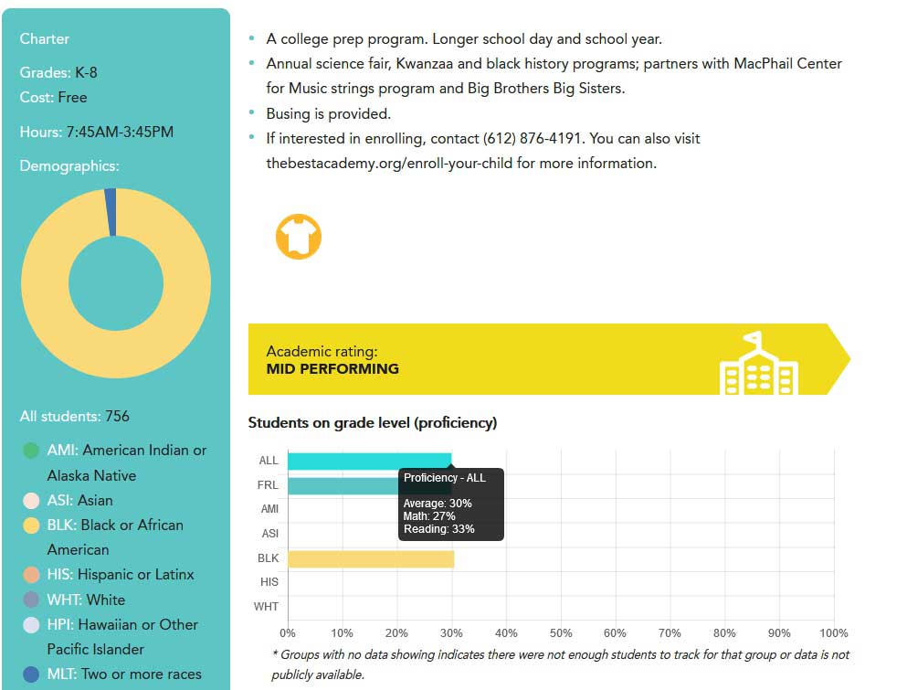
The finished system produces clean, responsive charts with tooltips on hover, automatically configured from the data entered through the Advanced Custom Fields interface. The client can update any chart at any time by editing the numbers directly on the relevant listing page, without navigating to a separate chart management area.
The best WordPress chart plugins in 2026
The custom approach above works well for projects with specific requirements. For most use cases, a WordPress chart plugin is the faster and more practical path. Here are the strongest options available in 2026.
Visualizer: Charts and Graphs
Visualizer is one of the most widely used WordPress chart plugins, with over 30,000 active users. It supports nine chart types in its free version, including line charts, bar charts, pie charts, column charts, area charts, and table charts. Interactive charts enhance user engagement, and Visualizer’s chart library delivers this through Google Charts rendering.
The free version allows data import from CSV files, making it practical for updating chart data without manual input. The pro version adds more chart types, Google Sheets import, and the ability to fetch data from MySQL databases and other external data sources. Visualizer uses Google Charts as its underlying chart library, which means it inherits Google’s responsive, cross-browser compatible rendering.
Best for: General-purpose data visualization without custom development requirements.
wpDataTables
wpDataTables takes a tables-first approach: users create editable tables that automatically update associated charts in real-time. This is one of the most powerful options for data analysis use cases where editors need to modify underlying data frequently and see charts reflect those changes immediately.
wpDataTables supports data import from CSV files, Excel, Google Sheets, and MySQL databases. Charts update dynamically as table data changes, which makes it particularly useful for reporting dashboards and financial data displays on WordPress pages. The plugin also supports responsive tables and responsive graphs that render cleanly on mobile devices.
Best for: Sites where tables and charts need to stay synchronized, and data changes frequently.
GFChart
GFChart turns Gravity Forms data into professional graphs and charts. If your WordPress site uses Gravity Forms to collect data through forms, GFChart lets you create charts and graphs directly from those form submissions. Supported chart types include bar charts, pie charts, line charts, and more.
Formidable Forms similarly supports various graph types, including geographic heat maps, built directly from form submission data using Gutenberg blocks. For sites that collect data through forms and want to display that data visually without exporting it first, either of these form-connected chart plugins eliminates a significant manual step in the data visualization workflow.
Best for: Sites that collect data through forms and want to display it as charts without manual export steps.
Graphina
Graphina integrates directly with Elementor for advanced chart creation within the page builder interface. If your WordPress site is built on Elementor, Graphina lets you add interactive data visualizations as Elementor widgets without any coding. It supports a broad range of chart types, including line charts, bar charts, pie charts, donut charts, radar charts, polar area charts, scatter graphs, and bubble charts.
Elementor charts through Graphina connect to Google Sheets and other data sources, making it possible to display live data that updates automatically without manual intervention.
Best for: Elementor-based WordPress sites needing a wide variety of chart types with a user-friendly interface.
iChart
iChart supports multiple chart types, including doughnut charts, pie charts, bar charts, and line graphs, with a simple interface for inputting data manually or importing from a CSV file. It’s a straightforward plugin suited to basic data visualization requirements without the complexity of database connections or form integrations.
Best for: Simple, lightweight chart displays without complex data source requirements.
Chartify
Chartify allows data input directly from Google Sheets or manual entry, making it a practical option for teams that manage data in Google Sheets and want those charts to update automatically on their WordPress site. It supports several standard chart types and embeds charts directly into WordPress pages and posts via Gutenberg.
Best for: Teams that manage data in Google Sheets and want automatic chart updates on their WordPress website.
Comparing the top WordPress chart plugins
| Plugin | Free chart types | Data sources | Best feature |
|---|---|---|---|
| Visualizer | 9 including line, bar, pie, area | CSV, Google Sheets (pro), MySQL (pro) | Widest free chart type selection |
| wpDataTables | Multiple | CSV, Excel, Google Sheets, MySQL | Real-time table-to-chart sync |
| GFChart | Bar, pie, line, more | Gravity Forms submissions | Direct form data visualization |
| Graphina | 15+ including radar, bubble, polar | Google Sheets, databases | Deepest Elementor integration |
| iChart | Doughnut, pie, bar, line | CSV, manual | Lightweight simplicity |
| Chartify | Several standard types | Google Sheets, manual | Google Sheets live updates |
Custom chart development vs. plugins: which is right for your project?
For most sites, a WordPress chart plugin delivers everything needed faster and with less development time than a custom solution. Plugins are the right choice when your chart requirements are standard, your data sources are common (CSV, Google Sheets, form submissions), and your team needs to create and update charts without developer involvement.
Custom development with Chart.js and Advanced Custom Fields is the right choice when:
- Charts must be managed directly within specific post or page editing areas
- Your data structure is non-standard and doesn’t map cleanly to plugin input formats
- You need multiple different chart types associated with individual posts or pages
- You need precise control over chart styling, colors, and behavior that plugins don’t expose
- Your site has a custom post type workflow where chart data is an integral part of the content
For ecommerce and complex WooCommerce builds where product data needs visual display, custom chart integrations are common. For standard content sites and reporting dashboards, a plugin almost always handles the requirement well.
The code in this article provides a reusable foundation. The red_get_demographic_data() function accepts any ACF repeater field name, and red_display_chart() accepts any Chart.js-supported chart type. With those two functions, you can extend the approach to any number of chart types on any post type with minimal additional code.
Additional resources
- Advanced Custom Fields code examples
- Advanced Custom Fields JavaScript API
- Chart.js documentation
- Complete files for WordPress charts using ACF and Chart.js
Build Beautiful WordPress Charts With Freshy’s Development Team
Whether you need a plugin-based data visualization solution or a fully custom WordPress charts implementation, choosing the right approach comes down to your data structure, your team’s technical capacity, and how tightly integrated the charts need to be with your content workflow.
Key takeaways:
- Data visualization turns numbers into graphics like bar charts, pie charts, line charts, and doughnut charts that help readers spot trends at a glance
- Standard WordPress chart plugins work well for most use cases; custom development is necessary when charts must integrate tightly with specific post types or editing workflows
- The ACF and Chart.js approach allows clients to update multiple data points directly on relevant pages without navigating to a separate chart management area
- Visualizer supports 9 chart types in its free version, and over 30,000 users rely on it for WordPress data visualization
- wpDataTables connects editable tables to live charts that update in real-time as data changes
- GFChart and Formidable Forms turn form submission data directly into visual charts without manual export steps
- Graphina provides the deepest Elementor integration for sites built on that page builder
- The custom ACF and Chart.js solution is reusable across any number of chart types and post types with minimal additional code
If your project requires custom WordPress charts or complex data visualization beyond what plugins provide, our development team has the expertise to build exactly what you need. Request a quote and tell us about your data visualization requirements, and read what our clients say about working with the Freshy team on complex custom builds.
FAQs
What is the best WordPress chart plugin in 2026?
Visualizer is the most widely used WordPress chart plugin, with over 30,000 users and 9 chart types in its free version. wpDataTables is the strongest option for real-time table-to-chart synchronization. Graphina is best for Elementor-based sites. The right plugin depends on your data sources, chart types needed, and whether your team manages data in Google Sheets, forms, or CSV files.
Can I create dynamic charts in WordPress without coding?
Yes. Plugins like Visualizer, wpDataTables, and Graphina provide user-friendly interfaces for creating dynamic charts from data sources, including CSV files, Google Sheets, and form submissions. Gutenberg is used for embedding charts into posts or pages in WordPress, and most plugins provide blocks or shortcodes for this purpose. Coding is only necessary when your requirements go beyond what the available plugins support.
How do I create charts in WordPress from Google Sheets data?
Visualizer’s pro version, Graphina, and Chartify all support Google Sheets as a data source. These plugins connect to your Google spreadsheet and display chart data that updates automatically as the sheet changes. This eliminates manual data entry and ensures charts always reflect the most current data without requiring any developer involvement after initial setup.
What is the difference between Chart.js and Google Charts for WordPress?
Chart.js is an open-source JavaScript chart library that renders charts locally in the browser using HTML5 canvas elements. Google Charts is a chart library provided by Google that renders via their servers. Visualizer uses Google Charts as its rendering engine.
The custom ACF solution in this article uses Chart.js. Both produce responsive, interactive charts; Chart.js gives more granular control over styling and behavior, while Google Charts requires no additional JavaScript loading.
When should I use a custom WordPress chart solution instead of a plugin?
Use a custom solution when charts must be managed directly within specific post or page editing areas, when your data structure is non-standard, when you need precise control over chart styling and behavior, or when multiple chart types need to be associated with individual posts in a custom post type workflow. For standard requirements where any major plugin handles the data source and chart types needed, a plugin is faster and more practical than custom development.
Can WordPress charts be made responsive for mobile devices?
Yes. Both Chart.js and Google Charts produce responsive charts that resize correctly across devices. Most WordPress chart plugins, including Visualizer, wpDataTables, and Graphina, create responsive charts by default. The custom ACF and Chart.js solution in this article includes responsive: true in the Chart.js configuration, ensuring charts render correctly on mobile without additional work.