People rely on attorneys at some of the toughest points in their life. They need someone who is credible, reliable and well-informed to hire for the job. When in need of an attorney, people turn to the internet and look to attorney’s websites for an idea of who that attorney is and the work they do.
Every website on this list is an example of a great attorney website design that properly communicates everything the attorney has to offer and more. They showcase ideal design qualities, as well as top-of-the-line functionality.
Are you ready to see examples of the best attorney websites the internet has to offer? If so, let’s go!
These are the top attorney websites for 2024
 Taylor Janis Workplace Law : Sleek and modern, the website for Taylor Janis Workplace Law has a great design that showcases the professionalism of the firm, as well as its ability to pay keen attention to detail. From the home page, there are two buttons visitors can get started on their experience with the Taylor Janis website. These buttons are specifically designed for two different types of customers – those who like to do business online and those who would rather talk to a person on the phone. We love this element of the website because we feel as though it makes the firm approachable for everyone.
 Stanchieri Family Law : Better known as the ‘Toronto Family Lawyers,’ Stanchieri Law Firm most definitely has one of the best attorney websites we could find online this month. As soon as visitors see the picture of the firms’ lawyers on the front page slider, they know this firm means business. A bold black background stands out against white and red text and graphics – a color scheme that doesn’t mess around. Pop-out navigation on the right side of the page adds a fun element to the site, but also makes it easy for visitors to navigate directly to the information they need and get down to business.
 Fritz Law, LLC : Fritz Law, LLC handles Estate Law and personal planning. The design of their website is different from many others we’ve seen – and we like it! The design offers a very corporate feel, but the pictures of families and smiling individuals on every page offer a personal touch. Bold, large, fonts are perfectly placed to attract the ideal client and every button and navigation is easy to use, eliminating any possible confusion. And, so no customer is lost trying to find out how to get in touch, there is a contact form at the top of the home page that can be easily filled out and sent with the touch of a button!
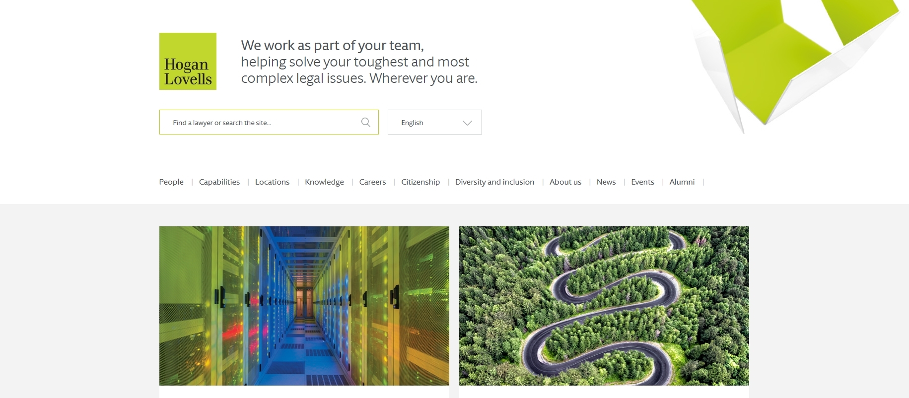 Hogan Lovells : The website for the Hogan Lovells law firm uses a template that’s most often used for a news source or blog website. However, it works perfectly for this website! The various buttons and call-outs that most web designers would use to showcase featured articles or posts, Hogan Lovells uses to highlight important information about their firm such as what their lawyers do and how their firm is different than others. In addition to that information, the home page also offers various stories and articles on important industry information that lends to the credibility of the professionals employed by the firm. Delightfully different, Hogan Lovells is easily one of the best attorney websites this month.
 Gomez Trial Attorneys : Just like the law firm, the website for Gomez Trial Attorneys certainly doesn’t mess around. From the dark color scheme, to the bold orange font, everything about this website means business, yet offers a friendly approach that welcomes new clients. Throughout the website, there are strategically placed client testimonials that help to develop trust with site visitors, as well as videos that communicate exactly what the firm has to offer. We love that this design includes all the details that make a great website in a practical, functional way.
 Bronstein & Carmona : Beautiful beach views, stunning sailboats and rolling waves – not exactly what you think about when you need to hire a lawyer. Nonetheless, it’s exactly what visitors get when they view the Bronstein & Carmona website. Overall, the website for this law firm is rather basic, but the details chosen, such as the beautiful pictures and animations, make it one-of-a-kind. Throughout the site, there are options to learn about the different attorneys at the practice and get a better idea of what types of cases they represent by means of simple navigation. Overall, we think Bronstein & Carmona have one of the best websites because they take a simple element of their business (such as its location) and use it to make a statement that sets them apart from the rest.
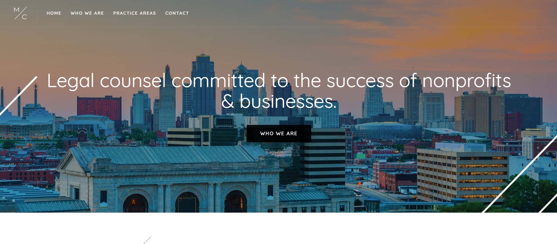 Mission Counsel KC : Attorneys with a purpose, the professionals at Mission Counsel in Kansas City, Kansas have effectively created a website that showcases what their business is all about. The modern design nods to the fact that the attorneys at this practice are young, but the prestigious fonts and professional photography used tells the tale of their professionalism and expertise. We love how as visitors scroll down the page, content pops up to greet them like a little wave. It’s a fun touch for a practice that does serious work!
 Mile Wright & Co. : Although this website isn’t in English, there are still some solid lessons on website designs that visitors can learn from Mile Wright & Co. Different from any other attorney website we’ve seen, this site takes a completely unique and modern approach with its ingenuity and design. Visitors can navigate through the entire website by using a simple arrow on the right side of the page, which is unexpected, yet convenient. Likewise, the profiles of the practicing attorneys are strategically sprinkled in among other information so they aren’t missed by anyone. From this website, we think others can learn that it’s good to be unique – as long as unique and functional aren’t mutually exclusive.
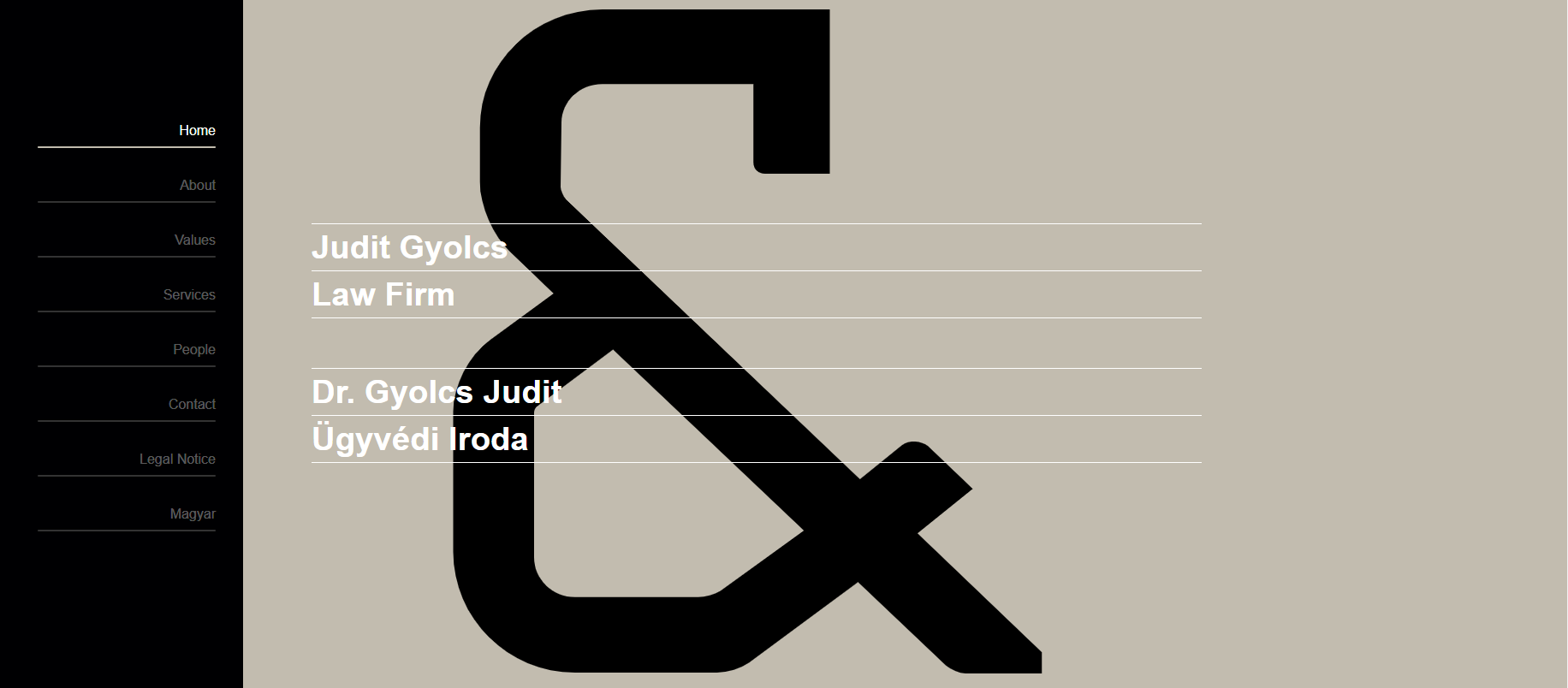 Judit Gyolcs Law Firm : The Judit Gyolcs Law Firm website is a top attorney website with a completely unexpected design. A large ampersand sits on the front of the home page that sets the website apart from any other. Likewise, the unique single page design with scrolling navigation is not something that’s typically seen on such a professional page. Yet, the lawyers at Judit Gyolcs Law Firm have made this design work perfectly for them. We believe that from this site, professionals can learn that being bold can be fun – even if you’re in a serious profession!
 Bryan Cave : This law firm is all about results and getting their clients the outcomes they desire. And, from the meticulous design of their website that’s easy to see. Bold blue and orange graphics, fonts and backgrounds grace each page of the site along with statistics and articles that showcase the accomplishments of the firm. Together, these elements create a well-rounded picture of the legal practice and invite visitors to learn more!
 Ambridge Law : Ambridge Law is a personal injury law firm out of Toronto, Ontario and we think it definitely has one of the best attorney websites on the list this month. The design has been crafted to resemble a newspaper with fun graphics and print. Likewise, every button, article and click-through has been strategically placed on the page for optimal use. Their use of graphics is creative and the two navigations are perfectly placed. All-in-all, the Ambridge Law website is a winning design that anyone could pull off!
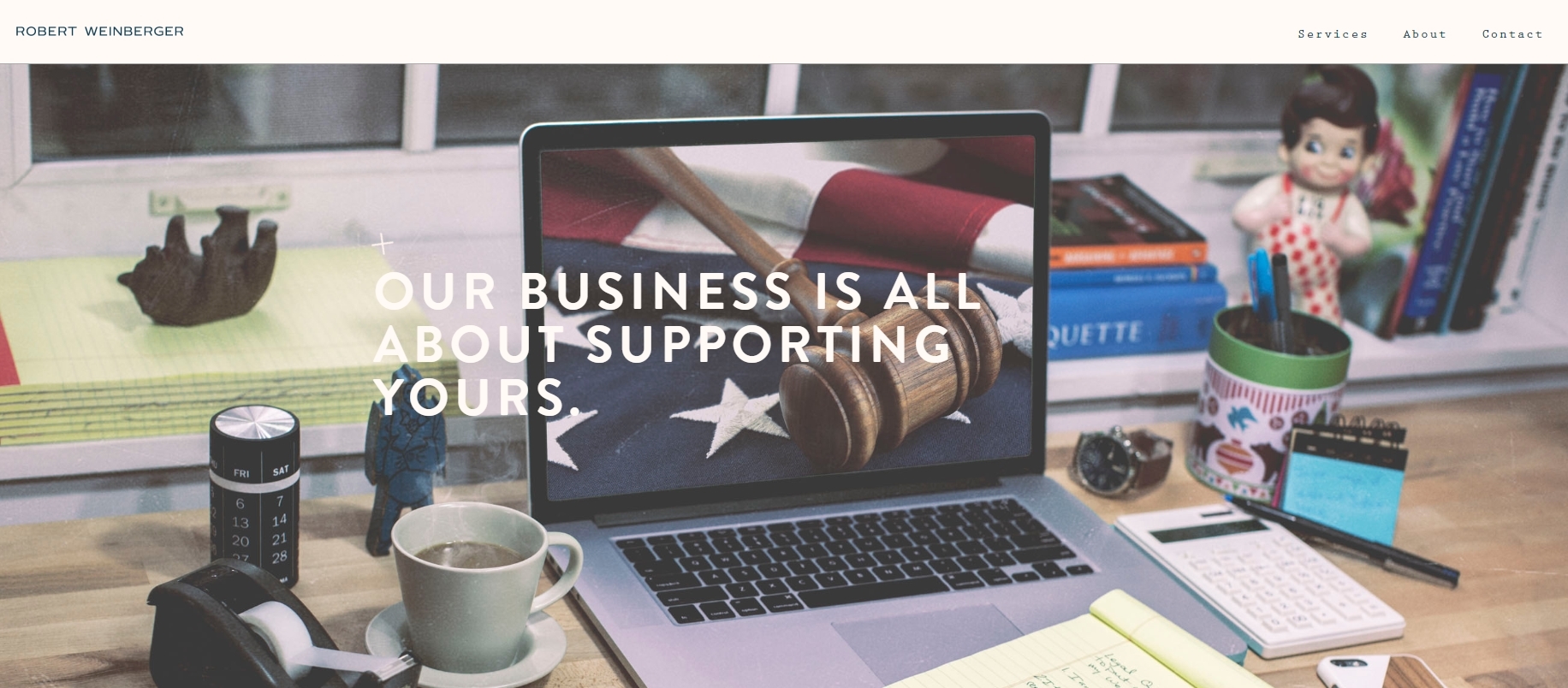 Robert Weinberger : Robert Weinberger is a lawyer that represents creatives and startups in New York City, and just as you’d suspect, his website does not disappoint in terms of design. From the picture in his slider, to the content underneath, it’s easy to see exactly what Robert stands for and the types of clients he wants to represent. The website does a great job of showing off both Robert’s professionalism and his unique personality – a winning combination! For lawyers with their own firm, Robert’s site is definitely one to take notes on.
 Robbins Firm : When they designed their website, the lawyers at Robbins Firm weren’t afraid to show off their best qualities or aim for the clientele they truly desire. One of the headlines even reads, “If it’s easy, don’t hire us.” And, although they might be blunt, the website is completely inviting. Fun graphics grace the front page and friendly pictures of the attorneys seem to be around every corner. This website definitely has a design anyone can learn from.
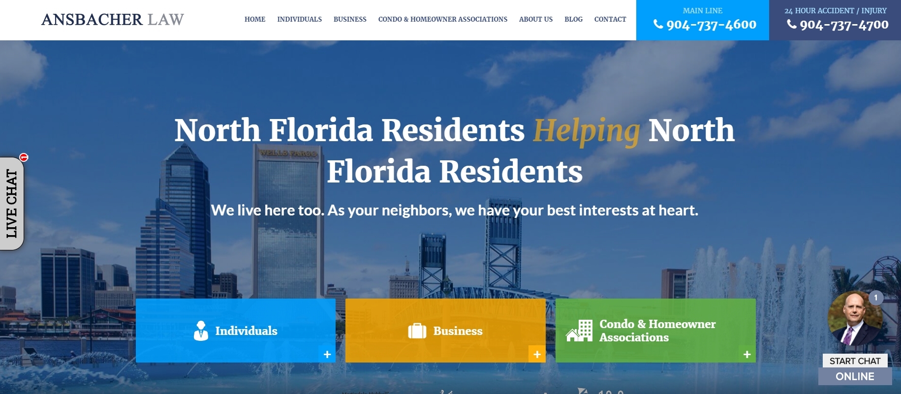 Ansbacher Law : Simple, fun and easy to use, the Ansbacher Law Firm has a website we think deserves a spot on our list of best attorney sites for this month. Bold colors and buttons make the site easy to use and help to guide visitors anywhere they need to go. We like that the slider on the homepage boldly sends different messages of why visitors should use the firm for their needs, and how the buttons underneath communicate information regarding the multiple areas of business the firm specializes in.
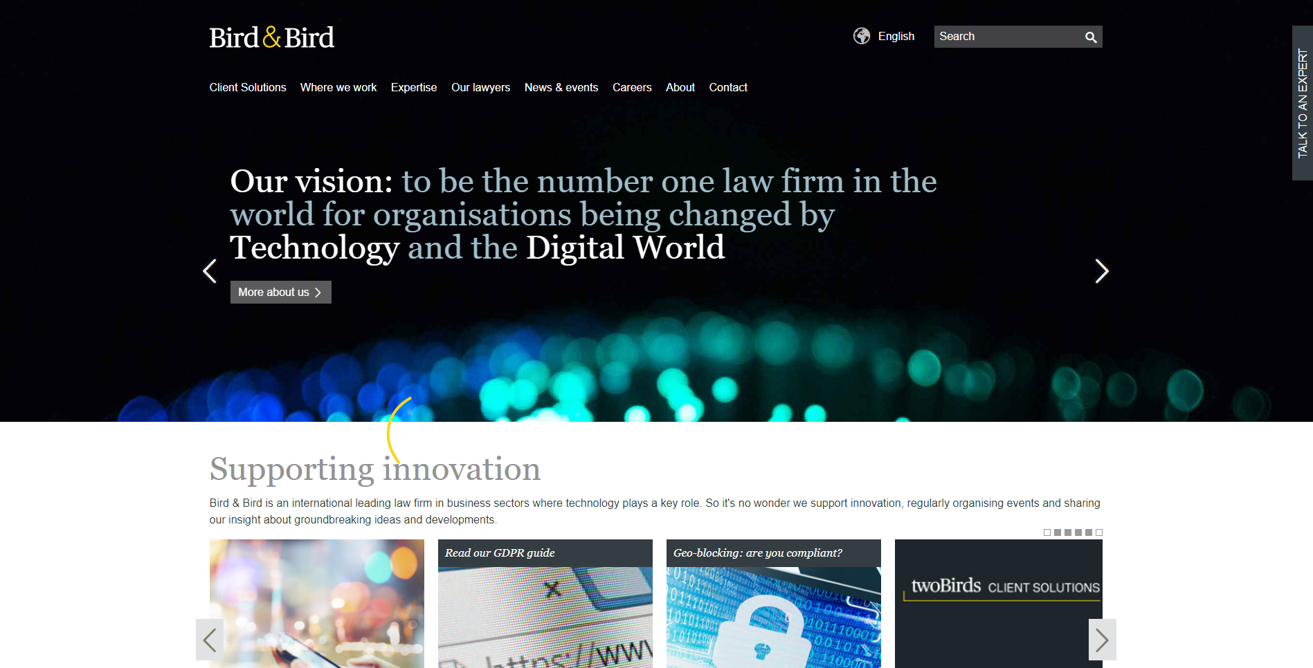 Bird & Bird : Simple and easy to use, Bird & Bird is a website that that doesn’t mess around when it comes to getting a message across. Much of the website consists of text content, but that’s okay because it does so in an aesthetically pleasing manner. Likewise, the content is all well-written and easy to read. We think this website is one of the best for the month because it demonstrates that there is more to a website than pictures and graphics.
 Emergence : If there was a winner for the month’s best attorney website, this would be it! The cartoon-like graphics on the home page are extremely inviting, fun and complimented by the bold color scheme of the site. Likewise, buttons that match the brand easily help visitors get where they need to go and encourage them to learn more about the lawyers that represent the firm and the successful business they’ve conducted in the past. A winning design that showcases individuality – this website is easily one to love!
 Dechert LLP : Dechert Law Firm is a global business that has a website with a global approach. Big buttons grace the front page to help site visitors make their way to the sections of the website that will help them most and a responsive navigation system makes the entire process of surfing the website even easier than it should be. We love the bold colors and bright design with simple fonts and graphics. Timeless design for a timeless business can easily be used as an example of an ideal website.
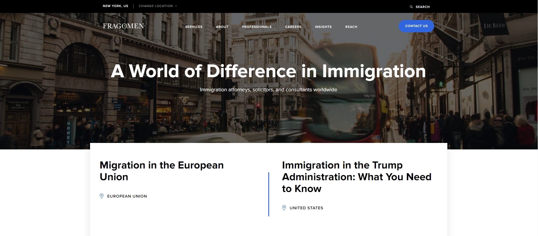 Fragomen Worldwide : Modern and inviting, the website for Fragomen Worldwide is an attorney website that won’t disappoint those looking for inspiration. Our favorite features include a scrolling newsfeed and case study area. Throughout the website, it’s easy to see what the law firm stands for thanks to their carefully placed content on each page. Overall, the website is simple and professional with strategically placed features that help to create functionality. In our book, a perfect design!
These amazing examples of the best attorney websites for 2024 are websites you should make note of and use to help guide the designs for your own.
A special lesson can be taken from each one, and we hope you take the time to learn from them all.
If you need assistance in creating the perfect attorney website for your firm, contact the professionals at Freshy.